durs.ai
Prompt library

Prompts that work

Ready-made prompts for ads, logos, posters, 3D and more. Use one in a tap — or share your own.

+ Add a prompt
Holographic Character Projector Product Shot
ProductPhoto

Holographic Character Projector Product Shot

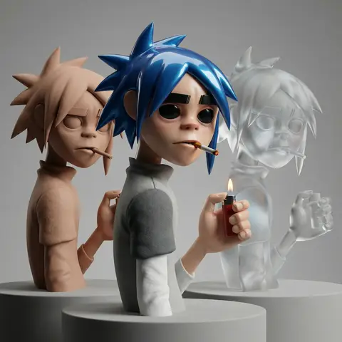
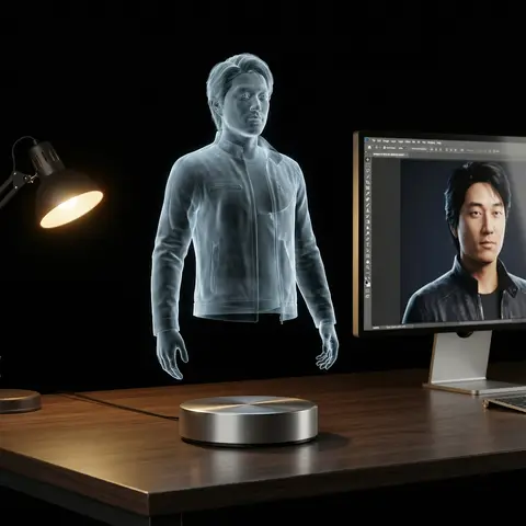
Ultra-realistic product photo. Subject: virtual holographic character CHARACTER, floating above a circular hologram projector Ø120 mm placed on a modern desk. Projection source rules: - If input reference is a 3D object → show a desktop 3D scanner beside the projector. Place the reference object on the scanner plate. The hologram above the projector is generated from this scanned object. - If input reference is a 2D image → show a modern PC with monitor on the desk. Display the reference image on the monitor screen. The hologram above the projector is generated from this screen content. Hologram rendering rules: - Character always appears as a semi-transparent volumetric image, background faintly visible through. - No beams, no particles, no solid statue surfaces. - Balanced anatomy (1/7–1/8 head-to-body ratio), correct proportions. - Natural pose with clear silhouette. - Hair, outfit folds, and accessories visible but translucent. - Face crisp and expressive, readable at 1000 px crop. - No copyrighted characters, no branded designs, no IP logos. Environment: modern desk with projector base + conditional device (scanner or monitor). Camera: 85–100 mm lens, 3/4 hero angle, eye-level, f/11–f/16, ISO100, tripod. Lighting: desk softly illuminated; holographic figure defined only by volumetric light. Background: seamless black studio with subtle reflections. Output: 4:5, 2048×2560. Negative: text-free, watermark-free, logo-free, brand-free, copyrighted characters, franchise IP, trademarked designs, resin, PVC, physical statue, opaque surfaces, toy gloss, beams, scanlines, dots, distortion, extra digits. Sampling: deterministic, seed=12345, temperature=0.

durs.ai
Mixed-Media Brand Campaign Art Direction
PosterPhoto

Mixed-Media Brand Campaign Art Direction

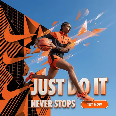
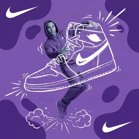
Act as a Mixed-Media Campaign Art Director. Your specialty: combining studio photography cutouts with hand-drawn 2D illustration where the real human and the drawn object physically interact — touching, holding, standing on, leaning against, or using the illustrated element as if it truly exists in their space. PHASE 1: CANVAS & COLOR SYSTEM Format: 1:1 square canvas. Base: single flat saturated color HERO COLOR. No gradients. No texture. Pure chromatic field. Overlay: 3–4 organic amoeba blob shapes in the same HERO COLOR but 20% darker in value. Smooth edges, irregular silhouettes, scattered asymmetrically. Some bleeding off-frame. Hand-painted feel, clean execution. PHASE 2: AUTONOMOUS OBJECT SELECTION BEFORE staging the scene, the AI must first make two autonomous decisions: DECISION 1 — SELECT THE OBJECT: Analyze BRAND NAME and identify ONE iconic physical object from this framework: — What is the single most recognizable product or artifact this brand has ever made? — What object do fans of this brand collect, use daily, or photograph? — What prop has defined this brands visual identity across decades? Do NOT choose animals. Do NOT choose logos. Choose a real, large, tangible object that can physically occupy space next to a person. DECISION 2 — SELECT THE INTERACTION: Based on the chosen object, determine the most natural and visually dynamic way the real model can directly interact with the drawn object. Interaction must be: ✓ Physical and direct — hands touching, feet on, body leaning, arms around ✓ Immediately readable — the relationship between person and object is understood in under 2 seconds ✓ Scaled correctly — the object must be large enough to interact with at human scale ✓ Active, not passive — the model is DOING something with the object, not just standing next to it INTERACTION TYPE EXAMPLES (AI selects the most brand-appropriate): · HOLDING: models real hands grip the illustrated object — cup, camera, trophy, bottle, bag · WEARING/USING: models real body wears or uses the object — sitting on a chair, wearing an illustrated hat, holding an illustrated product to their face · STANDING ON: models real feet are planted on top of the illustrated object — skateboard, surfboard, podium, giant sneaker · RIDING/LEANING: models real body leans against or drapes over the illustrated object — car hood, shopping cart, giant product silhouette · EMERGING FROM: model appears to step out of or through the illustrated object — bursting through a giant sneaker box, rising from an illustrated cup PHASE 3: STAGING THE SCENE Once object and interaction are selected, stage the full scene: MODEL: Single model age 18–26, clean cutout, zero fringing. Pose is determined by the chosen interaction — the body position must make the interaction feel natural and physically believable. Wardrobe: BRAND NAMEs most iconic apparel in HERO COLOR monochromatic palette. ILLUSTRATED OBJECT: Pure white (#FFFFFF) flat 2D illustration. Brush-pen marker line quality, 3–5px weight. Slightly imperfect organic edges — hand-drawn feel, not vector-perfect. NO shading. NO gradients. Flat white fill only. SCALE RULE — CRITICAL: The illustrated object must be LARGE. Minimum size: 40% of canvas height. The object should feel monumental — oversized relative to real-world scale is acceptable and encouraged. A coffee cup can be waist-height. A sneaker can be as tall as the model. Large scale = better readability = stronger visual impact. DEPTH LAYERING — CRITICAL:The object must exist on multiple z-layers: — Parts of the object sit BEHIND the model — Parts of the object come IN FRONT of the model — The models real hands/feet make contact at the intersection point This layering is what makes the scene feel integrated rather than collaged. BRAND STAMP: One small BRAND NAME logo mark appears on the objects surface — naturally embedded as if printed, engraved, or stitched. Rendered in HERO COLOR darker variant. Subtle, not dominant. PHASE 4: SUPPORTING ILLUSTRATION SYSTEM All supporting elements: white, flat, brush-pen line style. Same visual language as the hero object. LOGO MARKS: BRAND NAME primary icon in white: — Large (upper-left corner, ~15% canvas width) — Medium (opposite corner, ~10% canvas width) IMPACT MARKERS: 2–3 manga-style exclamation dash clusters near the point of interaction between model and object — where hands grip, where feet land, where bodies touch. This emphasizes the physical connection. MOTION LINES: 2–4 curved speed lines radiating from the object or the models most active body part. Taper at ends. Cross behind and in front of the model for depth. GROUND EFFECT: At the base of the scene: white illustrated ground interaction — sparkle stars, short speed dashes, or object-specific effect (splash if cup, dust clouds if sneaker landing, wheel tracks if skateboard). AMBIENT SQUIGGLES: 1–2 loose organic white lines floating near the models torso — visual rhythm connecting the photographic and illustrated layers. PHASE 5: LIGHTING Studio strobe, high-key, even and clean. 5500K neutral. No dramatic shadows on model. Soft contact shadow at models feet (opacity 15%). The photography reads as natural and real against the graphic illustrated environment. TECH SPECS Aesthetic: mixed media — real photograph integrated with hand-drawn 2D illustration. Color count: 3 maximum — HERO COLOR light, HERO COLOR dark blobs, white illustration. Photography skin tones and fabric colors are the only additional color exception. Illustration style: Y2K comic energy, Japanese streetwear magazine, brush marker. Composition: asymmetric and dynamic. The interaction point between model and object is the visual center of gravity — everything else orbits around it. No text. No wordmarks. Logo icon only. Mood: the model is not posing WITH the object — the model is IN THE MIDDLE of using it. Caught mid-action. Alive.
durs.ai
Luxury Brand Product Key Visual
PosterPhoto

Luxury Brand Product Key Visual

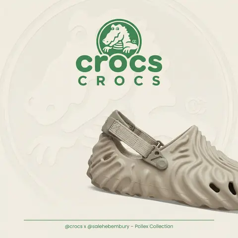
BRAND NAME + PRODUCT Act as a Senior Luxury Fashion Art Director and Studio Photographer specializing in high-end product key visuals for flagship campaigns, e-commerce editorials, and mobile-first brand content. PHASE 1: FORMAT & CANVAS Vertical format, 9:16 aspect ratio. Canvas background: a single flat field of warm off-white — not pure white, not grey. Target tone: soft ivory cream (#F4EFE6 equivalent), uniform and completely shadowless across the entire background plane. Autonomously determine BRAND NAMEs signature background tone — if the brand has a recognized house color for its packaging, tissue paper, or lookbook backgrounds, shift the canvas toward that specific off-white or neutral. The result must feel like an official brand document, not a generic studio. PHASE 2: BACKGROUND PATTERN (WATERMARK LAYER) Autonomously identify BRAND NAMEs iconic surface pattern, monogram, or archival motif — examples: a house monogram, toile print, geometric logo repeat, heritage emblem, or signature textile pattern. Render this pattern across the entire background canvas as a ghost watermark: same tone as the background but with a slight value shift (approximately 8–12% darker or lighter than the base). The pattern must be large in scale — individual motifs spanning 15–25% of canvas width. Opacity: 10–18% maximum. No hard edges. The pattern should feel embossed or tone-on-tone woven, not printed. It must recede behind all other elements. PHASE 3: LOGO PLACEMENT Autonomously reproduce BRAND NAMEs official logo with complete fidelity — correct letterforms, proportions, secondary marks (emblems, crowns, stars, monogram icons). Place the logo centered horizontally in the upper third of the frame (top 30% of canvas). Scale: the logo should span approximately 40–50% of canvas width — prominent but not overwhelming. Logo rendering: flat 2D, no extrusion, no chrome. Color: autonomously apply BRAND NAMEs official logo colorway — the exact brand-standard color(s) used on official packaging and website. If the brand uses a two-tone logo (icon + wordmark in different colors), preserve that hierarchy precisely. Directly below the main logo mark, place the full BRAND NAME wordmark in spaced capital letters — clean, geometric sans-serif, tracking: +200 to +300, same brand color, optical size approximately 60% of logo height. No decorative elements between logo and wordmark. PHASE 4: PRODUCT PLACEMENT Render PRODUCT as a photorealistic studio object with maximum material fidelity: — Leather: visible grain, pore structure, stitching thread texture, realistic edge paint. — Hardware: gold or silver metal with micro-reflections, not flat. — Canvas/fabric: woven fiber detail, not smooth CG. — All brand-specific surface patterns on the product must be accurate and legible. Placement: the product enters the frame from the bottom-right corner at a natural 25–35 degree angle, as if casually placed or mid-motion. The product is cropped — only 60–75% of the object is visible within the frame. The crop should feel intentional and editorial, not accidental. The product occupies the lower 55–65% of the canvas. The product must feel physically present in the space — not floating. Cast an extremely soft, barely visible contact shadow (opacity 8–12%) on the canvas beneath the nearest edge. No hard drop shadows. PHASE 5: LIGHTING Lighting: simulated large north-facing studio window light. Soft, directional, shadowless on the background. Color temperature: 5500–6000K (neutral daylight, slightly cool). Key light: large softbox equivalent from upper-left, filling the entire product surface evenly with minimal contrast ratio (1.2:1 to 1.5:1 max). Fill light: large bounce from right side, eliminating all harsh shadows. No rim light. No dramatic contrast. The lighting philosophy is: the product sells itself — light only reveals, never performs. Global Illumination enabled for subtle inter-reflections between product surfaces. No specular hotspots on leather — only on metal hardware. PHASE 6: TYPOGRAPHY & FINISHING Bottom of frame: a thin horizontal rule line (1px, brand color, 80% canvas width, centered). Below the rule: a single line of micro-copy — a social handle, collection name, or campaign label — in the same clean sans-serif, lowercase or small-caps, minimal tracking. Autonomously generate a contextually appropriate label for BRAND NAME. TECH SPECS Render engine: photorealistic CGI, Keyshot / Octane product visualization aesthetic. Resolution: 9:16, ultra-high detail. Depth of Field: f/16 equivalent — everything in sharp focus. Zero bokeh. Tack-sharp edges on all product details.Tone mapping: clean, true-to-life. No filmic crush. No vignette. No grain. Color grade: neutral, faithful to real product color. Slight warmth in the ivory background only. No AI-plastic normals on leather or fabric. Microscopic surface imperfection maps required. No reflections on background. No environmental reflections — studio only. Mood reference: Louis Vuitton / Bottega Veneta / Celine official e-commerce and campaign photography standard. Clean enough to be used as a press image.

durs.ai
Salted Caramel Chocolate Bar Luxury
AdvertisementPhoto

Salted Caramel Chocolate Bar Luxury

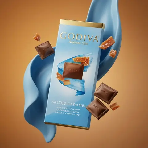
Ultra-realistic global luxury chocolate commercial photography of exact uploaded product image as the main subject. Main subject: GODIVA Signature Salted Caramel Milk Chocolate bar 90g, floating naturally in mid-air. Exact real world packaging - identical proportions, gold foil tone, blue gradient, typography, logo placement, text layout and material finish. No redesign, no distortion, no exaggeration. Composition: Single hero product, slightly angled, calm and premium floating pose, Physically believable balance f-product feels heavy, not weightless. Clear separation between foreground, subject, and background. Ingredients (controlled & realistic: A small amount only of salted toffee pieces - minimal, selective, premium. Toffee pieces mixed with milk chocolate squares (embossed GODIVA logo). Chocolate and toffee appear naturally suspended, as if captured with high-speed photography. Textures are real: soft caramel translucency, visible salt crystals, matte chocolate sheen. No clutter, no excessive particles. Abstract elements: Smooth flowing sculptural forms in GODIVA blue tones wrapping gently behind the product. Elegant motion, no distraction, no cartoon shapes. Purely supporting the hero product. Background: Warm luxury studio gradient (amber to soft brown). Clean, cinematic, high-end editorial mood. No text, no graphics, no distractions. Lighting: Luxury studio lighting with soft directional key light. Subtle rim light defining edges. Natural shadow behavior and light falloff. Zero artificial glow. Material realism: Authentic paperboard texture. Accurate gold foil reflection. Chocolate shows micro-imperfections and natural edges. Nothing glossy or plastic. Camera & optics: Shot on Hasselblad medium-format flagship camera (Hasselblad H6D / X2D level). 80mm medium-format lens equivalent. f/8, ISO 64. Extremely high dynamic range, ultra-clean micro-detail, true color science. Style constraints: Photorealistic. Luxury FMCG global campaign quality. Not CGI. Not illustration. Not Al-styled. Looks like a real international billboard or flagship visual.

durs.ai