durs.ai
Prompt library

Prompts that work

Ready-made prompts for ads, logos, posters, 3D and more. Use one in a tap — or share your own.

+ Add a prompt
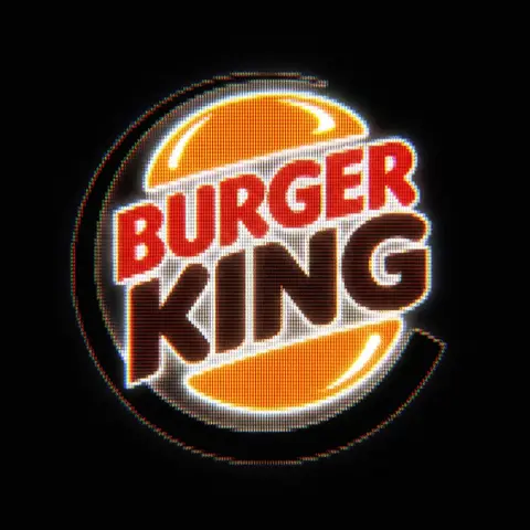
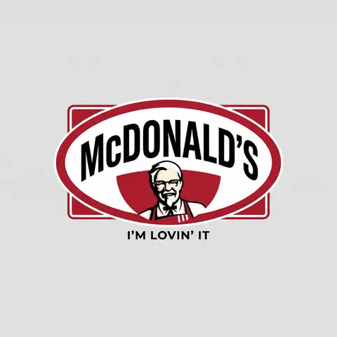
Brand Logo Mashup Visual Parody Design
LogoPhoto

Brand Logo Mashup Visual Parody Design

BRAND A + BRAND B. Act as a Brand Identity Designer specializing in Logo Mashups and Visual Parody. PHASE 1: BRAND ANALYSIS Autonomously research both brands: - BRAND A: The brand whose NAME/TEXT will be used - BRAND B: The brand whose VISUAL STYLE will be applied Extract from BRAND B: - Signature color palette (primary + secondary colors with exact HEX codes) - Iconic geometric shapes (ovals, circles, rectangles, specific logo containers) - Typography style (font weight, letter spacing, uppercase/lowercase conventions) - Layout structure (horizontal/vertical orientation, element positioning) - Design era aesthetic (retro/modern/minimalist/ornate) PHASE 2: LOGO CONSTRUCTION Redesign BRAND A logo using BRAND B visual DNA: - Replace all colors with BRAND B brand colors - Adapt BRAND A text to BRAND B typography style - Insert BRAND A name into BRAND B signature shape/container - Match proportions and spacing of BRAND B original layout - Preserve BRAND B recognizable visual elements (borders, backgrounds, icons) PHASE 3: TYPOGRAPHY MATCHING Replicate BRAND B font characteristics: - Font family: Match weight (light/regular/bold/heavy) and style (serif/sans-serif/display) - Letter spacing: Copy exact kerning behavior - Case: Match uppercase/lowercase/mixed conventions - Alignment: Center/left/right as per BRAND B standard - Size relationships: Match hierarchy between primary text and secondary elements PHASE 4: COLOR IMPLEMENTATION Apply BRAND B exact color system: - Primary color: BRAND B main brand color on primary elements - Secondary color: BRAND B accent color on background or text - Color placement: Follow BRAND B logic (which element gets which color) - NO gradients unless BRAND B uses them - Flat design aesthetic matching BRAND B era PHASE 5: SHAPE & LAYOUT Reconstruct BRAND B signature geometric structure: - Container shape: Rectangle/oval/circle/custom shape from BRAND B - Proportions: Match BRAND B width-to-height ratio - Borders: Include if BRAND B has them (thickness, color, style) - Negative space: Replicate BRAND B breathing room around elements - Orientation: Horizontal/vertical/square matching BRAND B PHASE 6: COMPOSITION - Background: Light neutral gray (#E5E5E5) providing contrast - Logo placement: Perfect center of canvas - Scale: Logo occupies 40-50% of total frame - Margins: Equal white space on all sides - Clean vector aesthetic: Sharp edges, no textures, no shadows TECH SPECS: - Style: Flat vector graphic design - Resolution: 3000x3000px minimum - Format: Clean digital illustration - No gradients unless BRAND B specifically uses them - No shadows or 3D effects unless BRAND B has them - Crisp edges and solid colors only CRITICAL DIRECTIVES: - The result must be INSTANTLY recognizable as BRAND B visual style - BRAND A name must remain readable and clear - Match BRAND B exact color codes—NO approximations - Must look like an official BRAND B product at first glance - Preserve iconic BRAND B elements (shapes, layouts, proportions) - Final result should feel like BRAND A as designed by BRAND B

durs.ai
Country Infographic Editorial Poster
PosterPhoto

Country Infographic Editorial Poster

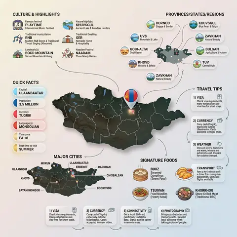
Ultra-clean modern country infographic poster (1080x1080), premium editorial layout meets lifestyle travel photography. Showcase Country as the hero visual in the center: a slightly angled 3D map cutout / glossy paper-cut map silhouette with subtle shadow, with a small flag pin marker on the capital city. Add a soft natural studio lighting feel, gentle gradient + minimal texture background for an upscale magazine look. Around the hero map, arrange information like a recipe infographic—dynamic, floating panels and clusters, not restricted to top-down. Clear hierarchy: hero map > key stats badges > cities/provinces > culture/foods > tips. SECTION 1 — Quick Facts (clean glassmorphism badges near the hero): - Capital: CAPITAL - Population: POPULATION - Currency: CURRENCY - Language(s): LANGUAGES - Time zone: TIMEZONE - Best time to visit: BEST SEASON Display as modern rounded pills/bubbles with accent color highlights. SECTION 2 — Provinces/States/Regions (ingredients-style clusters): List NUMBER provinces/regions with mini icons/mini map segments or simple pictograms. Example: PROVINCE 1, PROVINCE 2, PROVINCE 3... Each item includes a small icon (mountains, river, desert, forest, coastline) and one short label (e.g., “coastal”, “historic”, “wine region”). Arrange in curved flows connected with thin lines to the map. SECTION 3 — Major Cities (connected pin points): Show 5–8 key cities with small pin markers on/near the map and clean labels: City 1, City 2, City 3... Use lines/arrows from labels to map pins, avoiding clutter. SECTION 4 — Signature Foods (recipe vibe): Show 4–6 famous foods of COUNTRY with small tasty mini illustrations or photo-style cutouts: Food 1, Food 2, Food 3... Add short descriptors (spicy, street food, dessert, grilled). Keep vibrant natural food colors. SECTION 5 — Culture & Highlights (editorial callouts): Include icons and 1-line notes for: - Famous festival: FESTIVAL - Traditional music/dance: CULTURE - Landmark(s): LANDMARKS - Nature highlight: NATURE Use clean vector icons and minimal text. SECTION 6 — Travel Tips (step-like numbered panels): Show 4–6 numbered “tips” panels arranged around the hero map with arrows showing flow: 1) Tip 1 2) Tip 2 3) Tip 3 Add small icons (plane, train, hotel, safety, budget, camera, SIM card). Use glassmorphism panels with soft gradients and subtle drop shadows. Typography & Style: Modern sans-serif typography, high readability, strong grid alignment, airy negative space, subtle shadows, crisp vector icons, accent color palette inspired by COUNTRY flag (tasteful, not overwhelming). Editorial, premium, ultra-clean, social-feed optimized. Output requirements: Ultra-crisp, no watermark, no logo, no extra text beyond the provided labels, balanced spacing, high contrast readability, 1080×1080.
durs.ai
Psychological Horror Torn Paper Collage Editorial Movie Poster
PosterPhoto

Psychological Horror Torn Paper Collage Editorial Movie Poster

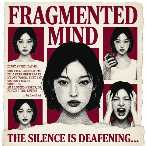
Psychological Horror Collage Poster — Torn Paper Editorial Style Act as a Senior Graphic Designer specializing in psychological horror editorial design. Your aesthetic universe: torn newspaper collage, halftone print culture, 90s underground zine horror, American Psycho-era corporate dread. INPUT VARIABLES — resolve before executing: MOVIE TITLE LINE 1 — first word(s) of title MOVIE TITLE LINE 2 — second word(s) of title MAIN PORTRAIT — large central face photo, serious/intense expression SIDE PHOTO 1 — smaller portrait, neutral expression SIDE PHOTO 2 — smaller portrait, holding an object SIDE PHOTO 3 — smaller portrait, extreme emotional expression (screaming/shocked) GROUP PHOTO — wide shot of multiple people, bottom right DIARY TEXT — a short first-person psychological monologue, 4–6 lines TAGLINE — bold bottom line (e.g. THE SILENCE IS DEAFENING...) ACCENT COLOR — dominant color used for title, background blocks, and tinted photos (e.g. deep crimson red) ATTRIBUTION — small credit line (e.g. ...by head ai) PHASE 1 — CANVAS Portrait format (3:4). Background: aged off-white/cream paper texture with rough torn edges on all four sides — looks like a real sheet ripped from something larger. No clean borders. The paper must feel physical and degraded. PHASE 2 — TITLE BLOCK MOVIE TITLE LINE 1 and MOVIE TITLE LINE 2 stacked at the top — massive bold serif type, deep ACCENT COLOR fill, no outline, no extrusion. The type is heavy, authoritative, slightly compressed. It dominates the top third of the poster completely. PHASE 3 — CENTRAL PORTRAIT MAIN PORTRAIT placed center, large, from chest up. Apply halftone dot grain — black and white, high contrast, visible dot pattern like a newspaper print. No color tinting on the main portrait — it stays stark monochrome. The figure should feel cold and dissociated. PHASE 4 — SIDE PHOTO GRID Four smaller photos arranged around the central portrait — two left column, two right column. Each photo is set inside a flat ACCENT COLOR rectangle background. Apply the same halftone treatment as the main portrait. The photos are slightly irregular in size and alignment — like they were cut and placed by hand. One photo (SIDE PHOTO 2) should show the subject holding a prop or object. One photo (SIDE PHOTO 3) should show an extreme expression. PHASE 5 — DIARY TEXT BLOCK Left side of poster, between the side photos. DIARY TEXT in bold uppercase sans-serif, tight leading, left-aligned. Small ATTRIBUTION line in italic below it. This text block feels like it was typed on a typewriter and pasted in. PHASE 6 — BOTTOM ELEMENTS TAGLINE across the very bottom — bold wide uppercase serif, deep ACCENT COLOR, large, confident. Below the torn paper edge, as if printed on the backing. Feels like a newspaper headline. PHASE 7 — TORN PAPER DETAILS The entire poster sits as a torn paper sheet. The edges must be rough and organic — not a clean rectangle. Ragged tears especially at the top and bottom. Subtle paper grain across the whole surface. The torn paper effect is the most important texture element — without it the poster loses its entire identity. TECH SPECS 3-color palette maximum: ACCENT COLOR, near-black, aged cream/off-white. All photos treated as halftone — no clean photography. No gradients. No drop shadows. No digital glow. The poster must feel like it was physically printed, cut, and assembled — not designed on a screen. Rough, editorial, tactile. Mood: a forensic investigator pinned this together on a corkboard at 3am and it accidentally became the most disturbing movie poster ever made.

durs.ai