Prompt library

Prompts that work

Ready-made prompts for ads, logos, posters, 3D and more. Use one in a tap — or share your own.

+ Add a prompt
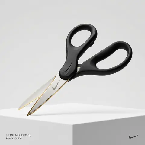
Brand everyday object style
ProductPhoto

Brand everyday object style

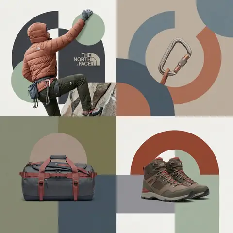
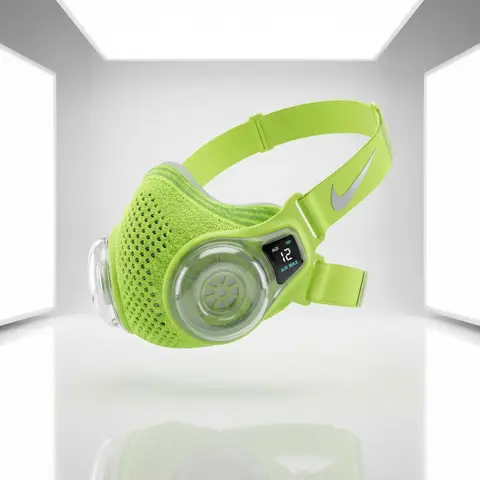
BRAND NAME or LOGO IMAGE. Act as a creative director curating a wide-ranging, eclectic collection of recontextualized everyday objects. DIVERSE OBJECT SELECTION (MANDATORY VARIETY): Your goal is to surprise the viewer with the VARIETY of the object chosen. Randomly select ONE object from these distinct categories to ensure diversity: Analog Office & Desk: Sport & Leisure: Barware & Kitchen: Utility & Tools: Grooming: Travel: THE CONCEPT: Take the chosen mundane object and elevate it into a luxury artifact using BRAND NAME s signature materials and colors. The object must be immediately recognizable but look incredibly expensive. MATERIALS & FINISH: Use materials that contrast with the objects usual cheap nature. Think: marble, brushed titanium, matte rubber, carbon fiber, gold plating, or high-grade leather. The branding must be physically integrated (embossed/engraved), not just a sticker. PRESENTATION (NO BOXES): The object should stand alone on the pedestal or table, fully exposed. If it has parts (like a ping pong set), arrange them neatly (knolling). Avoid closed boxes that hide the shape. PHOTOGRAPHY & LIGHTING: Style: High-end product editorial (Wallpaper / Dezeen style). Lighting: Soft, studio high-key lighting. No harsh shadows. Background: Clean, seamless light grey or white cyclorama. GRAPHIC OVERLAYS (UI): Bottom Left: A small, minimalist 2-line text block describing the object. Font: Manrope Regular. Color: #414141. Bottom Right: A small, discreet, monochrome logomark of BRAND NAME . Color: #414141. Do NOT visualize “Font name” and “Color code”.

durs.ai
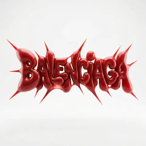
Moss Texture Logo Icon Art Direction
LogoPhoto

Moss Texture Logo Icon Art Direction

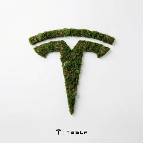
BRAND NAME: Enter the brand name here. Goal: Generate a minimalist organic image where a stylized logo icon of BRAND NAME is transformed into a large moss-textured artifact, with a small brand signature at the bottom. Constraint: NO TEXT inside or immediately near the central moss icon. Only the bottom signature. 1. THE CENTRAL MOSS ICON - Main Subject: A large, geometrically precise symbol, sculpted into the exact form of the BRAND NAME logo icon. - Material: The symbol is entirely made of dense, heavily textured, natural green stabilizing moss. The texture is rough and organic with varying shades of green and brown. - Form: The geometric edges are sharp and clean, but filled with the soft, billowy texture of moss. 2. ENVIRONMENT & LAYOUT - View: A top-down, central flat lay view. - Background: A flawless, uniform, matte white studio background. Full minimalist negative space. - Lighting: Bright, soft, diffused studio lighting that emphasizes the tactile moss texture while minimizing harsh shadows. 3. BOTTOM BRAND SIGNATURE (CRITICAL) - Placement: A clean horizontal signature block centered at the bottom, far below the moss icon. - Elements: A tiny, flat, minimalist version of the BRAND NAME logo icon on the left. - Text: The word BRAND NAME in a clean, bold, black sans-serif typeface immediately to the right of the tiny logo. - Scale: The signature must be very small compared to the central moss artifact. 4. AESTHETIC - Biophilic design, premium product photography, clean, fresh, airy, high-end editorial look. 8k resolution.

durs.ai
Mixed-Media Brand Campaign Art Direction
PosterPhoto

Mixed-Media Brand Campaign Art Direction

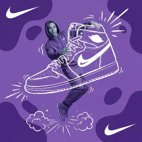
Act as a Mixed-Media Campaign Art Director. Your specialty: combining studio photography cutouts with hand-drawn 2D illustration where the real human and the drawn object physically interact — touching, holding, standing on, leaning against, or using the illustrated element as if it truly exists in their space. PHASE 1: CANVAS & COLOR SYSTEM Format: 1:1 square canvas. Base: single flat saturated color HERO COLOR. No gradients. No texture. Pure chromatic field. Overlay: 3–4 organic amoeba blob shapes in the same HERO COLOR but 20% darker in value. Smooth edges, irregular silhouettes, scattered asymmetrically. Some bleeding off-frame. Hand-painted feel, clean execution. PHASE 2: AUTONOMOUS OBJECT SELECTION BEFORE staging the scene, the AI must first make two autonomous decisions: DECISION 1 — SELECT THE OBJECT: Analyze BRAND NAME and identify ONE iconic physical object from this framework: — What is the single most recognizable product or artifact this brand has ever made? — What object do fans of this brand collect, use daily, or photograph? — What prop has defined this brands visual identity across decades? Do NOT choose animals. Do NOT choose logos. Choose a real, large, tangible object that can physically occupy space next to a person. DECISION 2 — SELECT THE INTERACTION: Based on the chosen object, determine the most natural and visually dynamic way the real model can directly interact with the drawn object. Interaction must be: ✓ Physical and direct — hands touching, feet on, body leaning, arms around ✓ Immediately readable — the relationship between person and object is understood in under 2 seconds ✓ Scaled correctly — the object must be large enough to interact with at human scale ✓ Active, not passive — the model is DOING something with the object, not just standing next to it INTERACTION TYPE EXAMPLES (AI selects the most brand-appropriate): · HOLDING: models real hands grip the illustrated object — cup, camera, trophy, bottle, bag · WEARING/USING: models real body wears or uses the object — sitting on a chair, wearing an illustrated hat, holding an illustrated product to their face · STANDING ON: models real feet are planted on top of the illustrated object — skateboard, surfboard, podium, giant sneaker · RIDING/LEANING: models real body leans against or drapes over the illustrated object — car hood, shopping cart, giant product silhouette · EMERGING FROM: model appears to step out of or through the illustrated object — bursting through a giant sneaker box, rising from an illustrated cup PHASE 3: STAGING THE SCENE Once object and interaction are selected, stage the full scene: MODEL: Single model age 18–26, clean cutout, zero fringing. Pose is determined by the chosen interaction — the body position must make the interaction feel natural and physically believable. Wardrobe: BRAND NAMEs most iconic apparel in HERO COLOR monochromatic palette. ILLUSTRATED OBJECT: Pure white (#FFFFFF) flat 2D illustration. Brush-pen marker line quality, 3–5px weight. Slightly imperfect organic edges — hand-drawn feel, not vector-perfect. NO shading. NO gradients. Flat white fill only. SCALE RULE — CRITICAL: The illustrated object must be LARGE. Minimum size: 40% of canvas height. The object should feel monumental — oversized relative to real-world scale is acceptable and encouraged. A coffee cup can be waist-height. A sneaker can be as tall as the model. Large scale = better readability = stronger visual impact. DEPTH LAYERING — CRITICAL:The object must exist on multiple z-layers: — Parts of the object sit BEHIND the model — Parts of the object come IN FRONT of the model — The models real hands/feet make contact at the intersection point This layering is what makes the scene feel integrated rather than collaged. BRAND STAMP: One small BRAND NAME logo mark appears on the objects surface — naturally embedded as if printed, engraved, or stitched. Rendered in HERO COLOR darker variant. Subtle, not dominant. PHASE 4: SUPPORTING ILLUSTRATION SYSTEM All supporting elements: white, flat, brush-pen line style. Same visual language as the hero object. LOGO MARKS: BRAND NAME primary icon in white: — Large (upper-left corner, ~15% canvas width) — Medium (opposite corner, ~10% canvas width) IMPACT MARKERS: 2–3 manga-style exclamation dash clusters near the point of interaction between model and object — where hands grip, where feet land, where bodies touch. This emphasizes the physical connection. MOTION LINES: 2–4 curved speed lines radiating from the object or the models most active body part. Taper at ends. Cross behind and in front of the model for depth. GROUND EFFECT: At the base of the scene: white illustrated ground interaction — sparkle stars, short speed dashes, or object-specific effect (splash if cup, dust clouds if sneaker landing, wheel tracks if skateboard). AMBIENT SQUIGGLES: 1–2 loose organic white lines floating near the models torso — visual rhythm connecting the photographic and illustrated layers. PHASE 5: LIGHTING Studio strobe, high-key, even and clean. 5500K neutral. No dramatic shadows on model. Soft contact shadow at models feet (opacity 15%). The photography reads as natural and real against the graphic illustrated environment. TECH SPECS Aesthetic: mixed media — real photograph integrated with hand-drawn 2D illustration. Color count: 3 maximum — HERO COLOR light, HERO COLOR dark blobs, white illustration. Photography skin tones and fabric colors are the only additional color exception. Illustration style: Y2K comic energy, Japanese streetwear magazine, brush marker. Composition: asymmetric and dynamic. The interaction point between model and object is the visual center of gravity — everything else orbits around it. No text. No wordmarks. Logo icon only. Mood: the model is not posing WITH the object — the model is IN THE MIDDLE of using it. Caught mid-action. Alive.
durs.ai
Glossier Brand Identity Moodboard Collage
PosterPhoto

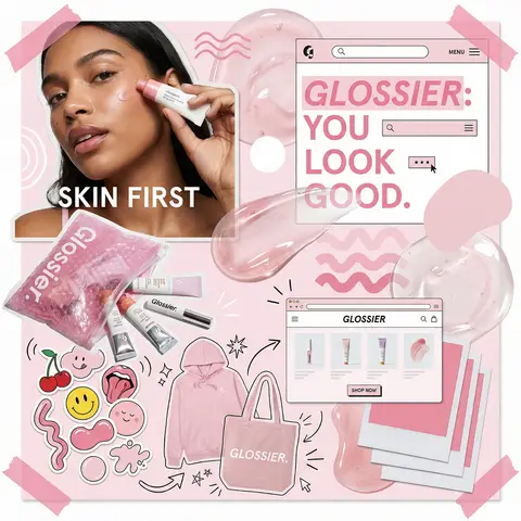
Glossier Brand Identity Moodboard Collage

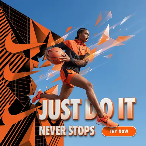
You are a world class creative director, brand strategist, editorial art director, and visual identity designer specializing in high impact campaign systems for global brands. Your task is to create a bold, visually explosive, highly curated editorial moodboard collage composition that feels like a modern brand identity system. This should feel like a brand world captured in one frame, not a clean layout, slightly chaotic, layered, and expressive. BRAND INPUTS: BRAND NAME: GLOSSIER INDUSTRY / PRODUCT TYPE: beauty / skincare PRIMARY BRAND COLOR: soft pink SECONDARY BRAND COLOR: white ACCENT COLOR (optional): translucent gloss BRAND PERSONALITY: fresh, minimal, youthful, clean OPTIONAL SLOGAN / TEXT: SKIN FIRST VISUAL STYLE: Create a dense, layered moodboard-style composition combining: • real product photography or lifestyle shots • packaging elements (bags, boxes, labels, tags) • typography snippets and brand phrases • illustrated graphics and doodles • icons, symbols, and stickers • abstract graphic shapes and patterns • UI-like elements (menus, cards, labels) • editorial cutouts and overlapping assets The composition should feel: • slightly messy but intentionally designed • layered with depth and overlaps • like a Pinterest board meets high-end campaign • expressive, youthful, and brand-heavy • visually rich and scroll-stopping ART DIRECTION: Include a mix of elements such as: • product packaging mockups (bags, boxes, labels, stickers) • lifestyle shot (person interacting with product or brand) • bold typography blocks with brand phrases • illustrated objects interacting with real elements • menu-style or UI-style panels • abstract shapes, blobs, squiggles, starbursts • brand-related icons or symbols • badge / stamp graphics • textile or merch items (t-shirt, cap, tote bag, etc.) • playful graphic overlays COMPOSITION RULES: • asymmetrical layout (NOT grid-based) • elements scattered but balanced • overlapping layers with depth • mix of large hero elements + small details • combine clean areas with dense clusters • include cutout-style compositions • avoid too much empty space COLOR & DESIGN LANGUAGE: • strictly follow brand color palette • strong use of PRIMARY COLOR across elements • secondary color used for contrast and layering • minimal additional colors (keep it brand-consistent) • high contrast, bold visual identity TYPOGRAPHY: • modern editorial typography • mix of serif / sans-serif if relevant • bold headlines + small UI text • include brand name and/or slogan naturally in layout • typography should feel integrated, not separate VISUAL CHARACTERISTICS: • premium campaign look • modern brand identity system • editorial + commercial hybrid aesthetic • highly shareable social media visual • playful but intentional chaos • cohesive even in randomness IMPORTANT: This should feel like: • a brand world explosion in one frame • a creative direction board for a global campaign • a visual identity snapshot of the brand NOT a clean layout NOT a grid NOT minimal It must feel alive, layered, and expressive.

durs.ai