durs.ai
Prompt library

Prompts that work

Ready-made prompts for ads, logos, posters, 3D and more. Use one in a tap — or share your own.

+ Add a prompt
Luxury Brand Product Key Visual
PosterPhoto

Luxury Brand Product Key Visual

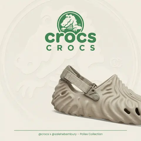
BRAND NAME + PRODUCT Act as a Senior Luxury Fashion Art Director and Studio Photographer specializing in high-end product key visuals for flagship campaigns, e-commerce editorials, and mobile-first brand content. PHASE 1: FORMAT & CANVAS Vertical format, 9:16 aspect ratio. Canvas background: a single flat field of warm off-white — not pure white, not grey. Target tone: soft ivory cream (#F4EFE6 equivalent), uniform and completely shadowless across the entire background plane. Autonomously determine BRAND NAMEs signature background tone — if the brand has a recognized house color for its packaging, tissue paper, or lookbook backgrounds, shift the canvas toward that specific off-white or neutral. The result must feel like an official brand document, not a generic studio. PHASE 2: BACKGROUND PATTERN (WATERMARK LAYER) Autonomously identify BRAND NAMEs iconic surface pattern, monogram, or archival motif — examples: a house monogram, toile print, geometric logo repeat, heritage emblem, or signature textile pattern. Render this pattern across the entire background canvas as a ghost watermark: same tone as the background but with a slight value shift (approximately 8–12% darker or lighter than the base). The pattern must be large in scale — individual motifs spanning 15–25% of canvas width. Opacity: 10–18% maximum. No hard edges. The pattern should feel embossed or tone-on-tone woven, not printed. It must recede behind all other elements. PHASE 3: LOGO PLACEMENT Autonomously reproduce BRAND NAMEs official logo with complete fidelity — correct letterforms, proportions, secondary marks (emblems, crowns, stars, monogram icons). Place the logo centered horizontally in the upper third of the frame (top 30% of canvas). Scale: the logo should span approximately 40–50% of canvas width — prominent but not overwhelming. Logo rendering: flat 2D, no extrusion, no chrome. Color: autonomously apply BRAND NAMEs official logo colorway — the exact brand-standard color(s) used on official packaging and website. If the brand uses a two-tone logo (icon + wordmark in different colors), preserve that hierarchy precisely. Directly below the main logo mark, place the full BRAND NAME wordmark in spaced capital letters — clean, geometric sans-serif, tracking: +200 to +300, same brand color, optical size approximately 60% of logo height. No decorative elements between logo and wordmark. PHASE 4: PRODUCT PLACEMENT Render PRODUCT as a photorealistic studio object with maximum material fidelity: — Leather: visible grain, pore structure, stitching thread texture, realistic edge paint. — Hardware: gold or silver metal with micro-reflections, not flat. — Canvas/fabric: woven fiber detail, not smooth CG. — All brand-specific surface patterns on the product must be accurate and legible. Placement: the product enters the frame from the bottom-right corner at a natural 25–35 degree angle, as if casually placed or mid-motion. The product is cropped — only 60–75% of the object is visible within the frame. The crop should feel intentional and editorial, not accidental. The product occupies the lower 55–65% of the canvas. The product must feel physically present in the space — not floating. Cast an extremely soft, barely visible contact shadow (opacity 8–12%) on the canvas beneath the nearest edge. No hard drop shadows. PHASE 5: LIGHTING Lighting: simulated large north-facing studio window light. Soft, directional, shadowless on the background. Color temperature: 5500–6000K (neutral daylight, slightly cool). Key light: large softbox equivalent from upper-left, filling the entire product surface evenly with minimal contrast ratio (1.2:1 to 1.5:1 max). Fill light: large bounce from right side, eliminating all harsh shadows. No rim light. No dramatic contrast. The lighting philosophy is: the product sells itself — light only reveals, never performs. Global Illumination enabled for subtle inter-reflections between product surfaces. No specular hotspots on leather — only on metal hardware. PHASE 6: TYPOGRAPHY & FINISHING Bottom of frame: a thin horizontal rule line (1px, brand color, 80% canvas width, centered). Below the rule: a single line of micro-copy — a social handle, collection name, or campaign label — in the same clean sans-serif, lowercase or small-caps, minimal tracking. Autonomously generate a contextually appropriate label for BRAND NAME. TECH SPECS Render engine: photorealistic CGI, Keyshot / Octane product visualization aesthetic. Resolution: 9:16, ultra-high detail. Depth of Field: f/16 equivalent — everything in sharp focus. Zero bokeh. Tack-sharp edges on all product details.Tone mapping: clean, true-to-life. No filmic crush. No vignette. No grain. Color grade: neutral, faithful to real product color. Slight warmth in the ivory background only. No AI-plastic normals on leather or fabric. Microscopic surface imperfection maps required. No reflections on background. No environmental reflections — studio only. Mood reference: Louis Vuitton / Bottega Veneta / Celine official e-commerce and campaign photography standard. Clean enough to be used as a press image.
durs.ai
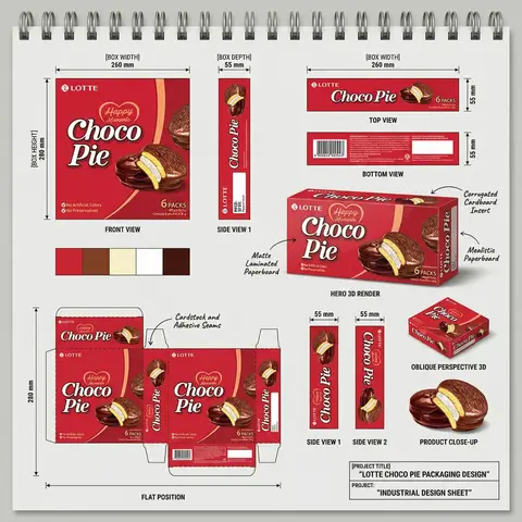
FMCG Product Packaging Technical Industrial Design Spec Sheet
PackagePhoto

FMCG Product Packaging Technical Industrial Design Spec Sheet

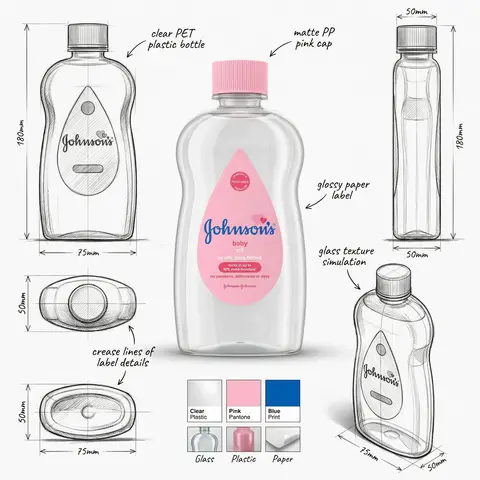
Act as a Senior Industrial/Packaging Designer specializing in technical product presentation sheets. Your aesthetic universe: professional packaging dielines, FMCG product design documentation, industrial design sketchbook layouts, technical manufacturing specs. INPUT VARIABLES — resolve before executing: BRAND NAME — company/manufacturer name (e.g. ORION) PRODUCT NAME — product name in large display type (e.g. Choco·Pie) VARIANT NAME — flavor/variant sub-label (e.g. Chocochip) PRODUCT PHOTO 1 — hero product shot, multiple units styled (for front face) PRODUCT PHOTO 2 — single product unit close-up (for oblique/detail views) PRODUCT PHOTO 3 — product cross-section or ingredient shot (e.g. sliced showing filling) INGREDIENT PHOTO — key flavor ingredient isolated (e.g. orange slice, strawberry) BOX WIDTH — e.g. 260 mm BOX HEIGHT — e.g. 280 mm BOX DEPTH — e.g. 55 mm UNIT COUNT — e.g. x12 NET WEIGHT — e.g. 360g COLOR PALETTE — 4–5 brand colors as swatches (e.g. navy, red, orange, brown, cream) PROJECT TITLE — bottom right label (e.g. ORION CHOCO-PIE PACKAGING DESIGN) PROJECT TYPE — bottom right sub-label (e.g. INDUSTRIAL DESIGN SHEET) MATERIAL NOTE 1 — e.g. Matte Laminated Paperboard MATERIAL NOTE 2 — e.g. Glossy UV Spot Varnish MATERIAL NOTE 3 — e.g. Corrugated Cardboard Insert MATERIAL NOTE 4 — e.g. Mealistic Paperboard MATERIAL NOTE 5 — e.g. Cardstock and Adhesive Seams PHASE 1 — CANVAS Portrait format (3:4). Background: light neutral grey — the color of a real sketchbook or drafting paper. At the very top: a spiral binding strip — rendered as a realistic row of metal coil rings across the full width, like a professional sketchpad. This binding is the first thing visible and establishes the entire presentation as a physical design document. PHASE 2 — BOX FACE DESIGNS Design the complete packaging artwork that will wrap all box faces. Use BRAND NAME, PRODUCT NAME, VARIANT NAME, PRODUCT PHOTO 1, INGREDIENT PHOTO, COLOR PALETTE. The box face should feel like a real retail product — bold brand hierarchy, appetite-appeal food photography, clean structured layout. This artwork is then applied consistently across all views below. PHASE 3 — ORTHOGRAPHIC VIEWS (top section) Arrange four flat technical views in a clean grid with dimension annotations: FRONT VIEW — full front face of box, largest panel, bottom left of grid. Annotated with BOX WIDTH (horizontal arrow above) and BOX HEIGHT (vertical arrow left side) SIDE VIEW 1 — narrow side panel, center of grid. Annotated with BOX DEPTH (horizontal arrow above) TOP VIEW — top face of box, top right of grid. Annotated with width and depth dimensions BOTTOM VIEW — small flat bottom face, right side. Annotated with depth dimension All dimension lines are thin black with arrow endpoints. Labels in small clean sans-serif. View titles in small uppercase below each panel. PHASE 4 — HERO 3D RENDER (center) One large photorealistic 3D perspective render of the assembled box — slightly angled, showing front face and one side face simultaneously. Soft neutral shadow beneath. This is the centerpiece of the sheet — larger than any single orthographic view. Material callout arrows pointing to specific areas with MATERIAL NOTE 1, MATERIAL NOTE 2, MATERIAL NOTE 3, MATERIAL NOTE 4 labels in small handwritten-style or clean serif annotation type. PHASE 5 — ADDITIONAL VIEWS (mid section) Arranged around the hero render: SIDE VIEW 1 — tall narrow vertical panel, left side, with 20mm depth annotation SIDE VIEW 2 — same narrow panel, right side OBLIQUE PERSPECTIVE — small 3/4 angle render of box, bottom right, labeled OBLIQUE PERSPECTIVE PRODUCT CLOSE-UP — PRODUCT PHOTO 2 and PRODUCT PHOTO 3 showing product detail below oblique view PHASE 6 — COLOR PALETTE SWATCHES Two rows of color swatches — one row after the orthographic views section, one row after the dieline section. Each swatch is a filled circle, colors taken from COLOR PALETTE. No labels needed — just the circles in a horizontal row. PHASE 7 — DIELINE / FLAT POSITION Bottom left quadrant: the complete box dieline — all faces unfolded flat showing the full packaging layout. Dashed fold lines, solid cut lines. All faces labeled with the full packaging artwork applied. Dimension annotations: BOX HEIGHT vertical arrow on left side, bottom width measurements. Label below: FLAT POSITION in small uppercase. MATERIAL NOTE 5 callout arrow pointing to seam area. PHASE 8 — PROJECT ID BLOCK Bottom right corner: a clean rectangular project identification box with thin black border. Contains: PROJECT TITLE in bold uppercase PROJECT: label followed by PROJECT TYPE in bold All in dark type on white or light background. Feels like a title block on an engineering drawing. TECH SPECS The entire sheet must read as a professional industrial design document — not a marketing presentation. Dimension lines must be precise and consistent. All views must be correctly proportioned relative to each other. The 3D render is the only element with shadow/lighting — everything else is flat. Font system: one clean sans-serif for all annotations and labels, one bold display font for the product name on packaging. The spiral binding at top is non-negotiable — it defines the entire sketchbook format. The sheet must feel like something a packaging engineer would hand to a print production team. Mood: a senior packaging designer at a major FMCG agency spent a full day perfecting this spec sheet — every measurement is intentional, every view tells the factory exactly what to print and fold.

durs.ai