durs.ai
Prompt library

Prompts that work

Ready-made prompts for ads, logos, posters, 3D and more. Use one in a tap — or share your own.

+ Add a prompt
Futuristic wellness elixir
ProductPhoto

Futuristic wellness elixir

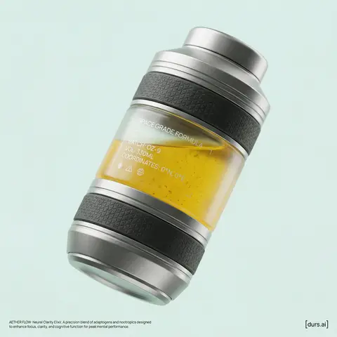
BRAND NAME or LOGO IMAGE is launching a new functional wellness elixir (e.g., adaptogenic, nootropic, or natural energy drink). As the Creative Director, devise a product name and visualize a complete high-end promotional shot. The aesthetic is Cosmic Premium—technological, clean, and sophisticated, like top-tier Apple product photography. THE PRODUCT: Design a sculptural, multi-layered beverage bottle suspended in the center. The form is engineered and futuristic. The materials are hyper-tactile: bead-blasted titanium details, frosted borosilicate glass, and textured haptic polymer grips. Crucial Color Instruction: The liquid inside must have a distinct, natural color relevant to its invented function (e.g., vibrant turmeric yellow, deep berry red, earthy matcha green, or pale calming blue). The liquid should look real with subtle natural sediment. Crucial Graphic Detail: On the clear glass section of the bottle, apply a layer of subtle, minimalist, technical typography printed in matte white ink. This design should feel utilitarian and futuristic (e.g., small technical specs like SPACE GRADE FORMULA, BATCH: OZ-9, volume indicators, or coordinate markings), adding a functional aesthetic similar to aerospace labeling, without overwhelming the bottles clean lines. THE ENVIRONMENT & LIGHTING: The bottle is in a seamless studio. Crucial Background Instruction: The background must be a solid, clean, very light pastel tone that is specifically chosen to complement the liquid color (e.g., a soft cool mint background for a warm orange liquid, or a pale blush background for a deep green liquid). No gradients. Ultra-soft, diffused studio lighting creates sleek highlights on metal and deep subsurface scattering in the glass and liquid. PHOTOGRAPHY STYLE: High-resolution 100mm macro lens shot. Shallow depth of field, sharp focus on bottle textures and the printed graphics on the glass, smooth pastel background bokeh. 8k resolve, hyper-realistic textures. GRAPHIC OVERLAYS: Include subtle dark gray UI elements. Bottom Left Corner: Very small, minimalist text (like Manrope Regular font) describing the products name and function in two sentences. Bottom Right Corner: A small, minimalist dark gray logomark for BRAND NAME.

durs.ai
Luxury Ceramic Beverage Bottle
AdvertisementPhoto

Luxury Ceramic Beverage Bottle

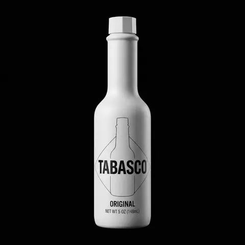
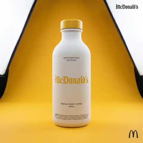
BRAND NAME or LOGO IMAGE. Act as a world-class product photographer creating an ultra-high-end editorial shot of a luxury beverage bottle. COMPOSITION (FULL VIEW): A full-body studio photograph showing the entire bottle from base to cap, centered in the frame. The bottle stands on a seamless surface. THE VESSEL & COLORS (MATERIALITY): Bottle Body: Premium, opaque matte white ceramic with a fine, powdery texture. Bottle Cap: A premium matte or satin-finish cap colored exactly in BRAND NAMEs primary brand color. LIGHTING & BACKGROUND (COLORED STUDIO): The background is a seamless, smooth studio cyclorama flooded with BRAND NAME s primary brand color, creating a rich, immersive color environment. Lighting: Sophisticated, high-end white studio lighting (large softboxes). The light must be soft and wrapping, creating elegant highlights along the ceramic edges to define form. CENTRAL BRANDING (ULTRA-PRECISION MICRO-EMBOSSING): The main Gothic/Blackletter BRAND NAME text is centered on the bottle. CRITICAL TEXTURE FIX: The text is rendered with ultra-subtle, shallow precision micro-embossing (maximum 0.2mm to 0.3mm depth). It must NOT look like applied clay or a heavy badge. It should look like a crisp, shallow tooling mark integrated perfectly into the ceramic surface, defined only by very subtle light catching the edges. Color: The embossed text itself is colored in BRAND NAME s primary brand color, perhaps with a slight semi-gloss finish to contrast subtly with the matte white bottle. TYPOGRAPHIC HIERARCHY (AUXILIARY DETAILS): All auxiliary text is printed cleanly in a neutral dark grey/black (monochrome) to sit quietly on the white surface: Top Micro-Blocks: Two very small lines above main text (e.g., LIMITED EDITION // BATCH 001). Flavor Name: Below main text, a beautiful, smaller, unobtrusive font for the flavor. Volume/Specs: Further down, technical info (e.g., 500ML). Ingredients Block: At the very bottom edge, a dense micro-print block. CORNER ELEMENTS: Top Right: Small, discrete monochrome Gothic brand name. Bottom Right: Small monochrome original brand logo.

durs.ai
Mixed-Media Brand Campaign Art Direction
PosterPhoto

Mixed-Media Brand Campaign Art Direction

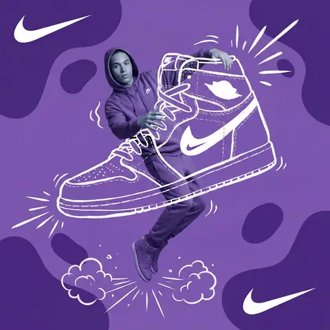
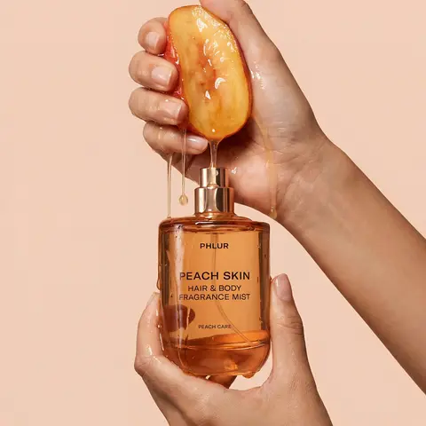
Act as a Mixed-Media Campaign Art Director. Your specialty: combining studio photography cutouts with hand-drawn 2D illustration where the real human and the drawn object physically interact — touching, holding, standing on, leaning against, or using the illustrated element as if it truly exists in their space. PHASE 1: CANVAS & COLOR SYSTEM Format: 1:1 square canvas. Base: single flat saturated color HERO COLOR. No gradients. No texture. Pure chromatic field. Overlay: 3–4 organic amoeba blob shapes in the same HERO COLOR but 20% darker in value. Smooth edges, irregular silhouettes, scattered asymmetrically. Some bleeding off-frame. Hand-painted feel, clean execution. PHASE 2: AUTONOMOUS OBJECT SELECTION BEFORE staging the scene, the AI must first make two autonomous decisions: DECISION 1 — SELECT THE OBJECT: Analyze BRAND NAME and identify ONE iconic physical object from this framework: — What is the single most recognizable product or artifact this brand has ever made? — What object do fans of this brand collect, use daily, or photograph? — What prop has defined this brands visual identity across decades? Do NOT choose animals. Do NOT choose logos. Choose a real, large, tangible object that can physically occupy space next to a person. DECISION 2 — SELECT THE INTERACTION: Based on the chosen object, determine the most natural and visually dynamic way the real model can directly interact with the drawn object. Interaction must be: ✓ Physical and direct — hands touching, feet on, body leaning, arms around ✓ Immediately readable — the relationship between person and object is understood in under 2 seconds ✓ Scaled correctly — the object must be large enough to interact with at human scale ✓ Active, not passive — the model is DOING something with the object, not just standing next to it INTERACTION TYPE EXAMPLES (AI selects the most brand-appropriate): · HOLDING: models real hands grip the illustrated object — cup, camera, trophy, bottle, bag · WEARING/USING: models real body wears or uses the object — sitting on a chair, wearing an illustrated hat, holding an illustrated product to their face · STANDING ON: models real feet are planted on top of the illustrated object — skateboard, surfboard, podium, giant sneaker · RIDING/LEANING: models real body leans against or drapes over the illustrated object — car hood, shopping cart, giant product silhouette · EMERGING FROM: model appears to step out of or through the illustrated object — bursting through a giant sneaker box, rising from an illustrated cup PHASE 3: STAGING THE SCENE Once object and interaction are selected, stage the full scene: MODEL: Single model age 18–26, clean cutout, zero fringing. Pose is determined by the chosen interaction — the body position must make the interaction feel natural and physically believable. Wardrobe: BRAND NAMEs most iconic apparel in HERO COLOR monochromatic palette. ILLUSTRATED OBJECT: Pure white (#FFFFFF) flat 2D illustration. Brush-pen marker line quality, 3–5px weight. Slightly imperfect organic edges — hand-drawn feel, not vector-perfect. NO shading. NO gradients. Flat white fill only. SCALE RULE — CRITICAL: The illustrated object must be LARGE. Minimum size: 40% of canvas height. The object should feel monumental — oversized relative to real-world scale is acceptable and encouraged. A coffee cup can be waist-height. A sneaker can be as tall as the model. Large scale = better readability = stronger visual impact. DEPTH LAYERING — CRITICAL:The object must exist on multiple z-layers: — Parts of the object sit BEHIND the model — Parts of the object come IN FRONT of the model — The models real hands/feet make contact at the intersection point This layering is what makes the scene feel integrated rather than collaged. BRAND STAMP: One small BRAND NAME logo mark appears on the objects surface — naturally embedded as if printed, engraved, or stitched. Rendered in HERO COLOR darker variant. Subtle, not dominant. PHASE 4: SUPPORTING ILLUSTRATION SYSTEM All supporting elements: white, flat, brush-pen line style. Same visual language as the hero object. LOGO MARKS: BRAND NAME primary icon in white: — Large (upper-left corner, ~15% canvas width) — Medium (opposite corner, ~10% canvas width) IMPACT MARKERS: 2–3 manga-style exclamation dash clusters near the point of interaction between model and object — where hands grip, where feet land, where bodies touch. This emphasizes the physical connection. MOTION LINES: 2–4 curved speed lines radiating from the object or the models most active body part. Taper at ends. Cross behind and in front of the model for depth. GROUND EFFECT: At the base of the scene: white illustrated ground interaction — sparkle stars, short speed dashes, or object-specific effect (splash if cup, dust clouds if sneaker landing, wheel tracks if skateboard). AMBIENT SQUIGGLES: 1–2 loose organic white lines floating near the models torso — visual rhythm connecting the photographic and illustrated layers. PHASE 5: LIGHTING Studio strobe, high-key, even and clean. 5500K neutral. No dramatic shadows on model. Soft contact shadow at models feet (opacity 15%). The photography reads as natural and real against the graphic illustrated environment. TECH SPECS Aesthetic: mixed media — real photograph integrated with hand-drawn 2D illustration. Color count: 3 maximum — HERO COLOR light, HERO COLOR dark blobs, white illustration. Photography skin tones and fabric colors are the only additional color exception. Illustration style: Y2K comic energy, Japanese streetwear magazine, brush marker. Composition: asymmetric and dynamic. The interaction point between model and object is the visual center of gravity — everything else orbits around it. No text. No wordmarks. Logo icon only. Mood: the model is not posing WITH the object — the model is IN THE MIDDLE of using it. Caught mid-action. Alive.
durs.ai
Dynamic Beverage Pour Into Glass Commercial Shot
AdvertisementPhoto

Dynamic Beverage Pour Into Glass Commercial Shot

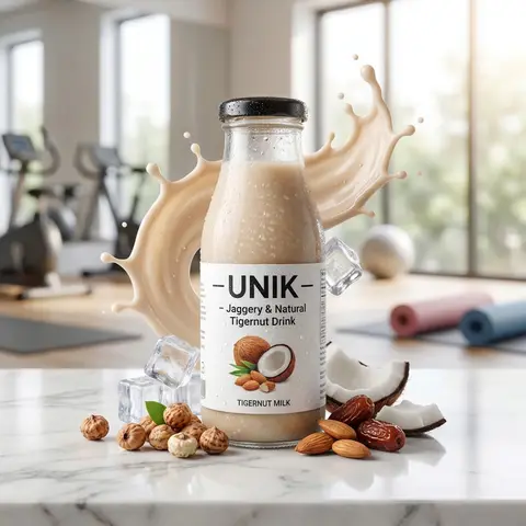
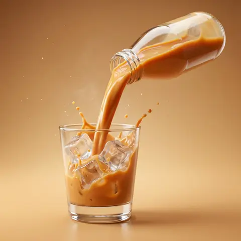
Create a hyper-realistic commercial product photography of a exact uploaded product image as the main subject bottled beverage pouring dynamically into a clear glass. The bottle is tilted mid-air at a powerful angle, with a rich, creamy liquid flowing smoothly in a thick stream into the glass. The liquid appears silky, glossy, and highly appetizing, with realistic viscosity and smooth motion. Add dynamic splash effects: - controlled creamy liquid splashes rising inside the glass - subtle splash arcs and droplets frozen mid-air - natural fluid interaction with glass walls Include crystal-clear ice cubes inside the glass: - realistic transparency and refraction-slight frost and condensation on ice surface - interaction between liquid and ice (soft splash + displacement) Studio shot, ultra high resolution, sharp focus, 85mm lens look, f/2.8 depth of field. Background: clean studio ackdrop color-matched to the product tone (warm caramel orange, creamy beige, or flavor-inspired color) with a soft gradient. Surface matches background tone for seamless premium look with subtle reflection. Add subtle atmospheric details: - fine micro droplets in air - light mist or cold vapor around glass Lighting: cinematic studio lighting with: - strong rim light highlighting liquid edges and glass contours - soft top light enhancing liquid gloss - side light emphasizing texture and splash detail Glass is ultra clean with realistic reflections, refraction, and soft shadow grounding. Composition is bold, dynamic, and premium - high-end beverage advertising style. No text, no typography, no clutter, no identifiable ingredients. Ultra realistic, photorealistic, high dynamic range, cinematic color grading, glossy highlights. 4K-8K resolution, billboard-ready, sharp detail, realistic studio shoot look.

durs.ai