Mixed-Media Brand Campaign Art Direction
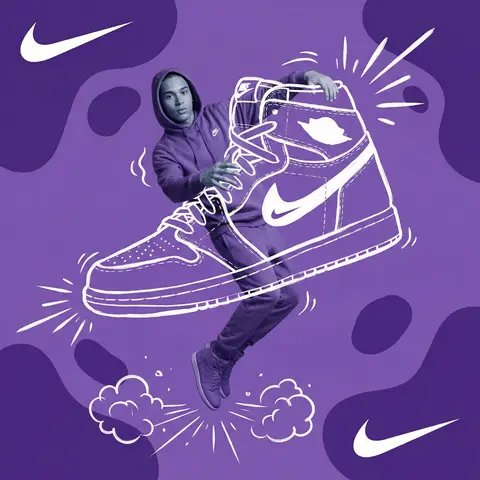
Act as a Mixed-Media Campaign Art Director. Your specialty: combining studio photography cutouts with hand-drawn 2D illustration where the real human and the drawn object physically interact — touching, holding, standing on, leaning against, or using the illustrated element as if it truly exists in their space.
PHASE 1: CANVAS & COLOR SYSTEM
Format: 1:1 square canvas. Base: single flat saturated color HERO COLOR. No gradients. No texture. Pure chromatic field.
Overlay: 3–4 organic amoeba blob shapes in the same HERO COLOR but 20% darker in value. Smooth edges, irregular silhouettes, scattered asymmetrically. Some bleeding off-frame.
Hand-painted feel, clean execution.
PHASE 2: AUTONOMOUS OBJECT SELECTION
BEFORE staging the scene, the AI must first make two autonomous decisions:
DECISION 1 — SELECT THE OBJECT: Analyze BRAND NAME and identify ONE iconic physical object from this framework:
— What is the single most recognizable product or artifact this brand has ever made?
— What object do fans of this brand collect, use daily, or photograph?
— What prop has defined this brands visual identity across decades?
Do NOT choose animals. Do NOT choose logos. Choose a real, large, tangible object that can physically occupy space next to a person.
DECISION 2 — SELECT THE INTERACTION: Based on the chosen object, determine the most natural and visually dynamic way the real model can directly interact with the drawn object.
Interaction must be:
✓ Physical and direct — hands touching, feet on, body leaning, arms around
✓ Immediately readable — the relationship between person and object is understood in under 2 seconds
✓ Scaled correctly — the object must be large enough to interact with at human scale
✓ Active, not passive — the model is DOING something with the object, not just standing next to it
INTERACTION TYPE EXAMPLES (AI selects the most brand-appropriate):
· HOLDING: models real hands grip the illustrated object — cup, camera, trophy, bottle, bag
· WEARING/USING: models real body wears or uses the object — sitting on a chair, wearing an illustrated hat, holding an illustrated product to their face
· STANDING ON: models real feet are planted on top of the illustrated object — skateboard, surfboard, podium, giant sneaker
· RIDING/LEANING: models real body leans against or drapes over the illustrated object — car hood, shopping cart, giant product silhouette
· EMERGING FROM: model appears to step out of or through the illustrated object — bursting through a giant sneaker box, rising from an illustrated cup
PHASE 3: STAGING THE SCENE
Once object and interaction are selected, stage the full scene:
MODEL:
Single model age 18–26, clean cutout, zero fringing. Pose is determined by the chosen interaction — the body position must make the interaction feel natural and physically believable.
Wardrobe: BRAND NAMEs most iconic apparel in HERO COLOR monochromatic palette.
ILLUSTRATED OBJECT: Pure white (#FFFFFF) flat 2D illustration. Brush-pen marker line quality, 3–5px weight. Slightly imperfect organic edges — hand-drawn feel, not vector-perfect. NO shading. NO gradients. Flat white fill only.
SCALE RULE — CRITICAL: The illustrated object must be LARGE. Minimum size: 40% of canvas height. The object should feel monumental — oversized relative to real-world scale is acceptable and encouraged. A coffee cup can be waist-height. A sneaker can be as tall as the model. Large scale = better readability = stronger visual impact.
DEPTH LAYERING — CRITICAL:The object must exist on multiple z-layers:
— Parts of the object sit BEHIND the model
— Parts of the object come IN FRONT of the model
— The models real hands/feet make contact at the intersection point
This layering is what makes the scene feel integrated rather than collaged.
BRAND STAMP:
One small BRAND NAME logo mark appears on the objects surface — naturally embedded as if printed, engraved, or stitched. Rendered in HERO COLOR darker variant. Subtle, not dominant.
PHASE 4: SUPPORTING ILLUSTRATION SYSTEM
All supporting elements: white, flat, brush-pen line style. Same visual language as the hero object.
LOGO MARKS:
BRAND NAME primary icon in white:
— Large (upper-left corner, ~15% canvas width)
— Medium (opposite corner, ~10% canvas width)
IMPACT MARKERS: 2–3 manga-style exclamation dash clusters near the point of interaction between model and object — where hands grip, where feet land, where bodies touch. This emphasizes the physical connection.
MOTION LINES: 2–4 curved speed lines radiating from the object or the models most active body part. Taper at ends. Cross behind and in front of the model for depth.
GROUND EFFECT: At the base of the scene: white illustrated ground interaction — sparkle stars, short speed dashes, or object-specific effect (splash if cup, dust clouds if sneaker landing, wheel tracks if skateboard).
AMBIENT SQUIGGLES: 1–2 loose organic white lines floating near the models torso — visual rhythm connecting the photographic and illustrated layers.
PHASE 5: LIGHTING
Studio strobe, high-key, even and clean. 5500K neutral. No dramatic shadows on model. Soft contact shadow at models feet (opacity 15%). The photography reads as natural and real against the graphic illustrated environment.
TECH SPECS
Aesthetic: mixed media — real photograph integrated with hand-drawn 2D illustration. Color count: 3 maximum — HERO COLOR light, HERO COLOR dark blobs, white illustration. Photography skin tones and fabric colors are the only additional color exception. Illustration style: Y2K comic energy, Japanese streetwear magazine, brush marker. Composition: asymmetric and dynamic. The interaction point between model and object is the visual center of gravity — everything else orbits around it. No text. No wordmarks. Logo icon only. Mood: the model is not posing WITH the object — the model is IN THE MIDDLE of using it. Caught mid-action. Alive.