Prompt library

Prompts that work

Ready-made prompts for ads, logos, posters, 3D and more. Use one in a tap — or share your own.

+ Add a prompt
Luxury Ceramic Beverage Bottle
AdvertisementPhoto

Luxury Ceramic Beverage Bottle

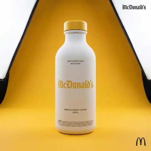
BRAND NAME or LOGO IMAGE. Act as a world-class product photographer creating an ultra-high-end editorial shot of a luxury beverage bottle. COMPOSITION (FULL VIEW): A full-body studio photograph showing the entire bottle from base to cap, centered in the frame. The bottle stands on a seamless surface. THE VESSEL & COLORS (MATERIALITY): Bottle Body: Premium, opaque matte white ceramic with a fine, powdery texture. Bottle Cap: A premium matte or satin-finish cap colored exactly in BRAND NAMEs primary brand color. LIGHTING & BACKGROUND (COLORED STUDIO): The background is a seamless, smooth studio cyclorama flooded with BRAND NAME s primary brand color, creating a rich, immersive color environment. Lighting: Sophisticated, high-end white studio lighting (large softboxes). The light must be soft and wrapping, creating elegant highlights along the ceramic edges to define form. CENTRAL BRANDING (ULTRA-PRECISION MICRO-EMBOSSING): The main Gothic/Blackletter BRAND NAME text is centered on the bottle. CRITICAL TEXTURE FIX: The text is rendered with ultra-subtle, shallow precision micro-embossing (maximum 0.2mm to 0.3mm depth). It must NOT look like applied clay or a heavy badge. It should look like a crisp, shallow tooling mark integrated perfectly into the ceramic surface, defined only by very subtle light catching the edges. Color: The embossed text itself is colored in BRAND NAME s primary brand color, perhaps with a slight semi-gloss finish to contrast subtly with the matte white bottle. TYPOGRAPHIC HIERARCHY (AUXILIARY DETAILS): All auxiliary text is printed cleanly in a neutral dark grey/black (monochrome) to sit quietly on the white surface: Top Micro-Blocks: Two very small lines above main text (e.g., LIMITED EDITION // BATCH 001). Flavor Name: Below main text, a beautiful, smaller, unobtrusive font for the flavor. Volume/Specs: Further down, technical info (e.g., 500ML). Ingredients Block: At the very bottom edge, a dense micro-print block. CORNER ELEMENTS: Top Right: Small, discrete monochrome Gothic brand name. Bottom Right: Small monochrome original brand logo.
durs.ai
Brand Logo Mashup Visual Parody Design
LogoPhoto

Brand Logo Mashup Visual Parody Design

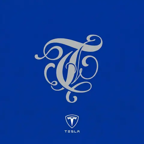
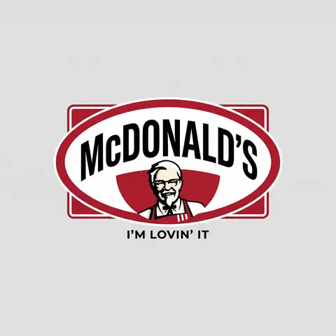
BRAND A + BRAND B. Act as a Brand Identity Designer specializing in Logo Mashups and Visual Parody. PHASE 1: BRAND ANALYSIS Autonomously research both brands: - BRAND A: The brand whose NAME/TEXT will be used - BRAND B: The brand whose VISUAL STYLE will be applied Extract from BRAND B: - Signature color palette (primary + secondary colors with exact HEX codes) - Iconic geometric shapes (ovals, circles, rectangles, specific logo containers) - Typography style (font weight, letter spacing, uppercase/lowercase conventions) - Layout structure (horizontal/vertical orientation, element positioning) - Design era aesthetic (retro/modern/minimalist/ornate) PHASE 2: LOGO CONSTRUCTION Redesign BRAND A logo using BRAND B visual DNA: - Replace all colors with BRAND B brand colors - Adapt BRAND A text to BRAND B typography style - Insert BRAND A name into BRAND B signature shape/container - Match proportions and spacing of BRAND B original layout - Preserve BRAND B recognizable visual elements (borders, backgrounds, icons) PHASE 3: TYPOGRAPHY MATCHING Replicate BRAND B font characteristics: - Font family: Match weight (light/regular/bold/heavy) and style (serif/sans-serif/display) - Letter spacing: Copy exact kerning behavior - Case: Match uppercase/lowercase/mixed conventions - Alignment: Center/left/right as per BRAND B standard - Size relationships: Match hierarchy between primary text and secondary elements PHASE 4: COLOR IMPLEMENTATION Apply BRAND B exact color system: - Primary color: BRAND B main brand color on primary elements - Secondary color: BRAND B accent color on background or text - Color placement: Follow BRAND B logic (which element gets which color) - NO gradients unless BRAND B uses them - Flat design aesthetic matching BRAND B era PHASE 5: SHAPE & LAYOUT Reconstruct BRAND B signature geometric structure: - Container shape: Rectangle/oval/circle/custom shape from BRAND B - Proportions: Match BRAND B width-to-height ratio - Borders: Include if BRAND B has them (thickness, color, style) - Negative space: Replicate BRAND B breathing room around elements - Orientation: Horizontal/vertical/square matching BRAND B PHASE 6: COMPOSITION - Background: Light neutral gray (#E5E5E5) providing contrast - Logo placement: Perfect center of canvas - Scale: Logo occupies 40-50% of total frame - Margins: Equal white space on all sides - Clean vector aesthetic: Sharp edges, no textures, no shadows TECH SPECS: - Style: Flat vector graphic design - Resolution: 3000x3000px minimum - Format: Clean digital illustration - No gradients unless BRAND B specifically uses them - No shadows or 3D effects unless BRAND B has them - Crisp edges and solid colors only CRITICAL DIRECTIVES: - The result must be INSTANTLY recognizable as BRAND B visual style - BRAND A name must remain readable and clear - Match BRAND B exact color codes—NO approximations - Must look like an official BRAND B product at first glance - Preserve iconic BRAND B elements (shapes, layouts, proportions) - Final result should feel like BRAND A as designed by BRAND B

durs.ai