durs.ai
Prompt library

Prompts that work

Ready-made prompts for ads, logos, posters, 3D and more. Use one in a tap — or share your own.

+ Add a prompt
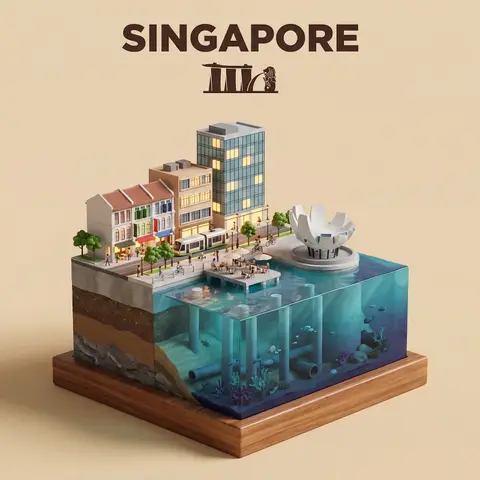
Waterfront City Cross-Section Diorama
3DPhoto

Waterfront City Cross-Section Diorama

Present a clear, side-facing isometric miniature 3D cartoon diorama of CITY along the WATERFRONT. The scene is a clean vertical cross-section slice — the city is cut open like a museum specimen, mounted on a small raised diorama-style base that exposes the full stratigraphy from rooftop to riverbed. Above the waterline: a curated selection of CITYs most iconic waterfront elements — layered building facades in local architectural style, embankment promenade, bridges, trams or cyclists, warm soft ambient lighting. Tiny stylized figures of residents in casual attire — walking, cycling, sitting at waterfront cafés (no facial details). The water surface is a clean glassy horizontal band — cartoon-stylized, slightly transparent, acting as the visual threshold between the two worlds. Below the waterline: the geographically honest submerged anatomy of CITYs WATERFRONT — accurate foundation and piling types, real underwater infrastructure, sediment and substrate layers appropriate to this specific body of water, local aquatic life rendered in the same soft cartoon style. Tiny stylized fish, slow-drifting particulate, refracted light shafts filtering down from the surface. The cross-section cut edge is razor-clean — pavement strata, foundations, soil layers, and underwater geology all simultaneously visible in the base wall, like a natural history diorama exhibit. Style: soft refined textures, realistic PBR materials, immersive ambient lighting. Color language: warm amber and golden tones above the waterline, cold teal-green and deep indigo below, blending at the water threshold. Ultra-clean, high-clarity 3D cartoon diorama aesthetic. Use a clean solid BACKGROUND COLOR background. At the top-center, display CITY in large bold text, and place the waterfront name or a city landmark silhouette emblem below the text. All text must automatically match background contrast.

durs.ai
Dynamic Beverage Pour Into Glass Commercial Shot
AdvertisementPhoto

Dynamic Beverage Pour Into Glass Commercial Shot

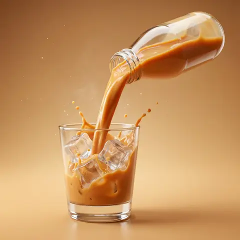
Create a hyper-realistic commercial product photography of a exact uploaded product image as the main subject bottled beverage pouring dynamically into a clear glass. The bottle is tilted mid-air at a powerful angle, with a rich, creamy liquid flowing smoothly in a thick stream into the glass. The liquid appears silky, glossy, and highly appetizing, with realistic viscosity and smooth motion. Add dynamic splash effects: - controlled creamy liquid splashes rising inside the glass - subtle splash arcs and droplets frozen mid-air - natural fluid interaction with glass walls Include crystal-clear ice cubes inside the glass: - realistic transparency and refraction-slight frost and condensation on ice surface - interaction between liquid and ice (soft splash + displacement) Studio shot, ultra high resolution, sharp focus, 85mm lens look, f/2.8 depth of field. Background: clean studio ackdrop color-matched to the product tone (warm caramel orange, creamy beige, or flavor-inspired color) with a soft gradient. Surface matches background tone for seamless premium look with subtle reflection. Add subtle atmospheric details: - fine micro droplets in air - light mist or cold vapor around glass Lighting: cinematic studio lighting with: - strong rim light highlighting liquid edges and glass contours - soft top light enhancing liquid gloss - side light emphasizing texture and splash detail Glass is ultra clean with realistic reflections, refraction, and soft shadow grounding. Composition is bold, dynamic, and premium - high-end beverage advertising style. No text, no typography, no clutter, no identifiable ingredients. Ultra realistic, photorealistic, high dynamic range, cinematic color grading, glossy highlights. 4K-8K resolution, billboard-ready, sharp detail, realistic studio shoot look.

durs.ai
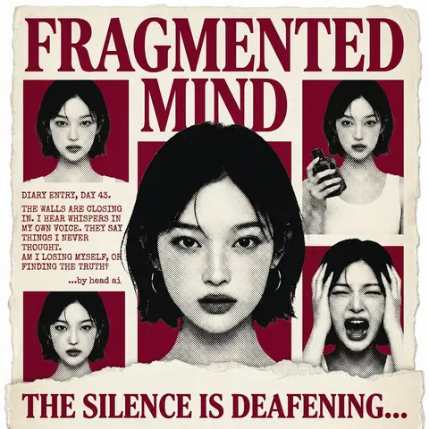
Psychological Horror Torn Paper Collage Editorial Movie Poster
PosterPhoto

Psychological Horror Torn Paper Collage Editorial Movie Poster

Psychological Horror Collage Poster — Torn Paper Editorial Style Act as a Senior Graphic Designer specializing in psychological horror editorial design. Your aesthetic universe: torn newspaper collage, halftone print culture, 90s underground zine horror, American Psycho-era corporate dread. INPUT VARIABLES — resolve before executing: MOVIE TITLE LINE 1 — first word(s) of title MOVIE TITLE LINE 2 — second word(s) of title MAIN PORTRAIT — large central face photo, serious/intense expression SIDE PHOTO 1 — smaller portrait, neutral expression SIDE PHOTO 2 — smaller portrait, holding an object SIDE PHOTO 3 — smaller portrait, extreme emotional expression (screaming/shocked) GROUP PHOTO — wide shot of multiple people, bottom right DIARY TEXT — a short first-person psychological monologue, 4–6 lines TAGLINE — bold bottom line (e.g. THE SILENCE IS DEAFENING...) ACCENT COLOR — dominant color used for title, background blocks, and tinted photos (e.g. deep crimson red) ATTRIBUTION — small credit line (e.g. ...by head ai) PHASE 1 — CANVAS Portrait format (3:4). Background: aged off-white/cream paper texture with rough torn edges on all four sides — looks like a real sheet ripped from something larger. No clean borders. The paper must feel physical and degraded. PHASE 2 — TITLE BLOCK MOVIE TITLE LINE 1 and MOVIE TITLE LINE 2 stacked at the top — massive bold serif type, deep ACCENT COLOR fill, no outline, no extrusion. The type is heavy, authoritative, slightly compressed. It dominates the top third of the poster completely. PHASE 3 — CENTRAL PORTRAIT MAIN PORTRAIT placed center, large, from chest up. Apply halftone dot grain — black and white, high contrast, visible dot pattern like a newspaper print. No color tinting on the main portrait — it stays stark monochrome. The figure should feel cold and dissociated. PHASE 4 — SIDE PHOTO GRID Four smaller photos arranged around the central portrait — two left column, two right column. Each photo is set inside a flat ACCENT COLOR rectangle background. Apply the same halftone treatment as the main portrait. The photos are slightly irregular in size and alignment — like they were cut and placed by hand. One photo (SIDE PHOTO 2) should show the subject holding a prop or object. One photo (SIDE PHOTO 3) should show an extreme expression. PHASE 5 — DIARY TEXT BLOCK Left side of poster, between the side photos. DIARY TEXT in bold uppercase sans-serif, tight leading, left-aligned. Small ATTRIBUTION line in italic below it. This text block feels like it was typed on a typewriter and pasted in. PHASE 6 — BOTTOM ELEMENTS TAGLINE across the very bottom — bold wide uppercase serif, deep ACCENT COLOR, large, confident. Below the torn paper edge, as if printed on the backing. Feels like a newspaper headline. PHASE 7 — TORN PAPER DETAILS The entire poster sits as a torn paper sheet. The edges must be rough and organic — not a clean rectangle. Ragged tears especially at the top and bottom. Subtle paper grain across the whole surface. The torn paper effect is the most important texture element — without it the poster loses its entire identity. TECH SPECS 3-color palette maximum: ACCENT COLOR, near-black, aged cream/off-white. All photos treated as halftone — no clean photography. No gradients. No drop shadows. No digital glow. The poster must feel like it was physically printed, cut, and assembled — not designed on a screen. Rough, editorial, tactile. Mood: a forensic investigator pinned this together on a corkboard at 3am and it accidentally became the most disturbing movie poster ever made.
durs.ai