durs.ai
Prompt library

Prompts that work

Ready-made prompts for ads, logos, posters, 3D and more. Use one in a tap — or share your own.

+ Add a prompt
Raw Collage Caricature Portrait
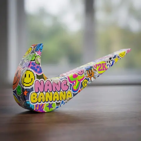
StickerPhoto

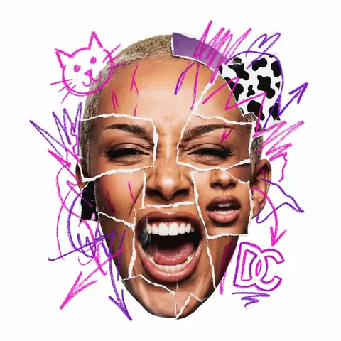
Raw Collage Caricature Portrait

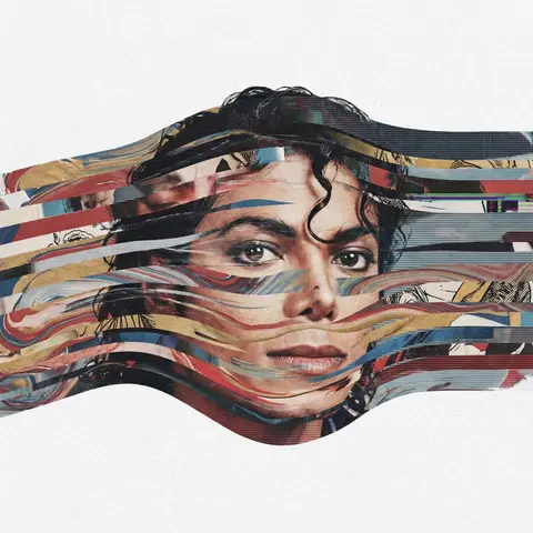
CHARACTER NAME or IMAGE. Act as a radical contemporary mixed-media artist creating a raw, aggressive urban collage portrait. 1. THE SUBJECT (AGGRESSIVE COLLAGE & EMOTION): Generate a hyper-realistic Big-Head Caricature of PERSON / CHARACTER constructed via aggressive photo-montage. Expression (High Energy): The subject must have a visceral, highly charged emotional expression (e.g., roaring laughter, a primal scream, an intensely focused snarl, a manic wide-eyed stare). No passive or neutral faces. The Raw Cut Technique (CRITICAL): The face is NOT a seamless photo. It is a crude assembly of mismatched parts torn from different sources. You must show rough, jagged white paper tear lines and seams where the eyes, mouth, and forehead pieces overlap and are pasted together. The edges must look analog, handmade, and imperfect, like torn magazine pages. 2. THE GRAFFITI EXPLOSION (SMART CONTENT & DYNAMIC PLACEMENT): Over the collage, apply wild, hand-drawn Neon Marker Scribbles. Color & Content Logic (Automatic): Identify the signature color AND 2-3 iconic symbols/logos associated with PERSON / CHARACTER . Draw these specific symbols crudely in the neon color. PLACEMENT (BREAKING BOUNDARIES): The scribble elements must NOT be contained within the face. They must explode dynamically outward, breaking the silhouette of the head and extending wildly into the surrounding white negative space. 3. PHOTOGRAPHY, LIGHTING & TEXTURE: Style: Gritty Street Art meets High-End Photography. Texture: Emphasize the tactile mix of materials: the glossy texture of the photo paper, the fibrous texture of the torn white edges, and the waxy texture of the neon marker. Lighting: Harsh, high-contrast studio lighting that casts hard shadows, emphasizing the layered paper cuts. 4. COMPOSITION: Framing: The photographic head is centered, but the composition feels chaotic due to the exploding scribbles. Background: Pure White (#FFFFFF). Clean, flat, zero texture, providing maximum contrast for the messy collage.

durs.ai
Mixed-Media Brand Campaign Art Direction
PosterPhoto

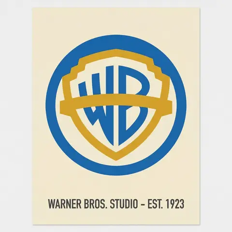
Mixed-Media Brand Campaign Art Direction

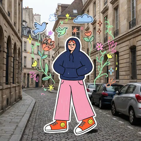
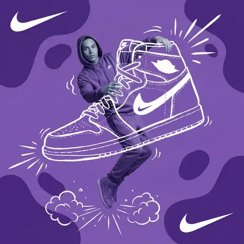
Act as a Mixed-Media Campaign Art Director. Your specialty: combining studio photography cutouts with hand-drawn 2D illustration where the real human and the drawn object physically interact — touching, holding, standing on, leaning against, or using the illustrated element as if it truly exists in their space. PHASE 1: CANVAS & COLOR SYSTEM Format: 1:1 square canvas. Base: single flat saturated color HERO COLOR. No gradients. No texture. Pure chromatic field. Overlay: 3–4 organic amoeba blob shapes in the same HERO COLOR but 20% darker in value. Smooth edges, irregular silhouettes, scattered asymmetrically. Some bleeding off-frame. Hand-painted feel, clean execution. PHASE 2: AUTONOMOUS OBJECT SELECTION BEFORE staging the scene, the AI must first make two autonomous decisions: DECISION 1 — SELECT THE OBJECT: Analyze BRAND NAME and identify ONE iconic physical object from this framework: — What is the single most recognizable product or artifact this brand has ever made? — What object do fans of this brand collect, use daily, or photograph? — What prop has defined this brands visual identity across decades? Do NOT choose animals. Do NOT choose logos. Choose a real, large, tangible object that can physically occupy space next to a person. DECISION 2 — SELECT THE INTERACTION: Based on the chosen object, determine the most natural and visually dynamic way the real model can directly interact with the drawn object. Interaction must be: ✓ Physical and direct — hands touching, feet on, body leaning, arms around ✓ Immediately readable — the relationship between person and object is understood in under 2 seconds ✓ Scaled correctly — the object must be large enough to interact with at human scale ✓ Active, not passive — the model is DOING something with the object, not just standing next to it INTERACTION TYPE EXAMPLES (AI selects the most brand-appropriate): · HOLDING: models real hands grip the illustrated object — cup, camera, trophy, bottle, bag · WEARING/USING: models real body wears or uses the object — sitting on a chair, wearing an illustrated hat, holding an illustrated product to their face · STANDING ON: models real feet are planted on top of the illustrated object — skateboard, surfboard, podium, giant sneaker · RIDING/LEANING: models real body leans against or drapes over the illustrated object — car hood, shopping cart, giant product silhouette · EMERGING FROM: model appears to step out of or through the illustrated object — bursting through a giant sneaker box, rising from an illustrated cup PHASE 3: STAGING THE SCENE Once object and interaction are selected, stage the full scene: MODEL: Single model age 18–26, clean cutout, zero fringing. Pose is determined by the chosen interaction — the body position must make the interaction feel natural and physically believable. Wardrobe: BRAND NAMEs most iconic apparel in HERO COLOR monochromatic palette. ILLUSTRATED OBJECT: Pure white (#FFFFFF) flat 2D illustration. Brush-pen marker line quality, 3–5px weight. Slightly imperfect organic edges — hand-drawn feel, not vector-perfect. NO shading. NO gradients. Flat white fill only. SCALE RULE — CRITICAL: The illustrated object must be LARGE. Minimum size: 40% of canvas height. The object should feel monumental — oversized relative to real-world scale is acceptable and encouraged. A coffee cup can be waist-height. A sneaker can be as tall as the model. Large scale = better readability = stronger visual impact. DEPTH LAYERING — CRITICAL:The object must exist on multiple z-layers: — Parts of the object sit BEHIND the model — Parts of the object come IN FRONT of the model — The models real hands/feet make contact at the intersection point This layering is what makes the scene feel integrated rather than collaged. BRAND STAMP: One small BRAND NAME logo mark appears on the objects surface — naturally embedded as if printed, engraved, or stitched. Rendered in HERO COLOR darker variant. Subtle, not dominant. PHASE 4: SUPPORTING ILLUSTRATION SYSTEM All supporting elements: white, flat, brush-pen line style. Same visual language as the hero object. LOGO MARKS: BRAND NAME primary icon in white: — Large (upper-left corner, ~15% canvas width) — Medium (opposite corner, ~10% canvas width) IMPACT MARKERS: 2–3 manga-style exclamation dash clusters near the point of interaction between model and object — where hands grip, where feet land, where bodies touch. This emphasizes the physical connection. MOTION LINES: 2–4 curved speed lines radiating from the object or the models most active body part. Taper at ends. Cross behind and in front of the model for depth. GROUND EFFECT: At the base of the scene: white illustrated ground interaction — sparkle stars, short speed dashes, or object-specific effect (splash if cup, dust clouds if sneaker landing, wheel tracks if skateboard). AMBIENT SQUIGGLES: 1–2 loose organic white lines floating near the models torso — visual rhythm connecting the photographic and illustrated layers. PHASE 5: LIGHTING Studio strobe, high-key, even and clean. 5500K neutral. No dramatic shadows on model. Soft contact shadow at models feet (opacity 15%). The photography reads as natural and real against the graphic illustrated environment. TECH SPECS Aesthetic: mixed media — real photograph integrated with hand-drawn 2D illustration. Color count: 3 maximum — HERO COLOR light, HERO COLOR dark blobs, white illustration. Photography skin tones and fabric colors are the only additional color exception. Illustration style: Y2K comic energy, Japanese streetwear magazine, brush marker. Composition: asymmetric and dynamic. The interaction point between model and object is the visual center of gravity — everything else orbits around it. No text. No wordmarks. Logo icon only. Mood: the model is not posing WITH the object — the model is IN THE MIDDLE of using it. Caught mid-action. Alive.
durs.ai
Glossier Brand Identity Moodboard Collage
PosterPhoto

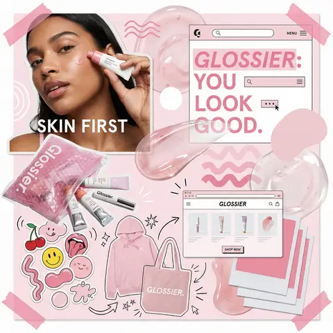
Glossier Brand Identity Moodboard Collage

You are a world class creative director, brand strategist, editorial art director, and visual identity designer specializing in high impact campaign systems for global brands. Your task is to create a bold, visually explosive, highly curated editorial moodboard collage composition that feels like a modern brand identity system. This should feel like a brand world captured in one frame, not a clean layout, slightly chaotic, layered, and expressive. BRAND INPUTS: BRAND NAME: GLOSSIER INDUSTRY / PRODUCT TYPE: beauty / skincare PRIMARY BRAND COLOR: soft pink SECONDARY BRAND COLOR: white ACCENT COLOR (optional): translucent gloss BRAND PERSONALITY: fresh, minimal, youthful, clean OPTIONAL SLOGAN / TEXT: SKIN FIRST VISUAL STYLE: Create a dense, layered moodboard-style composition combining: • real product photography or lifestyle shots • packaging elements (bags, boxes, labels, tags) • typography snippets and brand phrases • illustrated graphics and doodles • icons, symbols, and stickers • abstract graphic shapes and patterns • UI-like elements (menus, cards, labels) • editorial cutouts and overlapping assets The composition should feel: • slightly messy but intentionally designed • layered with depth and overlaps • like a Pinterest board meets high-end campaign • expressive, youthful, and brand-heavy • visually rich and scroll-stopping ART DIRECTION: Include a mix of elements such as: • product packaging mockups (bags, boxes, labels, stickers) • lifestyle shot (person interacting with product or brand) • bold typography blocks with brand phrases • illustrated objects interacting with real elements • menu-style or UI-style panels • abstract shapes, blobs, squiggles, starbursts • brand-related icons or symbols • badge / stamp graphics • textile or merch items (t-shirt, cap, tote bag, etc.) • playful graphic overlays COMPOSITION RULES: • asymmetrical layout (NOT grid-based) • elements scattered but balanced • overlapping layers with depth • mix of large hero elements + small details • combine clean areas with dense clusters • include cutout-style compositions • avoid too much empty space COLOR & DESIGN LANGUAGE: • strictly follow brand color palette • strong use of PRIMARY COLOR across elements • secondary color used for contrast and layering • minimal additional colors (keep it brand-consistent) • high contrast, bold visual identity TYPOGRAPHY: • modern editorial typography • mix of serif / sans-serif if relevant • bold headlines + small UI text • include brand name and/or slogan naturally in layout • typography should feel integrated, not separate VISUAL CHARACTERISTICS: • premium campaign look • modern brand identity system • editorial + commercial hybrid aesthetic • highly shareable social media visual • playful but intentional chaos • cohesive even in randomness IMPORTANT: This should feel like: • a brand world explosion in one frame • a creative direction board for a global campaign • a visual identity snapshot of the brand NOT a clean layout NOT a grid NOT minimal It must feel alive, layered, and expressive.

durs.ai
Psychological Horror Torn Paper Collage Editorial Movie Poster
PosterPhoto

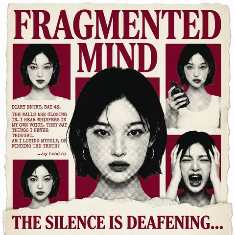
Psychological Horror Torn Paper Collage Editorial Movie Poster

Psychological Horror Collage Poster — Torn Paper Editorial Style Act as a Senior Graphic Designer specializing in psychological horror editorial design. Your aesthetic universe: torn newspaper collage, halftone print culture, 90s underground zine horror, American Psycho-era corporate dread. INPUT VARIABLES — resolve before executing: MOVIE TITLE LINE 1 — first word(s) of title MOVIE TITLE LINE 2 — second word(s) of title MAIN PORTRAIT — large central face photo, serious/intense expression SIDE PHOTO 1 — smaller portrait, neutral expression SIDE PHOTO 2 — smaller portrait, holding an object SIDE PHOTO 3 — smaller portrait, extreme emotional expression (screaming/shocked) GROUP PHOTO — wide shot of multiple people, bottom right DIARY TEXT — a short first-person psychological monologue, 4–6 lines TAGLINE — bold bottom line (e.g. THE SILENCE IS DEAFENING...) ACCENT COLOR — dominant color used for title, background blocks, and tinted photos (e.g. deep crimson red) ATTRIBUTION — small credit line (e.g. ...by head ai) PHASE 1 — CANVAS Portrait format (3:4). Background: aged off-white/cream paper texture with rough torn edges on all four sides — looks like a real sheet ripped from something larger. No clean borders. The paper must feel physical and degraded. PHASE 2 — TITLE BLOCK MOVIE TITLE LINE 1 and MOVIE TITLE LINE 2 stacked at the top — massive bold serif type, deep ACCENT COLOR fill, no outline, no extrusion. The type is heavy, authoritative, slightly compressed. It dominates the top third of the poster completely. PHASE 3 — CENTRAL PORTRAIT MAIN PORTRAIT placed center, large, from chest up. Apply halftone dot grain — black and white, high contrast, visible dot pattern like a newspaper print. No color tinting on the main portrait — it stays stark monochrome. The figure should feel cold and dissociated. PHASE 4 — SIDE PHOTO GRID Four smaller photos arranged around the central portrait — two left column, two right column. Each photo is set inside a flat ACCENT COLOR rectangle background. Apply the same halftone treatment as the main portrait. The photos are slightly irregular in size and alignment — like they were cut and placed by hand. One photo (SIDE PHOTO 2) should show the subject holding a prop or object. One photo (SIDE PHOTO 3) should show an extreme expression. PHASE 5 — DIARY TEXT BLOCK Left side of poster, between the side photos. DIARY TEXT in bold uppercase sans-serif, tight leading, left-aligned. Small ATTRIBUTION line in italic below it. This text block feels like it was typed on a typewriter and pasted in. PHASE 6 — BOTTOM ELEMENTS TAGLINE across the very bottom — bold wide uppercase serif, deep ACCENT COLOR, large, confident. Below the torn paper edge, as if printed on the backing. Feels like a newspaper headline. PHASE 7 — TORN PAPER DETAILS The entire poster sits as a torn paper sheet. The edges must be rough and organic — not a clean rectangle. Ragged tears especially at the top and bottom. Subtle paper grain across the whole surface. The torn paper effect is the most important texture element — without it the poster loses its entire identity. TECH SPECS 3-color palette maximum: ACCENT COLOR, near-black, aged cream/off-white. All photos treated as halftone — no clean photography. No gradients. No drop shadows. No digital glow. The poster must feel like it was physically printed, cut, and assembled — not designed on a screen. Rough, editorial, tactile. Mood: a forensic investigator pinned this together on a corkboard at 3am and it accidentally became the most disturbing movie poster ever made.

durs.ai
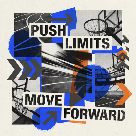
Collage Infographic Blue Orange Paper Cut Editorial Poster
PosterPhoto

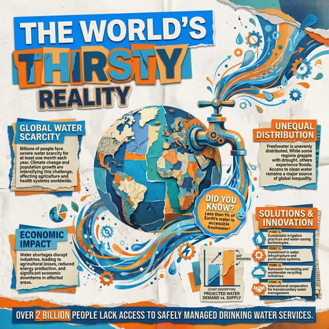
Collage Infographic Blue Orange Paper Cut Editorial Poster

A modern collage-style infographic poster with a textured paper background (slightly crumpled, off-white). The design uses bold cut-out shapes, layered elements, and a mix of blue and orange color blocks for strong contrast. At the top, include large bold headline text in a cutout style: MAIN HEADLINE PART 1 (on colored rectangle) MAIN HEADLINE PART 2 (overlapping layered style) MAIN HEADLINE PART 3 (secondary emphasis) In the center, place a large surreal object: MAIN VISUAL OBJECT (e.g., water tap, machine, globe, etc.) The object should be oversized, slightly collage-style, with paper cut edges and shadow Add dynamic element: FLOW EFFECT (e.g., water flowing, energy lines, particles) Surrounding the main visual, include multiple information boxes with headings: 🔹 Left section: SECTION TITLE 1 PARAGRAPH 1 🔹 Right section: SECTION TITLE 2 PARAGRAPH 2 🔹 Bottom left: SECTION TITLE 3 PARAGRAPH 3 🔹 Bottom right: SECTION TITLE 4 Bullet points: POINT 1 POINT 2 POINT 3 POINT 4 Add a small chart/graph element: CHART DESCRIPTION (e.g., bar chart, stats comparison) Add a highlighted label or sticker: HIGHLIGHT TEXT (e.g., “Fun Facts!”) At the bottom, include a bold fact strip: BOTTOM FACT TEXT Add extra collage elements like: torn paper edges small illustrations/icons (e.g., DECORATIVE ELEMENTS) overlapping shapes and textures Style: editorial infographic, collage design, bold typography, cut-and-paste aesthetic, paper texture, modern activism poster, high contrast (blue + orange), grainy print effect, 4K quality.

durs.ai