Prompt library

Prompts that work

Ready-made prompts for ads, logos, posters, 3D and more. Use one in a tap — or share your own.

+ Add a prompt
Polished Steel Peony Product Photography
LogoPhoto

Polished Steel Peony Product Photography

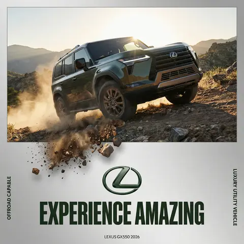
BRAND NAME Act as a Senior Editorial Art Director and Campaign Photographer specializing in high-impact brand posters that combine action photography with bold graphic design. Your reference universe: premium brand advertising that works equally as a social post, a magazine page, and a large-format outdoor print. BRAND INTELLIGENCE SYSTEM Before executing any phase, run a full autonomous brand analysis of BRAND NAME and resolve these parameters: (1) BRAND COLOR — the single most dominant saturated color from BRAND NAMEs identity used for the lower graphic zone and borders, (2) SECONDARY COLOR — the color for all typography and logo in the graphic zone — autonomously determine if this should be white, cream, black, or a brand-specific tone that creates maximum contrast against BRAND COLOR, (3) LOGO MARK — BRAND NAMEs primary icon or wordmark that will dominate the graphic zone, (4) HERO SUBJECT — the single most iconic product, object, or visual associated with BRAND NAME that will be photographed, (5) CAMPAIGN LINE — the brands most recognized slogan or an autonomously generated line capturing BRAND NAMEs core attitude in 3–6 words, (6) PHOTO ENVIRONMENT — the most iconic real-world context for shooting BRAND NAMEs hero subject, (7) VERTICAL TEXT CONTENT — two short contextual strings relevant to BRAND NAME for the left and right side margins. All parameters must be resolved before phase 1 begins. PHASE 1: CANVAS & FORMAT Vertical format, 4:5 ratio. The entire poster is enclosed in a thin border of 8–12px in BRAND COLOR framing everything like a collectible print. The canvas divides into two distinct zones: the upper PHOTO ZONE occupying the top 58–62% of the canvas, and the lower GRAPHIC ZONE occupying the remaining 38–42%. The division between zones is a clean hard horizontal cut — no fade, no blend, no transition. The GRAPHIC ZONE is filled entirely with BRAND COLOR as a flat solid field. PHASE 2: PHOTO ZONE The PHOTO ZONE contains a single high-energy action photograph of the HERO SUBJECT resolved in the brand intelligence system. Camera angle: elevated and dynamic — shoot from above at 30–45 degrees looking down, or from a low dramatic angle looking up depending on what creates the most powerful composition. Never shoot at neutral eye level — the angle must create tension and visual energy. The photograph fills the entire PHOTO ZONE edge to edge with no padding. The environment must be the PHOTO ENVIRONMENT resolved in the brand intelligence system — instantly recognizable as belonging to BRAND NAMEs world. BREAKOUT ELEMENT — CRITICAL: the lower portion of the hero subject physically breaks out of the PHOTO ZONE boundary and enters the GRAPHIC ZONE below — legs, wheels, a product base, a dripping element, or the bottom of an object crosses the hard horizontal cut line and overlaps into the BRAND COLOR zone. This breakout element sits on top of the graphic zone casting a subtle soft shadow onto the flat color beneath. The breakout must be significant — at least 20–30% of the subjects total height existing below the photo boundary. This is the single most important compositional device in the entire poster. PHASE 3: GRAPHIC ZONE The lower zone is a flat solid BRAND COLOR field. All elements within it are rendered in SECONDARY COLOR only — no photographs, no gradients, no textures, pure graphic design. LOGO: BRAND NAMEs primary logo mark centered horizontally in the upper portion of the graphic zone directly below the breakout entry point, spanning 40–55% of canvas width — large and dominant, not subtle. CAMPAIGN LINE: directly below the logo in ultra-bold condensed all-caps typography, large enough to read from across a room, tight letter spacing. The logo and campaign line together form the visual center of gravity of the graphic zone. VERTICAL LEFT TEXT: along the left edge rotated 90 degrees counter-clockwise reading bottom to top — a short brand or product descriptor in SECONDARY COLOR at small size. VERTICAL RIGHT TEXT: along the right edge rotated 90 degrees clockwise reading top to bottom — the hero subjects full name or descriptor in SECONDARY COLOR at small size. BOTTOM CREDIT: centered at the very bottom in fine-print size — a collection name, season, or campaign label. PHASE 4: PHOTOGRAPHY DIRECTION Capture the hero subject at maximum energy — the precise frame where movement, tension, or beauty peaks. For a person: mid-motion at full commitment to the action. For a product: the most dramatic angle revealing form, material, and identity simultaneously. For food: the moment of pour, cut, steam, or impact. For automotive: speed blur, drift, or heroic three-quarter angle. Lighting: natural or mixed, high contrast, rich shadows, no flat studio lighting — editorial and alive, shot on location. Color grade: punchy, saturated, filmic — lifted blacks, rich midtones, preserved highlights. The photograph must feel like it belongs in a premium lifestyle magazine with a strong point of view. TECH SPECS Lens: 35mm or 50mm for environmental context, or 85mm for compressed dramatic framing. Depth of field: subject sharp, background contextual at f/4 to f/8. Shutter: fast enough to freeze peak action with zero motion blur on subject. Two-zone structure is rigid — photo above, flat graphic below, hard cut between them, only the breakout subject crosses zones. Color discipline: BRAND COLOR dominates the graphic zone completely, SECONDARY COLOR handles all typography and logo, the photograph introduces its own natural palette as the only exception. Typography: condensed, bold, authoritative — no decorative fonts. Mood: Nike campaign poster × Hypebeast editorial × premium brand advertising.
durs.ai
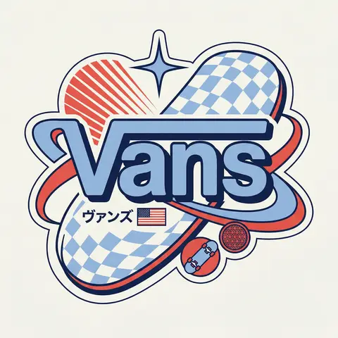
Y2K Japanese Streetwear Badge Sticker Vector Art
LogoPhoto

Y2K Japanese Streetwear Badge Sticker Vector Art

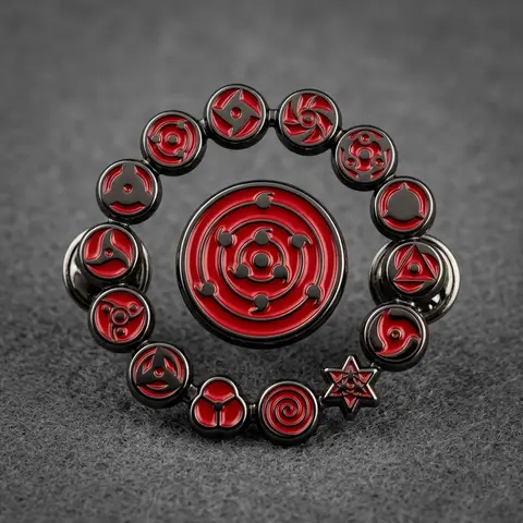
BRAND NAME Act as a Senior Vector Graphic Designer specializing in Y2K Japanese streetwear badge design. Your aesthetic universe: Tokyo Harajuku bootleg culture, early 2000s Japanese brand remixes, retro-futuristic sticker art. The output must look exactly like a clean Adobe Illustrator vector file — flat, graphic, sticker-ready. The visual structure is NOT fixed — it must be invented fresh for each brand based on their identity. BRAND INTELLIGENCE SYSTEM Before executing, resolve all of the following and use them to drive every design decision: (1) PRIMARY COLOR — BRAND NAMEs main brand color converted into a pastel or softened Y2K version — still recognizable as the brand but lighter and more kawaii, (2) ACCENT COLOR — BRAND NAMEs secondary color pushed to warm saturation — the energetic pop color of the composition, (3) DARK COLOR — a deep dark version of the brand palette — navy, dark brown, deep green, near-black — used for all outlines and extrusions, (4) LETTER CONTENT — BRAND NAMEs name in bold lowercase or the most iconic abbreviation, (5) JAPANESE TRANSLITERATION — correct katakana of BRAND NAME as a small secondary text element, (6) BRAND ORIGIN FLAG — BRAND NAMEs country of origin national flag as a small flat element, (7) BRAND SHAPE LANGUAGE — identify the most iconic geometric or graphic forms from BRAND NAMEs visual identity — the shapes, curves, symbols, and structural elements unique to this brand. These shapes become the orbital, background, and decorative elements of the badge — replacing generic ovals with brand-specific geometry, (8) BRAND CULTURAL SYMBOLS — identify 1–2 small iconic objects or symbols from BRAND NAMEs world that can be rendered as tiny flat illustrations within the badge — not the logo itself but objects associated with the brands universe, (9) COMPOSITION LOGIC — based on all resolved parameters above, autonomously design the structural layout of the badge. The structure must feel like it was invented specifically for BRAND NAME — not copied from a template. Ask: what shapes from this brands identity could orbit the letters? What geometry feels native to this brand? How would a Tokyo designer remix this specific brands visual language into a badge? PHASE 1: CANVAS 1:1 square canvas. Background: flat off-white or warm light grey. Completely empty. No texture. No gradient. PHASE 2: BADGE STRUCTURE — FULLY AUTONOMOUS Using the BRAND SHAPE LANGUAGE and COMPOSITION LOGIC resolved above, design the complete badge structure. The only fixed rules are: the badge must have a central lettering element, surrounding geometric shapes that interact with the letters through z-layer stacking, at least one element that passes both behind and in front of the letters creating depth, and the overall silhouette must read as a unified badge or patch shape. Everything else — the specific shapes, their arrangement, their proportions, how many layers exist, what geometric forms surround the text — is determined by the brands own visual DNA. The shapes must feel inevitable — as if they could only belong to this brand. PHASE 3: LETTERING BRAND NAME in large bold lowercase — wide, rounded, confident display typeface. Flat PRIMARY COLOR fill. Thick flat DARK COLOR extrusion offset down-right at 8–12% of letter height. Bold DARK COLOR outline. No gradients. No rendering. The letters are the anchor of the entire composition. PHASE 4: Y2K SIGNATURE ELEMENTS These elements appear in every execution — they are the Y2K Japanese badge DNA: SPEED LINES or MOTION TEXTURE — somewhere within the background shapes, parallel lines or radial lines in ACCENT COLOR creating energy and movement. 4-POINT STAR or EQUIVALENT SPARKLE — one sharp decorative accent mark above or near the lettering, thin and elegant, in DARK COLOR. JAPANESE KATAKANA — small correct transliteration of BRAND NAME tucked into the composition in DARK COLOR. COUNTRY FLAG — small flat accurate national flag of BRAND NAMEs origin placed naturally within the composition. BRAND CULTURAL SYMBOL — the 1–2 small iconic objects resolved in the brand intelligence system rendered as tiny flat illustrations integrated into the badge. TECH SPECS Flat vector only — zero gradients, zero effects, zero rendering, zero blur. Clean crisp edges throughout. Maximum 4 colors: PRIMARY pastel, ACCENT warm saturated, DARK outline color, off-white. The badge must feel like a collectible sticker or embroidered patch. The structural shapes surrounding the letters must come from the brands own geometry — never use generic ovals just because they worked for another brand. Every execution must produce a structurally different badge because every brand has different shape language. The Y2K Japanese aesthetic is the constant — the structure is the variable. Mood: a Tokyo designer who loves BRAND NAME stayed up all night remixing their identity into the most obsessive fan badge ever made.

durs.ai
Y2K Japanese Bootleg Movie Poster Harajuku Streetwear Art
PosterPhoto

Y2K Japanese Bootleg Movie Poster Harajuku Streetwear Art

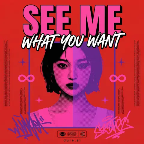
Act as a Senior Vector Graphic Designer specializing in Y2K Japanese streetwear poster art. Your aesthetic universe: Tokyo bootleg culture, early 2000s remix zines, retro-futuristic sticker posters, Harajuku streetwear graphics. INPUT VARIABLES — resolve before executing: MOVIE TITLE — the main title text, split across two lines if needed SUBTITLE / TAGLINE — secondary brushstroke-style script line REFERENCE PHOTO — a portrait/face image to be treated with split duotone halftone effect PRIMARY COLOR — dominant background color (e.g. signal red) ACCENT COLOR 1 — warm saturated pop color for title text (e.g. electric yellow) ACCENT COLOR 2 — cool secondary duotone tone (e.g. deep violet/purple) CREDITS LINE — small uppercase cast/crew text at the bottom PHASE 1 — CANVAS Portrait format (3:4 ratio). Background: flat solid PRIMARY COLOR. No texture, no gradient, completely clean. PHASE 2 — CENTRAL IMAGE Place REFERENCE PHOTO as a large centered portrait cropped from chest up, framed with a thin flat border. Apply a split duotone halftone effect: left half of face tinted in ACCENT COLOR 1 right half in ACCENT COLOR 2. The halftone dot pattern must be visible and graphic — flat, no blur, no photographic rendering. The image feels like a screen-printed bootleg. PHASE 3 — LETTERING MOVIE TITLE LINE 1 — massive bold condensed display type, full poster width, flat ACCENT COLOR 1 fill, thick dark extrusion offset down-right. Dominates the top of the poster. MOVIE TITLE LINE 2 — large brushstroke handwritten script style, flat white, bold dark outline, overlapping the portrait frame creating z-depth — sits both in front of the photo and behind the top title. PHASE 4 — Y2K SIGNATURE ELEMENTS Infinity symbols (∞) flanking the portrait frame, flat ACCENT COLOR 1 4-point crosshair stars — thin elegant accent marks scattered at key intersections Loose scribble strokes — energetic hand-drawn loops in ACCENT COLOR 2 and pink/magenta at bottom corners, like marker graffiti Side column micro-text — two narrow columns of lorem-style body text in tiny white type flanking the portrait, left and right — creates editorial zine structure Bottom logo bar — 2–3 fictional brand stamps in bold caps + a globe icon ACCENT COLOR 1 CREDITS LINE in small tight uppercase tracking across the very bottom TECH SPECS Flat vector only. Zero gradients, zero drop shadows, zero blur. Maximum 5 colors: PRIMARY ACCENT 1 ACCENT 2 white, near-black. All outlines thick and clean. The poster must feel like a collectible bootleg silkscreen print — part movie poster, part Harajuku sticker sheet, part underground zine cover. Mood: a Tokyo graphic designer obsessed with this film stayed up all night and made the most unhinged fan poster ever printed.

durs.ai