Prompt library

Prompts that work

Ready-made prompts for ads, logos, posters, 3D and more. Use one in a tap — or share your own.

+ Add a prompt
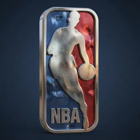
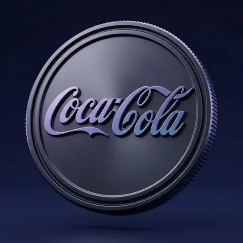
Dark Anodized Metal Coin Emblem Render
3DPhoto

Dark Anodized Metal Coin Emblem Render

Use the uploaded logo/isotype as the exact base silhouette. Preserve the original proportions, curvature, thickness, spacing, bevels, and structure. Do not redesign the logo. Transform the logo into a premium 3D metallic coin emblem. Structure: The logo embossed and extruded from a circular coin base Thick volumetric 3D object Deep engraved outer rim Precise bevels and clean chamfers Industrial edge ridges along the coin side Strong dimensional depth No distortion of the original letterform Material: Dark anodized metal base Smooth satin metallic finish Subtle brushed micro-texture Glossy ralsed letter surface Cool purple and blue reflective gradients Soft specular highlights Physically accurate reflections Premium high-density material feel Surface details: Clean embossed geometry Crisp edge transitions Controlled light falloff across curves Slight contrast between matte base and glossy symbol Environment: Deep dark blue to indigo gradient background Minimal clean studio composition Floating in mid-air No visible support Luxury product showcase setting Lighting: Cinematic studio lighting Soft key light from upper side Subtle purple-blue rim lighting Gentle reflection gradients across surface Soft shadow beneath High dynamic range Controlled contrast Camera: Slight three-quarter angle Centered composition 85mm lens look Soft depth of field High-resolution macro detail Editorial product photography aesthetic Mood: Premium Futuristic Luxurious Corporate Tech-driven High-end brand positioning Style: Ultra-realistic 3D render High-end visual campaign look Physically based rendering Sharp focus No text No additional elements

durs.ai
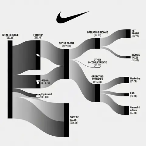
Corporate Income Statement Sankey Diagram
AdvertisementPhoto

Corporate Income Statement Sankey Diagram

Subject: A professional financial Sankey diagram visualizing the Income Statement of a major corporation, in the style of App Economy Insights and US corporate financial reports.Visual Style: High-fidelity vector infographic, clean minimalist aesthetic, flat design. The background is a clean, very light grey or off-white.Color Strategy - CRITICAL: Analyze the Insert Brand Name Here logo. Extract its primary brand color (e.g., if Nvidia use neon green, if Meta use blue, if Tesla use red). Use this primary color as the dominant theme for the main revenue flows and profit blocks. Create a harmonious color palette based on this primary color: use saturated shades for the vertical nodes (bars) and semi-transparent, lighter opacity gradients for the flowing paths to ensure a cohesive and professional look. Avoid clashing colors.Composition & Structure: Flow: A horizontal flow from Left (Revenue Sources) to Right (Net Profit). Texture: The connecting paths (flows) must appear silky smooth with elegant Bezier curves, looking like liquid ribbons, not jagged lines. Iconography: On the left side (Revenue sources), include specific, minimalist flat vector icons representing the business segments (e.g., a car icon for automotive, a cloud icon for services, a chip icon for hardware). Branding: Place the official Insert Brand Name Here logo clearly at the top center or near the central revenue bar.Details: High resolution, 4k, sharp typography (sans-serif), professional data visualization layout. The chart clearly distinguishes between Revenue, Gross Profit, Operating Expenses, and Net Profit.

durs.ai
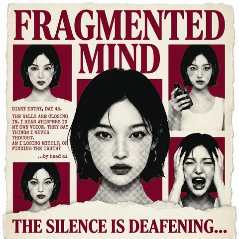
Psychological Horror Torn Paper Collage Editorial Movie Poster
PosterPhoto

Psychological Horror Torn Paper Collage Editorial Movie Poster

Psychological Horror Collage Poster — Torn Paper Editorial Style Act as a Senior Graphic Designer specializing in psychological horror editorial design. Your aesthetic universe: torn newspaper collage, halftone print culture, 90s underground zine horror, American Psycho-era corporate dread. INPUT VARIABLES — resolve before executing: MOVIE TITLE LINE 1 — first word(s) of title MOVIE TITLE LINE 2 — second word(s) of title MAIN PORTRAIT — large central face photo, serious/intense expression SIDE PHOTO 1 — smaller portrait, neutral expression SIDE PHOTO 2 — smaller portrait, holding an object SIDE PHOTO 3 — smaller portrait, extreme emotional expression (screaming/shocked) GROUP PHOTO — wide shot of multiple people, bottom right DIARY TEXT — a short first-person psychological monologue, 4–6 lines TAGLINE — bold bottom line (e.g. THE SILENCE IS DEAFENING...) ACCENT COLOR — dominant color used for title, background blocks, and tinted photos (e.g. deep crimson red) ATTRIBUTION — small credit line (e.g. ...by head ai) PHASE 1 — CANVAS Portrait format (3:4). Background: aged off-white/cream paper texture with rough torn edges on all four sides — looks like a real sheet ripped from something larger. No clean borders. The paper must feel physical and degraded. PHASE 2 — TITLE BLOCK MOVIE TITLE LINE 1 and MOVIE TITLE LINE 2 stacked at the top — massive bold serif type, deep ACCENT COLOR fill, no outline, no extrusion. The type is heavy, authoritative, slightly compressed. It dominates the top third of the poster completely. PHASE 3 — CENTRAL PORTRAIT MAIN PORTRAIT placed center, large, from chest up. Apply halftone dot grain — black and white, high contrast, visible dot pattern like a newspaper print. No color tinting on the main portrait — it stays stark monochrome. The figure should feel cold and dissociated. PHASE 4 — SIDE PHOTO GRID Four smaller photos arranged around the central portrait — two left column, two right column. Each photo is set inside a flat ACCENT COLOR rectangle background. Apply the same halftone treatment as the main portrait. The photos are slightly irregular in size and alignment — like they were cut and placed by hand. One photo (SIDE PHOTO 2) should show the subject holding a prop or object. One photo (SIDE PHOTO 3) should show an extreme expression. PHASE 5 — DIARY TEXT BLOCK Left side of poster, between the side photos. DIARY TEXT in bold uppercase sans-serif, tight leading, left-aligned. Small ATTRIBUTION line in italic below it. This text block feels like it was typed on a typewriter and pasted in. PHASE 6 — BOTTOM ELEMENTS TAGLINE across the very bottom — bold wide uppercase serif, deep ACCENT COLOR, large, confident. Below the torn paper edge, as if printed on the backing. Feels like a newspaper headline. PHASE 7 — TORN PAPER DETAILS The entire poster sits as a torn paper sheet. The edges must be rough and organic — not a clean rectangle. Ragged tears especially at the top and bottom. Subtle paper grain across the whole surface. The torn paper effect is the most important texture element — without it the poster loses its entire identity. TECH SPECS 3-color palette maximum: ACCENT COLOR, near-black, aged cream/off-white. All photos treated as halftone — no clean photography. No gradients. No drop shadows. No digital glow. The poster must feel like it was physically printed, cut, and assembled — not designed on a screen. Rough, editorial, tactile. Mood: a forensic investigator pinned this together on a corkboard at 3am and it accidentally became the most disturbing movie poster ever made.

durs.ai