Prompt library

Prompts that work

Ready-made prompts for ads, logos, posters, 3D and more. Use one in a tap — or share your own.

+ Add a prompt
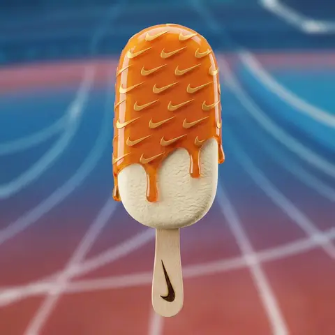
Brand Futuristic object
3DPhoto

Brand Futuristic object

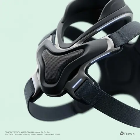
BRAND NAME or LOGO IMAGE: A high-end, glossy concept art magazine editorial photograph of a unique, unexpected functional object conceptualized and designed by the brand. 1. The Concept & Object (AI Invention): Based on the design philosophy, heritage, and material vocabulary of the specified brand, the AI must invent a novel utility product (NOT standard clothing, shoes, or bags). Examples could be home goods, tech accessories, tools, or sporting equipment, reinterpretated through the brands lens. The object should feel sculptural yet functional. 2. Materials & Details (Hyper-Premium): The object is constructed from ultra-premium, highly tactile materials characteristic of the brand (e.g., patinated exotic leathers, brushed aerospace-grade titanium, sculpted matte ceramics, molded carbon fiber, or technical high-fashion textiles). Every detail is hyper-realistic: visible stitching, microscopic material grain, precision engravings, and complex texture contrasts. 3. Photography & Lighting (Cinematic Studio): Shot on a medium format Phase One camera with a 100mm macro lens. Extremely shallow depth of field, with sharp focus on the hero details of the object and a creamy, smooth bokeh background. The lighting is sophisticated studio softbox lighting: gentle, enveloping fill light with precise rim lighting to accentuate contours and material textures. 4. Environment: A seamless, impeccably clean studio cyclorama background in a pure, ultra-light pastel tone (e.g., desaturated mint, pale blush, or off-white), free of shadows. 5. Layout & UI Elements (Strict Placement): - Bottom Right Corner: A small, understated, monochrome gray logo of the brand. - Bottom Left Corner: Small, minimalist monochrome gray text describing the invented product. The font style looks like Manrope Regular with very tight tracking (kerning) and balanced line spacing. Example format: CONCEPT STUDY: AI inserts invented product name. MATERIAL: AI inserts main materials. SS25.

durs.ai
Raw Collage Caricature Portrait
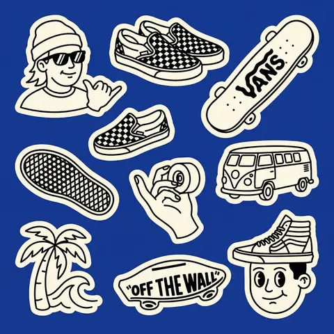
StickerPhoto

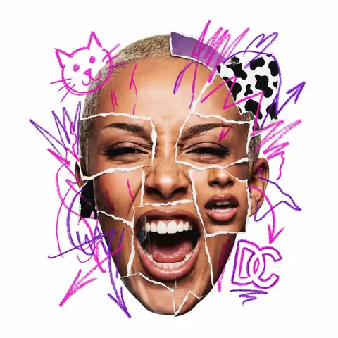
Raw Collage Caricature Portrait

CHARACTER NAME or IMAGE. Act as a radical contemporary mixed-media artist creating a raw, aggressive urban collage portrait. 1. THE SUBJECT (AGGRESSIVE COLLAGE & EMOTION): Generate a hyper-realistic Big-Head Caricature of PERSON / CHARACTER constructed via aggressive photo-montage. Expression (High Energy): The subject must have a visceral, highly charged emotional expression (e.g., roaring laughter, a primal scream, an intensely focused snarl, a manic wide-eyed stare). No passive or neutral faces. The Raw Cut Technique (CRITICAL): The face is NOT a seamless photo. It is a crude assembly of mismatched parts torn from different sources. You must show rough, jagged white paper tear lines and seams where the eyes, mouth, and forehead pieces overlap and are pasted together. The edges must look analog, handmade, and imperfect, like torn magazine pages. 2. THE GRAFFITI EXPLOSION (SMART CONTENT & DYNAMIC PLACEMENT): Over the collage, apply wild, hand-drawn Neon Marker Scribbles. Color & Content Logic (Automatic): Identify the signature color AND 2-3 iconic symbols/logos associated with PERSON / CHARACTER . Draw these specific symbols crudely in the neon color. PLACEMENT (BREAKING BOUNDARIES): The scribble elements must NOT be contained within the face. They must explode dynamically outward, breaking the silhouette of the head and extending wildly into the surrounding white negative space. 3. PHOTOGRAPHY, LIGHTING & TEXTURE: Style: Gritty Street Art meets High-End Photography. Texture: Emphasize the tactile mix of materials: the glossy texture of the photo paper, the fibrous texture of the torn white edges, and the waxy texture of the neon marker. Lighting: Harsh, high-contrast studio lighting that casts hard shadows, emphasizing the layered paper cuts. 4. COMPOSITION: Framing: The photographic head is centered, but the composition feels chaotic due to the exploding scribbles. Background: Pure White (#FFFFFF). Clean, flat, zero texture, providing maximum contrast for the messy collage.

durs.ai
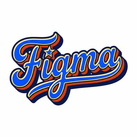
Retro Americana Fat Script Lettering
LogoPhoto

Retro Americana Fat Script Lettering

A bold, vibrant, retro-American vector lettering design displaying the name BRAND NAME or TEXT. TYPOGRAPHY STYLE (FAT SCRIPT): The text is rendered in a thick, chunky, hand-lettered baseball script or bubble style, reminiscent of 1950s-1970s American sports logos and automotive decals. Form: The letters are heavy, rounded, and tightly connected (ligatures). Perspective: The text line should be slightly slanted upwards or arched to create dynamic energy. Effects: Apply a thick, bold outline around the text. Crucially, add a deep, solid block shadow (extrusion) behind the letters to create a heavy 3D pop-out effect, characteristic of vintage sticker art. COLOR PALETTE (BRAND VINTAGE): Use a bright, saturated, and flat color palette inspired by BRAND NAMEs identity but filtered through a retro pop-art lens. Fill: Solid, punchy colors (no gradients). Contrast: High contrast between the letter fill, the outline (usually white or cream), and the block shadow (usually a darker shade or contrasting color). DECORATIVE ELEMENTS: Keep it clean and vector-like. You may include subtle, classic Americana design elements integrated into the text flow, such as a swoosh underline, a simple star, or a very simplified icon relevant to the brand (e.g., a lightning bolt for energy, a leaf for eco). Do NOT over-detail; keep it looking like a printed logo. BACKGROUND: Isolated on a clean, pure white background. No paper textures, no noise, no dirt.

durs.ai
Fashion E-Commerce Product Infographic
BrandingPhoto

Fashion E-Commerce Product Infographic

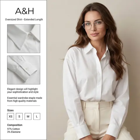
A professional fashion e-commerce infographic for the brand BRAND NAME or LOGO IMAGE. The layout is divided: on the right, a high-quality studio portrait of a woman with long, wavy brunette hair wearing thin-framed silver glasses, a crisp white oversized cotton shirt, and cream-colored high-waisted trousers. Her face is soft and elegant, looking directly at the camera. On the left, a clean white vertical sidebar containing two square close-up inset photos of the shirts collar and pleated cuff details. The text in the sidebar is in English: at the top BRAND NAME or LOGO IMAGE and Oversized Shirt - Extended Length, in the middle Elegant design will highlight your sophistication and style and Essential wardrobe staple made from high-quality materials. At the bottom, a Sizes section with XS, S, M, L in boxes, and a Composition section showing 97% Cotton and 3% Elastane. Soft studio lighting, minimalist aesthetic, high resolution, fashion magazine style. ​Key Elements for Success ​If you are using this in another AI generator, keep these levers in mind to get the best result: ​Layout Keywords: Use terms like UI/UX layout, product infographic, and split composition to ensure the text stays on one side and the model on the other. ​Character Consistency: Mentioning the thin-framed glasses and wavy brunette hair is crucial to maintaining the likeness from your second reference photo. ​Typography: AI can be finicky with long sentences. If the text comes out garbled, you may need to use a graphic design tool (like Canva or Photoshop) to overlay the final English text onto the generated image.

durs.ai
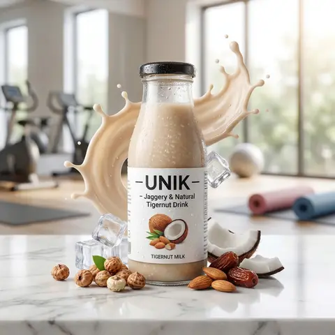
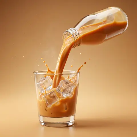
Dynamic Beverage Pour Into Glass Commercial Shot
AdvertisementPhoto

Dynamic Beverage Pour Into Glass Commercial Shot

Create a hyper-realistic commercial product photography of a exact uploaded product image as the main subject bottled beverage pouring dynamically into a clear glass. The bottle is tilted mid-air at a powerful angle, with a rich, creamy liquid flowing smoothly in a thick stream into the glass. The liquid appears silky, glossy, and highly appetizing, with realistic viscosity and smooth motion. Add dynamic splash effects: - controlled creamy liquid splashes rising inside the glass - subtle splash arcs and droplets frozen mid-air - natural fluid interaction with glass walls Include crystal-clear ice cubes inside the glass: - realistic transparency and refraction-slight frost and condensation on ice surface - interaction between liquid and ice (soft splash + displacement) Studio shot, ultra high resolution, sharp focus, 85mm lens look, f/2.8 depth of field. Background: clean studio ackdrop color-matched to the product tone (warm caramel orange, creamy beige, or flavor-inspired color) with a soft gradient. Surface matches background tone for seamless premium look with subtle reflection. Add subtle atmospheric details: - fine micro droplets in air - light mist or cold vapor around glass Lighting: cinematic studio lighting with: - strong rim light highlighting liquid edges and glass contours - soft top light enhancing liquid gloss - side light emphasizing texture and splash detail Glass is ultra clean with realistic reflections, refraction, and soft shadow grounding. Composition is bold, dynamic, and premium - high-end beverage advertising style. No text, no typography, no clutter, no identifiable ingredients. Ultra realistic, photorealistic, high dynamic range, cinematic color grading, glossy highlights. 4K-8K resolution, billboard-ready, sharp detail, realistic studio shoot look.

durs.ai
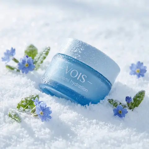
Polished Steel Peony Product Photography
LogoPhoto

Polished Steel Peony Product Photography

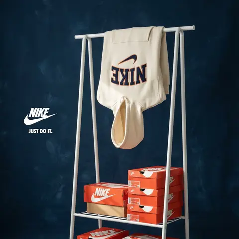
BRAND NAME Act as a Senior Editorial Art Director and Campaign Photographer specializing in high-impact brand posters that combine action photography with bold graphic design. Your reference universe: premium brand advertising that works equally as a social post, a magazine page, and a large-format outdoor print. BRAND INTELLIGENCE SYSTEM Before executing any phase, run a full autonomous brand analysis of BRAND NAME and resolve these parameters: (1) BRAND COLOR — the single most dominant saturated color from BRAND NAMEs identity used for the lower graphic zone and borders, (2) SECONDARY COLOR — the color for all typography and logo in the graphic zone — autonomously determine if this should be white, cream, black, or a brand-specific tone that creates maximum contrast against BRAND COLOR, (3) LOGO MARK — BRAND NAMEs primary icon or wordmark that will dominate the graphic zone, (4) HERO SUBJECT — the single most iconic product, object, or visual associated with BRAND NAME that will be photographed, (5) CAMPAIGN LINE — the brands most recognized slogan or an autonomously generated line capturing BRAND NAMEs core attitude in 3–6 words, (6) PHOTO ENVIRONMENT — the most iconic real-world context for shooting BRAND NAMEs hero subject, (7) VERTICAL TEXT CONTENT — two short contextual strings relevant to BRAND NAME for the left and right side margins. All parameters must be resolved before phase 1 begins. PHASE 1: CANVAS & FORMAT Vertical format, 4:5 ratio. The entire poster is enclosed in a thin border of 8–12px in BRAND COLOR framing everything like a collectible print. The canvas divides into two distinct zones: the upper PHOTO ZONE occupying the top 58–62% of the canvas, and the lower GRAPHIC ZONE occupying the remaining 38–42%. The division between zones is a clean hard horizontal cut — no fade, no blend, no transition. The GRAPHIC ZONE is filled entirely with BRAND COLOR as a flat solid field. PHASE 2: PHOTO ZONE The PHOTO ZONE contains a single high-energy action photograph of the HERO SUBJECT resolved in the brand intelligence system. Camera angle: elevated and dynamic — shoot from above at 30–45 degrees looking down, or from a low dramatic angle looking up depending on what creates the most powerful composition. Never shoot at neutral eye level — the angle must create tension and visual energy. The photograph fills the entire PHOTO ZONE edge to edge with no padding. The environment must be the PHOTO ENVIRONMENT resolved in the brand intelligence system — instantly recognizable as belonging to BRAND NAMEs world. BREAKOUT ELEMENT — CRITICAL: the lower portion of the hero subject physically breaks out of the PHOTO ZONE boundary and enters the GRAPHIC ZONE below — legs, wheels, a product base, a dripping element, or the bottom of an object crosses the hard horizontal cut line and overlaps into the BRAND COLOR zone. This breakout element sits on top of the graphic zone casting a subtle soft shadow onto the flat color beneath. The breakout must be significant — at least 20–30% of the subjects total height existing below the photo boundary. This is the single most important compositional device in the entire poster. PHASE 3: GRAPHIC ZONE The lower zone is a flat solid BRAND COLOR field. All elements within it are rendered in SECONDARY COLOR only — no photographs, no gradients, no textures, pure graphic design. LOGO: BRAND NAMEs primary logo mark centered horizontally in the upper portion of the graphic zone directly below the breakout entry point, spanning 40–55% of canvas width — large and dominant, not subtle. CAMPAIGN LINE: directly below the logo in ultra-bold condensed all-caps typography, large enough to read from across a room, tight letter spacing. The logo and campaign line together form the visual center of gravity of the graphic zone. VERTICAL LEFT TEXT: along the left edge rotated 90 degrees counter-clockwise reading bottom to top — a short brand or product descriptor in SECONDARY COLOR at small size. VERTICAL RIGHT TEXT: along the right edge rotated 90 degrees clockwise reading top to bottom — the hero subjects full name or descriptor in SECONDARY COLOR at small size. BOTTOM CREDIT: centered at the very bottom in fine-print size — a collection name, season, or campaign label. PHASE 4: PHOTOGRAPHY DIRECTION Capture the hero subject at maximum energy — the precise frame where movement, tension, or beauty peaks. For a person: mid-motion at full commitment to the action. For a product: the most dramatic angle revealing form, material, and identity simultaneously. For food: the moment of pour, cut, steam, or impact. For automotive: speed blur, drift, or heroic three-quarter angle. Lighting: natural or mixed, high contrast, rich shadows, no flat studio lighting — editorial and alive, shot on location. Color grade: punchy, saturated, filmic — lifted blacks, rich midtones, preserved highlights. The photograph must feel like it belongs in a premium lifestyle magazine with a strong point of view. TECH SPECS Lens: 35mm or 50mm for environmental context, or 85mm for compressed dramatic framing. Depth of field: subject sharp, background contextual at f/4 to f/8. Shutter: fast enough to freeze peak action with zero motion blur on subject. Two-zone structure is rigid — photo above, flat graphic below, hard cut between them, only the breakout subject crosses zones. Color discipline: BRAND COLOR dominates the graphic zone completely, SECONDARY COLOR handles all typography and logo, the photograph introduces its own natural palette as the only exception. Typography: condensed, bold, authoritative — no decorative fonts. Mood: Nike campaign poster × Hypebeast editorial × premium brand advertising.
durs.ai
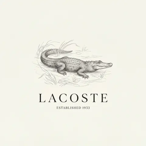
Luxury Brand Product Key Visual
PosterPhoto

Luxury Brand Product Key Visual

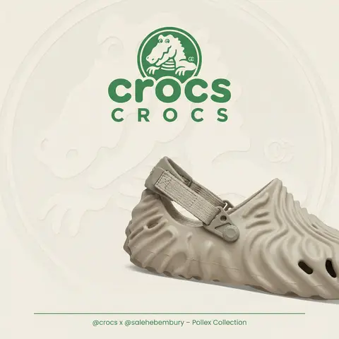
BRAND NAME + PRODUCT Act as a Senior Luxury Fashion Art Director and Studio Photographer specializing in high-end product key visuals for flagship campaigns, e-commerce editorials, and mobile-first brand content. PHASE 1: FORMAT & CANVAS Vertical format, 9:16 aspect ratio. Canvas background: a single flat field of warm off-white — not pure white, not grey. Target tone: soft ivory cream (#F4EFE6 equivalent), uniform and completely shadowless across the entire background plane. Autonomously determine BRAND NAMEs signature background tone — if the brand has a recognized house color for its packaging, tissue paper, or lookbook backgrounds, shift the canvas toward that specific off-white or neutral. The result must feel like an official brand document, not a generic studio. PHASE 2: BACKGROUND PATTERN (WATERMARK LAYER) Autonomously identify BRAND NAMEs iconic surface pattern, monogram, or archival motif — examples: a house monogram, toile print, geometric logo repeat, heritage emblem, or signature textile pattern. Render this pattern across the entire background canvas as a ghost watermark: same tone as the background but with a slight value shift (approximately 8–12% darker or lighter than the base). The pattern must be large in scale — individual motifs spanning 15–25% of canvas width. Opacity: 10–18% maximum. No hard edges. The pattern should feel embossed or tone-on-tone woven, not printed. It must recede behind all other elements. PHASE 3: LOGO PLACEMENT Autonomously reproduce BRAND NAMEs official logo with complete fidelity — correct letterforms, proportions, secondary marks (emblems, crowns, stars, monogram icons). Place the logo centered horizontally in the upper third of the frame (top 30% of canvas). Scale: the logo should span approximately 40–50% of canvas width — prominent but not overwhelming. Logo rendering: flat 2D, no extrusion, no chrome. Color: autonomously apply BRAND NAMEs official logo colorway — the exact brand-standard color(s) used on official packaging and website. If the brand uses a two-tone logo (icon + wordmark in different colors), preserve that hierarchy precisely. Directly below the main logo mark, place the full BRAND NAME wordmark in spaced capital letters — clean, geometric sans-serif, tracking: +200 to +300, same brand color, optical size approximately 60% of logo height. No decorative elements between logo and wordmark. PHASE 4: PRODUCT PLACEMENT Render PRODUCT as a photorealistic studio object with maximum material fidelity: — Leather: visible grain, pore structure, stitching thread texture, realistic edge paint. — Hardware: gold or silver metal with micro-reflections, not flat. — Canvas/fabric: woven fiber detail, not smooth CG. — All brand-specific surface patterns on the product must be accurate and legible. Placement: the product enters the frame from the bottom-right corner at a natural 25–35 degree angle, as if casually placed or mid-motion. The product is cropped — only 60–75% of the object is visible within the frame. The crop should feel intentional and editorial, not accidental. The product occupies the lower 55–65% of the canvas. The product must feel physically present in the space — not floating. Cast an extremely soft, barely visible contact shadow (opacity 8–12%) on the canvas beneath the nearest edge. No hard drop shadows. PHASE 5: LIGHTING Lighting: simulated large north-facing studio window light. Soft, directional, shadowless on the background. Color temperature: 5500–6000K (neutral daylight, slightly cool). Key light: large softbox equivalent from upper-left, filling the entire product surface evenly with minimal contrast ratio (1.2:1 to 1.5:1 max). Fill light: large bounce from right side, eliminating all harsh shadows. No rim light. No dramatic contrast. The lighting philosophy is: the product sells itself — light only reveals, never performs. Global Illumination enabled for subtle inter-reflections between product surfaces. No specular hotspots on leather — only on metal hardware. PHASE 6: TYPOGRAPHY & FINISHING Bottom of frame: a thin horizontal rule line (1px, brand color, 80% canvas width, centered). Below the rule: a single line of micro-copy — a social handle, collection name, or campaign label — in the same clean sans-serif, lowercase or small-caps, minimal tracking. Autonomously generate a contextually appropriate label for BRAND NAME. TECH SPECS Render engine: photorealistic CGI, Keyshot / Octane product visualization aesthetic. Resolution: 9:16, ultra-high detail. Depth of Field: f/16 equivalent — everything in sharp focus. Zero bokeh. Tack-sharp edges on all product details.Tone mapping: clean, true-to-life. No filmic crush. No vignette. No grain. Color grade: neutral, faithful to real product color. Slight warmth in the ivory background only. No AI-plastic normals on leather or fabric. Microscopic surface imperfection maps required. No reflections on background. No environmental reflections — studio only. Mood reference: Louis Vuitton / Bottega Veneta / Celine official e-commerce and campaign photography standard. Clean enough to be used as a press image.

durs.ai