Prompt library

Prompts that work

Ready-made prompts for ads, logos, posters, 3D and more. Use one in a tap — or share your own.

+ Add a prompt
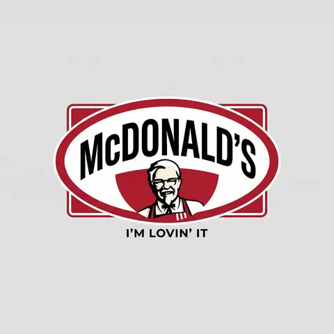
Brand Logo Mashup Visual Parody Design
LogoPhoto

Brand Logo Mashup Visual Parody Design

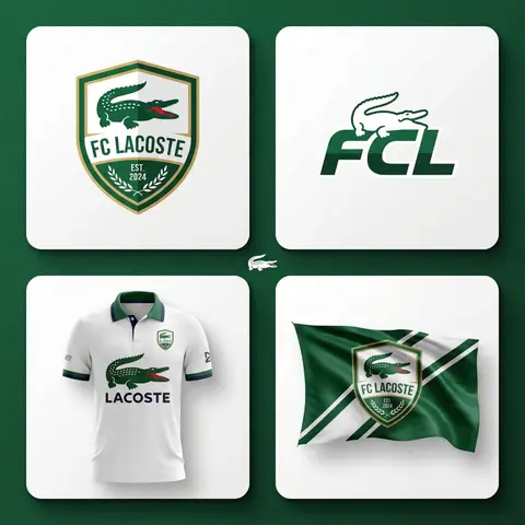
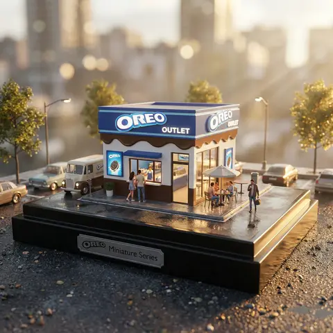
BRAND A + BRAND B. Act as a Brand Identity Designer specializing in Logo Mashups and Visual Parody. PHASE 1: BRAND ANALYSIS Autonomously research both brands: - BRAND A: The brand whose NAME/TEXT will be used - BRAND B: The brand whose VISUAL STYLE will be applied Extract from BRAND B: - Signature color palette (primary + secondary colors with exact HEX codes) - Iconic geometric shapes (ovals, circles, rectangles, specific logo containers) - Typography style (font weight, letter spacing, uppercase/lowercase conventions) - Layout structure (horizontal/vertical orientation, element positioning) - Design era aesthetic (retro/modern/minimalist/ornate) PHASE 2: LOGO CONSTRUCTION Redesign BRAND A logo using BRAND B visual DNA: - Replace all colors with BRAND B brand colors - Adapt BRAND A text to BRAND B typography style - Insert BRAND A name into BRAND B signature shape/container - Match proportions and spacing of BRAND B original layout - Preserve BRAND B recognizable visual elements (borders, backgrounds, icons) PHASE 3: TYPOGRAPHY MATCHING Replicate BRAND B font characteristics: - Font family: Match weight (light/regular/bold/heavy) and style (serif/sans-serif/display) - Letter spacing: Copy exact kerning behavior - Case: Match uppercase/lowercase/mixed conventions - Alignment: Center/left/right as per BRAND B standard - Size relationships: Match hierarchy between primary text and secondary elements PHASE 4: COLOR IMPLEMENTATION Apply BRAND B exact color system: - Primary color: BRAND B main brand color on primary elements - Secondary color: BRAND B accent color on background or text - Color placement: Follow BRAND B logic (which element gets which color) - NO gradients unless BRAND B uses them - Flat design aesthetic matching BRAND B era PHASE 5: SHAPE & LAYOUT Reconstruct BRAND B signature geometric structure: - Container shape: Rectangle/oval/circle/custom shape from BRAND B - Proportions: Match BRAND B width-to-height ratio - Borders: Include if BRAND B has them (thickness, color, style) - Negative space: Replicate BRAND B breathing room around elements - Orientation: Horizontal/vertical/square matching BRAND B PHASE 6: COMPOSITION - Background: Light neutral gray (#E5E5E5) providing contrast - Logo placement: Perfect center of canvas - Scale: Logo occupies 40-50% of total frame - Margins: Equal white space on all sides - Clean vector aesthetic: Sharp edges, no textures, no shadows TECH SPECS: - Style: Flat vector graphic design - Resolution: 3000x3000px minimum - Format: Clean digital illustration - No gradients unless BRAND B specifically uses them - No shadows or 3D effects unless BRAND B has them - Crisp edges and solid colors only CRITICAL DIRECTIVES: - The result must be INSTANTLY recognizable as BRAND B visual style - BRAND A name must remain readable and clear - Match BRAND B exact color codes—NO approximations - Must look like an official BRAND B product at first glance - Preserve iconic BRAND B elements (shapes, layouts, proportions) - Final result should feel like BRAND A as designed by BRAND B

durs.ai
Luxury Brand Product Key Visual
PosterPhoto

Luxury Brand Product Key Visual

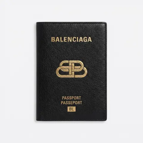
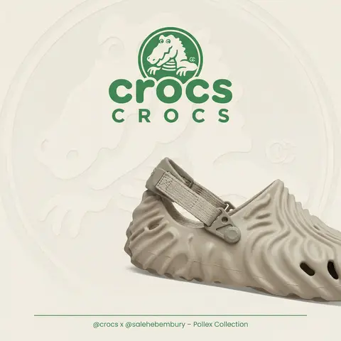
BRAND NAME + PRODUCT Act as a Senior Luxury Fashion Art Director and Studio Photographer specializing in high-end product key visuals for flagship campaigns, e-commerce editorials, and mobile-first brand content. PHASE 1: FORMAT & CANVAS Vertical format, 9:16 aspect ratio. Canvas background: a single flat field of warm off-white — not pure white, not grey. Target tone: soft ivory cream (#F4EFE6 equivalent), uniform and completely shadowless across the entire background plane. Autonomously determine BRAND NAMEs signature background tone — if the brand has a recognized house color for its packaging, tissue paper, or lookbook backgrounds, shift the canvas toward that specific off-white or neutral. The result must feel like an official brand document, not a generic studio. PHASE 2: BACKGROUND PATTERN (WATERMARK LAYER) Autonomously identify BRAND NAMEs iconic surface pattern, monogram, or archival motif — examples: a house monogram, toile print, geometric logo repeat, heritage emblem, or signature textile pattern. Render this pattern across the entire background canvas as a ghost watermark: same tone as the background but with a slight value shift (approximately 8–12% darker or lighter than the base). The pattern must be large in scale — individual motifs spanning 15–25% of canvas width. Opacity: 10–18% maximum. No hard edges. The pattern should feel embossed or tone-on-tone woven, not printed. It must recede behind all other elements. PHASE 3: LOGO PLACEMENT Autonomously reproduce BRAND NAMEs official logo with complete fidelity — correct letterforms, proportions, secondary marks (emblems, crowns, stars, monogram icons). Place the logo centered horizontally in the upper third of the frame (top 30% of canvas). Scale: the logo should span approximately 40–50% of canvas width — prominent but not overwhelming. Logo rendering: flat 2D, no extrusion, no chrome. Color: autonomously apply BRAND NAMEs official logo colorway — the exact brand-standard color(s) used on official packaging and website. If the brand uses a two-tone logo (icon + wordmark in different colors), preserve that hierarchy precisely. Directly below the main logo mark, place the full BRAND NAME wordmark in spaced capital letters — clean, geometric sans-serif, tracking: +200 to +300, same brand color, optical size approximately 60% of logo height. No decorative elements between logo and wordmark. PHASE 4: PRODUCT PLACEMENT Render PRODUCT as a photorealistic studio object with maximum material fidelity: — Leather: visible grain, pore structure, stitching thread texture, realistic edge paint. — Hardware: gold or silver metal with micro-reflections, not flat. — Canvas/fabric: woven fiber detail, not smooth CG. — All brand-specific surface patterns on the product must be accurate and legible. Placement: the product enters the frame from the bottom-right corner at a natural 25–35 degree angle, as if casually placed or mid-motion. The product is cropped — only 60–75% of the object is visible within the frame. The crop should feel intentional and editorial, not accidental. The product occupies the lower 55–65% of the canvas. The product must feel physically present in the space — not floating. Cast an extremely soft, barely visible contact shadow (opacity 8–12%) on the canvas beneath the nearest edge. No hard drop shadows. PHASE 5: LIGHTING Lighting: simulated large north-facing studio window light. Soft, directional, shadowless on the background. Color temperature: 5500–6000K (neutral daylight, slightly cool). Key light: large softbox equivalent from upper-left, filling the entire product surface evenly with minimal contrast ratio (1.2:1 to 1.5:1 max). Fill light: large bounce from right side, eliminating all harsh shadows. No rim light. No dramatic contrast. The lighting philosophy is: the product sells itself — light only reveals, never performs. Global Illumination enabled for subtle inter-reflections between product surfaces. No specular hotspots on leather — only on metal hardware. PHASE 6: TYPOGRAPHY & FINISHING Bottom of frame: a thin horizontal rule line (1px, brand color, 80% canvas width, centered). Below the rule: a single line of micro-copy — a social handle, collection name, or campaign label — in the same clean sans-serif, lowercase or small-caps, minimal tracking. Autonomously generate a contextually appropriate label for BRAND NAME. TECH SPECS Render engine: photorealistic CGI, Keyshot / Octane product visualization aesthetic. Resolution: 9:16, ultra-high detail. Depth of Field: f/16 equivalent — everything in sharp focus. Zero bokeh. Tack-sharp edges on all product details.Tone mapping: clean, true-to-life. No filmic crush. No vignette. No grain. Color grade: neutral, faithful to real product color. Slight warmth in the ivory background only. No AI-plastic normals on leather or fabric. Microscopic surface imperfection maps required. No reflections on background. No environmental reflections — studio only. Mood reference: Louis Vuitton / Bottega Veneta / Celine official e-commerce and campaign photography standard. Clean enough to be used as a press image.

durs.ai
Industrial X-Ray Transparency Product Render
3DPhoto

Industrial X-Ray Transparency Product Render

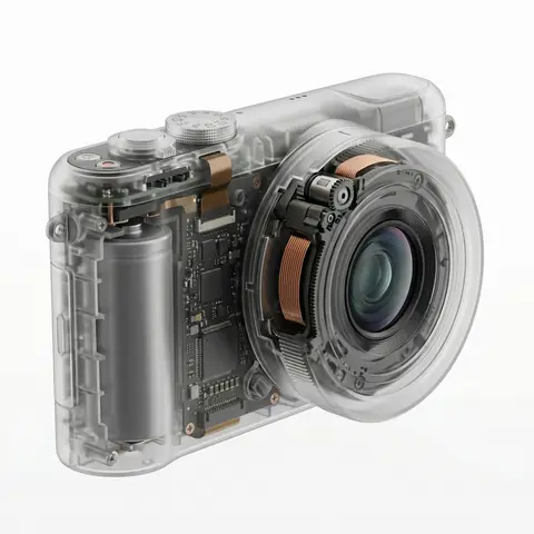
visual_style_analysis_v2: style_definition: name: Industrial X-Ray Transparency Render, core_aesthetic: Minimalist, Futuristic, Clinical Precision, Structural Functionalism , visual_logic: Exploded view aesthetics within a closed shell , color_system: palette_type: Monochromatic Grayscale with Metallic Accents, background: #F5F5F5 to #FFFFFF (Clean Studio White), foreground: outer_shell: Frosted Translucent White/Grey, inner_components_primary: Matte Black/Dark Graphite, inner_components_secondary: Metallic Silver/Copper, highlights: Soft Specular Highlights , internal_component_architecture: description: Hierarchy of internal parts to create realistic density, layer_1_structure_skeleton: elements: Injection molding ribs, screw bosses, mounting brackets, visual_role: Defines the shape and adds ghostly lines inside the shell , layer_2_power_drive: elements: Cylindrical/Pouch Batteries, Copper Coils, Transformers, Magnets, visual_role: Provides visual weight and dense black masses , layer_3_logic_control: elements: Printed Circuit Boards (PCB), Solder points, Silicon Chips, Ribbon Cables, visual_role: Adds intricate, fine detail and technical texture , layer_4_interface: elements: Tactile switches, USB-C ports, LED indicators, haptic motors, visual_role: Connects the inside to the outside surface , lighting_and_atmosphere: lighting_type: Backlit Clinical Studio, characteristics: Transmissive Glow, Rim Lighting to define edges, Soft Ambient Occlusion inside , materials_and_textures: shell_material: Frosted Polycarbonate (PC) with 85% opacity, internal_finish: Matte vs Glossy contrast (components are glossy, shell is matte), x_ray_effect: Depth-based opacity (thicker parts look darker) , demonstration_example: product_type: Pro Game Controller / Precision Tool, prompt_application: Show rumble motors (weights), battery pack in center, ribbon cables connecting triggers, complex PCB under buttons , ai_prompt_keywords_suggestion: X-ray render, translucent frosted shell, visible internal engineering, layered internal components, complex circuitry, copper coils and batteries, structural ribbing, C4D octane render, industrial exploded view, schematic realism
durs.ai