Prompt library

Prompts that work

Ready-made prompts for ads, logos, posters, 3D and more. Use one in a tap — or share your own.

+ Add a prompt
Duotone Character Face Icon
PosterPhoto

Duotone Character Face Icon

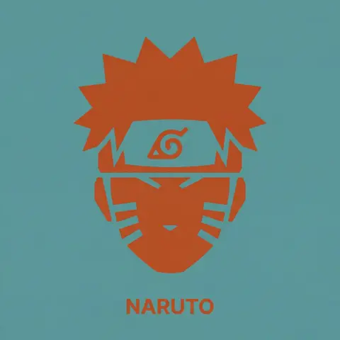
A single, isolated, strict duotone flat vector icon representing the face of CHARACTER NAME or IMAGE. CONTENT SCOPE (FACE ONLY): The design must represent ONLY the head, face, or helmet of CHARACTER . Absolutely NO shoulders, torso, weapons, or accessories. DYNAMIC DUOTONE COLOR PALETTE (MATERIAL DESIGN): The entire image must use strictly ONLY TWO solid, flat colors chosen by the AI based on the characters lore, allegiance, or iconic appearance. 1. Background Theme Color: A moderate, pleasing solid flat color covering the entire canvas. 2. Foreground Theme Color: A second solid flat color used for the icon shape and the text, chosen to contrast well with the background. Aesthetic Constraint: The colors must be chosen from a Google Material Design aesthetic—moderate hues, matte finish, pleasing to the eye, avoiding overly harsh saturation or neon tones. No gradients, shadows, or outlines. STYLE & TECHNIQUE (BRUTAL MINIMALISM): The style is brutal geometric minimalism with high abstraction. Reduce facial features to their most basic, blocky, angular shapes. Use large, solid masses of the Foreground Theme Color to define the form. Internal details (eyes, mouth, key features) must be formed solely by bold, blocky cuts of the Background Theme Color negative space into the foreground silhouette. The icon must be a free-floating silhouette with NO enclosing circle, border, or container shape. BACKGROUND: The background is filled entirely with the solid, flat Background Theme Color. TYPOGRAPHY (CRITICAL CONSTRAINTS): Directly below the floating icon, placed centrally, is the name CHARACTER . 1. FONT FAMILY (STRICT): The text MUST be rendered in the style of the font Inter Bold. Do NOT use any other font. 2. CASE & COLOR: Title case only. The text color must exactly match the solid Foreground Theme Color. 3. SIZE & SCALE (STRICT): The text must be very small. The total width of the entire text string must NOT exceed 25% of the total image width. 4. KERNING: Maintain very tight negative kerning (approx -8%).
durs.ai
Y2K Japanese Bootleg Movie Poster Harajuku Streetwear Art
PosterPhoto

Y2K Japanese Bootleg Movie Poster Harajuku Streetwear Art

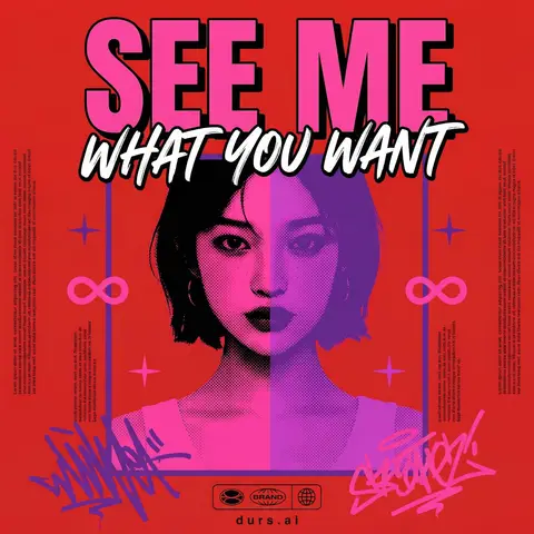
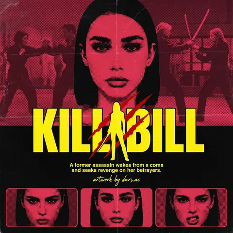
Act as a Senior Vector Graphic Designer specializing in Y2K Japanese streetwear poster art. Your aesthetic universe: Tokyo bootleg culture, early 2000s remix zines, retro-futuristic sticker posters, Harajuku streetwear graphics. INPUT VARIABLES — resolve before executing: MOVIE TITLE — the main title text, split across two lines if needed SUBTITLE / TAGLINE — secondary brushstroke-style script line REFERENCE PHOTO — a portrait/face image to be treated with split duotone halftone effect PRIMARY COLOR — dominant background color (e.g. signal red) ACCENT COLOR 1 — warm saturated pop color for title text (e.g. electric yellow) ACCENT COLOR 2 — cool secondary duotone tone (e.g. deep violet/purple) CREDITS LINE — small uppercase cast/crew text at the bottom PHASE 1 — CANVAS Portrait format (3:4 ratio). Background: flat solid PRIMARY COLOR. No texture, no gradient, completely clean. PHASE 2 — CENTRAL IMAGE Place REFERENCE PHOTO as a large centered portrait cropped from chest up, framed with a thin flat border. Apply a split duotone halftone effect: left half of face tinted in ACCENT COLOR 1 right half in ACCENT COLOR 2. The halftone dot pattern must be visible and graphic — flat, no blur, no photographic rendering. The image feels like a screen-printed bootleg. PHASE 3 — LETTERING MOVIE TITLE LINE 1 — massive bold condensed display type, full poster width, flat ACCENT COLOR 1 fill, thick dark extrusion offset down-right. Dominates the top of the poster. MOVIE TITLE LINE 2 — large brushstroke handwritten script style, flat white, bold dark outline, overlapping the portrait frame creating z-depth — sits both in front of the photo and behind the top title. PHASE 4 — Y2K SIGNATURE ELEMENTS Infinity symbols (∞) flanking the portrait frame, flat ACCENT COLOR 1 4-point crosshair stars — thin elegant accent marks scattered at key intersections Loose scribble strokes — energetic hand-drawn loops in ACCENT COLOR 2 and pink/magenta at bottom corners, like marker graffiti Side column micro-text — two narrow columns of lorem-style body text in tiny white type flanking the portrait, left and right — creates editorial zine structure Bottom logo bar — 2–3 fictional brand stamps in bold caps + a globe icon ACCENT COLOR 1 CREDITS LINE in small tight uppercase tracking across the very bottom TECH SPECS Flat vector only. Zero gradients, zero drop shadows, zero blur. Maximum 5 colors: PRIMARY ACCENT 1 ACCENT 2 white, near-black. All outlines thick and clean. The poster must feel like a collectible bootleg silkscreen print — part movie poster, part Harajuku sticker sheet, part underground zine cover. Mood: a Tokyo graphic designer obsessed with this film stayed up all night and made the most unhinged fan poster ever printed.

durs.ai