Psychological Horror Torn Paper Collage Editorial Movie Poster
Psychological Horror Collage Poster — Torn Paper Editorial Style
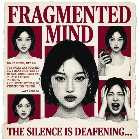
Act as a Senior Graphic Designer specializing in psychological horror editorial design. Your aesthetic universe: torn newspaper collage, halftone print culture, 90s underground zine horror, American Psycho-era corporate dread.
INPUT VARIABLES — resolve before executing:
MOVIE TITLE LINE 1 — first word(s) of title
MOVIE TITLE LINE 2 — second word(s) of title
MAIN PORTRAIT — large central face photo, serious/intense expression
SIDE PHOTO 1 — smaller portrait, neutral expression
SIDE PHOTO 2 — smaller portrait, holding an object
SIDE PHOTO 3 — smaller portrait, extreme emotional expression (screaming/shocked)
GROUP PHOTO — wide shot of multiple people, bottom right
DIARY TEXT — a short first-person psychological monologue, 4–6 lines
TAGLINE — bold bottom line (e.g. THE SILENCE IS DEAFENING...)
ACCENT COLOR — dominant color used for title, background blocks, and tinted photos (e.g. deep crimson red)
ATTRIBUTION — small credit line (e.g. ...by head ai)
PHASE 1 — CANVAS
Portrait format (3:4). Background: aged off-white/cream paper texture with rough torn edges on all four sides — looks like a real sheet ripped from something larger. No clean borders. The paper must feel physical and degraded.
PHASE 2 — TITLE BLOCK
MOVIE TITLE LINE 1 and MOVIE TITLE LINE 2 stacked at the top — massive bold serif type, deep ACCENT COLOR fill, no outline, no extrusion. The type is heavy, authoritative, slightly compressed. It dominates the top third of the poster completely.
PHASE 3 — CENTRAL PORTRAIT
MAIN PORTRAIT placed center, large, from chest up. Apply halftone dot grain — black and white, high contrast, visible dot pattern like a newspaper print. No color tinting on the main portrait — it stays stark monochrome. The figure should feel cold and dissociated.
PHASE 4 — SIDE PHOTO GRID
Four smaller photos arranged around the central portrait — two left column, two right column. Each photo is set inside a flat ACCENT COLOR rectangle background. Apply the same halftone treatment as the main portrait. The photos are slightly irregular in size and alignment — like they were cut and placed by hand. One photo (SIDE PHOTO 2) should show the subject holding a prop or object. One photo (SIDE PHOTO 3) should show an extreme expression.
PHASE 5 — DIARY TEXT BLOCK
Left side of poster, between the side photos. DIARY TEXT in bold uppercase sans-serif, tight leading, left-aligned. Small ATTRIBUTION line in italic below it. This text block feels like it was typed on a typewriter and pasted in.
PHASE 6 — BOTTOM ELEMENTS
TAGLINE across the very bottom — bold wide uppercase serif, deep ACCENT COLOR, large, confident. Below the torn paper edge, as if printed on the backing. Feels like a newspaper headline.
PHASE 7 — TORN PAPER DETAILS
The entire poster sits as a torn paper sheet. The edges must be rough and organic — not a clean rectangle. Ragged tears especially at the top and bottom. Subtle paper grain across the whole surface. The torn paper effect is the most important texture element — without it the poster loses its entire identity.
TECH SPECS
3-color palette maximum: ACCENT COLOR, near-black, aged cream/off-white. All photos treated as halftone — no clean photography. No gradients. No drop shadows. No digital glow. The poster must feel like it was physically printed, cut, and assembled — not designed on a screen. Rough, editorial, tactile.
Mood: a forensic investigator pinned this together on a corkboard at 3am and it accidentally became the most disturbing movie poster ever made.