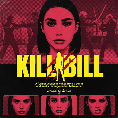
Y2K Japanese Bootleg Movie Poster Harajuku Streetwear Art
Act as a Senior Vector Graphic Designer specializing in Y2K Japanese streetwear poster art. Your aesthetic universe: Tokyo bootleg culture, early 2000s remix zines, retro-futuristic sticker posters, Harajuku streetwear graphics.
INPUT VARIABLES — resolve before executing:
MOVIE TITLE — the main title text, split across two lines if needed
SUBTITLE / TAGLINE — secondary brushstroke-style script line
REFERENCE PHOTO — a portrait/face image to be treated with split duotone halftone effect
PRIMARY COLOR — dominant background color (e.g. signal red)
ACCENT COLOR 1 — warm saturated pop color for title text (e.g. electric yellow)
ACCENT COLOR 2 — cool secondary duotone tone (e.g. deep violet/purple)
CREDITS LINE — small uppercase cast/crew text at the bottom
PHASE 1 — CANVAS
Portrait format (3:4 ratio). Background: flat solid PRIMARY COLOR. No texture, no gradient, completely clean.
PHASE 2 — CENTRAL IMAGE
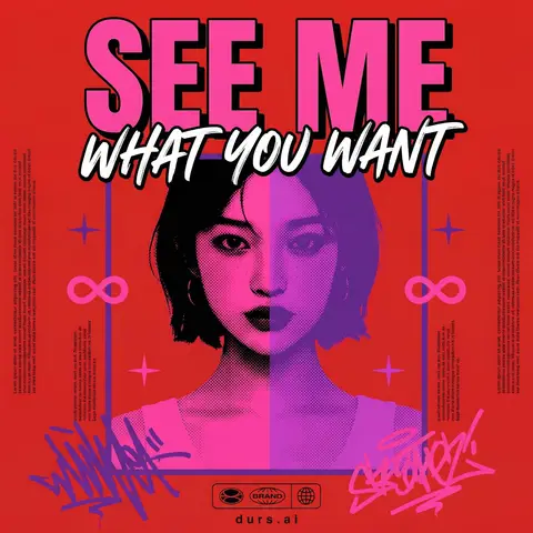
Place REFERENCE PHOTO as a large centered portrait cropped from chest up, framed with a thin flat border. Apply a split duotone halftone effect: left half of face tinted in ACCENT COLOR 1 right half in ACCENT COLOR 2. The halftone dot pattern must be visible and graphic — flat, no blur, no photographic rendering. The image feels like a screen-printed bootleg.
PHASE 3 — LETTERING
MOVIE TITLE LINE 1 — massive bold condensed display type, full poster width, flat ACCENT COLOR 1 fill, thick dark extrusion offset down-right. Dominates the top of the poster.
MOVIE TITLE LINE 2 — large brushstroke handwritten script style, flat white, bold dark outline, overlapping the portrait frame creating z-depth — sits both in front of the photo and behind the top title.
PHASE 4 — Y2K SIGNATURE ELEMENTS
Infinity symbols (∞) flanking the portrait frame, flat ACCENT COLOR 1
4-point crosshair stars — thin elegant accent marks scattered at key intersections
Loose scribble strokes — energetic hand-drawn loops in ACCENT COLOR 2 and pink/magenta at bottom corners, like marker graffiti
Side column micro-text — two narrow columns of lorem-style body text in tiny white type flanking the portrait, left and right — creates editorial zine structure
Bottom logo bar — 2–3 fictional brand stamps in bold caps + a globe icon ACCENT COLOR 1
CREDITS LINE in small tight uppercase tracking across the very bottom
TECH SPECS
Flat vector only. Zero gradients, zero drop shadows, zero blur. Maximum 5 colors: PRIMARY ACCENT 1 ACCENT 2 white, near-black. All outlines thick and clean. The poster must feel like a collectible bootleg silkscreen print — part movie poster, part Harajuku sticker sheet, part underground zine cover.
Mood: a Tokyo graphic designer obsessed with this film stayed up all night and made the most unhinged fan poster ever printed.