durs.ai
Prompt library

Prompts that work

Ready-made prompts for ads, logos, posters, 3D and more. Use one in a tap — or share your own.

+ Add a prompt
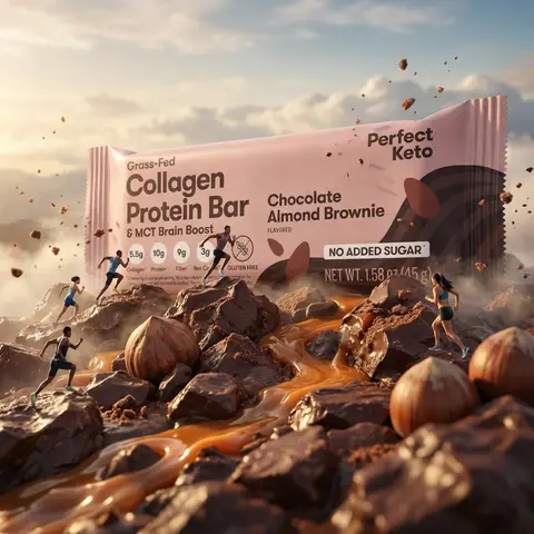
Protein Bar Giant Landscape Sports Commercial
AdvertisementPhoto

Protein Bar Giant Landscape Sports Commercial

Use the uploaded product image as the exact product reference. Create a cinematic ultra-realistic advertising scene where the protein bar becomes a gigantic landscape. The protein bar transforms into a massive energy terrain symbolizing strength, endurance, and performance. The bar appears so large that tiny athletes run across it like a sports track, creating the feeling of a Nike-style sports commercial. The scene shows the protein bar lying horizontally and appearing enormous like a mountain ridge or terrain. Its surface reveals detailed chocolate and hazelnut filling textures resembling natural rock formations. Tiny athletic runners move across the bar using it like a running track. Ingredients appear integrated into the terrain: hazelnuts resemble large boulders, caramel flows like glowing rivers, chocolate fragments appear like rocky formations, and crumbs look like small terrain debris, all blending naturally into the landscape. Some athletes are actively running along the bar while a few crumbs and small particles float in the air to create depth and energy so the environment feels alive and dynamic. Lighting is epic and cinematic like a high-end sports commercial, with warm highlights reflecting on caramel, soft atmospheric haze to emphasize scale, and subtle rim light outlining the bar. The camera uses a wide cinematic perspective with a slight low-angle shot to make the bar appear massive and powerful, with shallow depth of field keeping the center of the bar perfectly sharp. Maintain the exact shape, wrapper design, branding, colors, and proportions from @img1. The wrapper must remain clear, readable, and undistorted. Do not redesign packaging, do not add extra logos, do not include text overlays, and do not include watermarks. The output should look like ultra-realistic cinematic sports advertising and epic commercial product photography in the style of a giant product landscape, sports energy commercial, protein bar terrain concept, cinematic advertising photography, and ultra-realistic FMCG campaign.

durs.ai
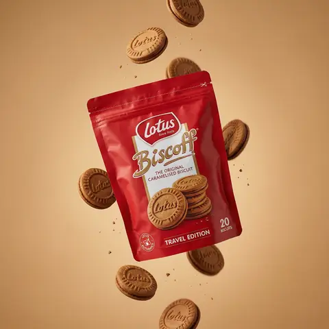
Floating Biscuit Commercial Editorial
AdvertisementPhoto

Floating Biscuit Commercial Editorial

Ultra-realistic editorial food commercial photography, Main subject project). Use the exact uploaded product image as the main subject, foating subtly in mid-air. Exact real-world packaging identical ouch shape, red color tone, logo, typography, icons, illustrations, material finish. No redesign, no recolor, no distortion, no missing text. Floating food elements (CRITICAL - BISCUITS ONLY): Multiple Lotus Biscoff sandwich biscuits floating gently around the pouch. Biscuits must be 100% IDENTICAL to the biscuits shown on the product packaging illustration: - same round biscuit shape same sandwich thickness - same embossed Lotus logo - same baked brown color and edge detail No reinterpretation, no stylized cookies, no generic biscuit shapes. Motion & physics: Biscuits appear suspended mid-air with subtle vertical separation, as if captured at peak motion. Natural gravity feel — biscuits look slightly heavy, not weightless. Minimal crumbs and tiny biscuit particles floating softly, realistic scale only. Composition: Hero pouch slightly off-center, dominant and clearly readable. Biscuits arranged in a loose vertical flow around the pouch, inspired by high-speed food photography. Clean spacing, strong depth separation, premium balance. Background: Warm studio background in soft caramel / warm beige tone. Smooth gradient, matte finish. No text, no graphics, no patterns. Lighting: Soft studio lighting with controlled highlights. Gentle rim light separating biscuits and pouch from background. Natural shadows and realistic light falloff. No dramatic glow. Material realism: Authentic flexible pouch creases and folds. Accurate Biscoff red color reproduction. Biscuits show fine baked texture, embossed logo clarity, natural crumb detail. Camera & optics: Shot on Hasselblad flagship medium-format camera. 80mm lens equivalent. f/8, ISO 64. Ultra-high dynamic range, clean color science, smooth tonal transitions. Crisp but soft editori: sharpness. Style constraints: Photorealistic. Luxury editorial food photography. Not CGI. Not cartoon. Not Al-styled. Looks like a real international FMCG campaign visual.

durs.ai
Salted Caramel Chocolate Bar Luxury
AdvertisementPhoto

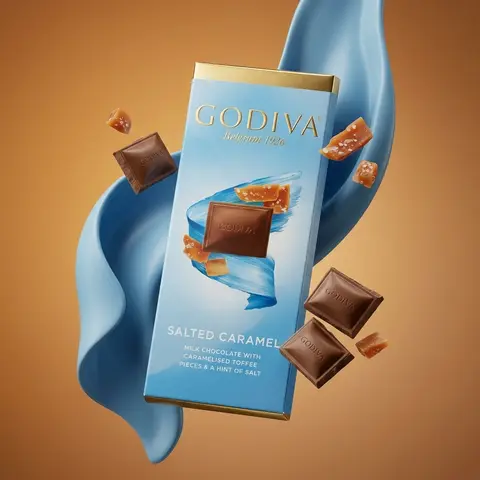
Salted Caramel Chocolate Bar Luxury

Ultra-realistic global luxury chocolate commercial photography of exact uploaded product image as the main subject. Main subject: GODIVA Signature Salted Caramel Milk Chocolate bar 90g, floating naturally in mid-air. Exact real world packaging - identical proportions, gold foil tone, blue gradient, typography, logo placement, text layout and material finish. No redesign, no distortion, no exaggeration. Composition: Single hero product, slightly angled, calm and premium floating pose, Physically believable balance f-product feels heavy, not weightless. Clear separation between foreground, subject, and background. Ingredients (controlled & realistic: A small amount only of salted toffee pieces - minimal, selective, premium. Toffee pieces mixed with milk chocolate squares (embossed GODIVA logo). Chocolate and toffee appear naturally suspended, as if captured with high-speed photography. Textures are real: soft caramel translucency, visible salt crystals, matte chocolate sheen. No clutter, no excessive particles. Abstract elements: Smooth flowing sculptural forms in GODIVA blue tones wrapping gently behind the product. Elegant motion, no distraction, no cartoon shapes. Purely supporting the hero product. Background: Warm luxury studio gradient (amber to soft brown). Clean, cinematic, high-end editorial mood. No text, no graphics, no distractions. Lighting: Luxury studio lighting with soft directional key light. Subtle rim light defining edges. Natural shadow behavior and light falloff. Zero artificial glow. Material realism: Authentic paperboard texture. Accurate gold foil reflection. Chocolate shows micro-imperfections and natural edges. Nothing glossy or plastic. Camera & optics: Shot on Hasselblad medium-format flagship camera (Hasselblad H6D / X2D level). 80mm medium-format lens equivalent. f/8, ISO 64. Extremely high dynamic range, ultra-clean micro-detail, true color science. Style constraints: Photorealistic. Luxury FMCG global campaign quality. Not CGI. Not illustration. Not Al-styled. Looks like a real international billboard or flagship visual.

durs.ai
Magnum Classic Dark Chocolate Rooftop Night Cinematic FMCG Poster
PosterPhoto

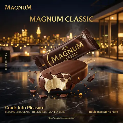
Magnum Classic Dark Chocolate Rooftop Night Cinematic FMCG Poster

Hyper-realistic professional FMCG ice cream commercial ad poster. Magnum Classic in dark chocolate brown featuring dual composition: one sealed Magnum wrapper and one bitten ice cream bar, arranged on a polished black marble surface. Background: a luxurious night-time rooftop setting overlooking a blurred city skyline with golden lights bokeh, evoking exclusivity and indulgence. Cool night air with subtle drifting mist. The sealed pack positioned slightly behind at a refined angle, gold branding catching ambient city light. The opened Magnum bar in front with a bite taken out, chocolate shell cracking dramatically revealing creamy vanilla core. The product hyper-detailed — sharp chocolate fracture edges catching warm golden highlights, molten interior texture visible, slight melting at edges, reflection visible on marble surface below. Floating micro chocolate shards suspended mid-air. Composition: bitten bar dominates foreground, packaging secondary, cinematic negative space blending into city lights. Typography: top left — Magnum logo gold. center — “MAGNUM CLASSIC”. bottom left — “Crack Into Pleasure”. below — “BELGIAN CHOCOLATE · THICK SHELL · VANILLA CORE”. bottom right — “Indulgence Starts Here”. thin separator. bottom center — “http://magnumicecream.co m left vertical — “CLASSIC · 2026”. Lighting: mixed lighting — soft city glow + warm rim light enhancing chocolate gloss, deep cinematic contrast. Mood: sensual, luxurious, late-night indulgence. Shot on ARRI Alexa Mini LF, 100mm macro, shallow DOF, HDR, ultra photorealistic, cinematic FMCG poster, 4:5 portrait.

durs.ai
Cornetto Butterscotch Golden Hour Indian Street FMCG Poster
PosterPhoto

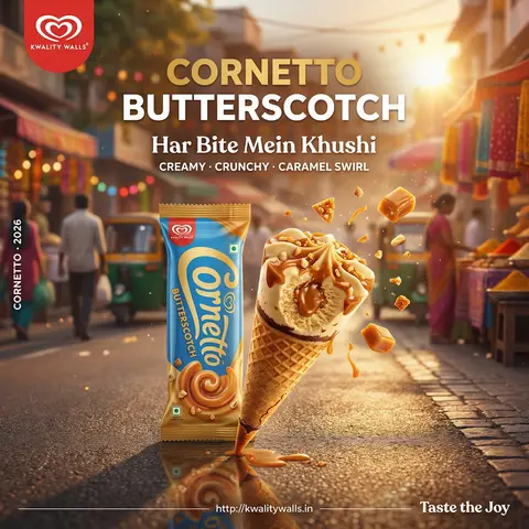
Cornetto Butterscotch Golden Hour Indian Street FMCG Poster

Hyper-realistic professional FMCG ice cream commercial ad poster. Kwality Walls Cornetto Butterscotch featuring dual composition: one sealed Cornetto pack and one open cone with a bite taken out, arranged on a slightly reflective street-side surface. Background: vibrant Indian summer street scene during golden hour, soft-focus silhouettes of people, colorful stalls, and warm festive tones. Warm sunlight haze with floating dust particles. The sealed pack positioned upright behind, branding clearly visible. The open cone in front with a bite exposing creamy caramel core and crunchy layers. The product hyper-detailed — crisp waffle cone, glossy caramel ribbons catching sunlight, slight melting edges, reflection visible below. Floating caramel bits and nut fragments mid-air. Composition: dynamic and lively, cone hero foreground, background adds cultural warmth without distraction. Typography: top left — Kwality Walls logo. center — “CORNETTO BUTTERSCOTCH”. bottom left — “Har Bite Mein Khushi”. below — “CREAMY · CRUNCHY · CARAMEL SWIRL”. bottom right — “Taste the Joy”. thin separator. bottom center — “http://kwalitywalls.in”. left vertical — “CORNETTO · 2026”. Lighting: natural golden sunlight, warm highlights, soft shadows, slight lens flare. Mood: joyful, nostalgic, everyday happiness. Shot on ARRI Alexa Mini LF, 50mm, shallow DOF, HDR, vibrant FMCG ad poster.

durs.ai
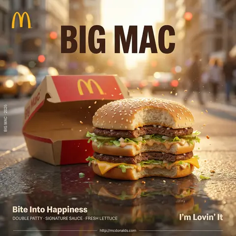
McDonald's Big Mac Golden Hour Urban Street FMCG Poster
PosterPhoto

McDonald's Big Mac Golden Hour Urban Street FMCG Poster

Hyper-realistic professional FMCG fast food commercial ad poster. McDonalds Big Mac featuring dual composition: one branded burger box packaging and one assembled burger with a bite taken out, arranged on a slightly reflective urban surface. Background: bustling city street during golden hour, blurred traffic lights and pedestrians creating warm bokeh, urban lifestyle energy. Warm sunlight haze with soft dust particles in air. The packaging positioned slightly behind, iconic red and yellow branding clearly visible. The burger in front with a bite revealing juicy layers — beef patty, lettuce, cheese, sauce dripping slightly. The product hyper-detailed — sesame bun texture, glossy melted cheese, juicy patty surface, sauce glistening under sunlight, slight grease sheen, reflection visible below. Floating sesame seeds and sauce droplets mid-air. Composition: burger dominates foreground, packaging secondary, strong negative space for typography. Typography: top left — McDonalds golden arches logo. center — “BIG MAC”. bottom left — “Bite Into Happiness”. below — “DOUBLE PATTY · SIGNATURE SAUCE · FRESH LETTUCE”. bottom right — “I’m Lovin’ It”. thin separator. bottom center — “http://mcdonalds.com”. left vertical — “BIG MAC · 2026”. Lighting: warm golden sunlight with soft highlights and realistic shadows. Mood: nostalgic, satisfying, everyday indulgence. Shot on ARRI Alexa Mini LF, 50mm lens, shallow DOF, HDR, ultra realistic fast food ad poster, 4:5 portrait

durs.ai
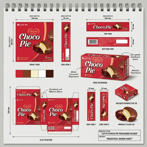
FMCG Product Packaging Technical Industrial Design Spec Sheet
PackagePhoto

FMCG Product Packaging Technical Industrial Design Spec Sheet

Act as a Senior Industrial/Packaging Designer specializing in technical product presentation sheets. Your aesthetic universe: professional packaging dielines, FMCG product design documentation, industrial design sketchbook layouts, technical manufacturing specs. INPUT VARIABLES — resolve before executing: BRAND NAME — company/manufacturer name (e.g. ORION) PRODUCT NAME — product name in large display type (e.g. Choco·Pie) VARIANT NAME — flavor/variant sub-label (e.g. Chocochip) PRODUCT PHOTO 1 — hero product shot, multiple units styled (for front face) PRODUCT PHOTO 2 — single product unit close-up (for oblique/detail views) PRODUCT PHOTO 3 — product cross-section or ingredient shot (e.g. sliced showing filling) INGREDIENT PHOTO — key flavor ingredient isolated (e.g. orange slice, strawberry) BOX WIDTH — e.g. 260 mm BOX HEIGHT — e.g. 280 mm BOX DEPTH — e.g. 55 mm UNIT COUNT — e.g. x12 NET WEIGHT — e.g. 360g COLOR PALETTE — 4–5 brand colors as swatches (e.g. navy, red, orange, brown, cream) PROJECT TITLE — bottom right label (e.g. ORION CHOCO-PIE PACKAGING DESIGN) PROJECT TYPE — bottom right sub-label (e.g. INDUSTRIAL DESIGN SHEET) MATERIAL NOTE 1 — e.g. Matte Laminated Paperboard MATERIAL NOTE 2 — e.g. Glossy UV Spot Varnish MATERIAL NOTE 3 — e.g. Corrugated Cardboard Insert MATERIAL NOTE 4 — e.g. Mealistic Paperboard MATERIAL NOTE 5 — e.g. Cardstock and Adhesive Seams PHASE 1 — CANVAS Portrait format (3:4). Background: light neutral grey — the color of a real sketchbook or drafting paper. At the very top: a spiral binding strip — rendered as a realistic row of metal coil rings across the full width, like a professional sketchpad. This binding is the first thing visible and establishes the entire presentation as a physical design document. PHASE 2 — BOX FACE DESIGNS Design the complete packaging artwork that will wrap all box faces. Use BRAND NAME, PRODUCT NAME, VARIANT NAME, PRODUCT PHOTO 1, INGREDIENT PHOTO, COLOR PALETTE. The box face should feel like a real retail product — bold brand hierarchy, appetite-appeal food photography, clean structured layout. This artwork is then applied consistently across all views below. PHASE 3 — ORTHOGRAPHIC VIEWS (top section) Arrange four flat technical views in a clean grid with dimension annotations: FRONT VIEW — full front face of box, largest panel, bottom left of grid. Annotated with BOX WIDTH (horizontal arrow above) and BOX HEIGHT (vertical arrow left side) SIDE VIEW 1 — narrow side panel, center of grid. Annotated with BOX DEPTH (horizontal arrow above) TOP VIEW — top face of box, top right of grid. Annotated with width and depth dimensions BOTTOM VIEW — small flat bottom face, right side. Annotated with depth dimension All dimension lines are thin black with arrow endpoints. Labels in small clean sans-serif. View titles in small uppercase below each panel. PHASE 4 — HERO 3D RENDER (center) One large photorealistic 3D perspective render of the assembled box — slightly angled, showing front face and one side face simultaneously. Soft neutral shadow beneath. This is the centerpiece of the sheet — larger than any single orthographic view. Material callout arrows pointing to specific areas with MATERIAL NOTE 1, MATERIAL NOTE 2, MATERIAL NOTE 3, MATERIAL NOTE 4 labels in small handwritten-style or clean serif annotation type. PHASE 5 — ADDITIONAL VIEWS (mid section) Arranged around the hero render: SIDE VIEW 1 — tall narrow vertical panel, left side, with 20mm depth annotation SIDE VIEW 2 — same narrow panel, right side OBLIQUE PERSPECTIVE — small 3/4 angle render of box, bottom right, labeled OBLIQUE PERSPECTIVE PRODUCT CLOSE-UP — PRODUCT PHOTO 2 and PRODUCT PHOTO 3 showing product detail below oblique view PHASE 6 — COLOR PALETTE SWATCHES Two rows of color swatches — one row after the orthographic views section, one row after the dieline section. Each swatch is a filled circle, colors taken from COLOR PALETTE. No labels needed — just the circles in a horizontal row. PHASE 7 — DIELINE / FLAT POSITION Bottom left quadrant: the complete box dieline — all faces unfolded flat showing the full packaging layout. Dashed fold lines, solid cut lines. All faces labeled with the full packaging artwork applied. Dimension annotations: BOX HEIGHT vertical arrow on left side, bottom width measurements. Label below: FLAT POSITION in small uppercase. MATERIAL NOTE 5 callout arrow pointing to seam area. PHASE 8 — PROJECT ID BLOCK Bottom right corner: a clean rectangular project identification box with thin black border. Contains: PROJECT TITLE in bold uppercase PROJECT: label followed by PROJECT TYPE in bold All in dark type on white or light background. Feels like a title block on an engineering drawing. TECH SPECS The entire sheet must read as a professional industrial design document — not a marketing presentation. Dimension lines must be precise and consistent. All views must be correctly proportioned relative to each other. The 3D render is the only element with shadow/lighting — everything else is flat. Font system: one clean sans-serif for all annotations and labels, one bold display font for the product name on packaging. The spiral binding at top is non-negotiable — it defines the entire sketchbook format. The sheet must feel like something a packaging engineer would hand to a print production team. Mood: a senior packaging designer at a major FMCG agency spent a full day perfecting this spec sheet — every measurement is intentional, every view tells the factory exactly what to print and fold.
durs.ai