Prompt library

Prompts that work

Ready-made prompts for ads, logos, posters, 3D and more. Use one in a tap — or share your own.

+ Add a prompt
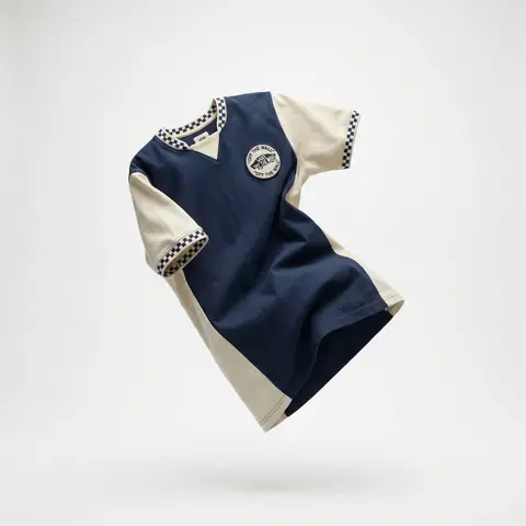
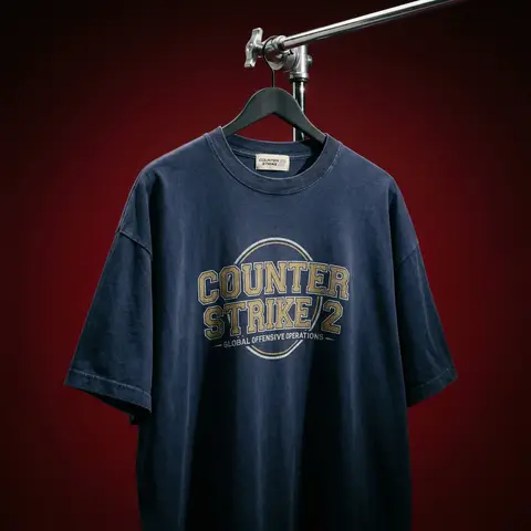
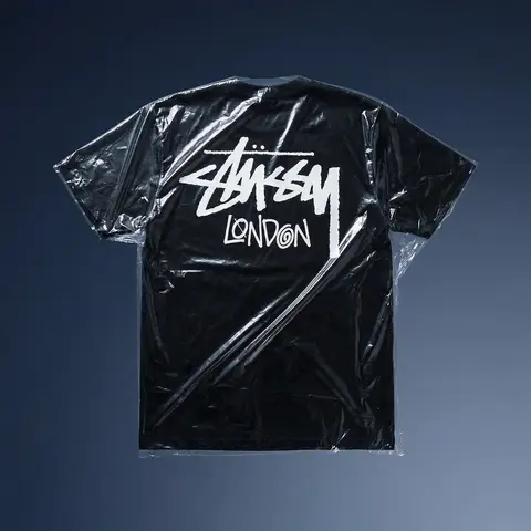
Cinematic Heavyweight T-Shirt Merch Campaign
ProductPhoto

Cinematic Heavyweight T-Shirt Merch Campaign

BRAND NAME. Act as a High-End Editorial Fashion Photographer specializing in dark, cinematic merch and streetwear product campaigns. PHASE 1: CONCEPT & OBJECT Photograph a single premium heavyweight cotton T-shirt hanging on a slim matte black clothing hanger. The hanger is suspended from an industrial chrome pipe rail with a visible mechanical clamp/hook fitting — the pipe enters the frame from the upper right corner at a diagonal angle, partially cropped by the frame. THE T-SHIRT: Oversized unisex silhouette, heavyweight garment-dyed cotton (320–380gsm equivalent). Color: autonomously determine the most iconic or culturally resonant base color associated with BRAND NAME — apply as a washed, slightly faded version (not factory-fresh, not overly distressed — editorial vintage). The shirt hangs with natural gravity drape — subtle wrinkles at the torso, slight fabric pull at the shoulders from the hanger. NOT ironed flat. NOT pinned. Pure natural hang. NECK LABEL: A small woven white label visible inside the back collar, folded slightly outward. The label reads BRAND NAME in fine serif or script typeface — small, understated, luxury. CHEST GRAPHIC: Autonomously design a chest-centered screen-print graphic that reflects BRAND NAMEs visual identity and cultural world. The graphic must follow this construction logic: - Style: Vintage varsity / retro sports circular badge OR editorial script lettering — the aesthetic that best fits BRAND NAMEs DNA - Technique: Screen-print appearance — ink sits ON the fabric, visible halftone texture at edges, slight cracking on the darkest ink areas (authentic vintage wear) - Color: 2–3 colors maximum. Autonomously determine the palette based on BRAND NAMEs iconic colors + white outline/stroke - Content: BRAND NAME wordmark or monogram rendered in the chosen style. Add one short sub-line of text (4–6 words) that captures BRAND NAMEs ethos or cultural reference - Scale: Graphic occupies ~35–40% of the shirts chest area PHASE 2: LIGHTING Single dominant key light: large softbox positioned front-left, elevated at 40 degrees above subject — Rembrandt lighting logic. This creates: - Strong illumination on the LEFT side of the shirt - The graphic/print fully lit and readable - RIGHT side falls into deep natural shadow (no fill light) - Hanger hardware catches a sharp specular highlight Color temperature: 4200K — slightly warm, tungsten-adjacent. No rim light. No background light. No lens flare. The shadow IS the aesthetic — do not fight it. Global Illumination: subtle bounce from the lit shirt face back onto the immediate background only. PHASE 3: BACKGROUND & ATMOSPHERE Seamless cyclorama backdrop: deep, saturated single-color gradient. Autonomously select the background color that creates maximum dramatic contrast with BRAND NAMEs shirt color while staying within a dark, moody palette — deep crimson, oxblood, prussian blue, forest shadow, noir charcoal. Vignette: strong radial darkening toward all four corners — center is 30% brighter than edges. No texture. No grain on BG. The background reads as infinite depth. PHASE 4: COMPOSITION & CAMERA Orientation: Portrait, 4:5 ratio. Camera angle: Slightly below eye-level, looking up 8–12 degrees — gives the garment presence and weight Framing: T-shirt occupies 70–75% of frame. Bottom hem is cropped slightly. Sleeve tips reach near frame edges. Hanger pipe enters from upper-right, cropped at frame edge. The hook/clamp mechanism is fully visible — its a design element. Rotation: Entire composition tilts 4–6 degrees counter-clockwise. Depth of Field: f/5.6 equivalent — entire shirt in sharp focus, background at soft focus threshold (not bokeh blurred — just atmospheric depth). Macro detail on fabric weave visible. TECH SPECS Render/Capture style: Photorealistic — NOT CGI render aesthetic. Must read as actual studio photography. Fabric texture: Individual cotton weave threads visible on the lit areas. Pilling micro-texture on surface. Subsurface light interaction on thick fabric ridges. Print texture: Screen-print ink layer has tactile presence — slightly raised, edge halftone dots, micro-cracking in dark fills. No AI plastic sheen on fabric. No oversaturated colors. No symmetrical composition. No ghost mannequin. No flat lay. Resolution: 4096 x 5120px. Post: Subtle film grain (ISO 800 equiv.), slight desaturation (-8), lifted blacks (cinematic), neutral-warm color grade. Style references: Undercover FW campaigns, Raf Simons archive product shots, Stüssy × Our Legacy editorials, Highsnobiety product features. NEGATIVE: No model wearing the shirt. No white background. No floating hanger (hardware must be attached to visible pipe). No CGI fabric simulation. No overly bright studio look.

durs.ai
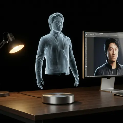
Holographic Character Projector Product Shot
ProductPhoto

Holographic Character Projector Product Shot

Ultra-realistic product photo. Subject: virtual holographic character CHARACTER, floating above a circular hologram projector Ø120 mm placed on a modern desk. Projection source rules: - If input reference is a 3D object → show a desktop 3D scanner beside the projector. Place the reference object on the scanner plate. The hologram above the projector is generated from this scanned object. - If input reference is a 2D image → show a modern PC with monitor on the desk. Display the reference image on the monitor screen. The hologram above the projector is generated from this screen content. Hologram rendering rules: - Character always appears as a semi-transparent volumetric image, background faintly visible through. - No beams, no particles, no solid statue surfaces. - Balanced anatomy (1/7–1/8 head-to-body ratio), correct proportions. - Natural pose with clear silhouette. - Hair, outfit folds, and accessories visible but translucent. - Face crisp and expressive, readable at 1000 px crop. - No copyrighted characters, no branded designs, no IP logos. Environment: modern desk with projector base + conditional device (scanner or monitor). Camera: 85–100 mm lens, 3/4 hero angle, eye-level, f/11–f/16, ISO100, tripod. Lighting: desk softly illuminated; holographic figure defined only by volumetric light. Background: seamless black studio with subtle reflections. Output: 4:5, 2048×2560. Negative: text-free, watermark-free, logo-free, brand-free, copyrighted characters, franchise IP, trademarked designs, resin, PVC, physical statue, opaque surfaces, toy gloss, beams, scanlines, dots, distortion, extra digits. Sampling: deterministic, seed=12345, temperature=0.

durs.ai
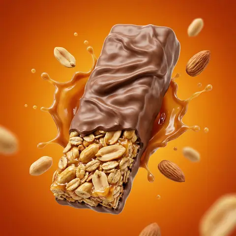
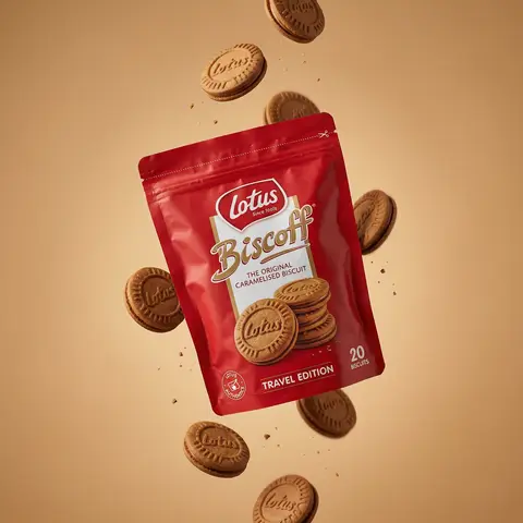
Floating Biscuit Commercial Editorial
AdvertisementPhoto

Floating Biscuit Commercial Editorial

Ultra-realistic editorial food commercial photography, Main subject project). Use the exact uploaded product image as the main subject, foating subtly in mid-air. Exact real-world packaging identical ouch shape, red color tone, logo, typography, icons, illustrations, material finish. No redesign, no recolor, no distortion, no missing text. Floating food elements (CRITICAL - BISCUITS ONLY): Multiple Lotus Biscoff sandwich biscuits floating gently around the pouch. Biscuits must be 100% IDENTICAL to the biscuits shown on the product packaging illustration: - same round biscuit shape same sandwich thickness - same embossed Lotus logo - same baked brown color and edge detail No reinterpretation, no stylized cookies, no generic biscuit shapes. Motion & physics: Biscuits appear suspended mid-air with subtle vertical separation, as if captured at peak motion. Natural gravity feel — biscuits look slightly heavy, not weightless. Minimal crumbs and tiny biscuit particles floating softly, realistic scale only. Composition: Hero pouch slightly off-center, dominant and clearly readable. Biscuits arranged in a loose vertical flow around the pouch, inspired by high-speed food photography. Clean spacing, strong depth separation, premium balance. Background: Warm studio background in soft caramel / warm beige tone. Smooth gradient, matte finish. No text, no graphics, no patterns. Lighting: Soft studio lighting with controlled highlights. Gentle rim light separating biscuits and pouch from background. Natural shadows and realistic light falloff. No dramatic glow. Material realism: Authentic flexible pouch creases and folds. Accurate Biscoff red color reproduction. Biscuits show fine baked texture, embossed logo clarity, natural crumb detail. Camera & optics: Shot on Hasselblad flagship medium-format camera. 80mm lens equivalent. f/8, ISO 64. Ultra-high dynamic range, clean color science, smooth tonal transitions. Crisp but soft editori: sharpness. Style constraints: Photorealistic. Luxury editorial food photography. Not CGI. Not cartoon. Not Al-styled. Looks like a real international FMCG campaign visual.

durs.ai
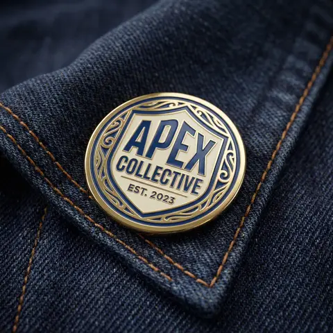
Monochromatic Shrink Wrap Logo CGI Render
LogoPhoto

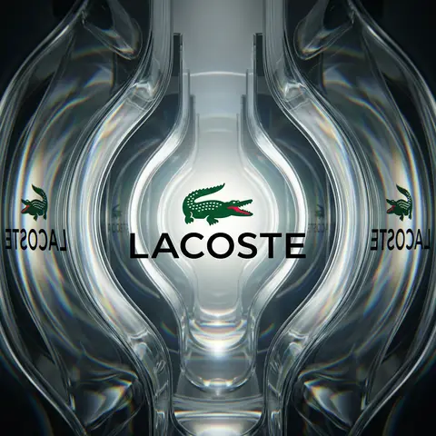
Monochromatic Shrink Wrap Logo CGI Render

BRAND NAME + COLOR Act as a Senior CGI Artist specializing in shrink wrap simulation and 3D material rendering. Your task: render BRAND NAMEs complete logo — icon mark AND wordmark if the brand uses one — completely wrapped under a single layer of tight stretched plastic film or shrink wrap. The logo forms are visible only as raised shapes beneath the material, never exposed directly. BRAND INTELLIGENCE SYSTEM Before executing, resolve: (1) LOGO GEOMETRY — identify BRAND NAMEs complete visual identity mark — this includes both the icon symbol AND the wordmark/logotype if the brand uses them together. Render both elements as they appear in the brands official lockup. If the brand uses only an icon with no wordmark, render the icon only. If the brand uses a wordmark without an icon, render the wordmark only. Preserve the correct spatial relationship between icon and text as it appears in the real logo, (2) COLOR SYSTEM — based on COLOR, determine one single monochromatic tone that covers everything in the scene without exception — the wrapped object, the background surface, the film material — pure tonal unity with variation only through light and shadow, (3) FILM CHARACTER — based on COLOR determine the stretch film behavior: bright saturated colors become tight latex or glossy shrink wrap with visible tension lines, neutrals become matte stretch film like packaging plastic, darks become semi-transparent vacuum seal film, light colors become frosted cling wrap. PHASE 1: SCENE & SURFACE The entire scene is monochromatic — one single color COLOR covers every element without exception. The background is the same film material pooling and wrinkling loosely around the central wrapped object — a continuous surface of the same material with natural stress lines, crinkles, and soft folds radiating outward from where the film is pulled tightest over the logo forms. No floor line. No walls. No horizon. Just continuous film material in every direction filling the entire frame. PHASE 2: THE WRAPPED LOGO — CRITICAL BRAND NAMEs complete logo — resolved in the brand intelligence system — exists as solid three-dimensional inflated forms. Each element of the logo — every letter, every curve of the icon, every geometric element — is volumetrically inflated like a balloon, giving each component roundness and depth. The complete logo lockup sits on the background surface and is covered by a single continuous layer of stretch plastic film pulled tightly from above. The film conforms precisely to every raised logo element — stretching tightly over the peaks of each inflated letter and icon form, creating visible tension stress lines in the film where it is pulled most taut, and releasing into loose crinkled pools of excess material in the gaps between letters, in the negative spaces of the icon, and around the outer perimeter of the logo where the film relaxes back onto the background surface. The entire logo must remain fully legible through the film — every letter readable, the icon identifiable — but no surface of the actual logo is ever directly visible or exposed. Only the film surface exists. The physical behavior of the film must be accurate: tight stretch over high points, stress lines radiating from tension peaks, loose crinkle pools in valleys, the film slightly lifting off the surface in the spaces between raised elements creating small shadow gaps underneath. PHASE 3: LIGHTING Large soft area light from upper-left — diffused and broad. The lighting reveals the films topography: raised logo elements catch more light on their peaks, valleys and gaps between forms fall into progressively deeper shadow, background crinkled film shows its own shadow landscape of stress lines and folds. For glossy or latex film COLOR: add subtle specular highlights running along the highest tension points of the film — a tight line of brighter light along the films most stretched areas. For matte film COLOR: no specular, pure diffuse light only. Global illumination on — ambient light fills shadow areas enough to retain detail in the deepest folds without flattening the overall relief. TECH SPECS The entire image is one color — COLOR — applied to every surface with variation only through light and shadow. No other colors anywhere. No exposed logo surfaces. No additional text beyond what is part of BRAND NAMEs actual logo lockup. Film simulation must be physically accurate — real stretch film behavior, real tension dynamics, real crinkle patterns. No fabric look. No cloth drape. This is plastic film — it has different tension behavior than textile: tighter, more stressed, more geometric stress lines, less organic drape. Film grain: ISO 400 equivalent. Mood: a product sealed for shipping, a reveal imminent, the form known but not yet touched.

durs.ai
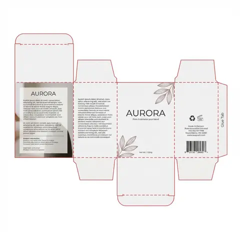
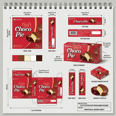
FMCG Product Packaging Technical Industrial Design Spec Sheet
PackagePhoto

FMCG Product Packaging Technical Industrial Design Spec Sheet

Act as a Senior Industrial/Packaging Designer specializing in technical product presentation sheets. Your aesthetic universe: professional packaging dielines, FMCG product design documentation, industrial design sketchbook layouts, technical manufacturing specs. INPUT VARIABLES — resolve before executing: BRAND NAME — company/manufacturer name (e.g. ORION) PRODUCT NAME — product name in large display type (e.g. Choco·Pie) VARIANT NAME — flavor/variant sub-label (e.g. Chocochip) PRODUCT PHOTO 1 — hero product shot, multiple units styled (for front face) PRODUCT PHOTO 2 — single product unit close-up (for oblique/detail views) PRODUCT PHOTO 3 — product cross-section or ingredient shot (e.g. sliced showing filling) INGREDIENT PHOTO — key flavor ingredient isolated (e.g. orange slice, strawberry) BOX WIDTH — e.g. 260 mm BOX HEIGHT — e.g. 280 mm BOX DEPTH — e.g. 55 mm UNIT COUNT — e.g. x12 NET WEIGHT — e.g. 360g COLOR PALETTE — 4–5 brand colors as swatches (e.g. navy, red, orange, brown, cream) PROJECT TITLE — bottom right label (e.g. ORION CHOCO-PIE PACKAGING DESIGN) PROJECT TYPE — bottom right sub-label (e.g. INDUSTRIAL DESIGN SHEET) MATERIAL NOTE 1 — e.g. Matte Laminated Paperboard MATERIAL NOTE 2 — e.g. Glossy UV Spot Varnish MATERIAL NOTE 3 — e.g. Corrugated Cardboard Insert MATERIAL NOTE 4 — e.g. Mealistic Paperboard MATERIAL NOTE 5 — e.g. Cardstock and Adhesive Seams PHASE 1 — CANVAS Portrait format (3:4). Background: light neutral grey — the color of a real sketchbook or drafting paper. At the very top: a spiral binding strip — rendered as a realistic row of metal coil rings across the full width, like a professional sketchpad. This binding is the first thing visible and establishes the entire presentation as a physical design document. PHASE 2 — BOX FACE DESIGNS Design the complete packaging artwork that will wrap all box faces. Use BRAND NAME, PRODUCT NAME, VARIANT NAME, PRODUCT PHOTO 1, INGREDIENT PHOTO, COLOR PALETTE. The box face should feel like a real retail product — bold brand hierarchy, appetite-appeal food photography, clean structured layout. This artwork is then applied consistently across all views below. PHASE 3 — ORTHOGRAPHIC VIEWS (top section) Arrange four flat technical views in a clean grid with dimension annotations: FRONT VIEW — full front face of box, largest panel, bottom left of grid. Annotated with BOX WIDTH (horizontal arrow above) and BOX HEIGHT (vertical arrow left side) SIDE VIEW 1 — narrow side panel, center of grid. Annotated with BOX DEPTH (horizontal arrow above) TOP VIEW — top face of box, top right of grid. Annotated with width and depth dimensions BOTTOM VIEW — small flat bottom face, right side. Annotated with depth dimension All dimension lines are thin black with arrow endpoints. Labels in small clean sans-serif. View titles in small uppercase below each panel. PHASE 4 — HERO 3D RENDER (center) One large photorealistic 3D perspective render of the assembled box — slightly angled, showing front face and one side face simultaneously. Soft neutral shadow beneath. This is the centerpiece of the sheet — larger than any single orthographic view. Material callout arrows pointing to specific areas with MATERIAL NOTE 1, MATERIAL NOTE 2, MATERIAL NOTE 3, MATERIAL NOTE 4 labels in small handwritten-style or clean serif annotation type. PHASE 5 — ADDITIONAL VIEWS (mid section) Arranged around the hero render: SIDE VIEW 1 — tall narrow vertical panel, left side, with 20mm depth annotation SIDE VIEW 2 — same narrow panel, right side OBLIQUE PERSPECTIVE — small 3/4 angle render of box, bottom right, labeled OBLIQUE PERSPECTIVE PRODUCT CLOSE-UP — PRODUCT PHOTO 2 and PRODUCT PHOTO 3 showing product detail below oblique view PHASE 6 — COLOR PALETTE SWATCHES Two rows of color swatches — one row after the orthographic views section, one row after the dieline section. Each swatch is a filled circle, colors taken from COLOR PALETTE. No labels needed — just the circles in a horizontal row. PHASE 7 — DIELINE / FLAT POSITION Bottom left quadrant: the complete box dieline — all faces unfolded flat showing the full packaging layout. Dashed fold lines, solid cut lines. All faces labeled with the full packaging artwork applied. Dimension annotations: BOX HEIGHT vertical arrow on left side, bottom width measurements. Label below: FLAT POSITION in small uppercase. MATERIAL NOTE 5 callout arrow pointing to seam area. PHASE 8 — PROJECT ID BLOCK Bottom right corner: a clean rectangular project identification box with thin black border. Contains: PROJECT TITLE in bold uppercase PROJECT: label followed by PROJECT TYPE in bold All in dark type on white or light background. Feels like a title block on an engineering drawing. TECH SPECS The entire sheet must read as a professional industrial design document — not a marketing presentation. Dimension lines must be precise and consistent. All views must be correctly proportioned relative to each other. The 3D render is the only element with shadow/lighting — everything else is flat. Font system: one clean sans-serif for all annotations and labels, one bold display font for the product name on packaging. The spiral binding at top is non-negotiable — it defines the entire sketchbook format. The sheet must feel like something a packaging engineer would hand to a print production team. Mood: a senior packaging designer at a major FMCG agency spent a full day perfecting this spec sheet — every measurement is intentional, every view tells the factory exactly what to print and fold.
durs.ai