durs.ai
Prompt library

Prompts that work

Ready-made prompts for ads, logos, posters, 3D and more. Use one in a tap — or share your own.

+ Add a prompt
Brand Futuristic object
3DPhoto

Brand Futuristic object

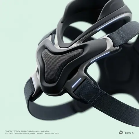
BRAND NAME or LOGO IMAGE: A high-end, glossy concept art magazine editorial photograph of a unique, unexpected functional object conceptualized and designed by the brand. 1. The Concept & Object (AI Invention): Based on the design philosophy, heritage, and material vocabulary of the specified brand, the AI must invent a novel utility product (NOT standard clothing, shoes, or bags). Examples could be home goods, tech accessories, tools, or sporting equipment, reinterpretated through the brands lens. The object should feel sculptural yet functional. 2. Materials & Details (Hyper-Premium): The object is constructed from ultra-premium, highly tactile materials characteristic of the brand (e.g., patinated exotic leathers, brushed aerospace-grade titanium, sculpted matte ceramics, molded carbon fiber, or technical high-fashion textiles). Every detail is hyper-realistic: visible stitching, microscopic material grain, precision engravings, and complex texture contrasts. 3. Photography & Lighting (Cinematic Studio): Shot on a medium format Phase One camera with a 100mm macro lens. Extremely shallow depth of field, with sharp focus on the hero details of the object and a creamy, smooth bokeh background. The lighting is sophisticated studio softbox lighting: gentle, enveloping fill light with precise rim lighting to accentuate contours and material textures. 4. Environment: A seamless, impeccably clean studio cyclorama background in a pure, ultra-light pastel tone (e.g., desaturated mint, pale blush, or off-white), free of shadows. 5. Layout & UI Elements (Strict Placement): - Bottom Right Corner: A small, understated, monochrome gray logo of the brand. - Bottom Left Corner: Small, minimalist monochrome gray text describing the invented product. The font style looks like Manrope Regular with very tight tracking (kerning) and balanced line spacing. Example format: CONCEPT STUDY: AI inserts invented product name. MATERIAL: AI inserts main materials. SS25.

durs.ai
Futuristic wellness elixir
ProductPhoto

Futuristic wellness elixir

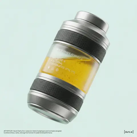
BRAND NAME or LOGO IMAGE is launching a new functional wellness elixir (e.g., adaptogenic, nootropic, or natural energy drink). As the Creative Director, devise a product name and visualize a complete high-end promotional shot. The aesthetic is Cosmic Premium—technological, clean, and sophisticated, like top-tier Apple product photography. THE PRODUCT: Design a sculptural, multi-layered beverage bottle suspended in the center. The form is engineered and futuristic. The materials are hyper-tactile: bead-blasted titanium details, frosted borosilicate glass, and textured haptic polymer grips. Crucial Color Instruction: The liquid inside must have a distinct, natural color relevant to its invented function (e.g., vibrant turmeric yellow, deep berry red, earthy matcha green, or pale calming blue). The liquid should look real with subtle natural sediment. Crucial Graphic Detail: On the clear glass section of the bottle, apply a layer of subtle, minimalist, technical typography printed in matte white ink. This design should feel utilitarian and futuristic (e.g., small technical specs like SPACE GRADE FORMULA, BATCH: OZ-9, volume indicators, or coordinate markings), adding a functional aesthetic similar to aerospace labeling, without overwhelming the bottles clean lines. THE ENVIRONMENT & LIGHTING: The bottle is in a seamless studio. Crucial Background Instruction: The background must be a solid, clean, very light pastel tone that is specifically chosen to complement the liquid color (e.g., a soft cool mint background for a warm orange liquid, or a pale blush background for a deep green liquid). No gradients. Ultra-soft, diffused studio lighting creates sleek highlights on metal and deep subsurface scattering in the glass and liquid. PHOTOGRAPHY STYLE: High-resolution 100mm macro lens shot. Shallow depth of field, sharp focus on bottle textures and the printed graphics on the glass, smooth pastel background bokeh. 8k resolve, hyper-realistic textures. GRAPHIC OVERLAYS: Include subtle dark gray UI elements. Bottom Left Corner: Very small, minimalist text (like Manrope Regular font) describing the products name and function in two sentences. Bottom Right Corner: A small, minimalist dark gray logomark for BRAND NAME.

durs.ai
Brand everyday object style
ProductPhoto

Brand everyday object style

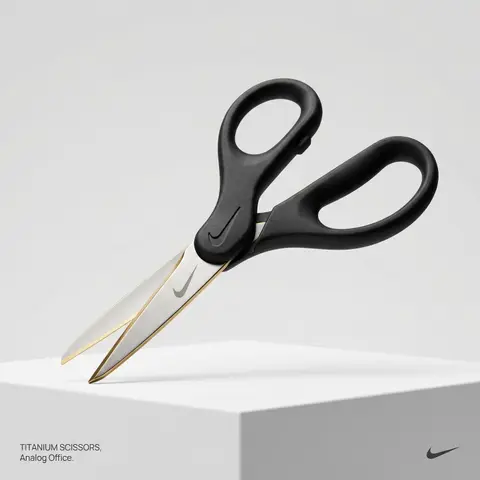
BRAND NAME or LOGO IMAGE. Act as a creative director curating a wide-ranging, eclectic collection of recontextualized everyday objects. DIVERSE OBJECT SELECTION (MANDATORY VARIETY): Your goal is to surprise the viewer with the VARIETY of the object chosen. Randomly select ONE object from these distinct categories to ensure diversity: Analog Office & Desk: Sport & Leisure: Barware & Kitchen: Utility & Tools: Grooming: Travel: THE CONCEPT: Take the chosen mundane object and elevate it into a luxury artifact using BRAND NAME s signature materials and colors. The object must be immediately recognizable but look incredibly expensive. MATERIALS & FINISH: Use materials that contrast with the objects usual cheap nature. Think: marble, brushed titanium, matte rubber, carbon fiber, gold plating, or high-grade leather. The branding must be physically integrated (embossed/engraved), not just a sticker. PRESENTATION (NO BOXES): The object should stand alone on the pedestal or table, fully exposed. If it has parts (like a ping pong set), arrange them neatly (knolling). Avoid closed boxes that hide the shape. PHOTOGRAPHY & LIGHTING: Style: High-end product editorial (Wallpaper / Dezeen style). Lighting: Soft, studio high-key lighting. No harsh shadows. Background: Clean, seamless light grey or white cyclorama. GRAPHIC OVERLAYS (UI): Bottom Left: A small, minimalist 2-line text block describing the object. Font: Manrope Regular. Color: #414141. Bottom Right: A small, discreet, monochrome logomark of BRAND NAME . Color: #414141. Do NOT visualize “Font name” and “Color code”.

durs.ai
Duotone Character Face Icon
PosterPhoto

Duotone Character Face Icon

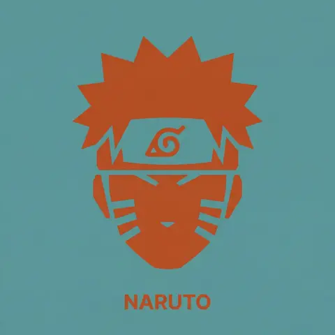
A single, isolated, strict duotone flat vector icon representing the face of CHARACTER NAME or IMAGE. CONTENT SCOPE (FACE ONLY): The design must represent ONLY the head, face, or helmet of CHARACTER . Absolutely NO shoulders, torso, weapons, or accessories. DYNAMIC DUOTONE COLOR PALETTE (MATERIAL DESIGN): The entire image must use strictly ONLY TWO solid, flat colors chosen by the AI based on the characters lore, allegiance, or iconic appearance. 1. Background Theme Color: A moderate, pleasing solid flat color covering the entire canvas. 2. Foreground Theme Color: A second solid flat color used for the icon shape and the text, chosen to contrast well with the background. Aesthetic Constraint: The colors must be chosen from a Google Material Design aesthetic—moderate hues, matte finish, pleasing to the eye, avoiding overly harsh saturation or neon tones. No gradients, shadows, or outlines. STYLE & TECHNIQUE (BRUTAL MINIMALISM): The style is brutal geometric minimalism with high abstraction. Reduce facial features to their most basic, blocky, angular shapes. Use large, solid masses of the Foreground Theme Color to define the form. Internal details (eyes, mouth, key features) must be formed solely by bold, blocky cuts of the Background Theme Color negative space into the foreground silhouette. The icon must be a free-floating silhouette with NO enclosing circle, border, or container shape. BACKGROUND: The background is filled entirely with the solid, flat Background Theme Color. TYPOGRAPHY (CRITICAL CONSTRAINTS): Directly below the floating icon, placed centrally, is the name CHARACTER . 1. FONT FAMILY (STRICT): The text MUST be rendered in the style of the font Inter Bold. Do NOT use any other font. 2. CASE & COLOR: Title case only. The text color must exactly match the solid Foreground Theme Color. 3. SIZE & SCALE (STRICT): The text must be very small. The total width of the entire text string must NOT exceed 25% of the total image width. 4. KERNING: Maintain very tight negative kerning (approx -8%).

durs.ai
Luxury Ceramic Beverage Bottle
AdvertisementPhoto

Luxury Ceramic Beverage Bottle

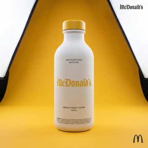
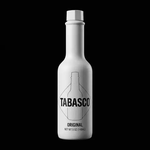
BRAND NAME or LOGO IMAGE. Act as a world-class product photographer creating an ultra-high-end editorial shot of a luxury beverage bottle. COMPOSITION (FULL VIEW): A full-body studio photograph showing the entire bottle from base to cap, centered in the frame. The bottle stands on a seamless surface. THE VESSEL & COLORS (MATERIALITY): Bottle Body: Premium, opaque matte white ceramic with a fine, powdery texture. Bottle Cap: A premium matte or satin-finish cap colored exactly in BRAND NAMEs primary brand color. LIGHTING & BACKGROUND (COLORED STUDIO): The background is a seamless, smooth studio cyclorama flooded with BRAND NAME s primary brand color, creating a rich, immersive color environment. Lighting: Sophisticated, high-end white studio lighting (large softboxes). The light must be soft and wrapping, creating elegant highlights along the ceramic edges to define form. CENTRAL BRANDING (ULTRA-PRECISION MICRO-EMBOSSING): The main Gothic/Blackletter BRAND NAME text is centered on the bottle. CRITICAL TEXTURE FIX: The text is rendered with ultra-subtle, shallow precision micro-embossing (maximum 0.2mm to 0.3mm depth). It must NOT look like applied clay or a heavy badge. It should look like a crisp, shallow tooling mark integrated perfectly into the ceramic surface, defined only by very subtle light catching the edges. Color: The embossed text itself is colored in BRAND NAME s primary brand color, perhaps with a slight semi-gloss finish to contrast subtly with the matte white bottle. TYPOGRAPHIC HIERARCHY (AUXILIARY DETAILS): All auxiliary text is printed cleanly in a neutral dark grey/black (monochrome) to sit quietly on the white surface: Top Micro-Blocks: Two very small lines above main text (e.g., LIMITED EDITION // BATCH 001). Flavor Name: Below main text, a beautiful, smaller, unobtrusive font for the flavor. Volume/Specs: Further down, technical info (e.g., 500ML). Ingredients Block: At the very bottom edge, a dense micro-print block. CORNER ELEMENTS: Top Right: Small, discrete monochrome Gothic brand name. Bottom Right: Small monochrome original brand logo.

durs.ai
Retro Americana Fat Script Lettering
LogoPhoto

Retro Americana Fat Script Lettering

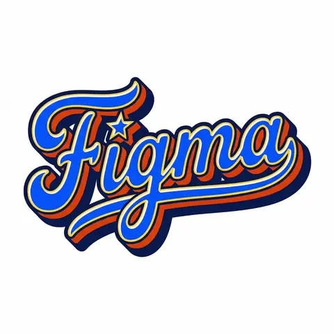
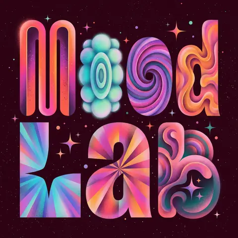
A bold, vibrant, retro-American vector lettering design displaying the name BRAND NAME or TEXT. TYPOGRAPHY STYLE (FAT SCRIPT): The text is rendered in a thick, chunky, hand-lettered baseball script or bubble style, reminiscent of 1950s-1970s American sports logos and automotive decals. Form: The letters are heavy, rounded, and tightly connected (ligatures). Perspective: The text line should be slightly slanted upwards or arched to create dynamic energy. Effects: Apply a thick, bold outline around the text. Crucially, add a deep, solid block shadow (extrusion) behind the letters to create a heavy 3D pop-out effect, characteristic of vintage sticker art. COLOR PALETTE (BRAND VINTAGE): Use a bright, saturated, and flat color palette inspired by BRAND NAMEs identity but filtered through a retro pop-art lens. Fill: Solid, punchy colors (no gradients). Contrast: High contrast between the letter fill, the outline (usually white or cream), and the block shadow (usually a darker shade or contrasting color). DECORATIVE ELEMENTS: Keep it clean and vector-like. You may include subtle, classic Americana design elements integrated into the text flow, such as a swoosh underline, a simple star, or a very simplified icon relevant to the brand (e.g., a lightning bolt for energy, a leaf for eco). Do NOT over-detail; keep it looking like a printed logo. BACKGROUND: Isolated on a clean, pure white background. No paper textures, no noise, no dirt.

durs.ai
Futuristic Instagram Profile UI Mockup
AdvertisementPhoto

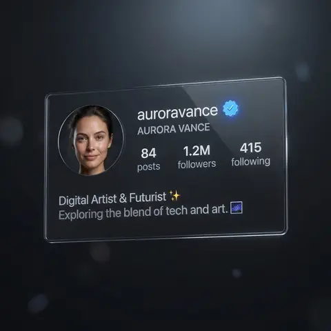
Futuristic Instagram Profile UI Mockup

REFERENCE IMAGE. Ultra high-resolution photorealistic futuristic Instagram profile interface for a verified creator account, dark mode Ul, premium tech aesthetic. Main focus: a floating transparent glass Ul panel displaying a modern Instagram profile layout, inspired by iOS design language, clean and minimal. Profile name text: NOME DO PERFIL, verified badge visible next to the username USERNAME DO PERFIL. Circular profile picture on the left: DESCRIÇÃO DO ROSTO / PESSOA, realistic skin texture, natural expression EXPRESSAO FACIAL), studio portrait lighting with soft shadow falloff, sharp facial details, correct anatomy. Typography: clean sans-serifUl font, white and soft gray text, perfectly aligned, readable, no distortion. Stats section: NÚMERO DE POSTS posts, INÚMERO DE SEGUIDORES seguidores INÚMERO SEGUINDO seguindo, displayed in a balanced horizontal grid. Bio section text: BIO DO PERFIL - PROFISSÃO / DESCRIÇÃO, optional emojis EMOJIS OPCIONAIS, engraved as subtle luminous text. Material: semi-transparent glass Ul panel with polished acrylic finish, soft internal reflections, realistic light refraction, thin glowing edges. Lighting: soft ambient top light, subtle rim light outlining the interface, controlled reflections, no blown highlights. Background: deep black to dark graphite gradient, cinematic low-key mood, shallow depth of field, strong subject separation. Camera: full-frame DSLR look, 50mm lens, f/2.0, ISO 100, ultra-sharp focus on Ul panel, minimal background bokeh. Style: ultra high-res, correct anatomy, professional lighting, clean branding mockup, futuristic social media identity, no extra text, no watermark, no Ul glitches.
durs.ai
Brand Logo Mashup Visual Parody Design
LogoPhoto

Brand Logo Mashup Visual Parody Design

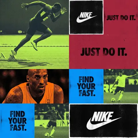
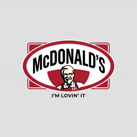
BRAND A + BRAND B. Act as a Brand Identity Designer specializing in Logo Mashups and Visual Parody. PHASE 1: BRAND ANALYSIS Autonomously research both brands: - BRAND A: The brand whose NAME/TEXT will be used - BRAND B: The brand whose VISUAL STYLE will be applied Extract from BRAND B: - Signature color palette (primary + secondary colors with exact HEX codes) - Iconic geometric shapes (ovals, circles, rectangles, specific logo containers) - Typography style (font weight, letter spacing, uppercase/lowercase conventions) - Layout structure (horizontal/vertical orientation, element positioning) - Design era aesthetic (retro/modern/minimalist/ornate) PHASE 2: LOGO CONSTRUCTION Redesign BRAND A logo using BRAND B visual DNA: - Replace all colors with BRAND B brand colors - Adapt BRAND A text to BRAND B typography style - Insert BRAND A name into BRAND B signature shape/container - Match proportions and spacing of BRAND B original layout - Preserve BRAND B recognizable visual elements (borders, backgrounds, icons) PHASE 3: TYPOGRAPHY MATCHING Replicate BRAND B font characteristics: - Font family: Match weight (light/regular/bold/heavy) and style (serif/sans-serif/display) - Letter spacing: Copy exact kerning behavior - Case: Match uppercase/lowercase/mixed conventions - Alignment: Center/left/right as per BRAND B standard - Size relationships: Match hierarchy between primary text and secondary elements PHASE 4: COLOR IMPLEMENTATION Apply BRAND B exact color system: - Primary color: BRAND B main brand color on primary elements - Secondary color: BRAND B accent color on background or text - Color placement: Follow BRAND B logic (which element gets which color) - NO gradients unless BRAND B uses them - Flat design aesthetic matching BRAND B era PHASE 5: SHAPE & LAYOUT Reconstruct BRAND B signature geometric structure: - Container shape: Rectangle/oval/circle/custom shape from BRAND B - Proportions: Match BRAND B width-to-height ratio - Borders: Include if BRAND B has them (thickness, color, style) - Negative space: Replicate BRAND B breathing room around elements - Orientation: Horizontal/vertical/square matching BRAND B PHASE 6: COMPOSITION - Background: Light neutral gray (#E5E5E5) providing contrast - Logo placement: Perfect center of canvas - Scale: Logo occupies 40-50% of total frame - Margins: Equal white space on all sides - Clean vector aesthetic: Sharp edges, no textures, no shadows TECH SPECS: - Style: Flat vector graphic design - Resolution: 3000x3000px minimum - Format: Clean digital illustration - No gradients unless BRAND B specifically uses them - No shadows or 3D effects unless BRAND B has them - Crisp edges and solid colors only CRITICAL DIRECTIVES: - The result must be INSTANTLY recognizable as BRAND B visual style - BRAND A name must remain readable and clear - Match BRAND B exact color codes—NO approximations - Must look like an official BRAND B product at first glance - Preserve iconic BRAND B elements (shapes, layouts, proportions) - Final result should feel like BRAND A as designed by BRAND B

durs.ai