durs.ai
Prompt library

Prompts that work

Ready-made prompts for ads, logos, posters, 3D and more. Use one in a tap — or share your own.

+ Add a prompt
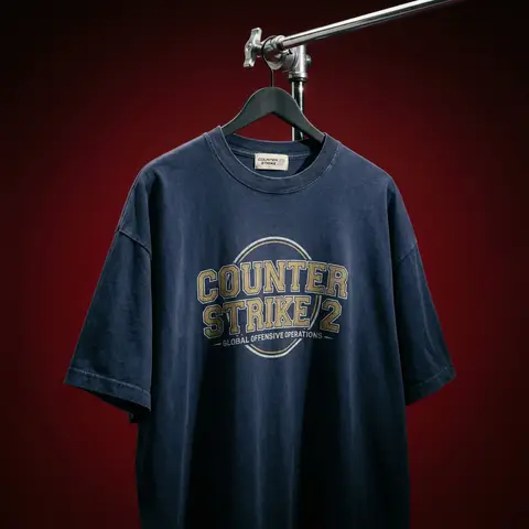
Cinematic Heavyweight T-Shirt Merch Campaign
ProductPhoto

Cinematic Heavyweight T-Shirt Merch Campaign

BRAND NAME. Act as a High-End Editorial Fashion Photographer specializing in dark, cinematic merch and streetwear product campaigns. PHASE 1: CONCEPT & OBJECT Photograph a single premium heavyweight cotton T-shirt hanging on a slim matte black clothing hanger. The hanger is suspended from an industrial chrome pipe rail with a visible mechanical clamp/hook fitting — the pipe enters the frame from the upper right corner at a diagonal angle, partially cropped by the frame. THE T-SHIRT: Oversized unisex silhouette, heavyweight garment-dyed cotton (320–380gsm equivalent). Color: autonomously determine the most iconic or culturally resonant base color associated with BRAND NAME — apply as a washed, slightly faded version (not factory-fresh, not overly distressed — editorial vintage). The shirt hangs with natural gravity drape — subtle wrinkles at the torso, slight fabric pull at the shoulders from the hanger. NOT ironed flat. NOT pinned. Pure natural hang. NECK LABEL: A small woven white label visible inside the back collar, folded slightly outward. The label reads BRAND NAME in fine serif or script typeface — small, understated, luxury. CHEST GRAPHIC: Autonomously design a chest-centered screen-print graphic that reflects BRAND NAMEs visual identity and cultural world. The graphic must follow this construction logic: - Style: Vintage varsity / retro sports circular badge OR editorial script lettering — the aesthetic that best fits BRAND NAMEs DNA - Technique: Screen-print appearance — ink sits ON the fabric, visible halftone texture at edges, slight cracking on the darkest ink areas (authentic vintage wear) - Color: 2–3 colors maximum. Autonomously determine the palette based on BRAND NAMEs iconic colors + white outline/stroke - Content: BRAND NAME wordmark or monogram rendered in the chosen style. Add one short sub-line of text (4–6 words) that captures BRAND NAMEs ethos or cultural reference - Scale: Graphic occupies ~35–40% of the shirts chest area PHASE 2: LIGHTING Single dominant key light: large softbox positioned front-left, elevated at 40 degrees above subject — Rembrandt lighting logic. This creates: - Strong illumination on the LEFT side of the shirt - The graphic/print fully lit and readable - RIGHT side falls into deep natural shadow (no fill light) - Hanger hardware catches a sharp specular highlight Color temperature: 4200K — slightly warm, tungsten-adjacent. No rim light. No background light. No lens flare. The shadow IS the aesthetic — do not fight it. Global Illumination: subtle bounce from the lit shirt face back onto the immediate background only. PHASE 3: BACKGROUND & ATMOSPHERE Seamless cyclorama backdrop: deep, saturated single-color gradient. Autonomously select the background color that creates maximum dramatic contrast with BRAND NAMEs shirt color while staying within a dark, moody palette — deep crimson, oxblood, prussian blue, forest shadow, noir charcoal. Vignette: strong radial darkening toward all four corners — center is 30% brighter than edges. No texture. No grain on BG. The background reads as infinite depth. PHASE 4: COMPOSITION & CAMERA Orientation: Portrait, 4:5 ratio. Camera angle: Slightly below eye-level, looking up 8–12 degrees — gives the garment presence and weight Framing: T-shirt occupies 70–75% of frame. Bottom hem is cropped slightly. Sleeve tips reach near frame edges. Hanger pipe enters from upper-right, cropped at frame edge. The hook/clamp mechanism is fully visible — its a design element. Rotation: Entire composition tilts 4–6 degrees counter-clockwise. Depth of Field: f/5.6 equivalent — entire shirt in sharp focus, background at soft focus threshold (not bokeh blurred — just atmospheric depth). Macro detail on fabric weave visible. TECH SPECS Render/Capture style: Photorealistic — NOT CGI render aesthetic. Must read as actual studio photography. Fabric texture: Individual cotton weave threads visible on the lit areas. Pilling micro-texture on surface. Subsurface light interaction on thick fabric ridges. Print texture: Screen-print ink layer has tactile presence — slightly raised, edge halftone dots, micro-cracking in dark fills. No AI plastic sheen on fabric. No oversaturated colors. No symmetrical composition. No ghost mannequin. No flat lay. Resolution: 4096 x 5120px. Post: Subtle film grain (ISO 800 equiv.), slight desaturation (-8), lifted blacks (cinematic), neutral-warm color grade. Style references: Undercover FW campaigns, Raf Simons archive product shots, Stüssy × Our Legacy editorials, Highsnobiety product features. NEGATIVE: No model wearing the shirt. No white background. No floating hanger (hardware must be attached to visible pipe). No CGI fabric simulation. No overly bright studio look.

durs.ai
Country Infographic Editorial Poster
PosterPhoto

Country Infographic Editorial Poster

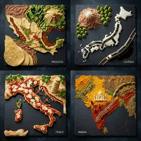
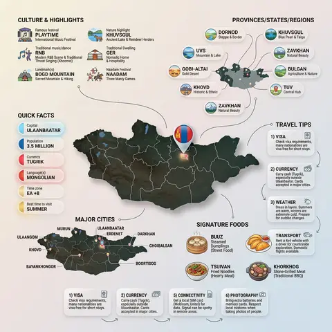
Ultra-clean modern country infographic poster (1080x1080), premium editorial layout meets lifestyle travel photography. Showcase Country as the hero visual in the center: a slightly angled 3D map cutout / glossy paper-cut map silhouette with subtle shadow, with a small flag pin marker on the capital city. Add a soft natural studio lighting feel, gentle gradient + minimal texture background for an upscale magazine look. Around the hero map, arrange information like a recipe infographic—dynamic, floating panels and clusters, not restricted to top-down. Clear hierarchy: hero map > key stats badges > cities/provinces > culture/foods > tips. SECTION 1 — Quick Facts (clean glassmorphism badges near the hero): - Capital: CAPITAL - Population: POPULATION - Currency: CURRENCY - Language(s): LANGUAGES - Time zone: TIMEZONE - Best time to visit: BEST SEASON Display as modern rounded pills/bubbles with accent color highlights. SECTION 2 — Provinces/States/Regions (ingredients-style clusters): List NUMBER provinces/regions with mini icons/mini map segments or simple pictograms. Example: PROVINCE 1, PROVINCE 2, PROVINCE 3... Each item includes a small icon (mountains, river, desert, forest, coastline) and one short label (e.g., “coastal”, “historic”, “wine region”). Arrange in curved flows connected with thin lines to the map. SECTION 3 — Major Cities (connected pin points): Show 5–8 key cities with small pin markers on/near the map and clean labels: City 1, City 2, City 3... Use lines/arrows from labels to map pins, avoiding clutter. SECTION 4 — Signature Foods (recipe vibe): Show 4–6 famous foods of COUNTRY with small tasty mini illustrations or photo-style cutouts: Food 1, Food 2, Food 3... Add short descriptors (spicy, street food, dessert, grilled). Keep vibrant natural food colors. SECTION 5 — Culture & Highlights (editorial callouts): Include icons and 1-line notes for: - Famous festival: FESTIVAL - Traditional music/dance: CULTURE - Landmark(s): LANDMARKS - Nature highlight: NATURE Use clean vector icons and minimal text. SECTION 6 — Travel Tips (step-like numbered panels): Show 4–6 numbered “tips” panels arranged around the hero map with arrows showing flow: 1) Tip 1 2) Tip 2 3) Tip 3 Add small icons (plane, train, hotel, safety, budget, camera, SIM card). Use glassmorphism panels with soft gradients and subtle drop shadows. Typography & Style: Modern sans-serif typography, high readability, strong grid alignment, airy negative space, subtle shadows, crisp vector icons, accent color palette inspired by COUNTRY flag (tasteful, not overwhelming). Editorial, premium, ultra-clean, social-feed optimized. Output requirements: Ultra-crisp, no watermark, no logo, no extra text beyond the provided labels, balanced spacing, high contrast readability, 1080×1080.
durs.ai
Super Famicom RPG Character Sprite Sheet
SurrealPhoto

Super Famicom RPG Character Sprite Sheet

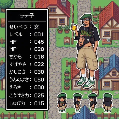
Aspect Ratio: 16:9 subject: - Transform the character from reference image A into: 1) A main 32x32 Super Famicom-style sprite (max 16 colors). 2) Four field-movement sprites (front, left, right, back), each 16x16 pixels, max 16 colors. - Preserve the character’s recognizable traits, clothing, colors, hairstyle, and silhouette from reference A. - If reference A is not full-body, reconstruct missing parts naturally to create a complete full-body 32x32 sprite. composition: Background should be a retro fantasy-RPG overworld field featuring: - cobblestone streets - rustic houses with tiled roofs - wooden fences and signboards - simple shops - simple 16-bit-style terrain transitions - no modern or realistic graphics - Place the enlarged 32x32 main sprite on the right. - Place the four 16x16 field sprites horizontally at the main sprite’s feet (front, left, right, back). - Place a retro RPG-style status window on the left. action: - Main sprite: same pose as reference A, converted to pixel art. - Field sprites: neutral standing pose facing front, left, right, back. location: Retro overworld field environment: - Cobblestone paths - Rustic houses with red or blue tiled roofs - Wooden fences - Simple shop signs - Old-school RPG map ambience style: - Super Famicom-inspired pixel art. - Main sprite: 32x32, max 16 colors. - Field sprites: 16x16, max 16 colors. - Background: 16-bit overworld field tiles. - Hard-edged pixels; no anti-aliasing; no gradients. - Limited-palette retro look. camera_lighting: - Orthographic, flat. - Minimal shading consistent with pixel-art style. colors: - Sprite palettes limited to 16 colors including transparency. - Background palette: - Greys for stone - Browns for wood - Red/Blue for roofs - Green for potted plants - All colors in retro 16-bit pixel palette style - Status window: - white border - black background - white pixel-font text text: # 名前はひらがな/カタカナで4文字以内。ここを直接書き換えて使用。 - At the top of the status window, center-aligned: - 「なまえ」 # 区切り線:ウィンドウ幅と一致した1本の水平線のみ - Draw a single-pixel horizontal divider line: - one pixel thick - full width of window - straight - not double-line or decorative # ステータス:項目名は左揃え、数値は3桁右揃え - Display the following stats: - 「せいべつ: 」 - 「レベル: 」 # max 99 - 「HP: 」 # max 999 - 「MP: 」 # max 999 - 「ちから: 」 # max 255 - 「すばやさ: 」 # max 255 - 「かしこさ: 」 # max 255 - 「うんのよさ: 」 # max 255 - 「えろさ: 」 # max 255 (inferred naturally) - 「こうげき力: 」 # max 999 - 「しゅび力: 」 # max 999 - Formatting rules: - Labels left-aligned - Numbers right-aligned in a 3-character field - Monospaced retro pixel-font required edit_instructions: - Convert reference A to a true 32x32 sprite using fixed pixel grid. - If reference is partial-body, reconstruct missing torso, legs, arms, shoes, etc., naturally and consistently. - Generate 4 field sprites (front/left/right/back) at 16x16 (max 16 colors). - Upscale sprites crisply; no smoothing. - Render a retro 16-bit overworld field background with grass, forest, and water tiles. - Status window must have white pixel border and black fill. - Name must be centered, 4 chars max, hiragana/katakana only. - Divider must be a single, pixel-straight line across width. - Stat labels left, numbers right (3-digit width). - Avoid copyrighted UI designs or specific franchise content. references: - A: Character appearance and pose. extras: - Pixel-perfect SFC-style sprite and field map rendering. - Consistent retro palette usage. - Retro RPG mockup layout.

durs.ai