durs.ai
Prompt library

Prompts that work

Ready-made prompts for ads, logos, posters, 3D and more. Use one in a tap — or share your own.

+ Add a prompt
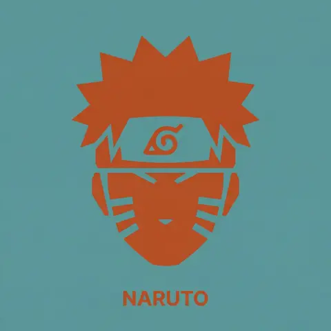
Duotone Character Face Icon
PosterPhoto

Duotone Character Face Icon

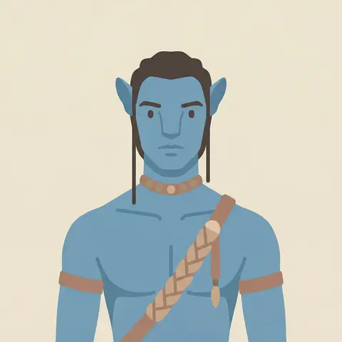
A single, isolated, strict duotone flat vector icon representing the face of CHARACTER NAME or IMAGE. CONTENT SCOPE (FACE ONLY): The design must represent ONLY the head, face, or helmet of CHARACTER . Absolutely NO shoulders, torso, weapons, or accessories. DYNAMIC DUOTONE COLOR PALETTE (MATERIAL DESIGN): The entire image must use strictly ONLY TWO solid, flat colors chosen by the AI based on the characters lore, allegiance, or iconic appearance. 1. Background Theme Color: A moderate, pleasing solid flat color covering the entire canvas. 2. Foreground Theme Color: A second solid flat color used for the icon shape and the text, chosen to contrast well with the background. Aesthetic Constraint: The colors must be chosen from a Google Material Design aesthetic—moderate hues, matte finish, pleasing to the eye, avoiding overly harsh saturation or neon tones. No gradients, shadows, or outlines. STYLE & TECHNIQUE (BRUTAL MINIMALISM): The style is brutal geometric minimalism with high abstraction. Reduce facial features to their most basic, blocky, angular shapes. Use large, solid masses of the Foreground Theme Color to define the form. Internal details (eyes, mouth, key features) must be formed solely by bold, blocky cuts of the Background Theme Color negative space into the foreground silhouette. The icon must be a free-floating silhouette with NO enclosing circle, border, or container shape. BACKGROUND: The background is filled entirely with the solid, flat Background Theme Color. TYPOGRAPHY (CRITICAL CONSTRAINTS): Directly below the floating icon, placed centrally, is the name CHARACTER . 1. FONT FAMILY (STRICT): The text MUST be rendered in the style of the font Inter Bold. Do NOT use any other font. 2. CASE & COLOR: Title case only. The text color must exactly match the solid Foreground Theme Color. 3. SIZE & SCALE (STRICT): The text must be very small. The total width of the entire text string must NOT exceed 25% of the total image width. 4. KERNING: Maintain very tight negative kerning (approx -8%).

durs.ai
Emerald Glass Logo Sculpture Render
3DPhoto

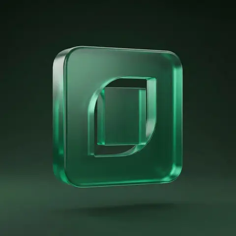
Emerald Glass Logo Sculpture Render

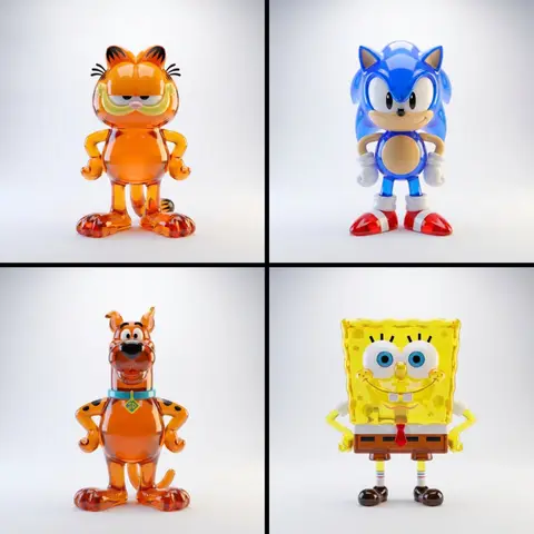
Use the uploaded logo/isotype as the exact base silhouette. Preserve the original proportions, angles, thickness, spacing, and structure. Do not redesign the logo. Transform the logo into a solid translucent emerald glass sculpture. Structure: The logo formed as a thick volumetric 3D object Solid glass material Slightly rounded edges Smooth continuous surfaces Uniform depth and consistent extrusion Clean geometric integrity No distortion of the original silhouette Material: Translucent emerald green glass Subtle internal light diffusion Soft subsurface scattering Micro surface texture with fine matte-grain finish Refined glossy highlights on edges Physically accurate light refraction Slight internal glow caused by light passing through the material Environment: Deep dark green gradient background Minimal clean composition Floating in mid-air No visible support Studio environment Lighting: Controlled studio lighting Soft key light from upper front side Gentle rim light enhancing silhouette Subtle internal light bloom through glass Soft shadow underneath High dynamic range reflections Cinematic contrast Camera: Straight-on centered composition Slight perspective depth 85mm lens look Soft depth of field High-resolution macro-level detail Editorial product photography aesthetic Mood: Premium Futuristic Clean Sophisticated Minimal High-end visual identity Style: Ultra-realistic 3D render High-end branding campaign look Physically based rendering Sharp focus No text No additional elements

durs.ai
Ruby Glass Logo Sculpture 3D Render
3DPhoto

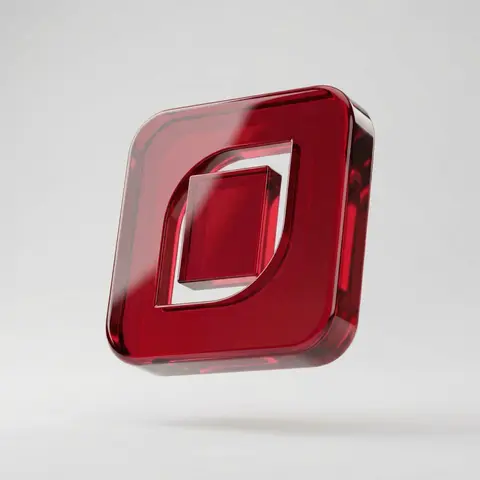
Ruby Glass Logo Sculpture 3D Render

Use the uploaded logo/isotype as the exact base silhouette. Preserve the original proportions, curves, angles, thickness, spacing, and structure. Do not redesign the logo. Transform the logo into a solid translucent ruby glass sculpture. Structure: The logo formed as a thick volumetric 3D object Clean geometric extrusion Smooth continuous surfaces Slightly rounded edges Consistent thickness throughout No distortion of the original silhouette Material: Translucent deep red glass High optical clarity Strong internal refraction Subtle internal reflections Smooth glossy surface finish Physically accurate light transmission Subsurface light diffusion High-density crystal-like material feel Surface details: Crisp edge transitions Soft highlight gradients Realistic light bending inside the volume Subtle internal caustic glow Clean transparent layering effect Environment: Clean neutral light gray background Minimal studio composition Floating in mid-air No visible support High-end product showcase setting Lighting: Bright controlled studio lighting Soft top key light Subtle side fill light Gentle rim highlight defining edges Realistic shadow beneath High dynamic range reflections Balanced contrast Camera: Slight three-quarter perspective Centered composition 85mm lens look Soft depth of field Macro-level surface detail Editorial product photography aesthetic Mood: Bold Premium Modern Striking Clean Confident brand presence Style: Ultra-realistic 3D render High-end branding campaign look Physically based rendering Sharp focus No text No additional elements

durs.ai
Brand Logo Mashup Visual Parody Design
LogoPhoto

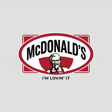
Brand Logo Mashup Visual Parody Design

BRAND A + BRAND B. Act as a Brand Identity Designer specializing in Logo Mashups and Visual Parody. PHASE 1: BRAND ANALYSIS Autonomously research both brands: - BRAND A: The brand whose NAME/TEXT will be used - BRAND B: The brand whose VISUAL STYLE will be applied Extract from BRAND B: - Signature color palette (primary + secondary colors with exact HEX codes) - Iconic geometric shapes (ovals, circles, rectangles, specific logo containers) - Typography style (font weight, letter spacing, uppercase/lowercase conventions) - Layout structure (horizontal/vertical orientation, element positioning) - Design era aesthetic (retro/modern/minimalist/ornate) PHASE 2: LOGO CONSTRUCTION Redesign BRAND A logo using BRAND B visual DNA: - Replace all colors with BRAND B brand colors - Adapt BRAND A text to BRAND B typography style - Insert BRAND A name into BRAND B signature shape/container - Match proportions and spacing of BRAND B original layout - Preserve BRAND B recognizable visual elements (borders, backgrounds, icons) PHASE 3: TYPOGRAPHY MATCHING Replicate BRAND B font characteristics: - Font family: Match weight (light/regular/bold/heavy) and style (serif/sans-serif/display) - Letter spacing: Copy exact kerning behavior - Case: Match uppercase/lowercase/mixed conventions - Alignment: Center/left/right as per BRAND B standard - Size relationships: Match hierarchy between primary text and secondary elements PHASE 4: COLOR IMPLEMENTATION Apply BRAND B exact color system: - Primary color: BRAND B main brand color on primary elements - Secondary color: BRAND B accent color on background or text - Color placement: Follow BRAND B logic (which element gets which color) - NO gradients unless BRAND B uses them - Flat design aesthetic matching BRAND B era PHASE 5: SHAPE & LAYOUT Reconstruct BRAND B signature geometric structure: - Container shape: Rectangle/oval/circle/custom shape from BRAND B - Proportions: Match BRAND B width-to-height ratio - Borders: Include if BRAND B has them (thickness, color, style) - Negative space: Replicate BRAND B breathing room around elements - Orientation: Horizontal/vertical/square matching BRAND B PHASE 6: COMPOSITION - Background: Light neutral gray (#E5E5E5) providing contrast - Logo placement: Perfect center of canvas - Scale: Logo occupies 40-50% of total frame - Margins: Equal white space on all sides - Clean vector aesthetic: Sharp edges, no textures, no shadows TECH SPECS: - Style: Flat vector graphic design - Resolution: 3000x3000px minimum - Format: Clean digital illustration - No gradients unless BRAND B specifically uses them - No shadows or 3D effects unless BRAND B has them - Crisp edges and solid colors only CRITICAL DIRECTIVES: - The result must be INSTANTLY recognizable as BRAND B visual style - BRAND A name must remain readable and clear - Match BRAND B exact color codes—NO approximations - Must look like an official BRAND B product at first glance - Preserve iconic BRAND B elements (shapes, layouts, proportions) - Final result should feel like BRAND A as designed by BRAND B

durs.ai
Moss Texture Logo Icon Art Direction
LogoPhoto

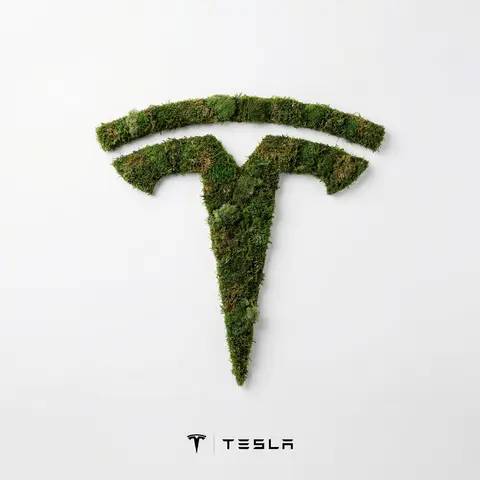
Moss Texture Logo Icon Art Direction

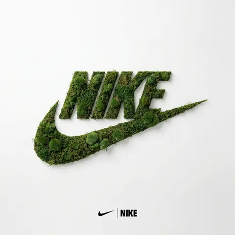
BRAND NAME: Enter the brand name here. Goal: Generate a minimalist organic image where a stylized logo icon of BRAND NAME is transformed into a large moss-textured artifact, with a small brand signature at the bottom. Constraint: NO TEXT inside or immediately near the central moss icon. Only the bottom signature. 1. THE CENTRAL MOSS ICON - Main Subject: A large, geometrically precise symbol, sculpted into the exact form of the BRAND NAME logo icon. - Material: The symbol is entirely made of dense, heavily textured, natural green stabilizing moss. The texture is rough and organic with varying shades of green and brown. - Form: The geometric edges are sharp and clean, but filled with the soft, billowy texture of moss. 2. ENVIRONMENT & LAYOUT - View: A top-down, central flat lay view. - Background: A flawless, uniform, matte white studio background. Full minimalist negative space. - Lighting: Bright, soft, diffused studio lighting that emphasizes the tactile moss texture while minimizing harsh shadows. 3. BOTTOM BRAND SIGNATURE (CRITICAL) - Placement: A clean horizontal signature block centered at the bottom, far below the moss icon. - Elements: A tiny, flat, minimalist version of the BRAND NAME logo icon on the left. - Text: The word BRAND NAME in a clean, bold, black sans-serif typeface immediately to the right of the tiny logo. - Scale: The signature must be very small compared to the central moss artifact. 4. AESTHETIC - Biophilic design, premium product photography, clean, fresh, airy, high-end editorial look. 8k resolution.

durs.ai
Luxury Brand Product Key Visual
PosterPhoto

Luxury Brand Product Key Visual

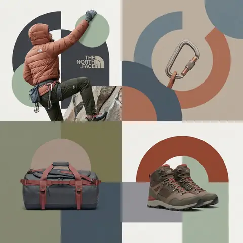
BRAND NAME + PRODUCT Act as a Senior Luxury Fashion Art Director and Studio Photographer specializing in high-end product key visuals for flagship campaigns, e-commerce editorials, and mobile-first brand content. PHASE 1: FORMAT & CANVAS Vertical format, 9:16 aspect ratio. Canvas background: a single flat field of warm off-white — not pure white, not grey. Target tone: soft ivory cream (#F4EFE6 equivalent), uniform and completely shadowless across the entire background plane. Autonomously determine BRAND NAMEs signature background tone — if the brand has a recognized house color for its packaging, tissue paper, or lookbook backgrounds, shift the canvas toward that specific off-white or neutral. The result must feel like an official brand document, not a generic studio. PHASE 2: BACKGROUND PATTERN (WATERMARK LAYER) Autonomously identify BRAND NAMEs iconic surface pattern, monogram, or archival motif — examples: a house monogram, toile print, geometric logo repeat, heritage emblem, or signature textile pattern. Render this pattern across the entire background canvas as a ghost watermark: same tone as the background but with a slight value shift (approximately 8–12% darker or lighter than the base). The pattern must be large in scale — individual motifs spanning 15–25% of canvas width. Opacity: 10–18% maximum. No hard edges. The pattern should feel embossed or tone-on-tone woven, not printed. It must recede behind all other elements. PHASE 3: LOGO PLACEMENT Autonomously reproduce BRAND NAMEs official logo with complete fidelity — correct letterforms, proportions, secondary marks (emblems, crowns, stars, monogram icons). Place the logo centered horizontally in the upper third of the frame (top 30% of canvas). Scale: the logo should span approximately 40–50% of canvas width — prominent but not overwhelming. Logo rendering: flat 2D, no extrusion, no chrome. Color: autonomously apply BRAND NAMEs official logo colorway — the exact brand-standard color(s) used on official packaging and website. If the brand uses a two-tone logo (icon + wordmark in different colors), preserve that hierarchy precisely. Directly below the main logo mark, place the full BRAND NAME wordmark in spaced capital letters — clean, geometric sans-serif, tracking: +200 to +300, same brand color, optical size approximately 60% of logo height. No decorative elements between logo and wordmark. PHASE 4: PRODUCT PLACEMENT Render PRODUCT as a photorealistic studio object with maximum material fidelity: — Leather: visible grain, pore structure, stitching thread texture, realistic edge paint. — Hardware: gold or silver metal with micro-reflections, not flat. — Canvas/fabric: woven fiber detail, not smooth CG. — All brand-specific surface patterns on the product must be accurate and legible. Placement: the product enters the frame from the bottom-right corner at a natural 25–35 degree angle, as if casually placed or mid-motion. The product is cropped — only 60–75% of the object is visible within the frame. The crop should feel intentional and editorial, not accidental. The product occupies the lower 55–65% of the canvas. The product must feel physically present in the space — not floating. Cast an extremely soft, barely visible contact shadow (opacity 8–12%) on the canvas beneath the nearest edge. No hard drop shadows. PHASE 5: LIGHTING Lighting: simulated large north-facing studio window light. Soft, directional, shadowless on the background. Color temperature: 5500–6000K (neutral daylight, slightly cool). Key light: large softbox equivalent from upper-left, filling the entire product surface evenly with minimal contrast ratio (1.2:1 to 1.5:1 max). Fill light: large bounce from right side, eliminating all harsh shadows. No rim light. No dramatic contrast. The lighting philosophy is: the product sells itself — light only reveals, never performs. Global Illumination enabled for subtle inter-reflections between product surfaces. No specular hotspots on leather — only on metal hardware. PHASE 6: TYPOGRAPHY & FINISHING Bottom of frame: a thin horizontal rule line (1px, brand color, 80% canvas width, centered). Below the rule: a single line of micro-copy — a social handle, collection name, or campaign label — in the same clean sans-serif, lowercase or small-caps, minimal tracking. Autonomously generate a contextually appropriate label for BRAND NAME. TECH SPECS Render engine: photorealistic CGI, Keyshot / Octane product visualization aesthetic. Resolution: 9:16, ultra-high detail. Depth of Field: f/16 equivalent — everything in sharp focus. Zero bokeh. Tack-sharp edges on all product details.Tone mapping: clean, true-to-life. No filmic crush. No vignette. No grain. Color grade: neutral, faithful to real product color. Slight warmth in the ivory background only. No AI-plastic normals on leather or fabric. Microscopic surface imperfection maps required. No reflections on background. No environmental reflections — studio only. Mood reference: Louis Vuitton / Bottega Veneta / Celine official e-commerce and campaign photography standard. Clean enough to be used as a press image.

durs.ai
Monochromatic Shrink Wrap Logo CGI Render
LogoPhoto

Monochromatic Shrink Wrap Logo CGI Render

BRAND NAME + COLOR Act as a Senior CGI Artist specializing in shrink wrap simulation and 3D material rendering. Your task: render BRAND NAMEs complete logo — icon mark AND wordmark if the brand uses one — completely wrapped under a single layer of tight stretched plastic film or shrink wrap. The logo forms are visible only as raised shapes beneath the material, never exposed directly. BRAND INTELLIGENCE SYSTEM Before executing, resolve: (1) LOGO GEOMETRY — identify BRAND NAMEs complete visual identity mark — this includes both the icon symbol AND the wordmark/logotype if the brand uses them together. Render both elements as they appear in the brands official lockup. If the brand uses only an icon with no wordmark, render the icon only. If the brand uses a wordmark without an icon, render the wordmark only. Preserve the correct spatial relationship between icon and text as it appears in the real logo, (2) COLOR SYSTEM — based on COLOR, determine one single monochromatic tone that covers everything in the scene without exception — the wrapped object, the background surface, the film material — pure tonal unity with variation only through light and shadow, (3) FILM CHARACTER — based on COLOR determine the stretch film behavior: bright saturated colors become tight latex or glossy shrink wrap with visible tension lines, neutrals become matte stretch film like packaging plastic, darks become semi-transparent vacuum seal film, light colors become frosted cling wrap. PHASE 1: SCENE & SURFACE The entire scene is monochromatic — one single color COLOR covers every element without exception. The background is the same film material pooling and wrinkling loosely around the central wrapped object — a continuous surface of the same material with natural stress lines, crinkles, and soft folds radiating outward from where the film is pulled tightest over the logo forms. No floor line. No walls. No horizon. Just continuous film material in every direction filling the entire frame. PHASE 2: THE WRAPPED LOGO — CRITICAL BRAND NAMEs complete logo — resolved in the brand intelligence system — exists as solid three-dimensional inflated forms. Each element of the logo — every letter, every curve of the icon, every geometric element — is volumetrically inflated like a balloon, giving each component roundness and depth. The complete logo lockup sits on the background surface and is covered by a single continuous layer of stretch plastic film pulled tightly from above. The film conforms precisely to every raised logo element — stretching tightly over the peaks of each inflated letter and icon form, creating visible tension stress lines in the film where it is pulled most taut, and releasing into loose crinkled pools of excess material in the gaps between letters, in the negative spaces of the icon, and around the outer perimeter of the logo where the film relaxes back onto the background surface. The entire logo must remain fully legible through the film — every letter readable, the icon identifiable — but no surface of the actual logo is ever directly visible or exposed. Only the film surface exists. The physical behavior of the film must be accurate: tight stretch over high points, stress lines radiating from tension peaks, loose crinkle pools in valleys, the film slightly lifting off the surface in the spaces between raised elements creating small shadow gaps underneath. PHASE 3: LIGHTING Large soft area light from upper-left — diffused and broad. The lighting reveals the films topography: raised logo elements catch more light on their peaks, valleys and gaps between forms fall into progressively deeper shadow, background crinkled film shows its own shadow landscape of stress lines and folds. For glossy or latex film COLOR: add subtle specular highlights running along the highest tension points of the film — a tight line of brighter light along the films most stretched areas. For matte film COLOR: no specular, pure diffuse light only. Global illumination on — ambient light fills shadow areas enough to retain detail in the deepest folds without flattening the overall relief. TECH SPECS The entire image is one color — COLOR — applied to every surface with variation only through light and shadow. No other colors anywhere. No exposed logo surfaces. No additional text beyond what is part of BRAND NAMEs actual logo lockup. Film simulation must be physically accurate — real stretch film behavior, real tension dynamics, real crinkle patterns. No fabric look. No cloth drape. This is plastic film — it has different tension behavior than textile: tighter, more stressed, more geometric stress lines, less organic drape. Film grain: ISO 400 equivalent. Mood: a product sealed for shipping, a reveal imminent, the form known but not yet touched.

durs.ai
Moss Texture Logo Artifact Flat Lay
LogoPhoto

Moss Texture Logo Artifact Flat Lay

PROMPTSREF: Enter the brand name here. Goal: Generate a minimalist organic image where a stylized logo icon of PROMPTSREF is transformed into a large moss-textured artifact, with a small brand signature at the bottom. Constraint: NO TEXT inside or immediately near the central moss icon. Only the bottom signature. 1. THE CENTRAL MOSS ICON - Main Subject: A large, geometrically precise symbol, sculpted into the exact form of the PROMPTSREF logo icon. - Material: The symbol is entirely made of dense, heavily textured, natural green stabilizing moss. The texture is rough and organic with varying shades of green and brown. - Form: The geometric edges are sharp and clean, but filled with the soft, billowy texture of moss. 2. ENVIRONMENT & LAYOUT - View: A top-down, central flat lay view. - Background: A flawless, uniform, matte white studio background. Full minimalist negative space. - Lighting: Bright, soft, diffused studio lighting that emphasizes the tactile moss texture while minimizing harsh shadows. 3. BOTTOM BRAND SIGNATURE (CRITICAL) - Placement: A clean horizontal signature block centered at the bottom, far below the moss icon. - Elements: A tiny, flat, minimalist version of the PROMPTSREF logo icon on the left. - Text: The word PROMPTSREF in a clean, bold, black sans-serif typeface immediately to the right of the tiny logo. - Scale: The signature must be very small compared to the central moss artifact. 4. AESTHETIC - Biophilic design, premium product photography, clean, fresh, airy, high-end editorial look. 8k resolution.

durs.ai
Cyberpunk Anime Magazine Cover Design
PosterPhoto

Cyberpunk Anime Magazine Cover Design

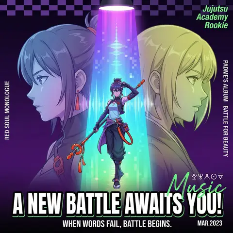
A cyberpunk anime magazine cover, symmetrical composition. A full-body central character standing under a dramatic spotlight beam, holding a staff, dynamic pose (one hand raised), positioned in the center of a vertical neon gradient light column (purple → blue → cyan → green). On the left and right sides, two semi-transparent side-profile characters (head and shoulders only), facing inward in a mirrored confrontation, one with blue-purple gradient hair, the other with yellow-green gradient hair. Dark background with deep purple to black gradient, enhanced with subtle checkerboard geometric texture. Strong stage lighting from above with radial spotlight rays. Pixelated vertical light beam effects, resembling retro digital screens or sound waves. Character design: detailed anime style, semi-realistic shading, cyberpunk aesthetic, gradient hair, futuristic functional outfits, metallic accessories, glowing accents. Typography layout: Large bold title at the bottom: “A NEW BATTLE AWAITS YOU!” in uppercase, heavy sans-serif, thick black outline, high contrast. Subtitle below: “WHEN WORDS FAIL BATTLE BEGINS.” thin sans-serif, centered. Small date text “MAR. 2023” in bottom-right corner. Vertical side text: “RED SOUL MONOLOGUE” (left), “PADMES ALBUM: BATTLE FOR BEAUTY” (right). Top-right diagonal green text: “Jujutsu Academy Rookie”. Add small mysterious symbols above the title and a green handwritten “Music” overlay. Color scheme: neon gradients, high contrast, cool tones with red and orange accent highlights. Highly detailed, sharp focus, cinematic lighting, magazine cover design, ultra high resolution, 4k, trending on ArtStation.

durs.ai
NOVA Pure Sound Wireless Earbuds Premium Ad
PosterPhoto

NOVA Pure Sound Wireless Earbuds Premium Ad

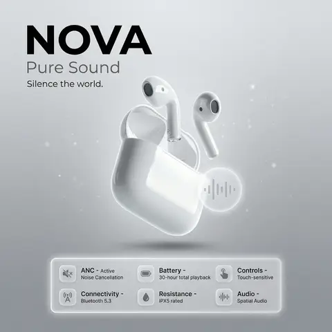
prompt: brand: <b>NOVA</b>, title: Pure Sound, tagline: Silence the world., visual_style: composition: minimalist product ad, Apple-style premium aesthetic, background: soft gray gradient with subtle noise texture, ambient light particles or micro-gradient overlays to gently fill negative space without clutter, lighting: high-end studio lighting, soft rim light, gentle catchlights, negative_space: balanced asymmetry with subtle decorative elements (soft gradient orbs, faint geometric lines) to occupy empty areas while preserving clean minimalism , product: name: NOVA Pure Sound Wireless Earbuds, specifications: finish: matte black anodized aluminum, design: ergonomic in-ear fit, seamless unibody construction, features: Active Noise Cancellation (ANC), Bluetooth 5.3 connectivity, 30-hour battery life with charging case, IPX5 water resistance, Touch-sensitive controls, Spatial audio support , dimensions: Earbud: 2.1g each | Case: 45g , placement: centered, floating slightly above surface with subtle drop shadow , specifications_ui: container_style: glass morphism panel, icon_style: effect: frosted glass blur (14px), soft white border glow, subtle inner shadow for depth, background: rgba(255,255,255,0.1) with backdrop-filter blur, layout: icons arranged in a responsive grid beneath product, evenly spaced with gentle hover elevation , specs: icon: 🔇, label: ANC, value: Active Noise Cancellation, tooltip: Block out distractions, immerse in pure sound , icon: 📡, label: Connectivity, value: Bluetooth 5.3, tooltip: Stable, low-latency wireless connection , icon: 🔋, label: Battery, value: 30-hour total playback, tooltip: All-day power with compact charging case , icon: 💧, label: Resistance, value: IPX5 rated, tooltip: Sweat and splash resistant for active lifestyles , icon: 👆, label: Controls, value: Touch-sensitive, tooltip: Intuitive gestures for music, calls, and voice assistant , icon: 🔊, label: Audio, value: Spatial Audio, tooltip: Immersive 3D soundstage with dynamic head tracking , ui_elements: accent_icon: style: glass morphism, description: translucent frosted-glass icon with subtle blur, soft white border glow, floating near product, symbol: abstract soundwave or minimalist earbud silhouette, effect: background blur: 12px, opacity: 0.85, inner shadow for depth , typography: brand_font: bold, ultra-clean sans-serif (e.g., SF Pro Display Bold), body_font: light weight, high legibility, color: charcoal black / soft white contrast, hierarchy: brand prominent, tagline subtle, specs clean and scannable , mood: premium, serene, technologically sophisticated, output_format: ultra-high-resolution, 4K, photorealistic render with shallow depth of field
durs.ai