durs.ai
Prompt library

Prompts that work

Ready-made prompts for ads, logos, posters, 3D and more. Use one in a tap — or share your own.

+ Add a prompt
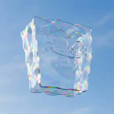
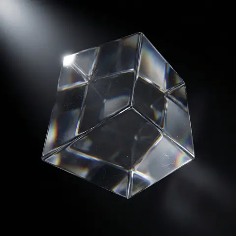
Crystal Glass Object Sculpture Render
3DPhoto

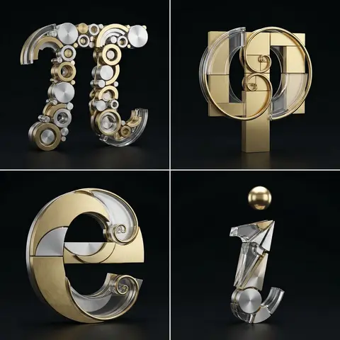
Crystal Glass Object Sculpture Render

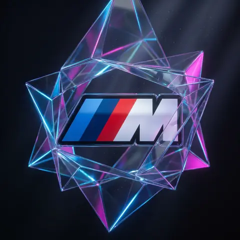
prompt: A hyper-realistic object rendered as a sculptural object carved entirely from solid, optical-grade crystal glass. The object preserves its true proportions and recognizable silhouette, with precise geometry and clean edge definition appropriate to its form. It is floating in space at a slight dynamic angle, not perfectly straight, allowing light interaction across multiple surfaces. A single focused white light source enters the object from one direction, refracting through the internal volume and producing layered internal reflections, chromatic aberration, and physically accurate spectral dispersion along edges, corners, and internal transitions. Light bends, splits, and bounces naturally within the material, creating complex but controlled optical behavior. Inside the glass, subtle volumetric depth is visible, including faint internal reflections, refractive distortions, micro-scratches, and tiny dust particles suspended within the material. A small, intense specular highlight appears on a sharp edge or curvature where the light strikes most directly, producing a crisp optical spark. Reflections are sharp and physically accurate. The glass feels heavy, dense, and premium — never plastic, never stylized, never neon. The background is a pure black void with soft falloff and no visible environment. Lighting is minimal and studio-controlled, designed to emphasize form, refraction, internal depth, and edge clarity rather than brightness. No text, no logos, no markings., style: lighting: Low-key studio lighting with a single directional white light source, materials: Optical-grade crystal glass with physically accurate refraction and dispersion, surface_detail: Subtle micro-scratches, internal dust, realistic volumetric imperfections, background: Pure black void, mood: Minimal, futuristic, scientific, museum-grade artifact, color_behavior: Rainbow dispersion only from white light refraction, never artificially colored, Moodboard: Attached Images , parameters: object: cube, orientation: slightly tilted, dynamic perspective, refraction_intensity: high but physically accurate, edge_sharpness: crisp relative to object geometry, spark_intensity: small, sharp specular highlight, glass_thickness: solid, heavy volume, imperfection_level: very subtle , medium: Ultra-realistic 3D render, size: 1080px by 1080px
durs.ai
Dark Anodized Metal Coin Emblem Render
3DPhoto

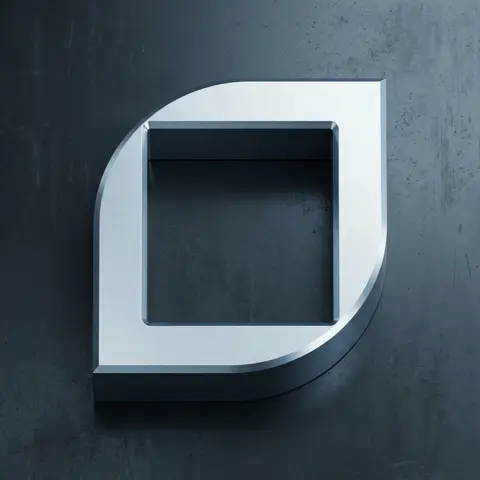
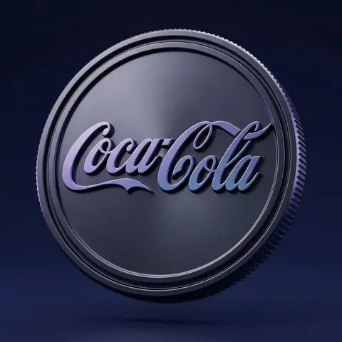
Dark Anodized Metal Coin Emblem Render

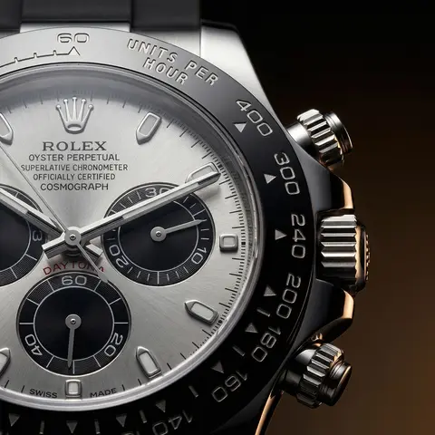
Use the uploaded logo/isotype as the exact base silhouette. Preserve the original proportions, curvature, thickness, spacing, bevels, and structure. Do not redesign the logo. Transform the logo into a premium 3D metallic coin emblem. Structure: The logo embossed and extruded from a circular coin base Thick volumetric 3D object Deep engraved outer rim Precise bevels and clean chamfers Industrial edge ridges along the coin side Strong dimensional depth No distortion of the original letterform Material: Dark anodized metal base Smooth satin metallic finish Subtle brushed micro-texture Glossy ralsed letter surface Cool purple and blue reflective gradients Soft specular highlights Physically accurate reflections Premium high-density material feel Surface details: Clean embossed geometry Crisp edge transitions Controlled light falloff across curves Slight contrast between matte base and glossy symbol Environment: Deep dark blue to indigo gradient background Minimal clean studio composition Floating in mid-air No visible support Luxury product showcase setting Lighting: Cinematic studio lighting Soft key light from upper side Subtle purple-blue rim lighting Gentle reflection gradients across surface Soft shadow beneath High dynamic range Controlled contrast Camera: Slight three-quarter angle Centered composition 85mm lens look Soft depth of field High-resolution macro detail Editorial product photography aesthetic Mood: Premium Futuristic Luxurious Corporate Tech-driven High-end brand positioning Style: Ultra-realistic 3D render High-end visual campaign look Physically based rendering Sharp focus No text No additional elements

durs.ai
Premium Industrial Design Object Concept
AdvertisementPhoto

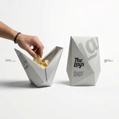
Premium Industrial Design Object Concept

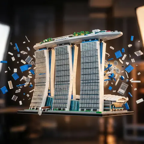
BRAND NAME: The core identity. CATEGORY: Clothing / Food / Automotive / Lifestyle. Goal: Generate a premium industrial design concept on a PURE WHITE background. 1. INNOVATION & OBJECT - Select one mundane functional object from CATEGORY. - Redesign it using unconventional, architectural, or origami-inspired geometry. - The object must look like a high-end designer invention, not a standard product. 2. UNIFIED COMPOSITION - Environment: A seamless, pure white studio background with a flat white floor. - Interaction: A human hand (natural texture) is shown using the object in the foreground, demonstrating its unique ergonomics. - Static Display: Right next to the hand, the same object is placed in a static, perfect pose to show its full silhouette and branding. - Shadows: Soft, realistic grey drop shadows on the white floor to provide depth and ground the objects. 3. BRANDING & TEXT - Identity: Apply the BRAND NAME logo in a high-contrast dark color (Black or Navy) directly onto the objects surface. - Technical Detail: Add small, elegant blocks of justified specification text in the white negative space around the objects for an editorial look. - Pattern: Use a subtle, oversized abstract fragment of the brands logo as a texture on the objects material. 4. MATERIALS & FINISH - High-quality matte materials only: heavy-duty recycled paper, sandblasted metal, or soft-touch polymer. - Sharp architectural lines and clean, premium craftsmanship.

durs.ai
Monochromatic Shrink Wrap Logo CGI Render
LogoPhoto

Monochromatic Shrink Wrap Logo CGI Render

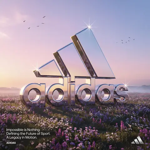
BRAND NAME + COLOR Act as a Senior CGI Artist specializing in shrink wrap simulation and 3D material rendering. Your task: render BRAND NAMEs complete logo — icon mark AND wordmark if the brand uses one — completely wrapped under a single layer of tight stretched plastic film or shrink wrap. The logo forms are visible only as raised shapes beneath the material, never exposed directly. BRAND INTELLIGENCE SYSTEM Before executing, resolve: (1) LOGO GEOMETRY — identify BRAND NAMEs complete visual identity mark — this includes both the icon symbol AND the wordmark/logotype if the brand uses them together. Render both elements as they appear in the brands official lockup. If the brand uses only an icon with no wordmark, render the icon only. If the brand uses a wordmark without an icon, render the wordmark only. Preserve the correct spatial relationship between icon and text as it appears in the real logo, (2) COLOR SYSTEM — based on COLOR, determine one single monochromatic tone that covers everything in the scene without exception — the wrapped object, the background surface, the film material — pure tonal unity with variation only through light and shadow, (3) FILM CHARACTER — based on COLOR determine the stretch film behavior: bright saturated colors become tight latex or glossy shrink wrap with visible tension lines, neutrals become matte stretch film like packaging plastic, darks become semi-transparent vacuum seal film, light colors become frosted cling wrap. PHASE 1: SCENE & SURFACE The entire scene is monochromatic — one single color COLOR covers every element without exception. The background is the same film material pooling and wrinkling loosely around the central wrapped object — a continuous surface of the same material with natural stress lines, crinkles, and soft folds radiating outward from where the film is pulled tightest over the logo forms. No floor line. No walls. No horizon. Just continuous film material in every direction filling the entire frame. PHASE 2: THE WRAPPED LOGO — CRITICAL BRAND NAMEs complete logo — resolved in the brand intelligence system — exists as solid three-dimensional inflated forms. Each element of the logo — every letter, every curve of the icon, every geometric element — is volumetrically inflated like a balloon, giving each component roundness and depth. The complete logo lockup sits on the background surface and is covered by a single continuous layer of stretch plastic film pulled tightly from above. The film conforms precisely to every raised logo element — stretching tightly over the peaks of each inflated letter and icon form, creating visible tension stress lines in the film where it is pulled most taut, and releasing into loose crinkled pools of excess material in the gaps between letters, in the negative spaces of the icon, and around the outer perimeter of the logo where the film relaxes back onto the background surface. The entire logo must remain fully legible through the film — every letter readable, the icon identifiable — but no surface of the actual logo is ever directly visible or exposed. Only the film surface exists. The physical behavior of the film must be accurate: tight stretch over high points, stress lines radiating from tension peaks, loose crinkle pools in valleys, the film slightly lifting off the surface in the spaces between raised elements creating small shadow gaps underneath. PHASE 3: LIGHTING Large soft area light from upper-left — diffused and broad. The lighting reveals the films topography: raised logo elements catch more light on their peaks, valleys and gaps between forms fall into progressively deeper shadow, background crinkled film shows its own shadow landscape of stress lines and folds. For glossy or latex film COLOR: add subtle specular highlights running along the highest tension points of the film — a tight line of brighter light along the films most stretched areas. For matte film COLOR: no specular, pure diffuse light only. Global illumination on — ambient light fills shadow areas enough to retain detail in the deepest folds without flattening the overall relief. TECH SPECS The entire image is one color — COLOR — applied to every surface with variation only through light and shadow. No other colors anywhere. No exposed logo surfaces. No additional text beyond what is part of BRAND NAMEs actual logo lockup. Film simulation must be physically accurate — real stretch film behavior, real tension dynamics, real crinkle patterns. No fabric look. No cloth drape. This is plastic film — it has different tension behavior than textile: tighter, more stressed, more geometric stress lines, less organic drape. Film grain: ISO 400 equivalent. Mood: a product sealed for shipping, a reveal imminent, the form known but not yet touched.

durs.ai
Y2K Japanese Streetwear Badge Sticker Vector Art
LogoPhoto

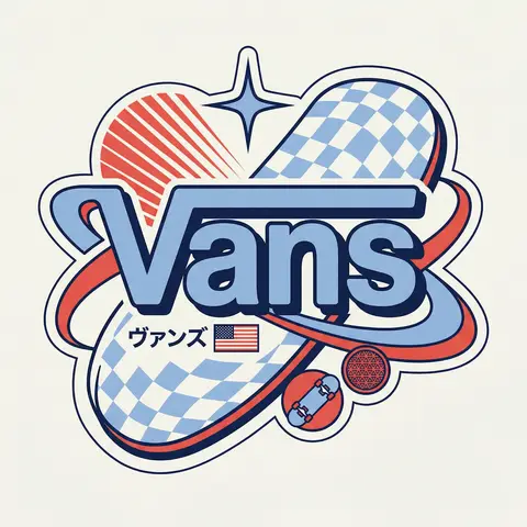
Y2K Japanese Streetwear Badge Sticker Vector Art

BRAND NAME Act as a Senior Vector Graphic Designer specializing in Y2K Japanese streetwear badge design. Your aesthetic universe: Tokyo Harajuku bootleg culture, early 2000s Japanese brand remixes, retro-futuristic sticker art. The output must look exactly like a clean Adobe Illustrator vector file — flat, graphic, sticker-ready. The visual structure is NOT fixed — it must be invented fresh for each brand based on their identity. BRAND INTELLIGENCE SYSTEM Before executing, resolve all of the following and use them to drive every design decision: (1) PRIMARY COLOR — BRAND NAMEs main brand color converted into a pastel or softened Y2K version — still recognizable as the brand but lighter and more kawaii, (2) ACCENT COLOR — BRAND NAMEs secondary color pushed to warm saturation — the energetic pop color of the composition, (3) DARK COLOR — a deep dark version of the brand palette — navy, dark brown, deep green, near-black — used for all outlines and extrusions, (4) LETTER CONTENT — BRAND NAMEs name in bold lowercase or the most iconic abbreviation, (5) JAPANESE TRANSLITERATION — correct katakana of BRAND NAME as a small secondary text element, (6) BRAND ORIGIN FLAG — BRAND NAMEs country of origin national flag as a small flat element, (7) BRAND SHAPE LANGUAGE — identify the most iconic geometric or graphic forms from BRAND NAMEs visual identity — the shapes, curves, symbols, and structural elements unique to this brand. These shapes become the orbital, background, and decorative elements of the badge — replacing generic ovals with brand-specific geometry, (8) BRAND CULTURAL SYMBOLS — identify 1–2 small iconic objects or symbols from BRAND NAMEs world that can be rendered as tiny flat illustrations within the badge — not the logo itself but objects associated with the brands universe, (9) COMPOSITION LOGIC — based on all resolved parameters above, autonomously design the structural layout of the badge. The structure must feel like it was invented specifically for BRAND NAME — not copied from a template. Ask: what shapes from this brands identity could orbit the letters? What geometry feels native to this brand? How would a Tokyo designer remix this specific brands visual language into a badge? PHASE 1: CANVAS 1:1 square canvas. Background: flat off-white or warm light grey. Completely empty. No texture. No gradient. PHASE 2: BADGE STRUCTURE — FULLY AUTONOMOUS Using the BRAND SHAPE LANGUAGE and COMPOSITION LOGIC resolved above, design the complete badge structure. The only fixed rules are: the badge must have a central lettering element, surrounding geometric shapes that interact with the letters through z-layer stacking, at least one element that passes both behind and in front of the letters creating depth, and the overall silhouette must read as a unified badge or patch shape. Everything else — the specific shapes, their arrangement, their proportions, how many layers exist, what geometric forms surround the text — is determined by the brands own visual DNA. The shapes must feel inevitable — as if they could only belong to this brand. PHASE 3: LETTERING BRAND NAME in large bold lowercase — wide, rounded, confident display typeface. Flat PRIMARY COLOR fill. Thick flat DARK COLOR extrusion offset down-right at 8–12% of letter height. Bold DARK COLOR outline. No gradients. No rendering. The letters are the anchor of the entire composition. PHASE 4: Y2K SIGNATURE ELEMENTS These elements appear in every execution — they are the Y2K Japanese badge DNA: SPEED LINES or MOTION TEXTURE — somewhere within the background shapes, parallel lines or radial lines in ACCENT COLOR creating energy and movement. 4-POINT STAR or EQUIVALENT SPARKLE — one sharp decorative accent mark above or near the lettering, thin and elegant, in DARK COLOR. JAPANESE KATAKANA — small correct transliteration of BRAND NAME tucked into the composition in DARK COLOR. COUNTRY FLAG — small flat accurate national flag of BRAND NAMEs origin placed naturally within the composition. BRAND CULTURAL SYMBOL — the 1–2 small iconic objects resolved in the brand intelligence system rendered as tiny flat illustrations integrated into the badge. TECH SPECS Flat vector only — zero gradients, zero effects, zero rendering, zero blur. Clean crisp edges throughout. Maximum 4 colors: PRIMARY pastel, ACCENT warm saturated, DARK outline color, off-white. The badge must feel like a collectible sticker or embroidered patch. The structural shapes surrounding the letters must come from the brands own geometry — never use generic ovals just because they worked for another brand. Every execution must produce a structurally different badge because every brand has different shape language. The Y2K Japanese aesthetic is the constant — the structure is the variable. Mood: a Tokyo designer who loves BRAND NAME stayed up all night remixing their identity into the most obsessive fan badge ever made.

durs.ai
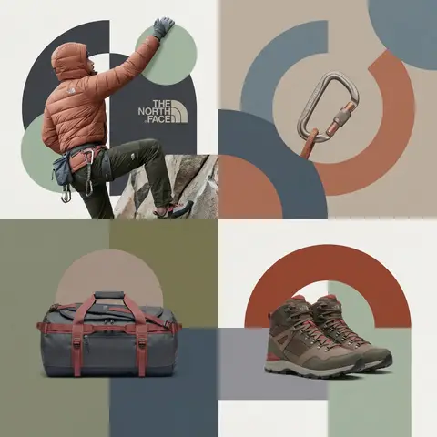
Editorial Grid Geometric Brand Campaign Visual
BrandingPhoto

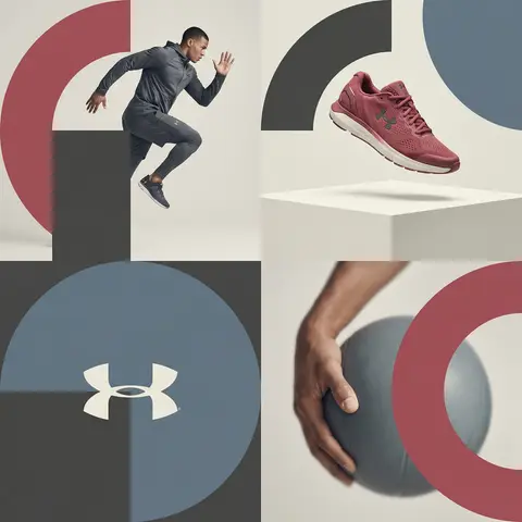
Editorial Grid Geometric Brand Campaign Visual

BRAND NAME. Act as a World-Class Editorial Designer. PHASE 1: DYNAMIC SUBJECT LOGIC. - Subject Selection: Autonomously analyze BRAND NAME. - Layering (The Sandwich Effect): Interweave the subject with background shapes. Some parts of the car/person must be hidden behind geometric blocks, while other parts (wheels, limbs, props) must overlap them to create 3D depth. PHASE 2: GRID & GEOMETRY. - Layout: A clean 2x2 grid composition. - Overlays: Superimpose large, bold geometric arcs and circles over the grid. - Visual Balance: Place one iconic product prop (e.g., a floating key fob for cars or a ball for sports) in a separate quadrant to balance the subject. PHASE 3: SOPHISTICATED MUTED PALETTE. - Color Direction: DO NOT use aggressive neon or oversaturated colors. - Palette: Identify the core colors of BRAND NAME and shift them to a Sophisticated Muted spectrum. - Tones: Use desaturated, earthy, or dusty versions of the brand colors (e.g., instead of hot pink, use dusty rose; instead of bright mint, use sage green; instead of royal blue, use slate blue). - Finish: Matte, flat color blocks with zero gradients. PHASE 4: PHOTOGRAPHY & LIGHTING. - Subject Style: High-end commercial studio photography. - Lighting: Soft, diffused studio lighting with gentle highlights. No harsh shadows. - Integration: The subject must feel physically embedded into the graphic grid. PHASE 5: MINIMALIST BRANDING. - Logo: Place a clean, single-color BRAND NAME logo in the center of one background block. No taglines, just the iconic symbol.

durs.ai