durs.ai
Prompt library

Prompts that work

Ready-made prompts for ads, logos, posters, 3D and more. Use one in a tap — or share your own.

+ Add a prompt
Transparent Glass Social Media Profile Card
3DPhoto

Transparent Glass Social Media Profile Card

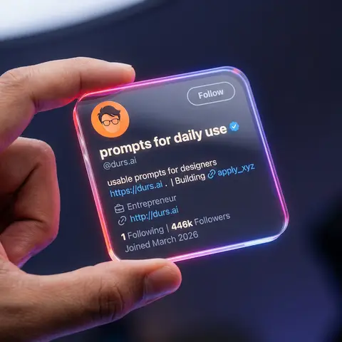
Close-up shot of a human hand holding a square, transparent acrylic/glass-like social media profile card in mid-air. Dark studio background, softly blurred, with subtle blue-purple ambient light. Very shallow depth of field (f/1.8), only the glass card and fingers are in sharp focus, with heavy bokeh background. Scene & Atmosphere Environment: Dark studio (#0c0f19), vignette edges, subtle blue-purple ambient light Mood: Futuristic, tech, premium, clean UI, social media identity card Camera: Macro lens (85mm equivalent), f/1.8, 8K ultra-realistic rendering Transparent Card Design Material: Transparent acrylic/glass (transparency 0.92, IOR 1.5, roughness 0.05) Shape: Perfect rounded square (corner radius 10-16px), 3-5mm thickness Edge Glow: Strong neon gradient - linear-gradient(135deg, #ff4d4d, #ff7de3, #8a5dff, #41c3ff) Held By: Realistic human hand, thumb on front-left edge, warm skin tone UI Layout Header: - Avatar: Circular, top-left, flat illustration style (orange background, dark hair, glasses) - Username: nanoprompts ▲ - Bold rounded sans-serif, near-white color - Verified Badge: Blue (#1D9BF0), next to username - Handle: @promptslab - Below username, color #d0d6e5 - Follow Button: Top-right, transparent/glassy, 1px solid #ffffff99 border Body: - Description: 100+ Free AI Prompts & Workflows for Nano Banana Image Generation - Link: https://nanoprompts.org . | Building 🔗apply_xyz (color #5da7ff) - Meta: Profession icon + Entrepreneur - Website: http://rehanuds.framr.website Footer Stats: - 135 Following | 446 Followers - Joined May 2025 (color #ffffff66) Lighting Main Light: Softbox from top-left/front-left, 5200-5600K cool white Rim Light: Neon edge emission, strong on corners Background: Dark with extra glow (#3e4fff33), round bokeh (#283759) Avoid No extra hands, distorted fingers, low-res text, fingerprints, watermarks, or cropped buttons

durs.ai
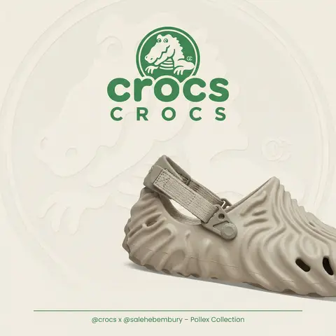
Polished Steel Peony Product Photography
LogoPhoto

Polished Steel Peony Product Photography

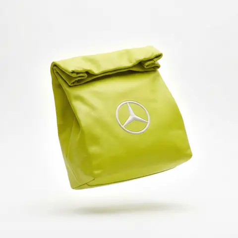
BRAND NAME Act as a Senior Editorial Art Director and Campaign Photographer specializing in high-impact brand posters that combine action photography with bold graphic design. Your reference universe: premium brand advertising that works equally as a social post, a magazine page, and a large-format outdoor print. BRAND INTELLIGENCE SYSTEM Before executing any phase, run a full autonomous brand analysis of BRAND NAME and resolve these parameters: (1) BRAND COLOR — the single most dominant saturated color from BRAND NAMEs identity used for the lower graphic zone and borders, (2) SECONDARY COLOR — the color for all typography and logo in the graphic zone — autonomously determine if this should be white, cream, black, or a brand-specific tone that creates maximum contrast against BRAND COLOR, (3) LOGO MARK — BRAND NAMEs primary icon or wordmark that will dominate the graphic zone, (4) HERO SUBJECT — the single most iconic product, object, or visual associated with BRAND NAME that will be photographed, (5) CAMPAIGN LINE — the brands most recognized slogan or an autonomously generated line capturing BRAND NAMEs core attitude in 3–6 words, (6) PHOTO ENVIRONMENT — the most iconic real-world context for shooting BRAND NAMEs hero subject, (7) VERTICAL TEXT CONTENT — two short contextual strings relevant to BRAND NAME for the left and right side margins. All parameters must be resolved before phase 1 begins. PHASE 1: CANVAS & FORMAT Vertical format, 4:5 ratio. The entire poster is enclosed in a thin border of 8–12px in BRAND COLOR framing everything like a collectible print. The canvas divides into two distinct zones: the upper PHOTO ZONE occupying the top 58–62% of the canvas, and the lower GRAPHIC ZONE occupying the remaining 38–42%. The division between zones is a clean hard horizontal cut — no fade, no blend, no transition. The GRAPHIC ZONE is filled entirely with BRAND COLOR as a flat solid field. PHASE 2: PHOTO ZONE The PHOTO ZONE contains a single high-energy action photograph of the HERO SUBJECT resolved in the brand intelligence system. Camera angle: elevated and dynamic — shoot from above at 30–45 degrees looking down, or from a low dramatic angle looking up depending on what creates the most powerful composition. Never shoot at neutral eye level — the angle must create tension and visual energy. The photograph fills the entire PHOTO ZONE edge to edge with no padding. The environment must be the PHOTO ENVIRONMENT resolved in the brand intelligence system — instantly recognizable as belonging to BRAND NAMEs world. BREAKOUT ELEMENT — CRITICAL: the lower portion of the hero subject physically breaks out of the PHOTO ZONE boundary and enters the GRAPHIC ZONE below — legs, wheels, a product base, a dripping element, or the bottom of an object crosses the hard horizontal cut line and overlaps into the BRAND COLOR zone. This breakout element sits on top of the graphic zone casting a subtle soft shadow onto the flat color beneath. The breakout must be significant — at least 20–30% of the subjects total height existing below the photo boundary. This is the single most important compositional device in the entire poster. PHASE 3: GRAPHIC ZONE The lower zone is a flat solid BRAND COLOR field. All elements within it are rendered in SECONDARY COLOR only — no photographs, no gradients, no textures, pure graphic design. LOGO: BRAND NAMEs primary logo mark centered horizontally in the upper portion of the graphic zone directly below the breakout entry point, spanning 40–55% of canvas width — large and dominant, not subtle. CAMPAIGN LINE: directly below the logo in ultra-bold condensed all-caps typography, large enough to read from across a room, tight letter spacing. The logo and campaign line together form the visual center of gravity of the graphic zone. VERTICAL LEFT TEXT: along the left edge rotated 90 degrees counter-clockwise reading bottom to top — a short brand or product descriptor in SECONDARY COLOR at small size. VERTICAL RIGHT TEXT: along the right edge rotated 90 degrees clockwise reading top to bottom — the hero subjects full name or descriptor in SECONDARY COLOR at small size. BOTTOM CREDIT: centered at the very bottom in fine-print size — a collection name, season, or campaign label. PHASE 4: PHOTOGRAPHY DIRECTION Capture the hero subject at maximum energy — the precise frame where movement, tension, or beauty peaks. For a person: mid-motion at full commitment to the action. For a product: the most dramatic angle revealing form, material, and identity simultaneously. For food: the moment of pour, cut, steam, or impact. For automotive: speed blur, drift, or heroic three-quarter angle. Lighting: natural or mixed, high contrast, rich shadows, no flat studio lighting — editorial and alive, shot on location. Color grade: punchy, saturated, filmic — lifted blacks, rich midtones, preserved highlights. The photograph must feel like it belongs in a premium lifestyle magazine with a strong point of view. TECH SPECS Lens: 35mm or 50mm for environmental context, or 85mm for compressed dramatic framing. Depth of field: subject sharp, background contextual at f/4 to f/8. Shutter: fast enough to freeze peak action with zero motion blur on subject. Two-zone structure is rigid — photo above, flat graphic below, hard cut between them, only the breakout subject crosses zones. Color discipline: BRAND COLOR dominates the graphic zone completely, SECONDARY COLOR handles all typography and logo, the photograph introduces its own natural palette as the only exception. Typography: condensed, bold, authoritative — no decorative fonts. Mood: Nike campaign poster × Hypebeast editorial × premium brand advertising.
durs.ai
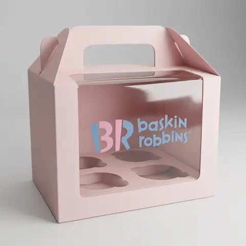
Luxury Brand Product Key Visual
PosterPhoto

Luxury Brand Product Key Visual

BRAND NAME + PRODUCT Act as a Senior Luxury Fashion Art Director and Studio Photographer specializing in high-end product key visuals for flagship campaigns, e-commerce editorials, and mobile-first brand content. PHASE 1: FORMAT & CANVAS Vertical format, 9:16 aspect ratio. Canvas background: a single flat field of warm off-white — not pure white, not grey. Target tone: soft ivory cream (#F4EFE6 equivalent), uniform and completely shadowless across the entire background plane. Autonomously determine BRAND NAMEs signature background tone — if the brand has a recognized house color for its packaging, tissue paper, or lookbook backgrounds, shift the canvas toward that specific off-white or neutral. The result must feel like an official brand document, not a generic studio. PHASE 2: BACKGROUND PATTERN (WATERMARK LAYER) Autonomously identify BRAND NAMEs iconic surface pattern, monogram, or archival motif — examples: a house monogram, toile print, geometric logo repeat, heritage emblem, or signature textile pattern. Render this pattern across the entire background canvas as a ghost watermark: same tone as the background but with a slight value shift (approximately 8–12% darker or lighter than the base). The pattern must be large in scale — individual motifs spanning 15–25% of canvas width. Opacity: 10–18% maximum. No hard edges. The pattern should feel embossed or tone-on-tone woven, not printed. It must recede behind all other elements. PHASE 3: LOGO PLACEMENT Autonomously reproduce BRAND NAMEs official logo with complete fidelity — correct letterforms, proportions, secondary marks (emblems, crowns, stars, monogram icons). Place the logo centered horizontally in the upper third of the frame (top 30% of canvas). Scale: the logo should span approximately 40–50% of canvas width — prominent but not overwhelming. Logo rendering: flat 2D, no extrusion, no chrome. Color: autonomously apply BRAND NAMEs official logo colorway — the exact brand-standard color(s) used on official packaging and website. If the brand uses a two-tone logo (icon + wordmark in different colors), preserve that hierarchy precisely. Directly below the main logo mark, place the full BRAND NAME wordmark in spaced capital letters — clean, geometric sans-serif, tracking: +200 to +300, same brand color, optical size approximately 60% of logo height. No decorative elements between logo and wordmark. PHASE 4: PRODUCT PLACEMENT Render PRODUCT as a photorealistic studio object with maximum material fidelity: — Leather: visible grain, pore structure, stitching thread texture, realistic edge paint. — Hardware: gold or silver metal with micro-reflections, not flat. — Canvas/fabric: woven fiber detail, not smooth CG. — All brand-specific surface patterns on the product must be accurate and legible. Placement: the product enters the frame from the bottom-right corner at a natural 25–35 degree angle, as if casually placed or mid-motion. The product is cropped — only 60–75% of the object is visible within the frame. The crop should feel intentional and editorial, not accidental. The product occupies the lower 55–65% of the canvas. The product must feel physically present in the space — not floating. Cast an extremely soft, barely visible contact shadow (opacity 8–12%) on the canvas beneath the nearest edge. No hard drop shadows. PHASE 5: LIGHTING Lighting: simulated large north-facing studio window light. Soft, directional, shadowless on the background. Color temperature: 5500–6000K (neutral daylight, slightly cool). Key light: large softbox equivalent from upper-left, filling the entire product surface evenly with minimal contrast ratio (1.2:1 to 1.5:1 max). Fill light: large bounce from right side, eliminating all harsh shadows. No rim light. No dramatic contrast. The lighting philosophy is: the product sells itself — light only reveals, never performs. Global Illumination enabled for subtle inter-reflections between product surfaces. No specular hotspots on leather — only on metal hardware. PHASE 6: TYPOGRAPHY & FINISHING Bottom of frame: a thin horizontal rule line (1px, brand color, 80% canvas width, centered). Below the rule: a single line of micro-copy — a social handle, collection name, or campaign label — in the same clean sans-serif, lowercase or small-caps, minimal tracking. Autonomously generate a contextually appropriate label for BRAND NAME. TECH SPECS Render engine: photorealistic CGI, Keyshot / Octane product visualization aesthetic. Resolution: 9:16, ultra-high detail. Depth of Field: f/16 equivalent — everything in sharp focus. Zero bokeh. Tack-sharp edges on all product details.Tone mapping: clean, true-to-life. No filmic crush. No vignette. No grain. Color grade: neutral, faithful to real product color. Slight warmth in the ivory background only. No AI-plastic normals on leather or fabric. Microscopic surface imperfection maps required. No reflections on background. No environmental reflections — studio only. Mood reference: Louis Vuitton / Bottega Veneta / Celine official e-commerce and campaign photography standard. Clean enough to be used as a press image.

durs.ai
Celestial Opulence Dark Academia Luxury Beauty Campaign Product Shot
AdvertisementPhoto

Celestial Opulence Dark Academia Luxury Beauty Campaign Product Shot

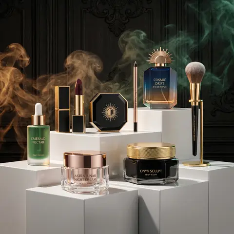
Product from the reference image. project_title: Celestial Opulence Beauty Campaign, visual_style: aesthetic: Luxury Avant-Garde / Dark Academia, composition: Product photography featuring items arranged on multi-tiered, white geometric pedestals against a dark, ornate wood-paneled background., lighting: Dramatic studio lighting with high contrast and sharp shadows, special_effects: Wispy, ethereal colored smoke (amber and emerald) swirling in the background. , product_inventory: category: Skincare, items: name: Astra Lunar Night Cream, packaging: Facetted glass jar with a rose gold geometric lid, theme: Celestial/Starlight , name: Onyx Sculpt, packaging: Heavy black glass jar with a textured gold metallic lid, theme: Earth/Stone , name: Emerald Nectar, packaging: Frosted deep green dropper bottle, theme: Botanical/Alchemy , category: Cosmetics, items: name: Maison Luna Lipstick, details: Deep burgundy shade in a black leather-textured and gold square case. , name: Solstice Powder, details: Octagonal black compact with a sunburst emblem. , name: Rose Gold Define, details: Slim rose gold metallic eyeliner or lip pencil. , category: Fragrance & Accessories, items: name: Cosmic Drift Eau de Parfum, packaging: Hexagonal blue-to-amber gradient glass bottle with a sun-ray architectural cap. , name: Articulated Makeup Brush, details: Black brush with a unique mechanical jointed handle on a gold stand. , color_palette: #000000 (Obsidian), #D4AF37 (Metallic Gold), #1A3636 (Emerald Green), #191970 (Midnight Blue), #FFFFFF (Stark White)

durs.ai