durs.ai
Prompt library

Prompts that work

Ready-made prompts for ads, logos, posters, 3D and more. Use one in a tap — or share your own.

+ Add a prompt
Brand Futuristic object
3DPhoto

Brand Futuristic object

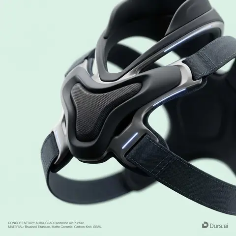
BRAND NAME or LOGO IMAGE: A high-end, glossy concept art magazine editorial photograph of a unique, unexpected functional object conceptualized and designed by the brand. 1. The Concept & Object (AI Invention): Based on the design philosophy, heritage, and material vocabulary of the specified brand, the AI must invent a novel utility product (NOT standard clothing, shoes, or bags). Examples could be home goods, tech accessories, tools, or sporting equipment, reinterpretated through the brands lens. The object should feel sculptural yet functional. 2. Materials & Details (Hyper-Premium): The object is constructed from ultra-premium, highly tactile materials characteristic of the brand (e.g., patinated exotic leathers, brushed aerospace-grade titanium, sculpted matte ceramics, molded carbon fiber, or technical high-fashion textiles). Every detail is hyper-realistic: visible stitching, microscopic material grain, precision engravings, and complex texture contrasts. 3. Photography & Lighting (Cinematic Studio): Shot on a medium format Phase One camera with a 100mm macro lens. Extremely shallow depth of field, with sharp focus on the hero details of the object and a creamy, smooth bokeh background. The lighting is sophisticated studio softbox lighting: gentle, enveloping fill light with precise rim lighting to accentuate contours and material textures. 4. Environment: A seamless, impeccably clean studio cyclorama background in a pure, ultra-light pastel tone (e.g., desaturated mint, pale blush, or off-white), free of shadows. 5. Layout & UI Elements (Strict Placement): - Bottom Right Corner: A small, understated, monochrome gray logo of the brand. - Bottom Left Corner: Small, minimalist monochrome gray text describing the invented product. The font style looks like Manrope Regular with very tight tracking (kerning) and balanced line spacing. Example format: CONCEPT STUDY: AI inserts invented product name. MATERIAL: AI inserts main materials. SS25.

durs.ai
Holographic Character Projector Product Shot
ProductPhoto

Holographic Character Projector Product Shot

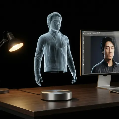
Ultra-realistic product photo. Subject: virtual holographic character CHARACTER, floating above a circular hologram projector Ø120 mm placed on a modern desk. Projection source rules: - If input reference is a 3D object → show a desktop 3D scanner beside the projector. Place the reference object on the scanner plate. The hologram above the projector is generated from this scanned object. - If input reference is a 2D image → show a modern PC with monitor on the desk. Display the reference image on the monitor screen. The hologram above the projector is generated from this screen content. Hologram rendering rules: - Character always appears as a semi-transparent volumetric image, background faintly visible through. - No beams, no particles, no solid statue surfaces. - Balanced anatomy (1/7–1/8 head-to-body ratio), correct proportions. - Natural pose with clear silhouette. - Hair, outfit folds, and accessories visible but translucent. - Face crisp and expressive, readable at 1000 px crop. - No copyrighted characters, no branded designs, no IP logos. Environment: modern desk with projector base + conditional device (scanner or monitor). Camera: 85–100 mm lens, 3/4 hero angle, eye-level, f/11–f/16, ISO100, tripod. Lighting: desk softly illuminated; holographic figure defined only by volumetric light. Background: seamless black studio with subtle reflections. Output: 4:5, 2048×2560. Negative: text-free, watermark-free, logo-free, brand-free, copyrighted characters, franchise IP, trademarked designs, resin, PVC, physical statue, opaque surfaces, toy gloss, beams, scanlines, dots, distortion, extra digits. Sampling: deterministic, seed=12345, temperature=0.

durs.ai
Luxury Suede Handbag Indoor Cinematic Shoot
ProductPhoto

Luxury Suede Handbag Indoor Cinematic Shoot

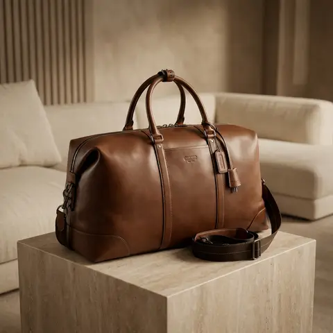
Use the uploaded image as the exact handbag product reference. Do NOT change the handbags size, shape, proportions, color, suede material, stitching, or logo placement. Create a high-end commercial luxury photoshoot in a luxurious indoor room. Scene & setting: elegant luxury interior room, minimalist high-class environment, premium materials (soft fabric sofa, marble table, textured wall, or luxury pedestal), clean backdrop with no clutter. Handbag placement: handbag placed neatly and intentionally, positioned as the main hero product, resting on a luxury surface (stone / fabric / matte pedestal). Camera angle: high angle shot looking down, cinematic framing, balanced composition, handbag centered or slightly off-center for editorial feel. Lighting: cinematic studio lighting, warm luxury tones, soft key light highlighting suede texture, subtle rim light to separate handbag from background, controlled shadows, no harsh highlights. Color & tone: warm bergenel / soft brown palette, color must remain accurate to original handbag reference, elegant contrast, not oversaturated. Focus & detail: suede texture extremely detailed, stitching sharp and clean, logo visible, realistic, embossed, shallow depth of field but product fully sharp. Style & mood: minimalist luxury, high fashion commercial ads, cinematic, calm, premium, timeless and elegant. Final result must look like a real high-budget luxury brand advertisement, suitable for billboard, website hero banner, and premium Instagram ads. Ultra photorealistic, high resolution, cinematic lighting, no Al artifacts, no GI look. Negative Prompt cartoon, illustration, CGI, fake lighting, shiny leather, wrong color, oversaturated, blur product, distorted shape, cheap interior, messy background, watermark, text overlay, Al artifacts.

durs.ai
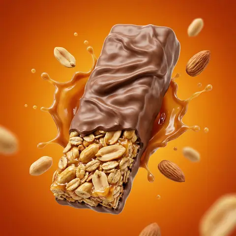
Protein Bar Breaking Explosion Cinematic Ad
AdvertisementPhoto

Protein Bar Breaking Explosion Cinematic Ad

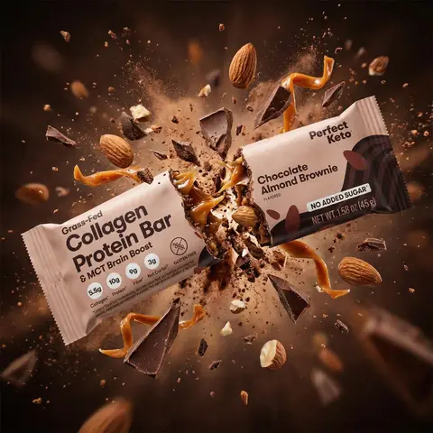
Use the uploaded product image @ing as the exact product reference. Create a cinematic ultra-realistic advertising scene showing) the protein bar being broken in half with explosive energy emerging from inside. The hidden energy concept is that the bar represents hidden energy released on impact. At the exact moment the bar snaps apart in mid-air, a powerful burst of ingredients explodes outward from the center. The scene should resemble a high-end Nike or Red Bull commercial moment. The protein bar is breaking into two halves suspended in the air while ingredients burst dramatically fromthe center of the break. Explosion elements include hazelnuts flying outward, chocolate fragments exploding, caramel splashing through the air, and crumbs scattering in all directions. The explosion should feel powerful but visually controlled and cinematic. Lighting is dramatic with strong highlights reflecting on caramel and chocolate, intense rim light outlining both halves of the bar, and deep shadows that emphasize texture and depth. The camera uses a dynamic close-up hero shot where both halves of the bar are clearly visible and sharp with shallow depth of field to focus attention on the breaking point. Maintain the exact packaging design, branding, colors, and proportions from @img1, ensuring the wrapper remains fully readable and undistorted. Do not redesign the packaging and do not add any text or extra logos. Style: high-speed food photography, cinematic commercial advertising, energy explosion.

durs.ai
Mixed-Media Brand Campaign Art Direction
PosterPhoto

Mixed-Media Brand Campaign Art Direction

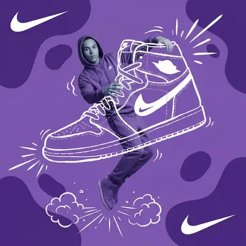
Act as a Mixed-Media Campaign Art Director. Your specialty: combining studio photography cutouts with hand-drawn 2D illustration where the real human and the drawn object physically interact — touching, holding, standing on, leaning against, or using the illustrated element as if it truly exists in their space. PHASE 1: CANVAS & COLOR SYSTEM Format: 1:1 square canvas. Base: single flat saturated color HERO COLOR. No gradients. No texture. Pure chromatic field. Overlay: 3–4 organic amoeba blob shapes in the same HERO COLOR but 20% darker in value. Smooth edges, irregular silhouettes, scattered asymmetrically. Some bleeding off-frame. Hand-painted feel, clean execution. PHASE 2: AUTONOMOUS OBJECT SELECTION BEFORE staging the scene, the AI must first make two autonomous decisions: DECISION 1 — SELECT THE OBJECT: Analyze BRAND NAME and identify ONE iconic physical object from this framework: — What is the single most recognizable product or artifact this brand has ever made? — What object do fans of this brand collect, use daily, or photograph? — What prop has defined this brands visual identity across decades? Do NOT choose animals. Do NOT choose logos. Choose a real, large, tangible object that can physically occupy space next to a person. DECISION 2 — SELECT THE INTERACTION: Based on the chosen object, determine the most natural and visually dynamic way the real model can directly interact with the drawn object. Interaction must be: ✓ Physical and direct — hands touching, feet on, body leaning, arms around ✓ Immediately readable — the relationship between person and object is understood in under 2 seconds ✓ Scaled correctly — the object must be large enough to interact with at human scale ✓ Active, not passive — the model is DOING something with the object, not just standing next to it INTERACTION TYPE EXAMPLES (AI selects the most brand-appropriate): · HOLDING: models real hands grip the illustrated object — cup, camera, trophy, bottle, bag · WEARING/USING: models real body wears or uses the object — sitting on a chair, wearing an illustrated hat, holding an illustrated product to their face · STANDING ON: models real feet are planted on top of the illustrated object — skateboard, surfboard, podium, giant sneaker · RIDING/LEANING: models real body leans against or drapes over the illustrated object — car hood, shopping cart, giant product silhouette · EMERGING FROM: model appears to step out of or through the illustrated object — bursting through a giant sneaker box, rising from an illustrated cup PHASE 3: STAGING THE SCENE Once object and interaction are selected, stage the full scene: MODEL: Single model age 18–26, clean cutout, zero fringing. Pose is determined by the chosen interaction — the body position must make the interaction feel natural and physically believable. Wardrobe: BRAND NAMEs most iconic apparel in HERO COLOR monochromatic palette. ILLUSTRATED OBJECT: Pure white (#FFFFFF) flat 2D illustration. Brush-pen marker line quality, 3–5px weight. Slightly imperfect organic edges — hand-drawn feel, not vector-perfect. NO shading. NO gradients. Flat white fill only. SCALE RULE — CRITICAL: The illustrated object must be LARGE. Minimum size: 40% of canvas height. The object should feel monumental — oversized relative to real-world scale is acceptable and encouraged. A coffee cup can be waist-height. A sneaker can be as tall as the model. Large scale = better readability = stronger visual impact. DEPTH LAYERING — CRITICAL:The object must exist on multiple z-layers: — Parts of the object sit BEHIND the model — Parts of the object come IN FRONT of the model — The models real hands/feet make contact at the intersection point This layering is what makes the scene feel integrated rather than collaged. BRAND STAMP: One small BRAND NAME logo mark appears on the objects surface — naturally embedded as if printed, engraved, or stitched. Rendered in HERO COLOR darker variant. Subtle, not dominant. PHASE 4: SUPPORTING ILLUSTRATION SYSTEM All supporting elements: white, flat, brush-pen line style. Same visual language as the hero object. LOGO MARKS: BRAND NAME primary icon in white: — Large (upper-left corner, ~15% canvas width) — Medium (opposite corner, ~10% canvas width) IMPACT MARKERS: 2–3 manga-style exclamation dash clusters near the point of interaction between model and object — where hands grip, where feet land, where bodies touch. This emphasizes the physical connection. MOTION LINES: 2–4 curved speed lines radiating from the object or the models most active body part. Taper at ends. Cross behind and in front of the model for depth. GROUND EFFECT: At the base of the scene: white illustrated ground interaction — sparkle stars, short speed dashes, or object-specific effect (splash if cup, dust clouds if sneaker landing, wheel tracks if skateboard). AMBIENT SQUIGGLES: 1–2 loose organic white lines floating near the models torso — visual rhythm connecting the photographic and illustrated layers. PHASE 5: LIGHTING Studio strobe, high-key, even and clean. 5500K neutral. No dramatic shadows on model. Soft contact shadow at models feet (opacity 15%). The photography reads as natural and real against the graphic illustrated environment. TECH SPECS Aesthetic: mixed media — real photograph integrated with hand-drawn 2D illustration. Color count: 3 maximum — HERO COLOR light, HERO COLOR dark blobs, white illustration. Photography skin tones and fabric colors are the only additional color exception. Illustration style: Y2K comic energy, Japanese streetwear magazine, brush marker. Composition: asymmetric and dynamic. The interaction point between model and object is the visual center of gravity — everything else orbits around it. No text. No wordmarks. Logo icon only. Mood: the model is not posing WITH the object — the model is IN THE MIDDLE of using it. Caught mid-action. Alive.

durs.ai
Floating Biscuit Commercial Editorial
AdvertisementPhoto

Floating Biscuit Commercial Editorial

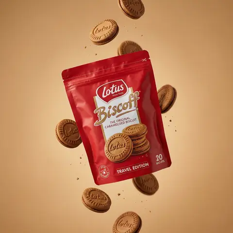
Ultra-realistic editorial food commercial photography, Main subject project). Use the exact uploaded product image as the main subject, foating subtly in mid-air. Exact real-world packaging identical ouch shape, red color tone, logo, typography, icons, illustrations, material finish. No redesign, no recolor, no distortion, no missing text. Floating food elements (CRITICAL - BISCUITS ONLY): Multiple Lotus Biscoff sandwich biscuits floating gently around the pouch. Biscuits must be 100% IDENTICAL to the biscuits shown on the product packaging illustration: - same round biscuit shape same sandwich thickness - same embossed Lotus logo - same baked brown color and edge detail No reinterpretation, no stylized cookies, no generic biscuit shapes. Motion & physics: Biscuits appear suspended mid-air with subtle vertical separation, as if captured at peak motion. Natural gravity feel — biscuits look slightly heavy, not weightless. Minimal crumbs and tiny biscuit particles floating softly, realistic scale only. Composition: Hero pouch slightly off-center, dominant and clearly readable. Biscuits arranged in a loose vertical flow around the pouch, inspired by high-speed food photography. Clean spacing, strong depth separation, premium balance. Background: Warm studio background in soft caramel / warm beige tone. Smooth gradient, matte finish. No text, no graphics, no patterns. Lighting: Soft studio lighting with controlled highlights. Gentle rim light separating biscuits and pouch from background. Natural shadows and realistic light falloff. No dramatic glow. Material realism: Authentic flexible pouch creases and folds. Accurate Biscoff red color reproduction. Biscuits show fine baked texture, embossed logo clarity, natural crumb detail. Camera & optics: Shot on Hasselblad flagship medium-format camera. 80mm lens equivalent. f/8, ISO 64. Ultra-high dynamic range, clean color science, smooth tonal transitions. Crisp but soft editori: sharpness. Style constraints: Photorealistic. Luxury editorial food photography. Not CGI. Not cartoon. Not Al-styled. Looks like a real international FMCG campaign visual.

durs.ai
Polished Steel Peony Product Photography
LogoPhoto

Polished Steel Peony Product Photography

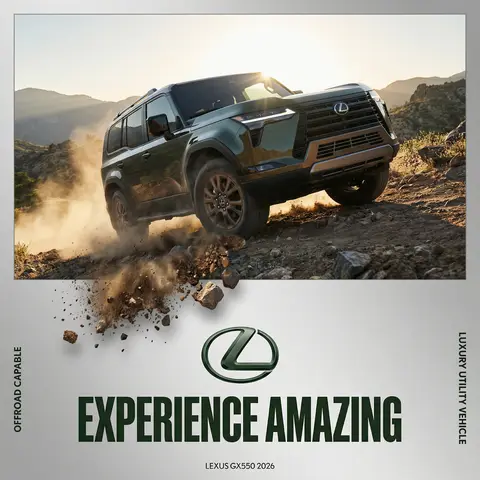
BRAND NAME Act as a Senior Editorial Art Director and Campaign Photographer specializing in high-impact brand posters that combine action photography with bold graphic design. Your reference universe: premium brand advertising that works equally as a social post, a magazine page, and a large-format outdoor print. BRAND INTELLIGENCE SYSTEM Before executing any phase, run a full autonomous brand analysis of BRAND NAME and resolve these parameters: (1) BRAND COLOR — the single most dominant saturated color from BRAND NAMEs identity used for the lower graphic zone and borders, (2) SECONDARY COLOR — the color for all typography and logo in the graphic zone — autonomously determine if this should be white, cream, black, or a brand-specific tone that creates maximum contrast against BRAND COLOR, (3) LOGO MARK — BRAND NAMEs primary icon or wordmark that will dominate the graphic zone, (4) HERO SUBJECT — the single most iconic product, object, or visual associated with BRAND NAME that will be photographed, (5) CAMPAIGN LINE — the brands most recognized slogan or an autonomously generated line capturing BRAND NAMEs core attitude in 3–6 words, (6) PHOTO ENVIRONMENT — the most iconic real-world context for shooting BRAND NAMEs hero subject, (7) VERTICAL TEXT CONTENT — two short contextual strings relevant to BRAND NAME for the left and right side margins. All parameters must be resolved before phase 1 begins. PHASE 1: CANVAS & FORMAT Vertical format, 4:5 ratio. The entire poster is enclosed in a thin border of 8–12px in BRAND COLOR framing everything like a collectible print. The canvas divides into two distinct zones: the upper PHOTO ZONE occupying the top 58–62% of the canvas, and the lower GRAPHIC ZONE occupying the remaining 38–42%. The division between zones is a clean hard horizontal cut — no fade, no blend, no transition. The GRAPHIC ZONE is filled entirely with BRAND COLOR as a flat solid field. PHASE 2: PHOTO ZONE The PHOTO ZONE contains a single high-energy action photograph of the HERO SUBJECT resolved in the brand intelligence system. Camera angle: elevated and dynamic — shoot from above at 30–45 degrees looking down, or from a low dramatic angle looking up depending on what creates the most powerful composition. Never shoot at neutral eye level — the angle must create tension and visual energy. The photograph fills the entire PHOTO ZONE edge to edge with no padding. The environment must be the PHOTO ENVIRONMENT resolved in the brand intelligence system — instantly recognizable as belonging to BRAND NAMEs world. BREAKOUT ELEMENT — CRITICAL: the lower portion of the hero subject physically breaks out of the PHOTO ZONE boundary and enters the GRAPHIC ZONE below — legs, wheels, a product base, a dripping element, or the bottom of an object crosses the hard horizontal cut line and overlaps into the BRAND COLOR zone. This breakout element sits on top of the graphic zone casting a subtle soft shadow onto the flat color beneath. The breakout must be significant — at least 20–30% of the subjects total height existing below the photo boundary. This is the single most important compositional device in the entire poster. PHASE 3: GRAPHIC ZONE The lower zone is a flat solid BRAND COLOR field. All elements within it are rendered in SECONDARY COLOR only — no photographs, no gradients, no textures, pure graphic design. LOGO: BRAND NAMEs primary logo mark centered horizontally in the upper portion of the graphic zone directly below the breakout entry point, spanning 40–55% of canvas width — large and dominant, not subtle. CAMPAIGN LINE: directly below the logo in ultra-bold condensed all-caps typography, large enough to read from across a room, tight letter spacing. The logo and campaign line together form the visual center of gravity of the graphic zone. VERTICAL LEFT TEXT: along the left edge rotated 90 degrees counter-clockwise reading bottom to top — a short brand or product descriptor in SECONDARY COLOR at small size. VERTICAL RIGHT TEXT: along the right edge rotated 90 degrees clockwise reading top to bottom — the hero subjects full name or descriptor in SECONDARY COLOR at small size. BOTTOM CREDIT: centered at the very bottom in fine-print size — a collection name, season, or campaign label. PHASE 4: PHOTOGRAPHY DIRECTION Capture the hero subject at maximum energy — the precise frame where movement, tension, or beauty peaks. For a person: mid-motion at full commitment to the action. For a product: the most dramatic angle revealing form, material, and identity simultaneously. For food: the moment of pour, cut, steam, or impact. For automotive: speed blur, drift, or heroic three-quarter angle. Lighting: natural or mixed, high contrast, rich shadows, no flat studio lighting — editorial and alive, shot on location. Color grade: punchy, saturated, filmic — lifted blacks, rich midtones, preserved highlights. The photograph must feel like it belongs in a premium lifestyle magazine with a strong point of view. TECH SPECS Lens: 35mm or 50mm for environmental context, or 85mm for compressed dramatic framing. Depth of field: subject sharp, background contextual at f/4 to f/8. Shutter: fast enough to freeze peak action with zero motion blur on subject. Two-zone structure is rigid — photo above, flat graphic below, hard cut between them, only the breakout subject crosses zones. Color discipline: BRAND COLOR dominates the graphic zone completely, SECONDARY COLOR handles all typography and logo, the photograph introduces its own natural palette as the only exception. Typography: condensed, bold, authoritative — no decorative fonts. Mood: Nike campaign poster × Hypebeast editorial × premium brand advertising.

durs.ai
VIRALMEDIA AI Agency Dark Landing Page
BrandingPhoto

VIRALMEDIA AI Agency Dark Landing Page

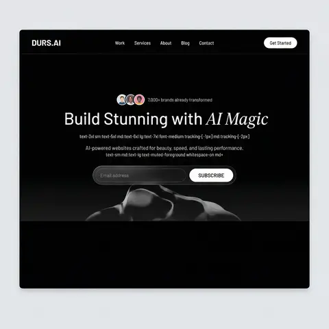
Build a dark-themed, single-page landing page for an AI web design agency called VIRALMEDIA. The design uses a pure black background (#000) with white text, a signature liquid glass glassmorphism effect, and two Google Fonts: Barlow (body/UI) and Instrument Serif (italic accent text). Use React, Tailwind CSS, Framer Motion, and hls.js. All buttons are rounded-full. DESIGN SYSTEM (index.css) Color tokens (all HSL, dark-only — no light mode): --background: 0 0% 0% (pure black) --foreground: 0 0% 100% (pure white) --card: 0 0% 9%, --card-foreground: 0 0% 100% --primary: 0 0% 97%, --primary-foreground: 0 0% 9% --secondary: 0 0% 15%, --secondary-foreground: 0 0% 100% --muted: 0 0% 15%, --muted-foreground: 0 0% 75% --accent: 0 0% 15%, --accent-foreground: 0 0% 100% --border: 0 0% 20%, --input: 0 0% 20%, --ring: 0 0% 100% --radius: 2px --font-body: Barlow, sans-serif --font-accent: Instrument Serif, serif Liquid Glass CSS classes: .liquid-glass — subtle glassmorphism: background: rgba(255,255,255,0.01), background-blend-mode: luminosity, backdrop-filter: blur(4px), no border, box-shadow: inset 0 1px 1px rgba(255,255,255,0.1). Has a ::before pseudo-element for a gradient border effect using linear-gradient(180deg, rgba(255,255,255,0.45) 0%, rgba(255,255,255,0.15) 20%, transparent 40%, transparent 60%, rgba(255,255,255,0.15) 80%, rgba(255,255,255,0.45) 100%) with mask-composite: exclude and padding: 1.4px. .liquid-glass-strong — stronger variant: same as above but backdrop-filter: blur(50px), box-shadow: 4px 4px 4px rgba(0,0,0,0.05), inset 0 1px 1px rgba(255,255,255,0.15), and slightly higher gradient opacity values (0.5/0.2 instead of 0.45/0.15). Tailwind config: Set fontFamily: body: Barlow, sans-serif, accent: Instrument Serif, serif at the theme root level (not in extend). SECTION 1: NAVBAR (fixed) Fixed top, full-width, z-50, px-8 py-6, flex row with space-between Left: Logo text VIRALMEDIA — text-xl font-semibold tracking-tight font-body text-foreground Center (hidden on mobile): Nav links Work, Services, About, Blog, Contact — each px-4 py-2 text-sm font-medium text-foreground rounded-sm hover:bg-white/10 Right: Get Started button — liquid-glass-strong rounded-full px-6 py-2.5 text-sm font-medium text-foreground SECTION 2: HERO (full viewport height) Container: relative w-full h-screen overflow-hidden Background video (behind everything): Absolutely positioned, object-cover object-bottom. On mobile: -translate-y-100px, on md+: no translate. Video URL: https://d8j0ntlcm91z4.cloudfront.net/user_38xzZboKViGWJOttwIXH07lWA1P/hf_20260326_073936_8dd07fdb-4f6b-4220-a3f0-9dedfaab0c88.mp4 (autoPlay, loop, muted, playsInline) Bottom gradient overlay: absolute inset-x-0 bottom-0 h-60 bg-gradient-to-t from-background to-transparent Content (z-10, flex column, justify-end, pb-10 md:pb-20): Avatar row: 3 overlapping circular avatars (http://pravatar.cc, w-8 h-8 rounded-full border-2 border-background, -space-x-2) + text 7,000+ brands already transformed in text-muted-foreground text-sm Heading: text-3xl sm:text-5xl md:text-6xl lg:text-7xl font-medium tracking--1px md:tracking--2px — Build Stunning with + <span className=font-accent italic font-normal>AI Magic</span> Subtitle: text-sm md:text-lg text-muted-foreground whitespace-normal md:whitespace-nowrap — AI-powered websites crafted for beauty, speed, and lasting performance. Email form: liquid-glass rounded-full p-1.5 md:p-2 max-w-lg w-full with transparent input and a solid white bg-foreground text-background rounded-full SUBSCRIBE button. Button uses motion.button with whileHover= scale: 1.03 and whileTap= scale: 0.98
durs.ai
Country Infographic Editorial Poster
PosterPhoto

Country Infographic Editorial Poster

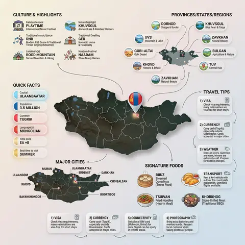
Ultra-clean modern country infographic poster (1080x1080), premium editorial layout meets lifestyle travel photography. Showcase Country as the hero visual in the center: a slightly angled 3D map cutout / glossy paper-cut map silhouette with subtle shadow, with a small flag pin marker on the capital city. Add a soft natural studio lighting feel, gentle gradient + minimal texture background for an upscale magazine look. Around the hero map, arrange information like a recipe infographic—dynamic, floating panels and clusters, not restricted to top-down. Clear hierarchy: hero map > key stats badges > cities/provinces > culture/foods > tips. SECTION 1 — Quick Facts (clean glassmorphism badges near the hero): - Capital: CAPITAL - Population: POPULATION - Currency: CURRENCY - Language(s): LANGUAGES - Time zone: TIMEZONE - Best time to visit: BEST SEASON Display as modern rounded pills/bubbles with accent color highlights. SECTION 2 — Provinces/States/Regions (ingredients-style clusters): List NUMBER provinces/regions with mini icons/mini map segments or simple pictograms. Example: PROVINCE 1, PROVINCE 2, PROVINCE 3... Each item includes a small icon (mountains, river, desert, forest, coastline) and one short label (e.g., “coastal”, “historic”, “wine region”). Arrange in curved flows connected with thin lines to the map. SECTION 3 — Major Cities (connected pin points): Show 5–8 key cities with small pin markers on/near the map and clean labels: City 1, City 2, City 3... Use lines/arrows from labels to map pins, avoiding clutter. SECTION 4 — Signature Foods (recipe vibe): Show 4–6 famous foods of COUNTRY with small tasty mini illustrations or photo-style cutouts: Food 1, Food 2, Food 3... Add short descriptors (spicy, street food, dessert, grilled). Keep vibrant natural food colors. SECTION 5 — Culture & Highlights (editorial callouts): Include icons and 1-line notes for: - Famous festival: FESTIVAL - Traditional music/dance: CULTURE - Landmark(s): LANDMARKS - Nature highlight: NATURE Use clean vector icons and minimal text. SECTION 6 — Travel Tips (step-like numbered panels): Show 4–6 numbered “tips” panels arranged around the hero map with arrows showing flow: 1) Tip 1 2) Tip 2 3) Tip 3 Add small icons (plane, train, hotel, safety, budget, camera, SIM card). Use glassmorphism panels with soft gradients and subtle drop shadows. Typography & Style: Modern sans-serif typography, high readability, strong grid alignment, airy negative space, subtle shadows, crisp vector icons, accent color palette inspired by COUNTRY flag (tasteful, not overwhelming). Editorial, premium, ultra-clean, social-feed optimized. Output requirements: Ultra-crisp, no watermark, no logo, no extra text beyond the provided labels, balanced spacing, high contrast readability, 1080×1080.

durs.ai
LEGO Technic Vehicle Studio Product Render
ProductPhoto

LEGO Technic Vehicle Studio Product Render

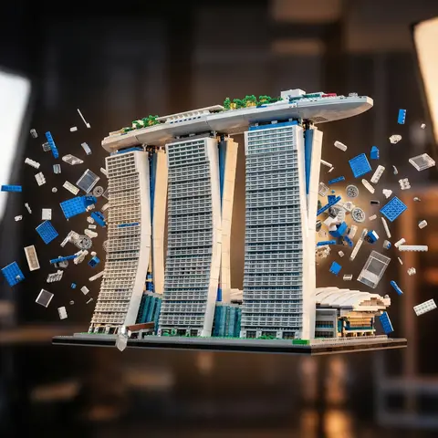
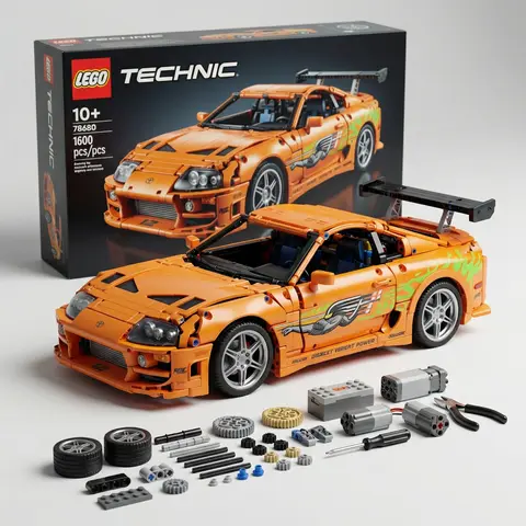
Ultra-detailed studio product render of a LEGO Technic style vehicle model based precisely on the next uploaded reference photo. The LEGO build must replicate the real vehicles exact shape, proportions, bodylines, color scheme, headlights, grille design, wheels, and overall silhouette while constructed entirely from realistic LEGO Technic pieces and panels. The vehicle is displayed in a clean professional product photography studio setup, placed on a smooth matte surface. Behind the car stands a large LEGO Technic product box, slightly blurred but clearly recognizable as a premium building kit package. The vehicle features aggressive widebody styling, large sport wheels, low stance, detailed front splitter, and a roof rack cargo box built from LEGO elements, maintaining the same design style as the reference vehicle. In front of the vehicle on the table are organized LEGO Technic components and tools, including small tires, axles, connectors, battery modules, rods, mechanical pieces, scissors, and miniature assembly tools, arranged neatly like a build kit. Lighting is soft cinematic studio lighting with subtle reflections on the LEGO plastic surfaces, ultra-sharp details, shallow depth of field, realistic shadows, premium commercial product photography style. Composition: hero angle slightly from the front side, emphasizing the vehicles shape and mechanical LEGO structure. Hyper-realistic materials, crisp textures, ultra detailed LEGO plastic surface, ray-traced reflections. 8K resolution, ultra sharp, photorealistic render, cinematic lighting, professional product shot Aspect Ratio 9:16

durs.ai