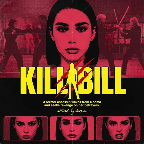
Prompt library

Prompts that work

Ready-made prompts for ads, logos, posters, 3D and more. Use one in a tap — or share your own.

+ Add a prompt
Luxury Brand Product Key Visual
PosterPhoto

Luxury Brand Product Key Visual

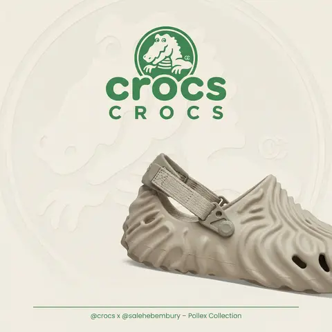
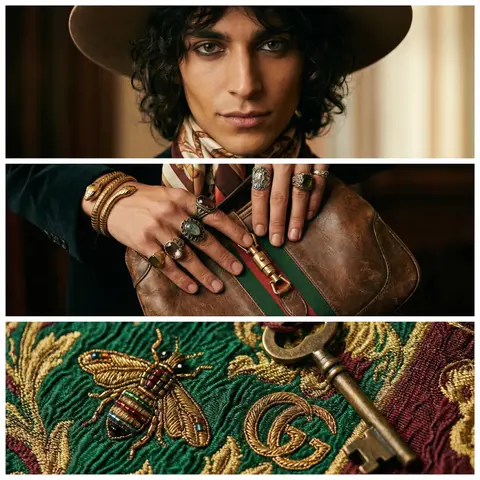
BRAND NAME + PRODUCT Act as a Senior Luxury Fashion Art Director and Studio Photographer specializing in high-end product key visuals for flagship campaigns, e-commerce editorials, and mobile-first brand content. PHASE 1: FORMAT & CANVAS Vertical format, 9:16 aspect ratio. Canvas background: a single flat field of warm off-white — not pure white, not grey. Target tone: soft ivory cream (#F4EFE6 equivalent), uniform and completely shadowless across the entire background plane. Autonomously determine BRAND NAMEs signature background tone — if the brand has a recognized house color for its packaging, tissue paper, or lookbook backgrounds, shift the canvas toward that specific off-white or neutral. The result must feel like an official brand document, not a generic studio. PHASE 2: BACKGROUND PATTERN (WATERMARK LAYER) Autonomously identify BRAND NAMEs iconic surface pattern, monogram, or archival motif — examples: a house monogram, toile print, geometric logo repeat, heritage emblem, or signature textile pattern. Render this pattern across the entire background canvas as a ghost watermark: same tone as the background but with a slight value shift (approximately 8–12% darker or lighter than the base). The pattern must be large in scale — individual motifs spanning 15–25% of canvas width. Opacity: 10–18% maximum. No hard edges. The pattern should feel embossed or tone-on-tone woven, not printed. It must recede behind all other elements. PHASE 3: LOGO PLACEMENT Autonomously reproduce BRAND NAMEs official logo with complete fidelity — correct letterforms, proportions, secondary marks (emblems, crowns, stars, monogram icons). Place the logo centered horizontally in the upper third of the frame (top 30% of canvas). Scale: the logo should span approximately 40–50% of canvas width — prominent but not overwhelming. Logo rendering: flat 2D, no extrusion, no chrome. Color: autonomously apply BRAND NAMEs official logo colorway — the exact brand-standard color(s) used on official packaging and website. If the brand uses a two-tone logo (icon + wordmark in different colors), preserve that hierarchy precisely. Directly below the main logo mark, place the full BRAND NAME wordmark in spaced capital letters — clean, geometric sans-serif, tracking: +200 to +300, same brand color, optical size approximately 60% of logo height. No decorative elements between logo and wordmark. PHASE 4: PRODUCT PLACEMENT Render PRODUCT as a photorealistic studio object with maximum material fidelity: — Leather: visible grain, pore structure, stitching thread texture, realistic edge paint. — Hardware: gold or silver metal with micro-reflections, not flat. — Canvas/fabric: woven fiber detail, not smooth CG. — All brand-specific surface patterns on the product must be accurate and legible. Placement: the product enters the frame from the bottom-right corner at a natural 25–35 degree angle, as if casually placed or mid-motion. The product is cropped — only 60–75% of the object is visible within the frame. The crop should feel intentional and editorial, not accidental. The product occupies the lower 55–65% of the canvas. The product must feel physically present in the space — not floating. Cast an extremely soft, barely visible contact shadow (opacity 8–12%) on the canvas beneath the nearest edge. No hard drop shadows. PHASE 5: LIGHTING Lighting: simulated large north-facing studio window light. Soft, directional, shadowless on the background. Color temperature: 5500–6000K (neutral daylight, slightly cool). Key light: large softbox equivalent from upper-left, filling the entire product surface evenly with minimal contrast ratio (1.2:1 to 1.5:1 max). Fill light: large bounce from right side, eliminating all harsh shadows. No rim light. No dramatic contrast. The lighting philosophy is: the product sells itself — light only reveals, never performs. Global Illumination enabled for subtle inter-reflections between product surfaces. No specular hotspots on leather — only on metal hardware. PHASE 6: TYPOGRAPHY & FINISHING Bottom of frame: a thin horizontal rule line (1px, brand color, 80% canvas width, centered). Below the rule: a single line of micro-copy — a social handle, collection name, or campaign label — in the same clean sans-serif, lowercase or small-caps, minimal tracking. Autonomously generate a contextually appropriate label for BRAND NAME. TECH SPECS Render engine: photorealistic CGI, Keyshot / Octane product visualization aesthetic. Resolution: 9:16, ultra-high detail. Depth of Field: f/16 equivalent — everything in sharp focus. Zero bokeh. Tack-sharp edges on all product details.Tone mapping: clean, true-to-life. No filmic crush. No vignette. No grain. Color grade: neutral, faithful to real product color. Slight warmth in the ivory background only. No AI-plastic normals on leather or fabric. Microscopic surface imperfection maps required. No reflections on background. No environmental reflections — studio only. Mood reference: Louis Vuitton / Bottega Veneta / Celine official e-commerce and campaign photography standard. Clean enough to be used as a press image.
durs.ai
Super Famicom RPG Character Sprite Sheet
SurrealPhoto

Super Famicom RPG Character Sprite Sheet

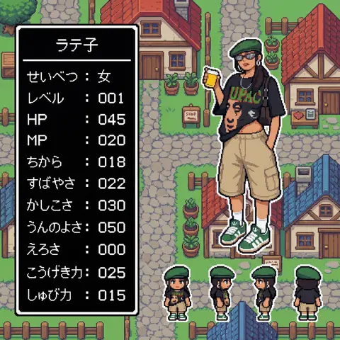
Aspect Ratio: 16:9 subject: - Transform the character from reference image A into: 1) A main 32x32 Super Famicom-style sprite (max 16 colors). 2) Four field-movement sprites (front, left, right, back), each 16x16 pixels, max 16 colors. - Preserve the character’s recognizable traits, clothing, colors, hairstyle, and silhouette from reference A. - If reference A is not full-body, reconstruct missing parts naturally to create a complete full-body 32x32 sprite. composition: Background should be a retro fantasy-RPG overworld field featuring: - cobblestone streets - rustic houses with tiled roofs - wooden fences and signboards - simple shops - simple 16-bit-style terrain transitions - no modern or realistic graphics - Place the enlarged 32x32 main sprite on the right. - Place the four 16x16 field sprites horizontally at the main sprite’s feet (front, left, right, back). - Place a retro RPG-style status window on the left. action: - Main sprite: same pose as reference A, converted to pixel art. - Field sprites: neutral standing pose facing front, left, right, back. location: Retro overworld field environment: - Cobblestone paths - Rustic houses with red or blue tiled roofs - Wooden fences - Simple shop signs - Old-school RPG map ambience style: - Super Famicom-inspired pixel art. - Main sprite: 32x32, max 16 colors. - Field sprites: 16x16, max 16 colors. - Background: 16-bit overworld field tiles. - Hard-edged pixels; no anti-aliasing; no gradients. - Limited-palette retro look. camera_lighting: - Orthographic, flat. - Minimal shading consistent with pixel-art style. colors: - Sprite palettes limited to 16 colors including transparency. - Background palette: - Greys for stone - Browns for wood - Red/Blue for roofs - Green for potted plants - All colors in retro 16-bit pixel palette style - Status window: - white border - black background - white pixel-font text text: # 名前はひらがな/カタカナで4文字以内。ここを直接書き換えて使用。 - At the top of the status window, center-aligned: - 「なまえ」 # 区切り線:ウィンドウ幅と一致した1本の水平線のみ - Draw a single-pixel horizontal divider line: - one pixel thick - full width of window - straight - not double-line or decorative # ステータス:項目名は左揃え、数値は3桁右揃え - Display the following stats: - 「せいべつ: 」 - 「レベル: 」 # max 99 - 「HP: 」 # max 999 - 「MP: 」 # max 999 - 「ちから: 」 # max 255 - 「すばやさ: 」 # max 255 - 「かしこさ: 」 # max 255 - 「うんのよさ: 」 # max 255 - 「えろさ: 」 # max 255 (inferred naturally) - 「こうげき力: 」 # max 999 - 「しゅび力: 」 # max 999 - Formatting rules: - Labels left-aligned - Numbers right-aligned in a 3-character field - Monospaced retro pixel-font required edit_instructions: - Convert reference A to a true 32x32 sprite using fixed pixel grid. - If reference is partial-body, reconstruct missing torso, legs, arms, shoes, etc., naturally and consistently. - Generate 4 field sprites (front/left/right/back) at 16x16 (max 16 colors). - Upscale sprites crisply; no smoothing. - Render a retro 16-bit overworld field background with grass, forest, and water tiles. - Status window must have white pixel border and black fill. - Name must be centered, 4 chars max, hiragana/katakana only. - Divider must be a single, pixel-straight line across width. - Stat labels left, numbers right (3-digit width). - Avoid copyrighted UI designs or specific franchise content. references: - A: Character appearance and pose. extras: - Pixel-perfect SFC-style sprite and field map rendering. - Consistent retro palette usage. - Retro RPG mockup layout.

durs.ai
Fashion Week Editorial Split Layout Magazine Poster Face Swap
PosterPhoto

Fashion Week Editorial Split Layout Magazine Poster Face Swap

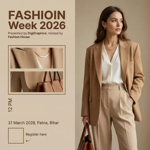
Ultra-realistic high-end fashion advertisement poster, minimalist editorial magazine style. STRICT LAYOUT (do not change anything): Vertical split composition. Right side: full-body fashion model. Left side: beige editorial panel with text + image frames. MODEL (KEEP EVERYTHING SAME, ONLY CHANGE FACE As GIVEN IN REFRANCE IMAGE): A stylish young woman standing in a relaxed confident pose, body slightly turned sideways, head turned to the right (looking away from camera). One hand inside pant pocket, other hand holding a brown leather bag. Outfit (exact): Beige/tan oversized blazer Soft white V-neck blouse High-waisted beige tailored trousers Minimal gold necklace Small earrings FACE REPLACEMENT (VERY IMPORTANT): Use the face from the provided reference image. Seamlessly blend the reference face onto the model’s head. Match skin tone, lighting, shadows, and color grading perfectly. Keep same head angle and expression as original pose. Ensure realistic identity preservation (no distortion, no mismatch). Ultra-clean face integration, professional fashion photography quality. LIGHTING & STYLE: Soft warm studio lighting, diffused, subtle shadows, luxury editorial look. Beige neutral tones, clean premium aesthetic. LEFT PANEL (COPY EXACT): Top text: “FASHIOIN Week 2026” (same spelling, bold modern sans-serif, brown) Below: “Presented by DigiGraphics. Hosted by Fashion House” Image frames: Two stacked rectangular frames showing cropped outfit close-ups (same outfit, same lighting) Bottom: Vertical text: “12 PM” “31 March 2026, Patna, Bihar” QR code placeholder “Register here” with small arrow STYLE KEYWORDS: ultra-realistic, editorial fashion poster, luxury branding, minimal, soft shadows, high detail, magazine layout.

durs.ai