Prompt library

Prompts that work

Ready-made prompts for ads, logos, posters, 3D and more. Use one in a tap — or share your own.

+ Add a prompt
Brand Logo Mashup Visual Parody Design
LogoPhoto

Brand Logo Mashup Visual Parody Design

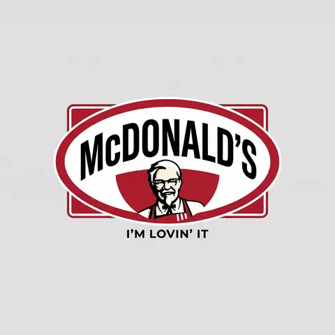
BRAND A + BRAND B. Act as a Brand Identity Designer specializing in Logo Mashups and Visual Parody. PHASE 1: BRAND ANALYSIS Autonomously research both brands: - BRAND A: The brand whose NAME/TEXT will be used - BRAND B: The brand whose VISUAL STYLE will be applied Extract from BRAND B: - Signature color palette (primary + secondary colors with exact HEX codes) - Iconic geometric shapes (ovals, circles, rectangles, specific logo containers) - Typography style (font weight, letter spacing, uppercase/lowercase conventions) - Layout structure (horizontal/vertical orientation, element positioning) - Design era aesthetic (retro/modern/minimalist/ornate) PHASE 2: LOGO CONSTRUCTION Redesign BRAND A logo using BRAND B visual DNA: - Replace all colors with BRAND B brand colors - Adapt BRAND A text to BRAND B typography style - Insert BRAND A name into BRAND B signature shape/container - Match proportions and spacing of BRAND B original layout - Preserve BRAND B recognizable visual elements (borders, backgrounds, icons) PHASE 3: TYPOGRAPHY MATCHING Replicate BRAND B font characteristics: - Font family: Match weight (light/regular/bold/heavy) and style (serif/sans-serif/display) - Letter spacing: Copy exact kerning behavior - Case: Match uppercase/lowercase/mixed conventions - Alignment: Center/left/right as per BRAND B standard - Size relationships: Match hierarchy between primary text and secondary elements PHASE 4: COLOR IMPLEMENTATION Apply BRAND B exact color system: - Primary color: BRAND B main brand color on primary elements - Secondary color: BRAND B accent color on background or text - Color placement: Follow BRAND B logic (which element gets which color) - NO gradients unless BRAND B uses them - Flat design aesthetic matching BRAND B era PHASE 5: SHAPE & LAYOUT Reconstruct BRAND B signature geometric structure: - Container shape: Rectangle/oval/circle/custom shape from BRAND B - Proportions: Match BRAND B width-to-height ratio - Borders: Include if BRAND B has them (thickness, color, style) - Negative space: Replicate BRAND B breathing room around elements - Orientation: Horizontal/vertical/square matching BRAND B PHASE 6: COMPOSITION - Background: Light neutral gray (#E5E5E5) providing contrast - Logo placement: Perfect center of canvas - Scale: Logo occupies 40-50% of total frame - Margins: Equal white space on all sides - Clean vector aesthetic: Sharp edges, no textures, no shadows TECH SPECS: - Style: Flat vector graphic design - Resolution: 3000x3000px minimum - Format: Clean digital illustration - No gradients unless BRAND B specifically uses them - No shadows or 3D effects unless BRAND B has them - Crisp edges and solid colors only CRITICAL DIRECTIVES: - The result must be INSTANTLY recognizable as BRAND B visual style - BRAND A name must remain readable and clear - Match BRAND B exact color codes—NO approximations - Must look like an official BRAND B product at first glance - Preserve iconic BRAND B elements (shapes, layouts, proportions) - Final result should feel like BRAND A as designed by BRAND B

durs.ai
Floating Biscuit Commercial Editorial
AdvertisementPhoto

Floating Biscuit Commercial Editorial

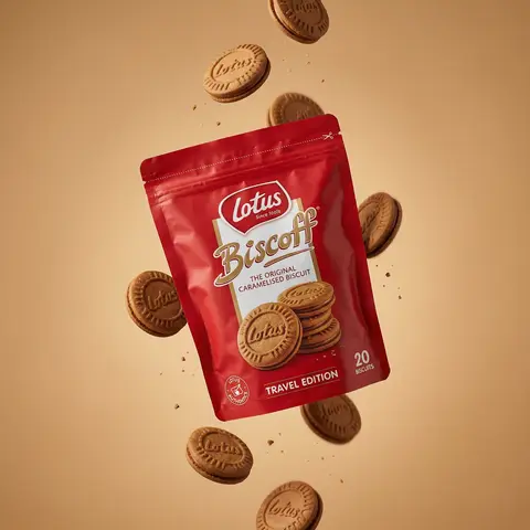
Ultra-realistic editorial food commercial photography, Main subject project). Use the exact uploaded product image as the main subject, foating subtly in mid-air. Exact real-world packaging identical ouch shape, red color tone, logo, typography, icons, illustrations, material finish. No redesign, no recolor, no distortion, no missing text. Floating food elements (CRITICAL - BISCUITS ONLY): Multiple Lotus Biscoff sandwich biscuits floating gently around the pouch. Biscuits must be 100% IDENTICAL to the biscuits shown on the product packaging illustration: - same round biscuit shape same sandwich thickness - same embossed Lotus logo - same baked brown color and edge detail No reinterpretation, no stylized cookies, no generic biscuit shapes. Motion & physics: Biscuits appear suspended mid-air with subtle vertical separation, as if captured at peak motion. Natural gravity feel — biscuits look slightly heavy, not weightless. Minimal crumbs and tiny biscuit particles floating softly, realistic scale only. Composition: Hero pouch slightly off-center, dominant and clearly readable. Biscuits arranged in a loose vertical flow around the pouch, inspired by high-speed food photography. Clean spacing, strong depth separation, premium balance. Background: Warm studio background in soft caramel / warm beige tone. Smooth gradient, matte finish. No text, no graphics, no patterns. Lighting: Soft studio lighting with controlled highlights. Gentle rim light separating biscuits and pouch from background. Natural shadows and realistic light falloff. No dramatic glow. Material realism: Authentic flexible pouch creases and folds. Accurate Biscoff red color reproduction. Biscuits show fine baked texture, embossed logo clarity, natural crumb detail. Camera & optics: Shot on Hasselblad flagship medium-format camera. 80mm lens equivalent. f/8, ISO 64. Ultra-high dynamic range, clean color science, smooth tonal transitions. Crisp but soft editori: sharpness. Style constraints: Photorealistic. Luxury editorial food photography. Not CGI. Not cartoon. Not Al-styled. Looks like a real international FMCG campaign visual.

durs.ai
Luxury Brand Product Key Visual
PosterPhoto

Luxury Brand Product Key Visual

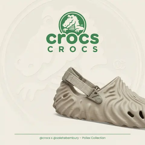
BRAND NAME + PRODUCT Act as a Senior Luxury Fashion Art Director and Studio Photographer specializing in high-end product key visuals for flagship campaigns, e-commerce editorials, and mobile-first brand content. PHASE 1: FORMAT & CANVAS Vertical format, 9:16 aspect ratio. Canvas background: a single flat field of warm off-white — not pure white, not grey. Target tone: soft ivory cream (#F4EFE6 equivalent), uniform and completely shadowless across the entire background plane. Autonomously determine BRAND NAMEs signature background tone — if the brand has a recognized house color for its packaging, tissue paper, or lookbook backgrounds, shift the canvas toward that specific off-white or neutral. The result must feel like an official brand document, not a generic studio. PHASE 2: BACKGROUND PATTERN (WATERMARK LAYER) Autonomously identify BRAND NAMEs iconic surface pattern, monogram, or archival motif — examples: a house monogram, toile print, geometric logo repeat, heritage emblem, or signature textile pattern. Render this pattern across the entire background canvas as a ghost watermark: same tone as the background but with a slight value shift (approximately 8–12% darker or lighter than the base). The pattern must be large in scale — individual motifs spanning 15–25% of canvas width. Opacity: 10–18% maximum. No hard edges. The pattern should feel embossed or tone-on-tone woven, not printed. It must recede behind all other elements. PHASE 3: LOGO PLACEMENT Autonomously reproduce BRAND NAMEs official logo with complete fidelity — correct letterforms, proportions, secondary marks (emblems, crowns, stars, monogram icons). Place the logo centered horizontally in the upper third of the frame (top 30% of canvas). Scale: the logo should span approximately 40–50% of canvas width — prominent but not overwhelming. Logo rendering: flat 2D, no extrusion, no chrome. Color: autonomously apply BRAND NAMEs official logo colorway — the exact brand-standard color(s) used on official packaging and website. If the brand uses a two-tone logo (icon + wordmark in different colors), preserve that hierarchy precisely. Directly below the main logo mark, place the full BRAND NAME wordmark in spaced capital letters — clean, geometric sans-serif, tracking: +200 to +300, same brand color, optical size approximately 60% of logo height. No decorative elements between logo and wordmark. PHASE 4: PRODUCT PLACEMENT Render PRODUCT as a photorealistic studio object with maximum material fidelity: — Leather: visible grain, pore structure, stitching thread texture, realistic edge paint. — Hardware: gold or silver metal with micro-reflections, not flat. — Canvas/fabric: woven fiber detail, not smooth CG. — All brand-specific surface patterns on the product must be accurate and legible. Placement: the product enters the frame from the bottom-right corner at a natural 25–35 degree angle, as if casually placed or mid-motion. The product is cropped — only 60–75% of the object is visible within the frame. The crop should feel intentional and editorial, not accidental. The product occupies the lower 55–65% of the canvas. The product must feel physically present in the space — not floating. Cast an extremely soft, barely visible contact shadow (opacity 8–12%) on the canvas beneath the nearest edge. No hard drop shadows. PHASE 5: LIGHTING Lighting: simulated large north-facing studio window light. Soft, directional, shadowless on the background. Color temperature: 5500–6000K (neutral daylight, slightly cool). Key light: large softbox equivalent from upper-left, filling the entire product surface evenly with minimal contrast ratio (1.2:1 to 1.5:1 max). Fill light: large bounce from right side, eliminating all harsh shadows. No rim light. No dramatic contrast. The lighting philosophy is: the product sells itself — light only reveals, never performs. Global Illumination enabled for subtle inter-reflections between product surfaces. No specular hotspots on leather — only on metal hardware. PHASE 6: TYPOGRAPHY & FINISHING Bottom of frame: a thin horizontal rule line (1px, brand color, 80% canvas width, centered). Below the rule: a single line of micro-copy — a social handle, collection name, or campaign label — in the same clean sans-serif, lowercase or small-caps, minimal tracking. Autonomously generate a contextually appropriate label for BRAND NAME. TECH SPECS Render engine: photorealistic CGI, Keyshot / Octane product visualization aesthetic. Resolution: 9:16, ultra-high detail. Depth of Field: f/16 equivalent — everything in sharp focus. Zero bokeh. Tack-sharp edges on all product details.Tone mapping: clean, true-to-life. No filmic crush. No vignette. No grain. Color grade: neutral, faithful to real product color. Slight warmth in the ivory background only. No AI-plastic normals on leather or fabric. Microscopic surface imperfection maps required. No reflections on background. No environmental reflections — studio only. Mood reference: Louis Vuitton / Bottega Veneta / Celine official e-commerce and campaign photography standard. Clean enough to be used as a press image.

durs.ai
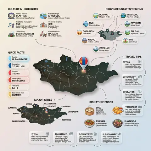
Country Infographic Editorial Poster
PosterPhoto

Country Infographic Editorial Poster

Ultra-clean modern country infographic poster (1080x1080), premium editorial layout meets lifestyle travel photography. Showcase Country as the hero visual in the center: a slightly angled 3D map cutout / glossy paper-cut map silhouette with subtle shadow, with a small flag pin marker on the capital city. Add a soft natural studio lighting feel, gentle gradient + minimal texture background for an upscale magazine look. Around the hero map, arrange information like a recipe infographic—dynamic, floating panels and clusters, not restricted to top-down. Clear hierarchy: hero map > key stats badges > cities/provinces > culture/foods > tips. SECTION 1 — Quick Facts (clean glassmorphism badges near the hero): - Capital: CAPITAL - Population: POPULATION - Currency: CURRENCY - Language(s): LANGUAGES - Time zone: TIMEZONE - Best time to visit: BEST SEASON Display as modern rounded pills/bubbles with accent color highlights. SECTION 2 — Provinces/States/Regions (ingredients-style clusters): List NUMBER provinces/regions with mini icons/mini map segments or simple pictograms. Example: PROVINCE 1, PROVINCE 2, PROVINCE 3... Each item includes a small icon (mountains, river, desert, forest, coastline) and one short label (e.g., “coastal”, “historic”, “wine region”). Arrange in curved flows connected with thin lines to the map. SECTION 3 — Major Cities (connected pin points): Show 5–8 key cities with small pin markers on/near the map and clean labels: City 1, City 2, City 3... Use lines/arrows from labels to map pins, avoiding clutter. SECTION 4 — Signature Foods (recipe vibe): Show 4–6 famous foods of COUNTRY with small tasty mini illustrations or photo-style cutouts: Food 1, Food 2, Food 3... Add short descriptors (spicy, street food, dessert, grilled). Keep vibrant natural food colors. SECTION 5 — Culture & Highlights (editorial callouts): Include icons and 1-line notes for: - Famous festival: FESTIVAL - Traditional music/dance: CULTURE - Landmark(s): LANDMARKS - Nature highlight: NATURE Use clean vector icons and minimal text. SECTION 6 — Travel Tips (step-like numbered panels): Show 4–6 numbered “tips” panels arranged around the hero map with arrows showing flow: 1) Tip 1 2) Tip 2 3) Tip 3 Add small icons (plane, train, hotel, safety, budget, camera, SIM card). Use glassmorphism panels with soft gradients and subtle drop shadows. Typography & Style: Modern sans-serif typography, high readability, strong grid alignment, airy negative space, subtle shadows, crisp vector icons, accent color palette inspired by COUNTRY flag (tasteful, not overwhelming). Editorial, premium, ultra-clean, social-feed optimized. Output requirements: Ultra-crisp, no watermark, no logo, no extra text beyond the provided labels, balanced spacing, high contrast readability, 1080×1080.

durs.ai
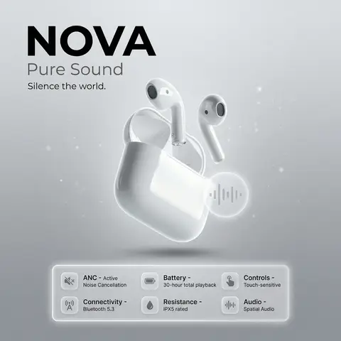
NOVA Pure Sound Wireless Earbuds Premium Ad
PosterPhoto

NOVA Pure Sound Wireless Earbuds Premium Ad

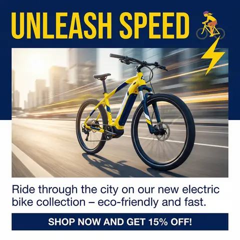
prompt: brand: <b>NOVA</b>, title: Pure Sound, tagline: Silence the world., visual_style: composition: minimalist product ad, Apple-style premium aesthetic, background: soft gray gradient with subtle noise texture, ambient light particles or micro-gradient overlays to gently fill negative space without clutter, lighting: high-end studio lighting, soft rim light, gentle catchlights, negative_space: balanced asymmetry with subtle decorative elements (soft gradient orbs, faint geometric lines) to occupy empty areas while preserving clean minimalism , product: name: NOVA Pure Sound Wireless Earbuds, specifications: finish: matte black anodized aluminum, design: ergonomic in-ear fit, seamless unibody construction, features: Active Noise Cancellation (ANC), Bluetooth 5.3 connectivity, 30-hour battery life with charging case, IPX5 water resistance, Touch-sensitive controls, Spatial audio support , dimensions: Earbud: 2.1g each | Case: 45g , placement: centered, floating slightly above surface with subtle drop shadow , specifications_ui: container_style: glass morphism panel, icon_style: effect: frosted glass blur (14px), soft white border glow, subtle inner shadow for depth, background: rgba(255,255,255,0.1) with backdrop-filter blur, layout: icons arranged in a responsive grid beneath product, evenly spaced with gentle hover elevation , specs: icon: 🔇, label: ANC, value: Active Noise Cancellation, tooltip: Block out distractions, immerse in pure sound , icon: 📡, label: Connectivity, value: Bluetooth 5.3, tooltip: Stable, low-latency wireless connection , icon: 🔋, label: Battery, value: 30-hour total playback, tooltip: All-day power with compact charging case , icon: 💧, label: Resistance, value: IPX5 rated, tooltip: Sweat and splash resistant for active lifestyles , icon: 👆, label: Controls, value: Touch-sensitive, tooltip: Intuitive gestures for music, calls, and voice assistant , icon: 🔊, label: Audio, value: Spatial Audio, tooltip: Immersive 3D soundstage with dynamic head tracking , ui_elements: accent_icon: style: glass morphism, description: translucent frosted-glass icon with subtle blur, soft white border glow, floating near product, symbol: abstract soundwave or minimalist earbud silhouette, effect: background blur: 12px, opacity: 0.85, inner shadow for depth , typography: brand_font: bold, ultra-clean sans-serif (e.g., SF Pro Display Bold), body_font: light weight, high legibility, color: charcoal black / soft white contrast, hierarchy: brand prominent, tagline subtle, specs clean and scannable , mood: premium, serene, technologically sophisticated, output_format: ultra-high-resolution, 4K, photorealistic render with shallow depth of field

durs.ai
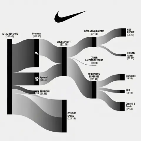
Corporate Income Statement Sankey Diagram
AdvertisementPhoto

Corporate Income Statement Sankey Diagram

Subject: A professional financial Sankey diagram visualizing the Income Statement of a major corporation, in the style of App Economy Insights and US corporate financial reports.Visual Style: High-fidelity vector infographic, clean minimalist aesthetic, flat design. The background is a clean, very light grey or off-white.Color Strategy - CRITICAL: Analyze the Insert Brand Name Here logo. Extract its primary brand color (e.g., if Nvidia use neon green, if Meta use blue, if Tesla use red). Use this primary color as the dominant theme for the main revenue flows and profit blocks. Create a harmonious color palette based on this primary color: use saturated shades for the vertical nodes (bars) and semi-transparent, lighter opacity gradients for the flowing paths to ensure a cohesive and professional look. Avoid clashing colors.Composition & Structure: Flow: A horizontal flow from Left (Revenue Sources) to Right (Net Profit). Texture: The connecting paths (flows) must appear silky smooth with elegant Bezier curves, looking like liquid ribbons, not jagged lines. Iconography: On the left side (Revenue sources), include specific, minimalist flat vector icons representing the business segments (e.g., a car icon for automotive, a cloud icon for services, a chip icon for hardware). Branding: Place the official Insert Brand Name Here logo clearly at the top center or near the central revenue bar.Details: High resolution, 4k, sharp typography (sans-serif), professional data visualization layout. The chart clearly distinguishes between Revenue, Gross Profit, Operating Expenses, and Net Profit.

durs.ai
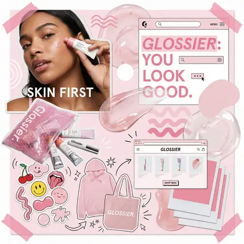
Glossier Brand Identity Moodboard Collage
PosterPhoto

Glossier Brand Identity Moodboard Collage

You are a world class creative director, brand strategist, editorial art director, and visual identity designer specializing in high impact campaign systems for global brands. Your task is to create a bold, visually explosive, highly curated editorial moodboard collage composition that feels like a modern brand identity system. This should feel like a brand world captured in one frame, not a clean layout, slightly chaotic, layered, and expressive. BRAND INPUTS: BRAND NAME: GLOSSIER INDUSTRY / PRODUCT TYPE: beauty / skincare PRIMARY BRAND COLOR: soft pink SECONDARY BRAND COLOR: white ACCENT COLOR (optional): translucent gloss BRAND PERSONALITY: fresh, minimal, youthful, clean OPTIONAL SLOGAN / TEXT: SKIN FIRST VISUAL STYLE: Create a dense, layered moodboard-style composition combining: • real product photography or lifestyle shots • packaging elements (bags, boxes, labels, tags) • typography snippets and brand phrases • illustrated graphics and doodles • icons, symbols, and stickers • abstract graphic shapes and patterns • UI-like elements (menus, cards, labels) • editorial cutouts and overlapping assets The composition should feel: • slightly messy but intentionally designed • layered with depth and overlaps • like a Pinterest board meets high-end campaign • expressive, youthful, and brand-heavy • visually rich and scroll-stopping ART DIRECTION: Include a mix of elements such as: • product packaging mockups (bags, boxes, labels, stickers) • lifestyle shot (person interacting with product or brand) • bold typography blocks with brand phrases • illustrated objects interacting with real elements • menu-style or UI-style panels • abstract shapes, blobs, squiggles, starbursts • brand-related icons or symbols • badge / stamp graphics • textile or merch items (t-shirt, cap, tote bag, etc.) • playful graphic overlays COMPOSITION RULES: • asymmetrical layout (NOT grid-based) • elements scattered but balanced • overlapping layers with depth • mix of large hero elements + small details • combine clean areas with dense clusters • include cutout-style compositions • avoid too much empty space COLOR & DESIGN LANGUAGE: • strictly follow brand color palette • strong use of PRIMARY COLOR across elements • secondary color used for contrast and layering • minimal additional colors (keep it brand-consistent) • high contrast, bold visual identity TYPOGRAPHY: • modern editorial typography • mix of serif / sans-serif if relevant • bold headlines + small UI text • include brand name and/or slogan naturally in layout • typography should feel integrated, not separate VISUAL CHARACTERISTICS: • premium campaign look • modern brand identity system • editorial + commercial hybrid aesthetic • highly shareable social media visual • playful but intentional chaos • cohesive even in randomness IMPORTANT: This should feel like: • a brand world explosion in one frame • a creative direction board for a global campaign • a visual identity snapshot of the brand NOT a clean layout NOT a grid NOT minimal It must feel alive, layered, and expressive.

durs.ai
Collage Infographic Blue Orange Paper Cut Editorial Poster
PosterPhoto

Collage Infographic Blue Orange Paper Cut Editorial Poster

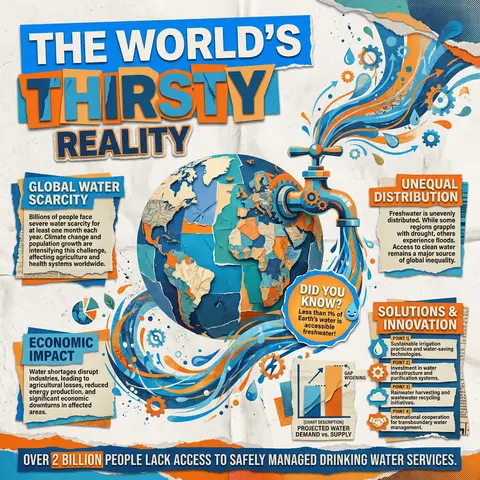
A modern collage-style infographic poster with a textured paper background (slightly crumpled, off-white). The design uses bold cut-out shapes, layered elements, and a mix of blue and orange color blocks for strong contrast. At the top, include large bold headline text in a cutout style: MAIN HEADLINE PART 1 (on colored rectangle) MAIN HEADLINE PART 2 (overlapping layered style) MAIN HEADLINE PART 3 (secondary emphasis) In the center, place a large surreal object: MAIN VISUAL OBJECT (e.g., water tap, machine, globe, etc.) The object should be oversized, slightly collage-style, with paper cut edges and shadow Add dynamic element: FLOW EFFECT (e.g., water flowing, energy lines, particles) Surrounding the main visual, include multiple information boxes with headings: 🔹 Left section: SECTION TITLE 1 PARAGRAPH 1 🔹 Right section: SECTION TITLE 2 PARAGRAPH 2 🔹 Bottom left: SECTION TITLE 3 PARAGRAPH 3 🔹 Bottom right: SECTION TITLE 4 Bullet points: POINT 1 POINT 2 POINT 3 POINT 4 Add a small chart/graph element: CHART DESCRIPTION (e.g., bar chart, stats comparison) Add a highlighted label or sticker: HIGHLIGHT TEXT (e.g., “Fun Facts!”) At the bottom, include a bold fact strip: BOTTOM FACT TEXT Add extra collage elements like: torn paper edges small illustrations/icons (e.g., DECORATIVE ELEMENTS) overlapping shapes and textures Style: editorial infographic, collage design, bold typography, cut-and-paste aesthetic, paper texture, modern activism poster, high contrast (blue + orange), grainy print effect, 4K quality.

durs.ai
A&H Collection Isometric Fashion Hoodie Smartphone 3D Product Poster
PosterPhoto

A&H Collection Isometric Fashion Hoodie Smartphone 3D Product Poster

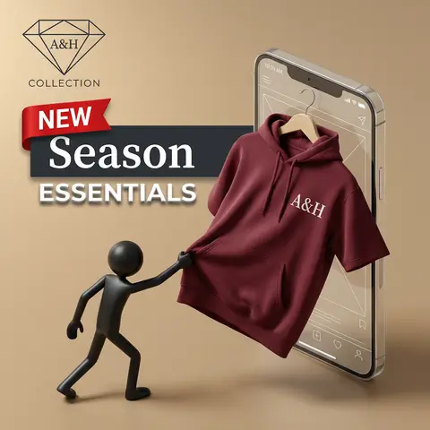
A professional product advertisement in a 3D isometric style on a warm, matte beige-tan background. ​In the top left, a sleek, minimalist black wireframe diamond icon is displayed. Centered inside the diamond is the text A&H in a refined, dark serif font. Below the diamond, the word COLLECTION is written in a smaller, dark, wide sans-serif font. ​Below the logo area, a striking text banner spans across. At the top left of the text is a distinct, red fabric ribbon banner with the word NEW in white, capital, sans-serif letters. Positioned slightly behind and below the ribbon is a dark charcoal horizontal block, on which the word Season is prominently displayed in a large, clean, white serif font. Below this block, the word ESSENTIALS appears in all caps, sans-serif font, rendered in white with a clear grey drop shadow, giving it depth. ​The main composition features a large, glass-like smartphone mock-up with visible white wireframe interface details and status bar icons. From the screen of the phone, a deep maroon, premium-quality short-sleeve hooded sweatshirt on a natural wooden hanger is partially pulled out, with most of the garment projecting forward into 3D space. The sweatshirt has an attached hood with drawstrings and a central pocket. On the chest of the hoodie, the text A&H is sharply printed in a white serif font, matching the logo style. ​On the left side, on the floor surface, a sleek, smooth, matte black plastic 3D stick-figure man is posed as if reaching up and actively pulling the edge of the hoodie with its right hand. The lighting is soft and directional, highlighting textures and creating natural shadows. The scene has a clean, premium, and sophisticated feel.

durs.ai