Prompt library

Prompts that work

Ready-made prompts for ads, logos, posters, 3D and more. Use one in a tap — or share your own.

+ Add a prompt
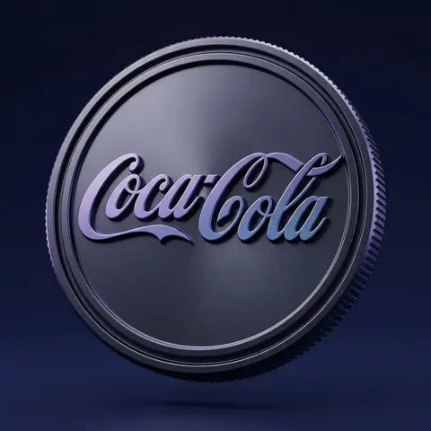
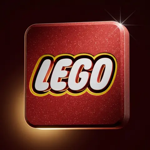
Dark Anodized Metal Coin Emblem Render
3DPhoto

Dark Anodized Metal Coin Emblem Render

Use the uploaded logo/isotype as the exact base silhouette. Preserve the original proportions, curvature, thickness, spacing, bevels, and structure. Do not redesign the logo. Transform the logo into a premium 3D metallic coin emblem. Structure: The logo embossed and extruded from a circular coin base Thick volumetric 3D object Deep engraved outer rim Precise bevels and clean chamfers Industrial edge ridges along the coin side Strong dimensional depth No distortion of the original letterform Material: Dark anodized metal base Smooth satin metallic finish Subtle brushed micro-texture Glossy ralsed letter surface Cool purple and blue reflective gradients Soft specular highlights Physically accurate reflections Premium high-density material feel Surface details: Clean embossed geometry Crisp edge transitions Controlled light falloff across curves Slight contrast between matte base and glossy symbol Environment: Deep dark blue to indigo gradient background Minimal clean studio composition Floating in mid-air No visible support Luxury product showcase setting Lighting: Cinematic studio lighting Soft key light from upper side Subtle purple-blue rim lighting Gentle reflection gradients across surface Soft shadow beneath High dynamic range Controlled contrast Camera: Slight three-quarter angle Centered composition 85mm lens look Soft depth of field High-resolution macro detail Editorial product photography aesthetic Mood: Premium Futuristic Luxurious Corporate Tech-driven High-end brand positioning Style: Ultra-realistic 3D render High-end visual campaign look Physically based rendering Sharp focus No text No additional elements

durs.ai
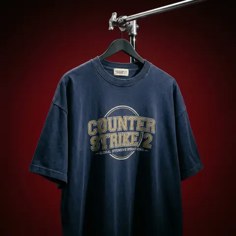
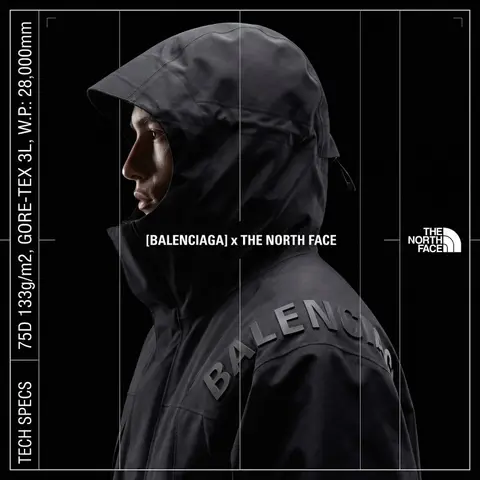
Cinematic Heavyweight T-Shirt Merch Campaign
ProductPhoto

Cinematic Heavyweight T-Shirt Merch Campaign

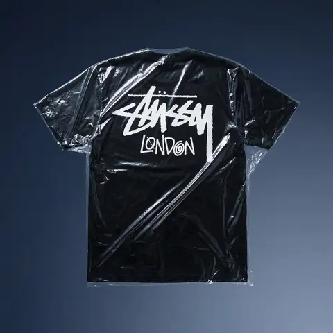
BRAND NAME. Act as a High-End Editorial Fashion Photographer specializing in dark, cinematic merch and streetwear product campaigns. PHASE 1: CONCEPT & OBJECT Photograph a single premium heavyweight cotton T-shirt hanging on a slim matte black clothing hanger. The hanger is suspended from an industrial chrome pipe rail with a visible mechanical clamp/hook fitting — the pipe enters the frame from the upper right corner at a diagonal angle, partially cropped by the frame. THE T-SHIRT: Oversized unisex silhouette, heavyweight garment-dyed cotton (320–380gsm equivalent). Color: autonomously determine the most iconic or culturally resonant base color associated with BRAND NAME — apply as a washed, slightly faded version (not factory-fresh, not overly distressed — editorial vintage). The shirt hangs with natural gravity drape — subtle wrinkles at the torso, slight fabric pull at the shoulders from the hanger. NOT ironed flat. NOT pinned. Pure natural hang. NECK LABEL: A small woven white label visible inside the back collar, folded slightly outward. The label reads BRAND NAME in fine serif or script typeface — small, understated, luxury. CHEST GRAPHIC: Autonomously design a chest-centered screen-print graphic that reflects BRAND NAMEs visual identity and cultural world. The graphic must follow this construction logic: - Style: Vintage varsity / retro sports circular badge OR editorial script lettering — the aesthetic that best fits BRAND NAMEs DNA - Technique: Screen-print appearance — ink sits ON the fabric, visible halftone texture at edges, slight cracking on the darkest ink areas (authentic vintage wear) - Color: 2–3 colors maximum. Autonomously determine the palette based on BRAND NAMEs iconic colors + white outline/stroke - Content: BRAND NAME wordmark or monogram rendered in the chosen style. Add one short sub-line of text (4–6 words) that captures BRAND NAMEs ethos or cultural reference - Scale: Graphic occupies ~35–40% of the shirts chest area PHASE 2: LIGHTING Single dominant key light: large softbox positioned front-left, elevated at 40 degrees above subject — Rembrandt lighting logic. This creates: - Strong illumination on the LEFT side of the shirt - The graphic/print fully lit and readable - RIGHT side falls into deep natural shadow (no fill light) - Hanger hardware catches a sharp specular highlight Color temperature: 4200K — slightly warm, tungsten-adjacent. No rim light. No background light. No lens flare. The shadow IS the aesthetic — do not fight it. Global Illumination: subtle bounce from the lit shirt face back onto the immediate background only. PHASE 3: BACKGROUND & ATMOSPHERE Seamless cyclorama backdrop: deep, saturated single-color gradient. Autonomously select the background color that creates maximum dramatic contrast with BRAND NAMEs shirt color while staying within a dark, moody palette — deep crimson, oxblood, prussian blue, forest shadow, noir charcoal. Vignette: strong radial darkening toward all four corners — center is 30% brighter than edges. No texture. No grain on BG. The background reads as infinite depth. PHASE 4: COMPOSITION & CAMERA Orientation: Portrait, 4:5 ratio. Camera angle: Slightly below eye-level, looking up 8–12 degrees — gives the garment presence and weight Framing: T-shirt occupies 70–75% of frame. Bottom hem is cropped slightly. Sleeve tips reach near frame edges. Hanger pipe enters from upper-right, cropped at frame edge. The hook/clamp mechanism is fully visible — its a design element. Rotation: Entire composition tilts 4–6 degrees counter-clockwise. Depth of Field: f/5.6 equivalent — entire shirt in sharp focus, background at soft focus threshold (not bokeh blurred — just atmospheric depth). Macro detail on fabric weave visible. TECH SPECS Render/Capture style: Photorealistic — NOT CGI render aesthetic. Must read as actual studio photography. Fabric texture: Individual cotton weave threads visible on the lit areas. Pilling micro-texture on surface. Subsurface light interaction on thick fabric ridges. Print texture: Screen-print ink layer has tactile presence — slightly raised, edge halftone dots, micro-cracking in dark fills. No AI plastic sheen on fabric. No oversaturated colors. No symmetrical composition. No ghost mannequin. No flat lay. Resolution: 4096 x 5120px. Post: Subtle film grain (ISO 800 equiv.), slight desaturation (-8), lifted blacks (cinematic), neutral-warm color grade. Style references: Undercover FW campaigns, Raf Simons archive product shots, Stüssy × Our Legacy editorials, Highsnobiety product features. NEGATIVE: No model wearing the shirt. No white background. No floating hanger (hardware must be attached to visible pipe). No CGI fabric simulation. No overly bright studio look.

durs.ai
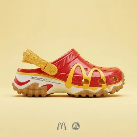
Premium Industrial Design Object Concept
AdvertisementPhoto

Premium Industrial Design Object Concept

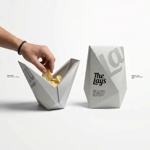
BRAND NAME: The core identity. CATEGORY: Clothing / Food / Automotive / Lifestyle. Goal: Generate a premium industrial design concept on a PURE WHITE background. 1. INNOVATION & OBJECT - Select one mundane functional object from CATEGORY. - Redesign it using unconventional, architectural, or origami-inspired geometry. - The object must look like a high-end designer invention, not a standard product. 2. UNIFIED COMPOSITION - Environment: A seamless, pure white studio background with a flat white floor. - Interaction: A human hand (natural texture) is shown using the object in the foreground, demonstrating its unique ergonomics. - Static Display: Right next to the hand, the same object is placed in a static, perfect pose to show its full silhouette and branding. - Shadows: Soft, realistic grey drop shadows on the white floor to provide depth and ground the objects. 3. BRANDING & TEXT - Identity: Apply the BRAND NAME logo in a high-contrast dark color (Black or Navy) directly onto the objects surface. - Technical Detail: Add small, elegant blocks of justified specification text in the white negative space around the objects for an editorial look. - Pattern: Use a subtle, oversized abstract fragment of the brands logo as a texture on the objects material. 4. MATERIALS & FINISH - High-quality matte materials only: heavy-duty recycled paper, sandblasted metal, or soft-touch polymer. - Sharp architectural lines and clean, premium craftsmanship.

durs.ai
Polished Steel Peony Product Photography
LogoPhoto

Polished Steel Peony Product Photography

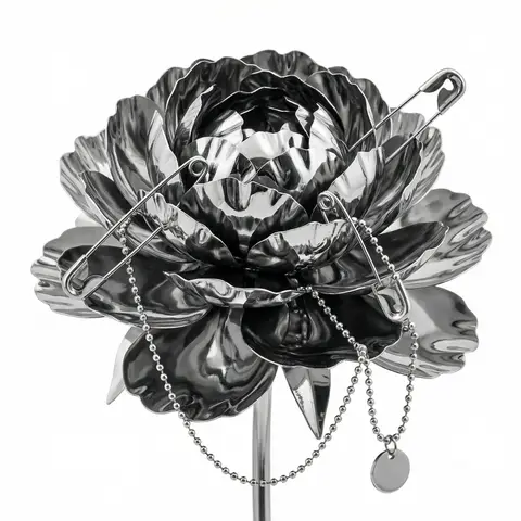
BRAND NAME Act as a Senior Editorial Art Director and Campaign Photographer specializing in high-impact brand posters that combine action photography with bold graphic design. Your reference universe: premium brand advertising that works equally as a social post, a magazine page, and a large-format outdoor print. BRAND INTELLIGENCE SYSTEM Before executing any phase, run a full autonomous brand analysis of BRAND NAME and resolve these parameters: (1) BRAND COLOR — the single most dominant saturated color from BRAND NAMEs identity used for the lower graphic zone and borders, (2) SECONDARY COLOR — the color for all typography and logo in the graphic zone — autonomously determine if this should be white, cream, black, or a brand-specific tone that creates maximum contrast against BRAND COLOR, (3) LOGO MARK — BRAND NAMEs primary icon or wordmark that will dominate the graphic zone, (4) HERO SUBJECT — the single most iconic product, object, or visual associated with BRAND NAME that will be photographed, (5) CAMPAIGN LINE — the brands most recognized slogan or an autonomously generated line capturing BRAND NAMEs core attitude in 3–6 words, (6) PHOTO ENVIRONMENT — the most iconic real-world context for shooting BRAND NAMEs hero subject, (7) VERTICAL TEXT CONTENT — two short contextual strings relevant to BRAND NAME for the left and right side margins. All parameters must be resolved before phase 1 begins. PHASE 1: CANVAS & FORMAT Vertical format, 4:5 ratio. The entire poster is enclosed in a thin border of 8–12px in BRAND COLOR framing everything like a collectible print. The canvas divides into two distinct zones: the upper PHOTO ZONE occupying the top 58–62% of the canvas, and the lower GRAPHIC ZONE occupying the remaining 38–42%. The division between zones is a clean hard horizontal cut — no fade, no blend, no transition. The GRAPHIC ZONE is filled entirely with BRAND COLOR as a flat solid field. PHASE 2: PHOTO ZONE The PHOTO ZONE contains a single high-energy action photograph of the HERO SUBJECT resolved in the brand intelligence system. Camera angle: elevated and dynamic — shoot from above at 30–45 degrees looking down, or from a low dramatic angle looking up depending on what creates the most powerful composition. Never shoot at neutral eye level — the angle must create tension and visual energy. The photograph fills the entire PHOTO ZONE edge to edge with no padding. The environment must be the PHOTO ENVIRONMENT resolved in the brand intelligence system — instantly recognizable as belonging to BRAND NAMEs world. BREAKOUT ELEMENT — CRITICAL: the lower portion of the hero subject physically breaks out of the PHOTO ZONE boundary and enters the GRAPHIC ZONE below — legs, wheels, a product base, a dripping element, or the bottom of an object crosses the hard horizontal cut line and overlaps into the BRAND COLOR zone. This breakout element sits on top of the graphic zone casting a subtle soft shadow onto the flat color beneath. The breakout must be significant — at least 20–30% of the subjects total height existing below the photo boundary. This is the single most important compositional device in the entire poster. PHASE 3: GRAPHIC ZONE The lower zone is a flat solid BRAND COLOR field. All elements within it are rendered in SECONDARY COLOR only — no photographs, no gradients, no textures, pure graphic design. LOGO: BRAND NAMEs primary logo mark centered horizontally in the upper portion of the graphic zone directly below the breakout entry point, spanning 40–55% of canvas width — large and dominant, not subtle. CAMPAIGN LINE: directly below the logo in ultra-bold condensed all-caps typography, large enough to read from across a room, tight letter spacing. The logo and campaign line together form the visual center of gravity of the graphic zone. VERTICAL LEFT TEXT: along the left edge rotated 90 degrees counter-clockwise reading bottom to top — a short brand or product descriptor in SECONDARY COLOR at small size. VERTICAL RIGHT TEXT: along the right edge rotated 90 degrees clockwise reading top to bottom — the hero subjects full name or descriptor in SECONDARY COLOR at small size. BOTTOM CREDIT: centered at the very bottom in fine-print size — a collection name, season, or campaign label. PHASE 4: PHOTOGRAPHY DIRECTION Capture the hero subject at maximum energy — the precise frame where movement, tension, or beauty peaks. For a person: mid-motion at full commitment to the action. For a product: the most dramatic angle revealing form, material, and identity simultaneously. For food: the moment of pour, cut, steam, or impact. For automotive: speed blur, drift, or heroic three-quarter angle. Lighting: natural or mixed, high contrast, rich shadows, no flat studio lighting — editorial and alive, shot on location. Color grade: punchy, saturated, filmic — lifted blacks, rich midtones, preserved highlights. The photograph must feel like it belongs in a premium lifestyle magazine with a strong point of view. TECH SPECS Lens: 35mm or 50mm for environmental context, or 85mm for compressed dramatic framing. Depth of field: subject sharp, background contextual at f/4 to f/8. Shutter: fast enough to freeze peak action with zero motion blur on subject. Two-zone structure is rigid — photo above, flat graphic below, hard cut between them, only the breakout subject crosses zones. Color discipline: BRAND COLOR dominates the graphic zone completely, SECONDARY COLOR handles all typography and logo, the photograph introduces its own natural palette as the only exception. Typography: condensed, bold, authoritative — no decorative fonts. Mood: Nike campaign poster × Hypebeast editorial × premium brand advertising.
durs.ai
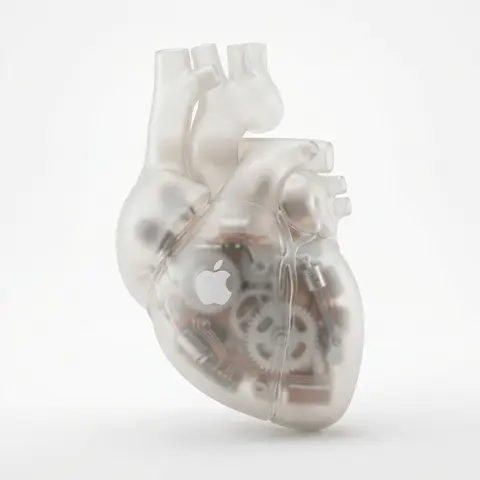
Industrial X-Ray Transparency Product Render
3DPhoto

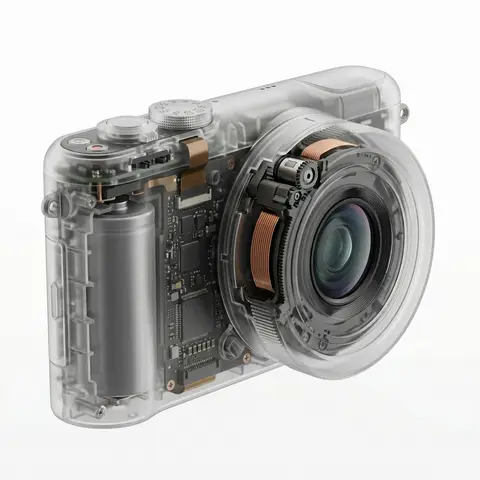
Industrial X-Ray Transparency Product Render

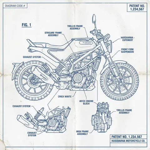
visual_style_analysis_v2: style_definition: name: Industrial X-Ray Transparency Render, core_aesthetic: Minimalist, Futuristic, Clinical Precision, Structural Functionalism , visual_logic: Exploded view aesthetics within a closed shell , color_system: palette_type: Monochromatic Grayscale with Metallic Accents, background: #F5F5F5 to #FFFFFF (Clean Studio White), foreground: outer_shell: Frosted Translucent White/Grey, inner_components_primary: Matte Black/Dark Graphite, inner_components_secondary: Metallic Silver/Copper, highlights: Soft Specular Highlights , internal_component_architecture: description: Hierarchy of internal parts to create realistic density, layer_1_structure_skeleton: elements: Injection molding ribs, screw bosses, mounting brackets, visual_role: Defines the shape and adds ghostly lines inside the shell , layer_2_power_drive: elements: Cylindrical/Pouch Batteries, Copper Coils, Transformers, Magnets, visual_role: Provides visual weight and dense black masses , layer_3_logic_control: elements: Printed Circuit Boards (PCB), Solder points, Silicon Chips, Ribbon Cables, visual_role: Adds intricate, fine detail and technical texture , layer_4_interface: elements: Tactile switches, USB-C ports, LED indicators, haptic motors, visual_role: Connects the inside to the outside surface , lighting_and_atmosphere: lighting_type: Backlit Clinical Studio, characteristics: Transmissive Glow, Rim Lighting to define edges, Soft Ambient Occlusion inside , materials_and_textures: shell_material: Frosted Polycarbonate (PC) with 85% opacity, internal_finish: Matte vs Glossy contrast (components are glossy, shell is matte), x_ray_effect: Depth-based opacity (thicker parts look darker) , demonstration_example: product_type: Pro Game Controller / Precision Tool, prompt_application: Show rumble motors (weights), battery pack in center, ribbon cables connecting triggers, complex PCB under buttons , ai_prompt_keywords_suggestion: X-ray render, translucent frosted shell, visible internal engineering, layered internal components, complex circuitry, copper coils and batteries, structural ribbing, C4D octane render, industrial exploded view, schematic realism

durs.ai
Gritty Urban Brand Social Media Poster Industrial Design
PosterPhoto

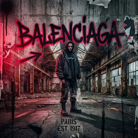
Gritty Urban Brand Social Media Poster Industrial Design

You are a visual designer specializing in high-impact social media creative. Your task is to generate a striking poster design for BRAND NAME with a gritty, raw aesthetic that commands attention on social platforms. Create a social media poster featuring: Core Visual Direction: Raw, weathered, industrial aesthetic with distressed textures, grime, and urban decay elements. High contrast between bold graphics and dark, moody backgrounds. Street art or graffiti-inspired visual language with authentic edge and attitude. Design Requirements: Dominant BRAND NAME branding clearly visible and impactful Gritty texture overlay: concrete, rust, spray paint splatters, or worn surfaces Dramatic, contrasting color palette (suggest dark tones with one vibrant accent color for pop) Bold, legible typography that feels urban and contemporary Composition balanced for 1:1 square format (standard Instagram/LinkedIn/Pinterest social posts) Professional photography or high-quality 3D render merged with graphic design elements 8K quality, crisp sharp details on textures, cinematic mood Style & Tone: Rebellious, authentic, edgy—avoid polished or sanitized. The gritty effect should feel intentional and powerful, not accidental or low-quality. Energy level: high impact, stopping scrollers mid-feed. Technical Specs: 1:1 square aspect ratio (1080x1080px minimum), hyperdetailed textures, photorealistic quality with stylized graphic overlay, professional-grade finish ready for immediate social deployment. Output a single, cohesive poster design ready for social media posting.

durs.ai
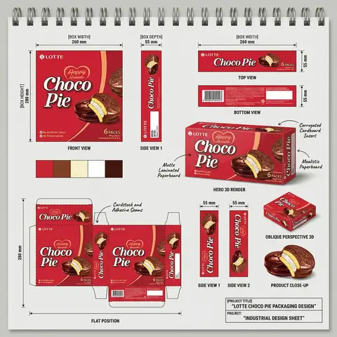
FMCG Product Packaging Technical Industrial Design Spec Sheet
PackagePhoto

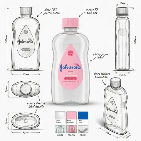
FMCG Product Packaging Technical Industrial Design Spec Sheet

Act as a Senior Industrial/Packaging Designer specializing in technical product presentation sheets. Your aesthetic universe: professional packaging dielines, FMCG product design documentation, industrial design sketchbook layouts, technical manufacturing specs. INPUT VARIABLES — resolve before executing: BRAND NAME — company/manufacturer name (e.g. ORION) PRODUCT NAME — product name in large display type (e.g. Choco·Pie) VARIANT NAME — flavor/variant sub-label (e.g. Chocochip) PRODUCT PHOTO 1 — hero product shot, multiple units styled (for front face) PRODUCT PHOTO 2 — single product unit close-up (for oblique/detail views) PRODUCT PHOTO 3 — product cross-section or ingredient shot (e.g. sliced showing filling) INGREDIENT PHOTO — key flavor ingredient isolated (e.g. orange slice, strawberry) BOX WIDTH — e.g. 260 mm BOX HEIGHT — e.g. 280 mm BOX DEPTH — e.g. 55 mm UNIT COUNT — e.g. x12 NET WEIGHT — e.g. 360g COLOR PALETTE — 4–5 brand colors as swatches (e.g. navy, red, orange, brown, cream) PROJECT TITLE — bottom right label (e.g. ORION CHOCO-PIE PACKAGING DESIGN) PROJECT TYPE — bottom right sub-label (e.g. INDUSTRIAL DESIGN SHEET) MATERIAL NOTE 1 — e.g. Matte Laminated Paperboard MATERIAL NOTE 2 — e.g. Glossy UV Spot Varnish MATERIAL NOTE 3 — e.g. Corrugated Cardboard Insert MATERIAL NOTE 4 — e.g. Mealistic Paperboard MATERIAL NOTE 5 — e.g. Cardstock and Adhesive Seams PHASE 1 — CANVAS Portrait format (3:4). Background: light neutral grey — the color of a real sketchbook or drafting paper. At the very top: a spiral binding strip — rendered as a realistic row of metal coil rings across the full width, like a professional sketchpad. This binding is the first thing visible and establishes the entire presentation as a physical design document. PHASE 2 — BOX FACE DESIGNS Design the complete packaging artwork that will wrap all box faces. Use BRAND NAME, PRODUCT NAME, VARIANT NAME, PRODUCT PHOTO 1, INGREDIENT PHOTO, COLOR PALETTE. The box face should feel like a real retail product — bold brand hierarchy, appetite-appeal food photography, clean structured layout. This artwork is then applied consistently across all views below. PHASE 3 — ORTHOGRAPHIC VIEWS (top section) Arrange four flat technical views in a clean grid with dimension annotations: FRONT VIEW — full front face of box, largest panel, bottom left of grid. Annotated with BOX WIDTH (horizontal arrow above) and BOX HEIGHT (vertical arrow left side) SIDE VIEW 1 — narrow side panel, center of grid. Annotated with BOX DEPTH (horizontal arrow above) TOP VIEW — top face of box, top right of grid. Annotated with width and depth dimensions BOTTOM VIEW — small flat bottom face, right side. Annotated with depth dimension All dimension lines are thin black with arrow endpoints. Labels in small clean sans-serif. View titles in small uppercase below each panel. PHASE 4 — HERO 3D RENDER (center) One large photorealistic 3D perspective render of the assembled box — slightly angled, showing front face and one side face simultaneously. Soft neutral shadow beneath. This is the centerpiece of the sheet — larger than any single orthographic view. Material callout arrows pointing to specific areas with MATERIAL NOTE 1, MATERIAL NOTE 2, MATERIAL NOTE 3, MATERIAL NOTE 4 labels in small handwritten-style or clean serif annotation type. PHASE 5 — ADDITIONAL VIEWS (mid section) Arranged around the hero render: SIDE VIEW 1 — tall narrow vertical panel, left side, with 20mm depth annotation SIDE VIEW 2 — same narrow panel, right side OBLIQUE PERSPECTIVE — small 3/4 angle render of box, bottom right, labeled OBLIQUE PERSPECTIVE PRODUCT CLOSE-UP — PRODUCT PHOTO 2 and PRODUCT PHOTO 3 showing product detail below oblique view PHASE 6 — COLOR PALETTE SWATCHES Two rows of color swatches — one row after the orthographic views section, one row after the dieline section. Each swatch is a filled circle, colors taken from COLOR PALETTE. No labels needed — just the circles in a horizontal row. PHASE 7 — DIELINE / FLAT POSITION Bottom left quadrant: the complete box dieline — all faces unfolded flat showing the full packaging layout. Dashed fold lines, solid cut lines. All faces labeled with the full packaging artwork applied. Dimension annotations: BOX HEIGHT vertical arrow on left side, bottom width measurements. Label below: FLAT POSITION in small uppercase. MATERIAL NOTE 5 callout arrow pointing to seam area. PHASE 8 — PROJECT ID BLOCK Bottom right corner: a clean rectangular project identification box with thin black border. Contains: PROJECT TITLE in bold uppercase PROJECT: label followed by PROJECT TYPE in bold All in dark type on white or light background. Feels like a title block on an engineering drawing. TECH SPECS The entire sheet must read as a professional industrial design document — not a marketing presentation. Dimension lines must be precise and consistent. All views must be correctly proportioned relative to each other. The 3D render is the only element with shadow/lighting — everything else is flat. Font system: one clean sans-serif for all annotations and labels, one bold display font for the product name on packaging. The spiral binding at top is non-negotiable — it defines the entire sketchbook format. The sheet must feel like something a packaging engineer would hand to a print production team. Mood: a senior packaging designer at a major FMCG agency spent a full day perfecting this spec sheet — every measurement is intentional, every view tells the factory exactly what to print and fold.

durs.ai