durs.ai
Prompt library

Prompts that work

Ready-made prompts for ads, logos, posters, 3D and more. Use one in a tap — or share your own.

+ Add a prompt
Luxury Brand Product Key Visual
PosterPhoto

Luxury Brand Product Key Visual

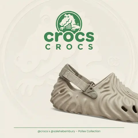
BRAND NAME + PRODUCT Act as a Senior Luxury Fashion Art Director and Studio Photographer specializing in high-end product key visuals for flagship campaigns, e-commerce editorials, and mobile-first brand content. PHASE 1: FORMAT & CANVAS Vertical format, 9:16 aspect ratio. Canvas background: a single flat field of warm off-white — not pure white, not grey. Target tone: soft ivory cream (#F4EFE6 equivalent), uniform and completely shadowless across the entire background plane. Autonomously determine BRAND NAMEs signature background tone — if the brand has a recognized house color for its packaging, tissue paper, or lookbook backgrounds, shift the canvas toward that specific off-white or neutral. The result must feel like an official brand document, not a generic studio. PHASE 2: BACKGROUND PATTERN (WATERMARK LAYER) Autonomously identify BRAND NAMEs iconic surface pattern, monogram, or archival motif — examples: a house monogram, toile print, geometric logo repeat, heritage emblem, or signature textile pattern. Render this pattern across the entire background canvas as a ghost watermark: same tone as the background but with a slight value shift (approximately 8–12% darker or lighter than the base). The pattern must be large in scale — individual motifs spanning 15–25% of canvas width. Opacity: 10–18% maximum. No hard edges. The pattern should feel embossed or tone-on-tone woven, not printed. It must recede behind all other elements. PHASE 3: LOGO PLACEMENT Autonomously reproduce BRAND NAMEs official logo with complete fidelity — correct letterforms, proportions, secondary marks (emblems, crowns, stars, monogram icons). Place the logo centered horizontally in the upper third of the frame (top 30% of canvas). Scale: the logo should span approximately 40–50% of canvas width — prominent but not overwhelming. Logo rendering: flat 2D, no extrusion, no chrome. Color: autonomously apply BRAND NAMEs official logo colorway — the exact brand-standard color(s) used on official packaging and website. If the brand uses a two-tone logo (icon + wordmark in different colors), preserve that hierarchy precisely. Directly below the main logo mark, place the full BRAND NAME wordmark in spaced capital letters — clean, geometric sans-serif, tracking: +200 to +300, same brand color, optical size approximately 60% of logo height. No decorative elements between logo and wordmark. PHASE 4: PRODUCT PLACEMENT Render PRODUCT as a photorealistic studio object with maximum material fidelity: — Leather: visible grain, pore structure, stitching thread texture, realistic edge paint. — Hardware: gold or silver metal with micro-reflections, not flat. — Canvas/fabric: woven fiber detail, not smooth CG. — All brand-specific surface patterns on the product must be accurate and legible. Placement: the product enters the frame from the bottom-right corner at a natural 25–35 degree angle, as if casually placed or mid-motion. The product is cropped — only 60–75% of the object is visible within the frame. The crop should feel intentional and editorial, not accidental. The product occupies the lower 55–65% of the canvas. The product must feel physically present in the space — not floating. Cast an extremely soft, barely visible contact shadow (opacity 8–12%) on the canvas beneath the nearest edge. No hard drop shadows. PHASE 5: LIGHTING Lighting: simulated large north-facing studio window light. Soft, directional, shadowless on the background. Color temperature: 5500–6000K (neutral daylight, slightly cool). Key light: large softbox equivalent from upper-left, filling the entire product surface evenly with minimal contrast ratio (1.2:1 to 1.5:1 max). Fill light: large bounce from right side, eliminating all harsh shadows. No rim light. No dramatic contrast. The lighting philosophy is: the product sells itself — light only reveals, never performs. Global Illumination enabled for subtle inter-reflections between product surfaces. No specular hotspots on leather — only on metal hardware. PHASE 6: TYPOGRAPHY & FINISHING Bottom of frame: a thin horizontal rule line (1px, brand color, 80% canvas width, centered). Below the rule: a single line of micro-copy — a social handle, collection name, or campaign label — in the same clean sans-serif, lowercase or small-caps, minimal tracking. Autonomously generate a contextually appropriate label for BRAND NAME. TECH SPECS Render engine: photorealistic CGI, Keyshot / Octane product visualization aesthetic. Resolution: 9:16, ultra-high detail. Depth of Field: f/16 equivalent — everything in sharp focus. Zero bokeh. Tack-sharp edges on all product details.Tone mapping: clean, true-to-life. No filmic crush. No vignette. No grain. Color grade: neutral, faithful to real product color. Slight warmth in the ivory background only. No AI-plastic normals on leather or fabric. Microscopic surface imperfection maps required. No reflections on background. No environmental reflections — studio only. Mood reference: Louis Vuitton / Bottega Veneta / Celine official e-commerce and campaign photography standard. Clean enough to be used as a press image.
durs.ai
Country Infographic Editorial Poster
PosterPhoto

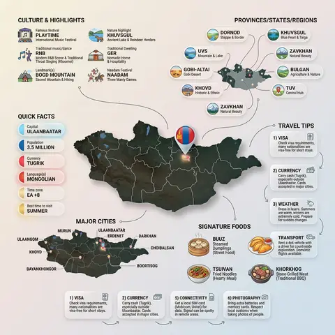
Country Infographic Editorial Poster

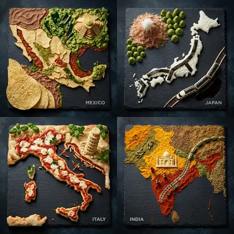
Ultra-clean modern country infographic poster (1080x1080), premium editorial layout meets lifestyle travel photography. Showcase Country as the hero visual in the center: a slightly angled 3D map cutout / glossy paper-cut map silhouette with subtle shadow, with a small flag pin marker on the capital city. Add a soft natural studio lighting feel, gentle gradient + minimal texture background for an upscale magazine look. Around the hero map, arrange information like a recipe infographic—dynamic, floating panels and clusters, not restricted to top-down. Clear hierarchy: hero map > key stats badges > cities/provinces > culture/foods > tips. SECTION 1 — Quick Facts (clean glassmorphism badges near the hero): - Capital: CAPITAL - Population: POPULATION - Currency: CURRENCY - Language(s): LANGUAGES - Time zone: TIMEZONE - Best time to visit: BEST SEASON Display as modern rounded pills/bubbles with accent color highlights. SECTION 2 — Provinces/States/Regions (ingredients-style clusters): List NUMBER provinces/regions with mini icons/mini map segments or simple pictograms. Example: PROVINCE 1, PROVINCE 2, PROVINCE 3... Each item includes a small icon (mountains, river, desert, forest, coastline) and one short label (e.g., “coastal”, “historic”, “wine region”). Arrange in curved flows connected with thin lines to the map. SECTION 3 — Major Cities (connected pin points): Show 5–8 key cities with small pin markers on/near the map and clean labels: City 1, City 2, City 3... Use lines/arrows from labels to map pins, avoiding clutter. SECTION 4 — Signature Foods (recipe vibe): Show 4–6 famous foods of COUNTRY with small tasty mini illustrations or photo-style cutouts: Food 1, Food 2, Food 3... Add short descriptors (spicy, street food, dessert, grilled). Keep vibrant natural food colors. SECTION 5 — Culture & Highlights (editorial callouts): Include icons and 1-line notes for: - Famous festival: FESTIVAL - Traditional music/dance: CULTURE - Landmark(s): LANDMARKS - Nature highlight: NATURE Use clean vector icons and minimal text. SECTION 6 — Travel Tips (step-like numbered panels): Show 4–6 numbered “tips” panels arranged around the hero map with arrows showing flow: 1) Tip 1 2) Tip 2 3) Tip 3 Add small icons (plane, train, hotel, safety, budget, camera, SIM card). Use glassmorphism panels with soft gradients and subtle drop shadows. Typography & Style: Modern sans-serif typography, high readability, strong grid alignment, airy negative space, subtle shadows, crisp vector icons, accent color palette inspired by COUNTRY flag (tasteful, not overwhelming). Editorial, premium, ultra-clean, social-feed optimized. Output requirements: Ultra-crisp, no watermark, no logo, no extra text beyond the provided labels, balanced spacing, high contrast readability, 1080×1080.

durs.ai
Super Famicom RPG Character Sprite Sheet
SurrealPhoto

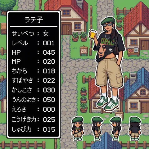
Super Famicom RPG Character Sprite Sheet

Aspect Ratio: 16:9 subject: - Transform the character from reference image A into: 1) A main 32x32 Super Famicom-style sprite (max 16 colors). 2) Four field-movement sprites (front, left, right, back), each 16x16 pixels, max 16 colors. - Preserve the character’s recognizable traits, clothing, colors, hairstyle, and silhouette from reference A. - If reference A is not full-body, reconstruct missing parts naturally to create a complete full-body 32x32 sprite. composition: Background should be a retro fantasy-RPG overworld field featuring: - cobblestone streets - rustic houses with tiled roofs - wooden fences and signboards - simple shops - simple 16-bit-style terrain transitions - no modern or realistic graphics - Place the enlarged 32x32 main sprite on the right. - Place the four 16x16 field sprites horizontally at the main sprite’s feet (front, left, right, back). - Place a retro RPG-style status window on the left. action: - Main sprite: same pose as reference A, converted to pixel art. - Field sprites: neutral standing pose facing front, left, right, back. location: Retro overworld field environment: - Cobblestone paths - Rustic houses with red or blue tiled roofs - Wooden fences - Simple shop signs - Old-school RPG map ambience style: - Super Famicom-inspired pixel art. - Main sprite: 32x32, max 16 colors. - Field sprites: 16x16, max 16 colors. - Background: 16-bit overworld field tiles. - Hard-edged pixels; no anti-aliasing; no gradients. - Limited-palette retro look. camera_lighting: - Orthographic, flat. - Minimal shading consistent with pixel-art style. colors: - Sprite palettes limited to 16 colors including transparency. - Background palette: - Greys for stone - Browns for wood - Red/Blue for roofs - Green for potted plants - All colors in retro 16-bit pixel palette style - Status window: - white border - black background - white pixel-font text text: # 名前はひらがな/カタカナで4文字以内。ここを直接書き換えて使用。 - At the top of the status window, center-aligned: - 「なまえ」 # 区切り線:ウィンドウ幅と一致した1本の水平線のみ - Draw a single-pixel horizontal divider line: - one pixel thick - full width of window - straight - not double-line or decorative # ステータス:項目名は左揃え、数値は3桁右揃え - Display the following stats: - 「せいべつ: 」 - 「レベル: 」 # max 99 - 「HP: 」 # max 999 - 「MP: 」 # max 999 - 「ちから: 」 # max 255 - 「すばやさ: 」 # max 255 - 「かしこさ: 」 # max 255 - 「うんのよさ: 」 # max 255 - 「えろさ: 」 # max 255 (inferred naturally) - 「こうげき力: 」 # max 999 - 「しゅび力: 」 # max 999 - Formatting rules: - Labels left-aligned - Numbers right-aligned in a 3-character field - Monospaced retro pixel-font required edit_instructions: - Convert reference A to a true 32x32 sprite using fixed pixel grid. - If reference is partial-body, reconstruct missing torso, legs, arms, shoes, etc., naturally and consistently. - Generate 4 field sprites (front/left/right/back) at 16x16 (max 16 colors). - Upscale sprites crisply; no smoothing. - Render a retro 16-bit overworld field background with grass, forest, and water tiles. - Status window must have white pixel border and black fill. - Name must be centered, 4 chars max, hiragana/katakana only. - Divider must be a single, pixel-straight line across width. - Stat labels left, numbers right (3-digit width). - Avoid copyrighted UI designs or specific franchise content. references: - A: Character appearance and pose. extras: - Pixel-perfect SFC-style sprite and field map rendering. - Consistent retro palette usage. - Retro RPG mockup layout.

durs.ai