durs.ai
Prompt library

Prompts that work

Ready-made prompts for ads, logos, posters, 3D and more. Use one in a tap — or share your own.

+ Add a prompt
Luxury Ceramic Beverage Bottle
AdvertisementPhoto

Luxury Ceramic Beverage Bottle

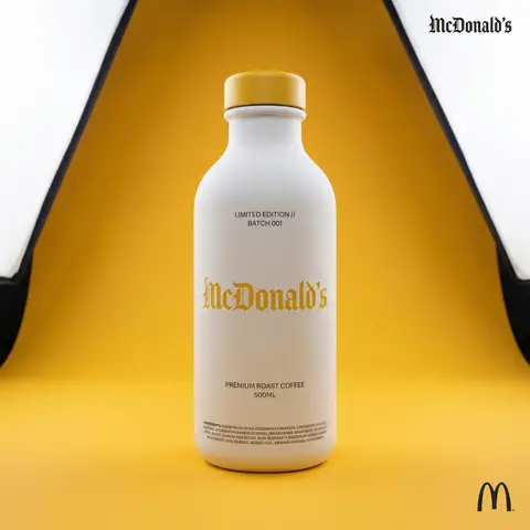
BRAND NAME or LOGO IMAGE. Act as a world-class product photographer creating an ultra-high-end editorial shot of a luxury beverage bottle. COMPOSITION (FULL VIEW): A full-body studio photograph showing the entire bottle from base to cap, centered in the frame. The bottle stands on a seamless surface. THE VESSEL & COLORS (MATERIALITY): Bottle Body: Premium, opaque matte white ceramic with a fine, powdery texture. Bottle Cap: A premium matte or satin-finish cap colored exactly in BRAND NAMEs primary brand color. LIGHTING & BACKGROUND (COLORED STUDIO): The background is a seamless, smooth studio cyclorama flooded with BRAND NAME s primary brand color, creating a rich, immersive color environment. Lighting: Sophisticated, high-end white studio lighting (large softboxes). The light must be soft and wrapping, creating elegant highlights along the ceramic edges to define form. CENTRAL BRANDING (ULTRA-PRECISION MICRO-EMBOSSING): The main Gothic/Blackletter BRAND NAME text is centered on the bottle. CRITICAL TEXTURE FIX: The text is rendered with ultra-subtle, shallow precision micro-embossing (maximum 0.2mm to 0.3mm depth). It must NOT look like applied clay or a heavy badge. It should look like a crisp, shallow tooling mark integrated perfectly into the ceramic surface, defined only by very subtle light catching the edges. Color: The embossed text itself is colored in BRAND NAME s primary brand color, perhaps with a slight semi-gloss finish to contrast subtly with the matte white bottle. TYPOGRAPHIC HIERARCHY (AUXILIARY DETAILS): All auxiliary text is printed cleanly in a neutral dark grey/black (monochrome) to sit quietly on the white surface: Top Micro-Blocks: Two very small lines above main text (e.g., LIMITED EDITION // BATCH 001). Flavor Name: Below main text, a beautiful, smaller, unobtrusive font for the flavor. Volume/Specs: Further down, technical info (e.g., 500ML). Ingredients Block: At the very bottom edge, a dense micro-print block. CORNER ELEMENTS: Top Right: Small, discrete monochrome Gothic brand name. Bottom Right: Small monochrome original brand logo.

durs.ai
Polished Steel Peony Product Photography
LogoPhoto

Polished Steel Peony Product Photography

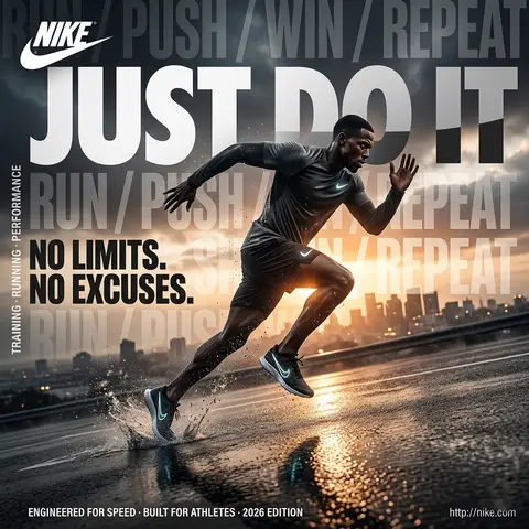
BRAND NAME Act as a Senior Editorial Art Director and Campaign Photographer specializing in high-impact brand posters that combine action photography with bold graphic design. Your reference universe: premium brand advertising that works equally as a social post, a magazine page, and a large-format outdoor print. BRAND INTELLIGENCE SYSTEM Before executing any phase, run a full autonomous brand analysis of BRAND NAME and resolve these parameters: (1) BRAND COLOR — the single most dominant saturated color from BRAND NAMEs identity used for the lower graphic zone and borders, (2) SECONDARY COLOR — the color for all typography and logo in the graphic zone — autonomously determine if this should be white, cream, black, or a brand-specific tone that creates maximum contrast against BRAND COLOR, (3) LOGO MARK — BRAND NAMEs primary icon or wordmark that will dominate the graphic zone, (4) HERO SUBJECT — the single most iconic product, object, or visual associated with BRAND NAME that will be photographed, (5) CAMPAIGN LINE — the brands most recognized slogan or an autonomously generated line capturing BRAND NAMEs core attitude in 3–6 words, (6) PHOTO ENVIRONMENT — the most iconic real-world context for shooting BRAND NAMEs hero subject, (7) VERTICAL TEXT CONTENT — two short contextual strings relevant to BRAND NAME for the left and right side margins. All parameters must be resolved before phase 1 begins. PHASE 1: CANVAS & FORMAT Vertical format, 4:5 ratio. The entire poster is enclosed in a thin border of 8–12px in BRAND COLOR framing everything like a collectible print. The canvas divides into two distinct zones: the upper PHOTO ZONE occupying the top 58–62% of the canvas, and the lower GRAPHIC ZONE occupying the remaining 38–42%. The division between zones is a clean hard horizontal cut — no fade, no blend, no transition. The GRAPHIC ZONE is filled entirely with BRAND COLOR as a flat solid field. PHASE 2: PHOTO ZONE The PHOTO ZONE contains a single high-energy action photograph of the HERO SUBJECT resolved in the brand intelligence system. Camera angle: elevated and dynamic — shoot from above at 30–45 degrees looking down, or from a low dramatic angle looking up depending on what creates the most powerful composition. Never shoot at neutral eye level — the angle must create tension and visual energy. The photograph fills the entire PHOTO ZONE edge to edge with no padding. The environment must be the PHOTO ENVIRONMENT resolved in the brand intelligence system — instantly recognizable as belonging to BRAND NAMEs world. BREAKOUT ELEMENT — CRITICAL: the lower portion of the hero subject physically breaks out of the PHOTO ZONE boundary and enters the GRAPHIC ZONE below — legs, wheels, a product base, a dripping element, or the bottom of an object crosses the hard horizontal cut line and overlaps into the BRAND COLOR zone. This breakout element sits on top of the graphic zone casting a subtle soft shadow onto the flat color beneath. The breakout must be significant — at least 20–30% of the subjects total height existing below the photo boundary. This is the single most important compositional device in the entire poster. PHASE 3: GRAPHIC ZONE The lower zone is a flat solid BRAND COLOR field. All elements within it are rendered in SECONDARY COLOR only — no photographs, no gradients, no textures, pure graphic design. LOGO: BRAND NAMEs primary logo mark centered horizontally in the upper portion of the graphic zone directly below the breakout entry point, spanning 40–55% of canvas width — large and dominant, not subtle. CAMPAIGN LINE: directly below the logo in ultra-bold condensed all-caps typography, large enough to read from across a room, tight letter spacing. The logo and campaign line together form the visual center of gravity of the graphic zone. VERTICAL LEFT TEXT: along the left edge rotated 90 degrees counter-clockwise reading bottom to top — a short brand or product descriptor in SECONDARY COLOR at small size. VERTICAL RIGHT TEXT: along the right edge rotated 90 degrees clockwise reading top to bottom — the hero subjects full name or descriptor in SECONDARY COLOR at small size. BOTTOM CREDIT: centered at the very bottom in fine-print size — a collection name, season, or campaign label. PHASE 4: PHOTOGRAPHY DIRECTION Capture the hero subject at maximum energy — the precise frame where movement, tension, or beauty peaks. For a person: mid-motion at full commitment to the action. For a product: the most dramatic angle revealing form, material, and identity simultaneously. For food: the moment of pour, cut, steam, or impact. For automotive: speed blur, drift, or heroic three-quarter angle. Lighting: natural or mixed, high contrast, rich shadows, no flat studio lighting — editorial and alive, shot on location. Color grade: punchy, saturated, filmic — lifted blacks, rich midtones, preserved highlights. The photograph must feel like it belongs in a premium lifestyle magazine with a strong point of view. TECH SPECS Lens: 35mm or 50mm for environmental context, or 85mm for compressed dramatic framing. Depth of field: subject sharp, background contextual at f/4 to f/8. Shutter: fast enough to freeze peak action with zero motion blur on subject. Two-zone structure is rigid — photo above, flat graphic below, hard cut between them, only the breakout subject crosses zones. Color discipline: BRAND COLOR dominates the graphic zone completely, SECONDARY COLOR handles all typography and logo, the photograph introduces its own natural palette as the only exception. Typography: condensed, bold, authoritative — no decorative fonts. Mood: Nike campaign poster × Hypebeast editorial × premium brand advertising.
durs.ai
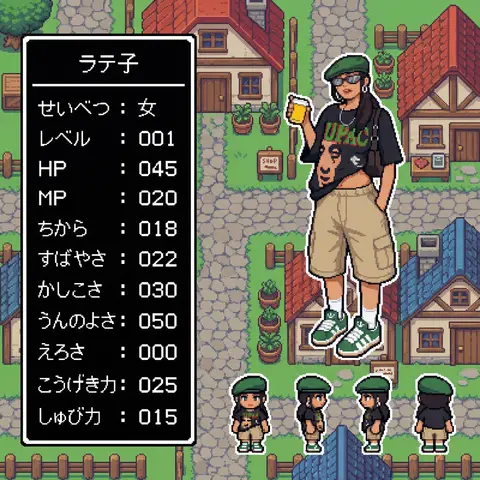
Super Famicom RPG Character Sprite Sheet
SurrealPhoto

Super Famicom RPG Character Sprite Sheet

Aspect Ratio: 16:9 subject: - Transform the character from reference image A into: 1) A main 32x32 Super Famicom-style sprite (max 16 colors). 2) Four field-movement sprites (front, left, right, back), each 16x16 pixels, max 16 colors. - Preserve the character’s recognizable traits, clothing, colors, hairstyle, and silhouette from reference A. - If reference A is not full-body, reconstruct missing parts naturally to create a complete full-body 32x32 sprite. composition: Background should be a retro fantasy-RPG overworld field featuring: - cobblestone streets - rustic houses with tiled roofs - wooden fences and signboards - simple shops - simple 16-bit-style terrain transitions - no modern or realistic graphics - Place the enlarged 32x32 main sprite on the right. - Place the four 16x16 field sprites horizontally at the main sprite’s feet (front, left, right, back). - Place a retro RPG-style status window on the left. action: - Main sprite: same pose as reference A, converted to pixel art. - Field sprites: neutral standing pose facing front, left, right, back. location: Retro overworld field environment: - Cobblestone paths - Rustic houses with red or blue tiled roofs - Wooden fences - Simple shop signs - Old-school RPG map ambience style: - Super Famicom-inspired pixel art. - Main sprite: 32x32, max 16 colors. - Field sprites: 16x16, max 16 colors. - Background: 16-bit overworld field tiles. - Hard-edged pixels; no anti-aliasing; no gradients. - Limited-palette retro look. camera_lighting: - Orthographic, flat. - Minimal shading consistent with pixel-art style. colors: - Sprite palettes limited to 16 colors including transparency. - Background palette: - Greys for stone - Browns for wood - Red/Blue for roofs - Green for potted plants - All colors in retro 16-bit pixel palette style - Status window: - white border - black background - white pixel-font text text: # 名前はひらがな/カタカナで4文字以内。ここを直接書き換えて使用。 - At the top of the status window, center-aligned: - 「なまえ」 # 区切り線:ウィンドウ幅と一致した1本の水平線のみ - Draw a single-pixel horizontal divider line: - one pixel thick - full width of window - straight - not double-line or decorative # ステータス:項目名は左揃え、数値は3桁右揃え - Display the following stats: - 「せいべつ: 」 - 「レベル: 」 # max 99 - 「HP: 」 # max 999 - 「MP: 」 # max 999 - 「ちから: 」 # max 255 - 「すばやさ: 」 # max 255 - 「かしこさ: 」 # max 255 - 「うんのよさ: 」 # max 255 - 「えろさ: 」 # max 255 (inferred naturally) - 「こうげき力: 」 # max 999 - 「しゅび力: 」 # max 999 - Formatting rules: - Labels left-aligned - Numbers right-aligned in a 3-character field - Monospaced retro pixel-font required edit_instructions: - Convert reference A to a true 32x32 sprite using fixed pixel grid. - If reference is partial-body, reconstruct missing torso, legs, arms, shoes, etc., naturally and consistently. - Generate 4 field sprites (front/left/right/back) at 16x16 (max 16 colors). - Upscale sprites crisply; no smoothing. - Render a retro 16-bit overworld field background with grass, forest, and water tiles. - Status window must have white pixel border and black fill. - Name must be centered, 4 chars max, hiragana/katakana only. - Divider must be a single, pixel-straight line across width. - Stat labels left, numbers right (3-digit width). - Avoid copyrighted UI designs or specific franchise content. references: - A: Character appearance and pose. extras: - Pixel-perfect SFC-style sprite and field map rendering. - Consistent retro palette usage. - Retro RPG mockup layout.

durs.ai