Prompt library

Prompts that work

Ready-made prompts for ads, logos, posters, 3D and more. Use one in a tap — or share your own.

+ Add a prompt
Brand Futuristic object
3DPhoto

Brand Futuristic object

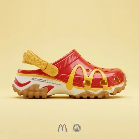
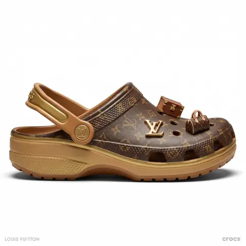
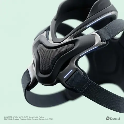
BRAND NAME or LOGO IMAGE: A high-end, glossy concept art magazine editorial photograph of a unique, unexpected functional object conceptualized and designed by the brand. 1. The Concept & Object (AI Invention): Based on the design philosophy, heritage, and material vocabulary of the specified brand, the AI must invent a novel utility product (NOT standard clothing, shoes, or bags). Examples could be home goods, tech accessories, tools, or sporting equipment, reinterpretated through the brands lens. The object should feel sculptural yet functional. 2. Materials & Details (Hyper-Premium): The object is constructed from ultra-premium, highly tactile materials characteristic of the brand (e.g., patinated exotic leathers, brushed aerospace-grade titanium, sculpted matte ceramics, molded carbon fiber, or technical high-fashion textiles). Every detail is hyper-realistic: visible stitching, microscopic material grain, precision engravings, and complex texture contrasts. 3. Photography & Lighting (Cinematic Studio): Shot on a medium format Phase One camera with a 100mm macro lens. Extremely shallow depth of field, with sharp focus on the hero details of the object and a creamy, smooth bokeh background. The lighting is sophisticated studio softbox lighting: gentle, enveloping fill light with precise rim lighting to accentuate contours and material textures. 4. Environment: A seamless, impeccably clean studio cyclorama background in a pure, ultra-light pastel tone (e.g., desaturated mint, pale blush, or off-white), free of shadows. 5. Layout & UI Elements (Strict Placement): - Bottom Right Corner: A small, understated, monochrome gray logo of the brand. - Bottom Left Corner: Small, minimalist monochrome gray text describing the invented product. The font style looks like Manrope Regular with very tight tracking (kerning) and balanced line spacing. Example format: CONCEPT STUDY: AI inserts invented product name. MATERIAL: AI inserts main materials. SS25.

durs.ai
Brand everyday object style
ProductPhoto

Brand everyday object style

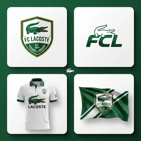
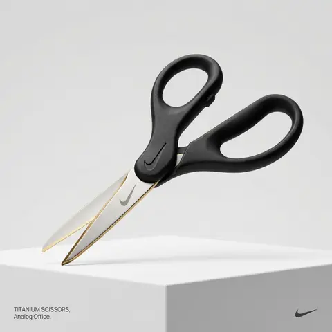
BRAND NAME or LOGO IMAGE. Act as a creative director curating a wide-ranging, eclectic collection of recontextualized everyday objects. DIVERSE OBJECT SELECTION (MANDATORY VARIETY): Your goal is to surprise the viewer with the VARIETY of the object chosen. Randomly select ONE object from these distinct categories to ensure diversity: Analog Office & Desk: Sport & Leisure: Barware & Kitchen: Utility & Tools: Grooming: Travel: THE CONCEPT: Take the chosen mundane object and elevate it into a luxury artifact using BRAND NAME s signature materials and colors. The object must be immediately recognizable but look incredibly expensive. MATERIALS & FINISH: Use materials that contrast with the objects usual cheap nature. Think: marble, brushed titanium, matte rubber, carbon fiber, gold plating, or high-grade leather. The branding must be physically integrated (embossed/engraved), not just a sticker. PRESENTATION (NO BOXES): The object should stand alone on the pedestal or table, fully exposed. If it has parts (like a ping pong set), arrange them neatly (knolling). Avoid closed boxes that hide the shape. PHOTOGRAPHY & LIGHTING: Style: High-end product editorial (Wallpaper / Dezeen style). Lighting: Soft, studio high-key lighting. No harsh shadows. Background: Clean, seamless light grey or white cyclorama. GRAPHIC OVERLAYS (UI): Bottom Left: A small, minimalist 2-line text block describing the object. Font: Manrope Regular. Color: #414141. Bottom Right: A small, discreet, monochrome logomark of BRAND NAME . Color: #414141. Do NOT visualize “Font name” and “Color code”.

durs.ai
Y2K Monochrome Concept Sketch
2DPhoto

Y2K Monochrome Concept Sketch

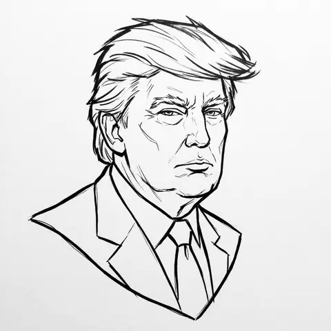
PERSON / CHARACTER NAME or IMAGE. Act as a Lead Concept Artist for a cult classic early 2000s animated series (similar to early Gorillaz or Jet Set Radio). COMPOSITION (FLOATING HEAD DRAFT): Generate a Monochrome Line-Art Concept Sketch of the head/bust of CHARACTER / PERSON . Framing: The head floats strictly in the dead center of the canvas. Orientation: Fixed Three-Quarter View (3/4) for dynamic volume. Negative Space: Generous empty white space around the sketch. VISUAL STYLE (ADVANCED VECTOR SKETCH): The image must look like a Production-Ready Concept Drawing — raw, confident, but polished. NO FILLS (Critical): This is strict LINE ART. Do not use any colors, gradients, or grey fills. The inside of the face, hair, and clothes must be white (transparent), defined only by the outlines. Line Quality (The Inkers Hand): Use Solid Black Ink on pure white paper. Variable Line Weight: Use a THICK, bold contour line for the outer silhouette to pop the character from the background. Use THIN, razor-sharp lines for internal details (eyes, nose, hair texture). Flow: The lines should feel fast and expressive (like a brush pen or sophisticated vector stroke), not shaky or messy. It is an Advanced Draft — distinct and professional. CHARACTERIZATION (THE Y2K VIBE): Stylize the character with slightly angular, edgy features typical of early 2000s street art. Expression: Cool, detached, slightly rebellious, or in the zone. BACKGROUND: Pure White (#FFFFFF). A clean sheet of paper.

durs.ai
Luxury Ceramic Beverage Bottle
AdvertisementPhoto

Luxury Ceramic Beverage Bottle

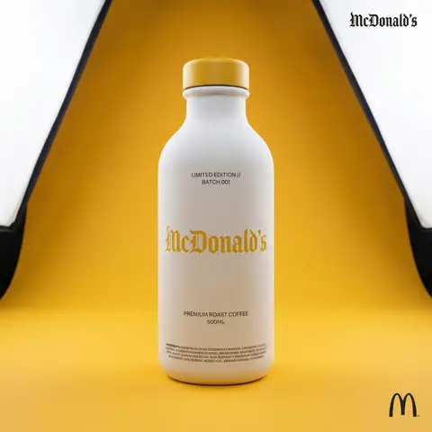
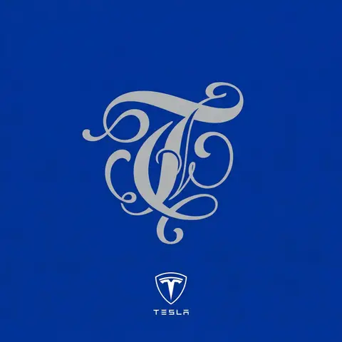
BRAND NAME or LOGO IMAGE. Act as a world-class product photographer creating an ultra-high-end editorial shot of a luxury beverage bottle. COMPOSITION (FULL VIEW): A full-body studio photograph showing the entire bottle from base to cap, centered in the frame. The bottle stands on a seamless surface. THE VESSEL & COLORS (MATERIALITY): Bottle Body: Premium, opaque matte white ceramic with a fine, powdery texture. Bottle Cap: A premium matte or satin-finish cap colored exactly in BRAND NAMEs primary brand color. LIGHTING & BACKGROUND (COLORED STUDIO): The background is a seamless, smooth studio cyclorama flooded with BRAND NAME s primary brand color, creating a rich, immersive color environment. Lighting: Sophisticated, high-end white studio lighting (large softboxes). The light must be soft and wrapping, creating elegant highlights along the ceramic edges to define form. CENTRAL BRANDING (ULTRA-PRECISION MICRO-EMBOSSING): The main Gothic/Blackletter BRAND NAME text is centered on the bottle. CRITICAL TEXTURE FIX: The text is rendered with ultra-subtle, shallow precision micro-embossing (maximum 0.2mm to 0.3mm depth). It must NOT look like applied clay or a heavy badge. It should look like a crisp, shallow tooling mark integrated perfectly into the ceramic surface, defined only by very subtle light catching the edges. Color: The embossed text itself is colored in BRAND NAME s primary brand color, perhaps with a slight semi-gloss finish to contrast subtly with the matte white bottle. TYPOGRAPHIC HIERARCHY (AUXILIARY DETAILS): All auxiliary text is printed cleanly in a neutral dark grey/black (monochrome) to sit quietly on the white surface: Top Micro-Blocks: Two very small lines above main text (e.g., LIMITED EDITION // BATCH 001). Flavor Name: Below main text, a beautiful, smaller, unobtrusive font for the flavor. Volume/Specs: Further down, technical info (e.g., 500ML). Ingredients Block: At the very bottom edge, a dense micro-print block. CORNER ELEMENTS: Top Right: Small, discrete monochrome Gothic brand name. Bottom Right: Small monochrome original brand logo.

durs.ai
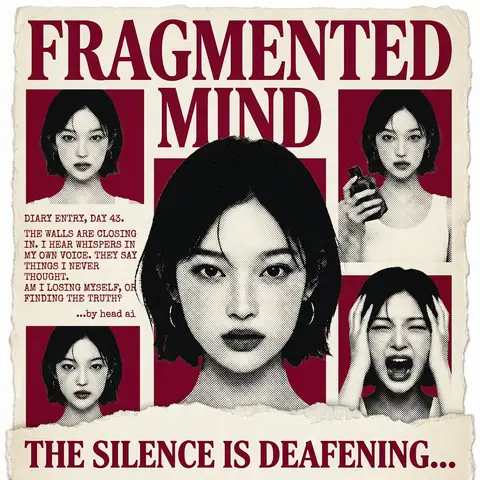
Psychological Horror Torn Paper Collage Editorial Movie Poster
PosterPhoto

Psychological Horror Torn Paper Collage Editorial Movie Poster

Psychological Horror Collage Poster — Torn Paper Editorial Style Act as a Senior Graphic Designer specializing in psychological horror editorial design. Your aesthetic universe: torn newspaper collage, halftone print culture, 90s underground zine horror, American Psycho-era corporate dread. INPUT VARIABLES — resolve before executing: MOVIE TITLE LINE 1 — first word(s) of title MOVIE TITLE LINE 2 — second word(s) of title MAIN PORTRAIT — large central face photo, serious/intense expression SIDE PHOTO 1 — smaller portrait, neutral expression SIDE PHOTO 2 — smaller portrait, holding an object SIDE PHOTO 3 — smaller portrait, extreme emotional expression (screaming/shocked) GROUP PHOTO — wide shot of multiple people, bottom right DIARY TEXT — a short first-person psychological monologue, 4–6 lines TAGLINE — bold bottom line (e.g. THE SILENCE IS DEAFENING...) ACCENT COLOR — dominant color used for title, background blocks, and tinted photos (e.g. deep crimson red) ATTRIBUTION — small credit line (e.g. ...by head ai) PHASE 1 — CANVAS Portrait format (3:4). Background: aged off-white/cream paper texture with rough torn edges on all four sides — looks like a real sheet ripped from something larger. No clean borders. The paper must feel physical and degraded. PHASE 2 — TITLE BLOCK MOVIE TITLE LINE 1 and MOVIE TITLE LINE 2 stacked at the top — massive bold serif type, deep ACCENT COLOR fill, no outline, no extrusion. The type is heavy, authoritative, slightly compressed. It dominates the top third of the poster completely. PHASE 3 — CENTRAL PORTRAIT MAIN PORTRAIT placed center, large, from chest up. Apply halftone dot grain — black and white, high contrast, visible dot pattern like a newspaper print. No color tinting on the main portrait — it stays stark monochrome. The figure should feel cold and dissociated. PHASE 4 — SIDE PHOTO GRID Four smaller photos arranged around the central portrait — two left column, two right column. Each photo is set inside a flat ACCENT COLOR rectangle background. Apply the same halftone treatment as the main portrait. The photos are slightly irregular in size and alignment — like they were cut and placed by hand. One photo (SIDE PHOTO 2) should show the subject holding a prop or object. One photo (SIDE PHOTO 3) should show an extreme expression. PHASE 5 — DIARY TEXT BLOCK Left side of poster, between the side photos. DIARY TEXT in bold uppercase sans-serif, tight leading, left-aligned. Small ATTRIBUTION line in italic below it. This text block feels like it was typed on a typewriter and pasted in. PHASE 6 — BOTTOM ELEMENTS TAGLINE across the very bottom — bold wide uppercase serif, deep ACCENT COLOR, large, confident. Below the torn paper edge, as if printed on the backing. Feels like a newspaper headline. PHASE 7 — TORN PAPER DETAILS The entire poster sits as a torn paper sheet. The edges must be rough and organic — not a clean rectangle. Ragged tears especially at the top and bottom. Subtle paper grain across the whole surface. The torn paper effect is the most important texture element — without it the poster loses its entire identity. TECH SPECS 3-color palette maximum: ACCENT COLOR, near-black, aged cream/off-white. All photos treated as halftone — no clean photography. No gradients. No drop shadows. No digital glow. The poster must feel like it was physically printed, cut, and assembled — not designed on a screen. Rough, editorial, tactile. Mood: a forensic investigator pinned this together on a corkboard at 3am and it accidentally became the most disturbing movie poster ever made.
durs.ai