Prompt library

Prompts that work

Ready-made prompts for ads, logos, posters, 3D and more. Use one in a tap — or share your own.

+ Add a prompt
Brand everyday object style
ProductPhoto

Brand everyday object style

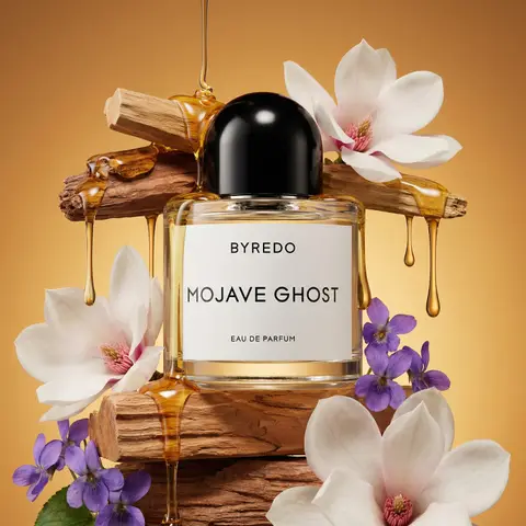
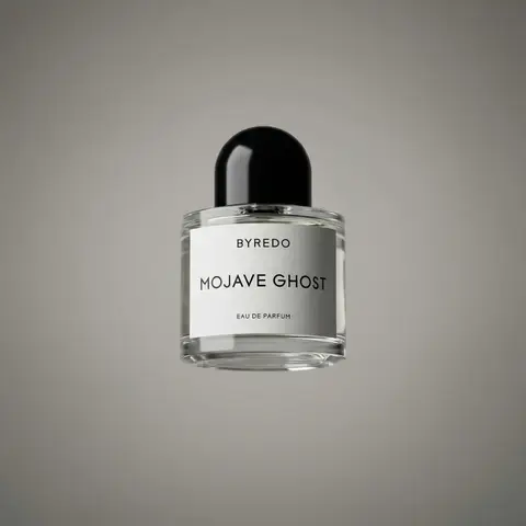
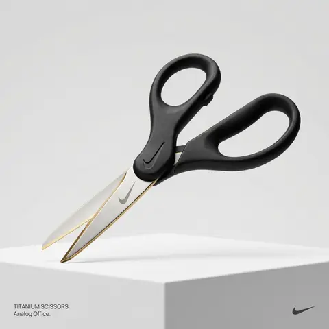
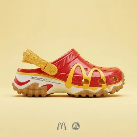
BRAND NAME or LOGO IMAGE. Act as a creative director curating a wide-ranging, eclectic collection of recontextualized everyday objects. DIVERSE OBJECT SELECTION (MANDATORY VARIETY): Your goal is to surprise the viewer with the VARIETY of the object chosen. Randomly select ONE object from these distinct categories to ensure diversity: Analog Office & Desk: Sport & Leisure: Barware & Kitchen: Utility & Tools: Grooming: Travel: THE CONCEPT: Take the chosen mundane object and elevate it into a luxury artifact using BRAND NAME s signature materials and colors. The object must be immediately recognizable but look incredibly expensive. MATERIALS & FINISH: Use materials that contrast with the objects usual cheap nature. Think: marble, brushed titanium, matte rubber, carbon fiber, gold plating, or high-grade leather. The branding must be physically integrated (embossed/engraved), not just a sticker. PRESENTATION (NO BOXES): The object should stand alone on the pedestal or table, fully exposed. If it has parts (like a ping pong set), arrange them neatly (knolling). Avoid closed boxes that hide the shape. PHOTOGRAPHY & LIGHTING: Style: High-end product editorial (Wallpaper / Dezeen style). Lighting: Soft, studio high-key lighting. No harsh shadows. Background: Clean, seamless light grey or white cyclorama. GRAPHIC OVERLAYS (UI): Bottom Left: A small, minimalist 2-line text block describing the object. Font: Manrope Regular. Color: #414141. Bottom Right: A small, discreet, monochrome logomark of BRAND NAME . Color: #414141. Do NOT visualize “Font name” and “Color code”.

durs.ai
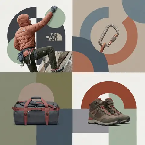
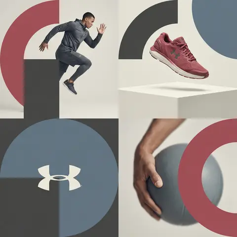
Editorial Grid Geometric Brand Campaign Visual
BrandingPhoto

Editorial Grid Geometric Brand Campaign Visual

BRAND NAME. Act as a World-Class Editorial Designer. PHASE 1: DYNAMIC SUBJECT LOGIC. - Subject Selection: Autonomously analyze BRAND NAME. - Layering (The Sandwich Effect): Interweave the subject with background shapes. Some parts of the car/person must be hidden behind geometric blocks, while other parts (wheels, limbs, props) must overlap them to create 3D depth. PHASE 2: GRID & GEOMETRY. - Layout: A clean 2x2 grid composition. - Overlays: Superimpose large, bold geometric arcs and circles over the grid. - Visual Balance: Place one iconic product prop (e.g., a floating key fob for cars or a ball for sports) in a separate quadrant to balance the subject. PHASE 3: SOPHISTICATED MUTED PALETTE. - Color Direction: DO NOT use aggressive neon or oversaturated colors. - Palette: Identify the core colors of BRAND NAME and shift them to a Sophisticated Muted spectrum. - Tones: Use desaturated, earthy, or dusty versions of the brand colors (e.g., instead of hot pink, use dusty rose; instead of bright mint, use sage green; instead of royal blue, use slate blue). - Finish: Matte, flat color blocks with zero gradients. PHASE 4: PHOTOGRAPHY & LIGHTING. - Subject Style: High-end commercial studio photography. - Lighting: Soft, diffused studio lighting with gentle highlights. No harsh shadows. - Integration: The subject must feel physically embedded into the graphic grid. PHASE 5: MINIMALIST BRANDING. - Logo: Place a clean, single-color BRAND NAME logo in the center of one background block. No taglines, just the iconic symbol.
durs.ai