Prompt library

Prompts that work

Ready-made prompts for ads, logos, posters, 3D and more. Use one in a tap — or share your own.

+ Add a prompt
Brand Futuristic object
3DPhoto

Brand Futuristic object

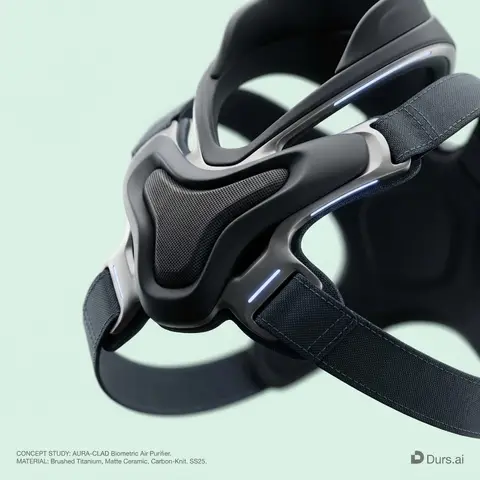
BRAND NAME or LOGO IMAGE: A high-end, glossy concept art magazine editorial photograph of a unique, unexpected functional object conceptualized and designed by the brand. 1. The Concept & Object (AI Invention): Based on the design philosophy, heritage, and material vocabulary of the specified brand, the AI must invent a novel utility product (NOT standard clothing, shoes, or bags). Examples could be home goods, tech accessories, tools, or sporting equipment, reinterpretated through the brands lens. The object should feel sculptural yet functional. 2. Materials & Details (Hyper-Premium): The object is constructed from ultra-premium, highly tactile materials characteristic of the brand (e.g., patinated exotic leathers, brushed aerospace-grade titanium, sculpted matte ceramics, molded carbon fiber, or technical high-fashion textiles). Every detail is hyper-realistic: visible stitching, microscopic material grain, precision engravings, and complex texture contrasts. 3. Photography & Lighting (Cinematic Studio): Shot on a medium format Phase One camera with a 100mm macro lens. Extremely shallow depth of field, with sharp focus on the hero details of the object and a creamy, smooth bokeh background. The lighting is sophisticated studio softbox lighting: gentle, enveloping fill light with precise rim lighting to accentuate contours and material textures. 4. Environment: A seamless, impeccably clean studio cyclorama background in a pure, ultra-light pastel tone (e.g., desaturated mint, pale blush, or off-white), free of shadows. 5. Layout & UI Elements (Strict Placement): - Bottom Right Corner: A small, understated, monochrome gray logo of the brand. - Bottom Left Corner: Small, minimalist monochrome gray text describing the invented product. The font style looks like Manrope Regular with very tight tracking (kerning) and balanced line spacing. Example format: CONCEPT STUDY: AI inserts invented product name. MATERIAL: AI inserts main materials. SS25.

durs.ai
Luxury Brand Product Key Visual
PosterPhoto

Luxury Brand Product Key Visual

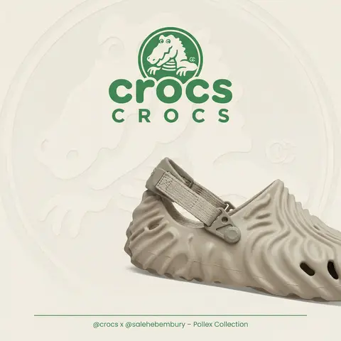
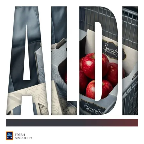
BRAND NAME + PRODUCT Act as a Senior Luxury Fashion Art Director and Studio Photographer specializing in high-end product key visuals for flagship campaigns, e-commerce editorials, and mobile-first brand content. PHASE 1: FORMAT & CANVAS Vertical format, 9:16 aspect ratio. Canvas background: a single flat field of warm off-white — not pure white, not grey. Target tone: soft ivory cream (#F4EFE6 equivalent), uniform and completely shadowless across the entire background plane. Autonomously determine BRAND NAMEs signature background tone — if the brand has a recognized house color for its packaging, tissue paper, or lookbook backgrounds, shift the canvas toward that specific off-white or neutral. The result must feel like an official brand document, not a generic studio. PHASE 2: BACKGROUND PATTERN (WATERMARK LAYER) Autonomously identify BRAND NAMEs iconic surface pattern, monogram, or archival motif — examples: a house monogram, toile print, geometric logo repeat, heritage emblem, or signature textile pattern. Render this pattern across the entire background canvas as a ghost watermark: same tone as the background but with a slight value shift (approximately 8–12% darker or lighter than the base). The pattern must be large in scale — individual motifs spanning 15–25% of canvas width. Opacity: 10–18% maximum. No hard edges. The pattern should feel embossed or tone-on-tone woven, not printed. It must recede behind all other elements. PHASE 3: LOGO PLACEMENT Autonomously reproduce BRAND NAMEs official logo with complete fidelity — correct letterforms, proportions, secondary marks (emblems, crowns, stars, monogram icons). Place the logo centered horizontally in the upper third of the frame (top 30% of canvas). Scale: the logo should span approximately 40–50% of canvas width — prominent but not overwhelming. Logo rendering: flat 2D, no extrusion, no chrome. Color: autonomously apply BRAND NAMEs official logo colorway — the exact brand-standard color(s) used on official packaging and website. If the brand uses a two-tone logo (icon + wordmark in different colors), preserve that hierarchy precisely. Directly below the main logo mark, place the full BRAND NAME wordmark in spaced capital letters — clean, geometric sans-serif, tracking: +200 to +300, same brand color, optical size approximately 60% of logo height. No decorative elements between logo and wordmark. PHASE 4: PRODUCT PLACEMENT Render PRODUCT as a photorealistic studio object with maximum material fidelity: — Leather: visible grain, pore structure, stitching thread texture, realistic edge paint. — Hardware: gold or silver metal with micro-reflections, not flat. — Canvas/fabric: woven fiber detail, not smooth CG. — All brand-specific surface patterns on the product must be accurate and legible. Placement: the product enters the frame from the bottom-right corner at a natural 25–35 degree angle, as if casually placed or mid-motion. The product is cropped — only 60–75% of the object is visible within the frame. The crop should feel intentional and editorial, not accidental. The product occupies the lower 55–65% of the canvas. The product must feel physically present in the space — not floating. Cast an extremely soft, barely visible contact shadow (opacity 8–12%) on the canvas beneath the nearest edge. No hard drop shadows. PHASE 5: LIGHTING Lighting: simulated large north-facing studio window light. Soft, directional, shadowless on the background. Color temperature: 5500–6000K (neutral daylight, slightly cool). Key light: large softbox equivalent from upper-left, filling the entire product surface evenly with minimal contrast ratio (1.2:1 to 1.5:1 max). Fill light: large bounce from right side, eliminating all harsh shadows. No rim light. No dramatic contrast. The lighting philosophy is: the product sells itself — light only reveals, never performs. Global Illumination enabled for subtle inter-reflections between product surfaces. No specular hotspots on leather — only on metal hardware. PHASE 6: TYPOGRAPHY & FINISHING Bottom of frame: a thin horizontal rule line (1px, brand color, 80% canvas width, centered). Below the rule: a single line of micro-copy — a social handle, collection name, or campaign label — in the same clean sans-serif, lowercase or small-caps, minimal tracking. Autonomously generate a contextually appropriate label for BRAND NAME. TECH SPECS Render engine: photorealistic CGI, Keyshot / Octane product visualization aesthetic. Resolution: 9:16, ultra-high detail. Depth of Field: f/16 equivalent — everything in sharp focus. Zero bokeh. Tack-sharp edges on all product details.Tone mapping: clean, true-to-life. No filmic crush. No vignette. No grain. Color grade: neutral, faithful to real product color. Slight warmth in the ivory background only. No AI-plastic normals on leather or fabric. Microscopic surface imperfection maps required. No reflections on background. No environmental reflections — studio only. Mood reference: Louis Vuitton / Bottega Veneta / Celine official e-commerce and campaign photography standard. Clean enough to be used as a press image.
durs.ai
Corporate Income Statement Sankey Diagram
AdvertisementPhoto

Corporate Income Statement Sankey Diagram

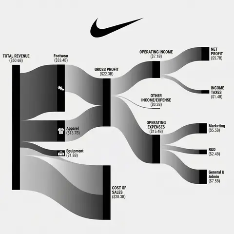
Subject: A professional financial Sankey diagram visualizing the Income Statement of a major corporation, in the style of App Economy Insights and US corporate financial reports.Visual Style: High-fidelity vector infographic, clean minimalist aesthetic, flat design. The background is a clean, very light grey or off-white.Color Strategy - CRITICAL: Analyze the Insert Brand Name Here logo. Extract its primary brand color (e.g., if Nvidia use neon green, if Meta use blue, if Tesla use red). Use this primary color as the dominant theme for the main revenue flows and profit blocks. Create a harmonious color palette based on this primary color: use saturated shades for the vertical nodes (bars) and semi-transparent, lighter opacity gradients for the flowing paths to ensure a cohesive and professional look. Avoid clashing colors.Composition & Structure: Flow: A horizontal flow from Left (Revenue Sources) to Right (Net Profit). Texture: The connecting paths (flows) must appear silky smooth with elegant Bezier curves, looking like liquid ribbons, not jagged lines. Iconography: On the left side (Revenue sources), include specific, minimalist flat vector icons representing the business segments (e.g., a car icon for automotive, a cloud icon for services, a chip icon for hardware). Branding: Place the official Insert Brand Name Here logo clearly at the top center or near the central revenue bar.Details: High resolution, 4k, sharp typography (sans-serif), professional data visualization layout. The chart clearly distinguishes between Revenue, Gross Profit, Operating Expenses, and Net Profit.

durs.ai
Y2K Japanese Streetwear Badge Sticker Vector Art
LogoPhoto

Y2K Japanese Streetwear Badge Sticker Vector Art

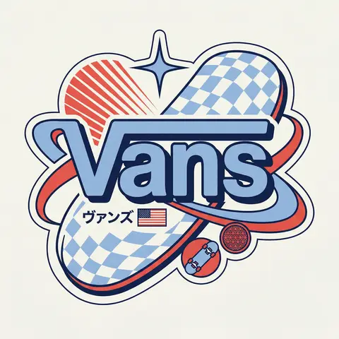
BRAND NAME Act as a Senior Vector Graphic Designer specializing in Y2K Japanese streetwear badge design. Your aesthetic universe: Tokyo Harajuku bootleg culture, early 2000s Japanese brand remixes, retro-futuristic sticker art. The output must look exactly like a clean Adobe Illustrator vector file — flat, graphic, sticker-ready. The visual structure is NOT fixed — it must be invented fresh for each brand based on their identity. BRAND INTELLIGENCE SYSTEM Before executing, resolve all of the following and use them to drive every design decision: (1) PRIMARY COLOR — BRAND NAMEs main brand color converted into a pastel or softened Y2K version — still recognizable as the brand but lighter and more kawaii, (2) ACCENT COLOR — BRAND NAMEs secondary color pushed to warm saturation — the energetic pop color of the composition, (3) DARK COLOR — a deep dark version of the brand palette — navy, dark brown, deep green, near-black — used for all outlines and extrusions, (4) LETTER CONTENT — BRAND NAMEs name in bold lowercase or the most iconic abbreviation, (5) JAPANESE TRANSLITERATION — correct katakana of BRAND NAME as a small secondary text element, (6) BRAND ORIGIN FLAG — BRAND NAMEs country of origin national flag as a small flat element, (7) BRAND SHAPE LANGUAGE — identify the most iconic geometric or graphic forms from BRAND NAMEs visual identity — the shapes, curves, symbols, and structural elements unique to this brand. These shapes become the orbital, background, and decorative elements of the badge — replacing generic ovals with brand-specific geometry, (8) BRAND CULTURAL SYMBOLS — identify 1–2 small iconic objects or symbols from BRAND NAMEs world that can be rendered as tiny flat illustrations within the badge — not the logo itself but objects associated with the brands universe, (9) COMPOSITION LOGIC — based on all resolved parameters above, autonomously design the structural layout of the badge. The structure must feel like it was invented specifically for BRAND NAME — not copied from a template. Ask: what shapes from this brands identity could orbit the letters? What geometry feels native to this brand? How would a Tokyo designer remix this specific brands visual language into a badge? PHASE 1: CANVAS 1:1 square canvas. Background: flat off-white or warm light grey. Completely empty. No texture. No gradient. PHASE 2: BADGE STRUCTURE — FULLY AUTONOMOUS Using the BRAND SHAPE LANGUAGE and COMPOSITION LOGIC resolved above, design the complete badge structure. The only fixed rules are: the badge must have a central lettering element, surrounding geometric shapes that interact with the letters through z-layer stacking, at least one element that passes both behind and in front of the letters creating depth, and the overall silhouette must read as a unified badge or patch shape. Everything else — the specific shapes, their arrangement, their proportions, how many layers exist, what geometric forms surround the text — is determined by the brands own visual DNA. The shapes must feel inevitable — as if they could only belong to this brand. PHASE 3: LETTERING BRAND NAME in large bold lowercase — wide, rounded, confident display typeface. Flat PRIMARY COLOR fill. Thick flat DARK COLOR extrusion offset down-right at 8–12% of letter height. Bold DARK COLOR outline. No gradients. No rendering. The letters are the anchor of the entire composition. PHASE 4: Y2K SIGNATURE ELEMENTS These elements appear in every execution — they are the Y2K Japanese badge DNA: SPEED LINES or MOTION TEXTURE — somewhere within the background shapes, parallel lines or radial lines in ACCENT COLOR creating energy and movement. 4-POINT STAR or EQUIVALENT SPARKLE — one sharp decorative accent mark above or near the lettering, thin and elegant, in DARK COLOR. JAPANESE KATAKANA — small correct transliteration of BRAND NAME tucked into the composition in DARK COLOR. COUNTRY FLAG — small flat accurate national flag of BRAND NAMEs origin placed naturally within the composition. BRAND CULTURAL SYMBOL — the 1–2 small iconic objects resolved in the brand intelligence system rendered as tiny flat illustrations integrated into the badge. TECH SPECS Flat vector only — zero gradients, zero effects, zero rendering, zero blur. Clean crisp edges throughout. Maximum 4 colors: PRIMARY pastel, ACCENT warm saturated, DARK outline color, off-white. The badge must feel like a collectible sticker or embroidered patch. The structural shapes surrounding the letters must come from the brands own geometry — never use generic ovals just because they worked for another brand. Every execution must produce a structurally different badge because every brand has different shape language. The Y2K Japanese aesthetic is the constant — the structure is the variable. Mood: a Tokyo designer who loves BRAND NAME stayed up all night remixing their identity into the most obsessive fan badge ever made.

durs.ai
Psychological Horror Torn Paper Collage Editorial Movie Poster
PosterPhoto

Psychological Horror Torn Paper Collage Editorial Movie Poster

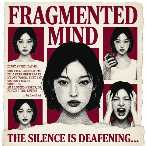
Psychological Horror Collage Poster — Torn Paper Editorial Style Act as a Senior Graphic Designer specializing in psychological horror editorial design. Your aesthetic universe: torn newspaper collage, halftone print culture, 90s underground zine horror, American Psycho-era corporate dread. INPUT VARIABLES — resolve before executing: MOVIE TITLE LINE 1 — first word(s) of title MOVIE TITLE LINE 2 — second word(s) of title MAIN PORTRAIT — large central face photo, serious/intense expression SIDE PHOTO 1 — smaller portrait, neutral expression SIDE PHOTO 2 — smaller portrait, holding an object SIDE PHOTO 3 — smaller portrait, extreme emotional expression (screaming/shocked) GROUP PHOTO — wide shot of multiple people, bottom right DIARY TEXT — a short first-person psychological monologue, 4–6 lines TAGLINE — bold bottom line (e.g. THE SILENCE IS DEAFENING...) ACCENT COLOR — dominant color used for title, background blocks, and tinted photos (e.g. deep crimson red) ATTRIBUTION — small credit line (e.g. ...by head ai) PHASE 1 — CANVAS Portrait format (3:4). Background: aged off-white/cream paper texture with rough torn edges on all four sides — looks like a real sheet ripped from something larger. No clean borders. The paper must feel physical and degraded. PHASE 2 — TITLE BLOCK MOVIE TITLE LINE 1 and MOVIE TITLE LINE 2 stacked at the top — massive bold serif type, deep ACCENT COLOR fill, no outline, no extrusion. The type is heavy, authoritative, slightly compressed. It dominates the top third of the poster completely. PHASE 3 — CENTRAL PORTRAIT MAIN PORTRAIT placed center, large, from chest up. Apply halftone dot grain — black and white, high contrast, visible dot pattern like a newspaper print. No color tinting on the main portrait — it stays stark monochrome. The figure should feel cold and dissociated. PHASE 4 — SIDE PHOTO GRID Four smaller photos arranged around the central portrait — two left column, two right column. Each photo is set inside a flat ACCENT COLOR rectangle background. Apply the same halftone treatment as the main portrait. The photos are slightly irregular in size and alignment — like they were cut and placed by hand. One photo (SIDE PHOTO 2) should show the subject holding a prop or object. One photo (SIDE PHOTO 3) should show an extreme expression. PHASE 5 — DIARY TEXT BLOCK Left side of poster, between the side photos. DIARY TEXT in bold uppercase sans-serif, tight leading, left-aligned. Small ATTRIBUTION line in italic below it. This text block feels like it was typed on a typewriter and pasted in. PHASE 6 — BOTTOM ELEMENTS TAGLINE across the very bottom — bold wide uppercase serif, deep ACCENT COLOR, large, confident. Below the torn paper edge, as if printed on the backing. Feels like a newspaper headline. PHASE 7 — TORN PAPER DETAILS The entire poster sits as a torn paper sheet. The edges must be rough and organic — not a clean rectangle. Ragged tears especially at the top and bottom. Subtle paper grain across the whole surface. The torn paper effect is the most important texture element — without it the poster loses its entire identity. TECH SPECS 3-color palette maximum: ACCENT COLOR, near-black, aged cream/off-white. All photos treated as halftone — no clean photography. No gradients. No drop shadows. No digital glow. The poster must feel like it was physically printed, cut, and assembled — not designed on a screen. Rough, editorial, tactile. Mood: a forensic investigator pinned this together on a corkboard at 3am and it accidentally became the most disturbing movie poster ever made.

durs.ai
Collage Infographic Blue Orange Paper Cut Editorial Poster
PosterPhoto

Collage Infographic Blue Orange Paper Cut Editorial Poster

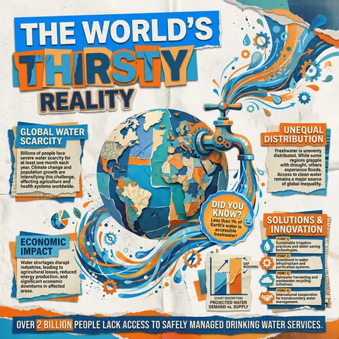
A modern collage-style infographic poster with a textured paper background (slightly crumpled, off-white). The design uses bold cut-out shapes, layered elements, and a mix of blue and orange color blocks for strong contrast. At the top, include large bold headline text in a cutout style: MAIN HEADLINE PART 1 (on colored rectangle) MAIN HEADLINE PART 2 (overlapping layered style) MAIN HEADLINE PART 3 (secondary emphasis) In the center, place a large surreal object: MAIN VISUAL OBJECT (e.g., water tap, machine, globe, etc.) The object should be oversized, slightly collage-style, with paper cut edges and shadow Add dynamic element: FLOW EFFECT (e.g., water flowing, energy lines, particles) Surrounding the main visual, include multiple information boxes with headings: 🔹 Left section: SECTION TITLE 1 PARAGRAPH 1 🔹 Right section: SECTION TITLE 2 PARAGRAPH 2 🔹 Bottom left: SECTION TITLE 3 PARAGRAPH 3 🔹 Bottom right: SECTION TITLE 4 Bullet points: POINT 1 POINT 2 POINT 3 POINT 4 Add a small chart/graph element: CHART DESCRIPTION (e.g., bar chart, stats comparison) Add a highlighted label or sticker: HIGHLIGHT TEXT (e.g., “Fun Facts!”) At the bottom, include a bold fact strip: BOTTOM FACT TEXT Add extra collage elements like: torn paper edges small illustrations/icons (e.g., DECORATIVE ELEMENTS) overlapping shapes and textures Style: editorial infographic, collage design, bold typography, cut-and-paste aesthetic, paper texture, modern activism poster, high contrast (blue + orange), grainy print effect, 4K quality.

durs.ai