durs.ai
Prompt library

Prompts that work

Ready-made prompts for ads, logos, posters, 3D and more. Use one in a tap — or share your own.

+ Add a prompt
Futuristic wellness elixir
ProductPhoto

Futuristic wellness elixir

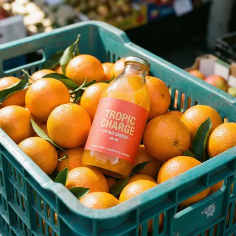
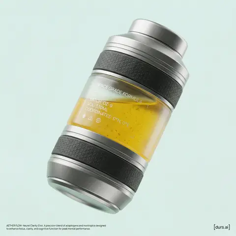
BRAND NAME or LOGO IMAGE is launching a new functional wellness elixir (e.g., adaptogenic, nootropic, or natural energy drink). As the Creative Director, devise a product name and visualize a complete high-end promotional shot. The aesthetic is Cosmic Premium—technological, clean, and sophisticated, like top-tier Apple product photography. THE PRODUCT: Design a sculptural, multi-layered beverage bottle suspended in the center. The form is engineered and futuristic. The materials are hyper-tactile: bead-blasted titanium details, frosted borosilicate glass, and textured haptic polymer grips. Crucial Color Instruction: The liquid inside must have a distinct, natural color relevant to its invented function (e.g., vibrant turmeric yellow, deep berry red, earthy matcha green, or pale calming blue). The liquid should look real with subtle natural sediment. Crucial Graphic Detail: On the clear glass section of the bottle, apply a layer of subtle, minimalist, technical typography printed in matte white ink. This design should feel utilitarian and futuristic (e.g., small technical specs like SPACE GRADE FORMULA, BATCH: OZ-9, volume indicators, or coordinate markings), adding a functional aesthetic similar to aerospace labeling, without overwhelming the bottles clean lines. THE ENVIRONMENT & LIGHTING: The bottle is in a seamless studio. Crucial Background Instruction: The background must be a solid, clean, very light pastel tone that is specifically chosen to complement the liquid color (e.g., a soft cool mint background for a warm orange liquid, or a pale blush background for a deep green liquid). No gradients. Ultra-soft, diffused studio lighting creates sleek highlights on metal and deep subsurface scattering in the glass and liquid. PHOTOGRAPHY STYLE: High-resolution 100mm macro lens shot. Shallow depth of field, sharp focus on bottle textures and the printed graphics on the glass, smooth pastel background bokeh. 8k resolve, hyper-realistic textures. GRAPHIC OVERLAYS: Include subtle dark gray UI elements. Bottom Left Corner: Very small, minimalist text (like Manrope Regular font) describing the products name and function in two sentences. Bottom Right Corner: A small, minimalist dark gray logomark for BRAND NAME.

durs.ai
Transparent Glass Social Media Profile Card
3DPhoto

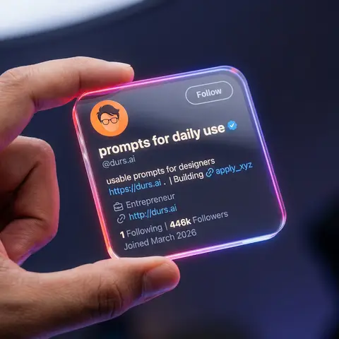
Transparent Glass Social Media Profile Card

Close-up shot of a human hand holding a square, transparent acrylic/glass-like social media profile card in mid-air. Dark studio background, softly blurred, with subtle blue-purple ambient light. Very shallow depth of field (f/1.8), only the glass card and fingers are in sharp focus, with heavy bokeh background. Scene & Atmosphere Environment: Dark studio (#0c0f19), vignette edges, subtle blue-purple ambient light Mood: Futuristic, tech, premium, clean UI, social media identity card Camera: Macro lens (85mm equivalent), f/1.8, 8K ultra-realistic rendering Transparent Card Design Material: Transparent acrylic/glass (transparency 0.92, IOR 1.5, roughness 0.05) Shape: Perfect rounded square (corner radius 10-16px), 3-5mm thickness Edge Glow: Strong neon gradient - linear-gradient(135deg, #ff4d4d, #ff7de3, #8a5dff, #41c3ff) Held By: Realistic human hand, thumb on front-left edge, warm skin tone UI Layout Header: - Avatar: Circular, top-left, flat illustration style (orange background, dark hair, glasses) - Username: nanoprompts ▲ - Bold rounded sans-serif, near-white color - Verified Badge: Blue (#1D9BF0), next to username - Handle: @promptslab - Below username, color #d0d6e5 - Follow Button: Top-right, transparent/glassy, 1px solid #ffffff99 border Body: - Description: 100+ Free AI Prompts & Workflows for Nano Banana Image Generation - Link: https://nanoprompts.org . | Building 🔗apply_xyz (color #5da7ff) - Meta: Profession icon + Entrepreneur - Website: http://rehanuds.framr.website Footer Stats: - 135 Following | 446 Followers - Joined May 2025 (color #ffffff66) Lighting Main Light: Softbox from top-left/front-left, 5200-5600K cool white Rim Light: Neon edge emission, strong on corners Background: Dark with extra glow (#3e4fff33), round bokeh (#283759) Avoid No extra hands, distorted fingers, low-res text, fingerprints, watermarks, or cropped buttons
durs.ai
Dynamic Beverage Pour Into Glass Commercial Shot
AdvertisementPhoto

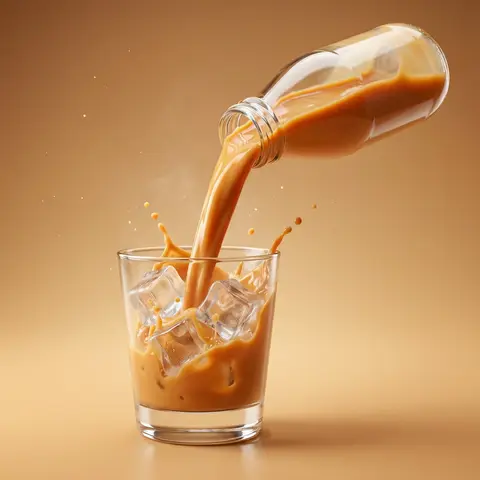
Dynamic Beverage Pour Into Glass Commercial Shot

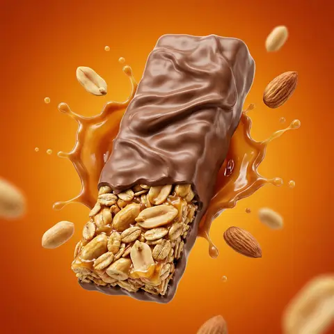
Create a hyper-realistic commercial product photography of a exact uploaded product image as the main subject bottled beverage pouring dynamically into a clear glass. The bottle is tilted mid-air at a powerful angle, with a rich, creamy liquid flowing smoothly in a thick stream into the glass. The liquid appears silky, glossy, and highly appetizing, with realistic viscosity and smooth motion. Add dynamic splash effects: - controlled creamy liquid splashes rising inside the glass - subtle splash arcs and droplets frozen mid-air - natural fluid interaction with glass walls Include crystal-clear ice cubes inside the glass: - realistic transparency and refraction-slight frost and condensation on ice surface - interaction between liquid and ice (soft splash + displacement) Studio shot, ultra high resolution, sharp focus, 85mm lens look, f/2.8 depth of field. Background: clean studio ackdrop color-matched to the product tone (warm caramel orange, creamy beige, or flavor-inspired color) with a soft gradient. Surface matches background tone for seamless premium look with subtle reflection. Add subtle atmospheric details: - fine micro droplets in air - light mist or cold vapor around glass Lighting: cinematic studio lighting with: - strong rim light highlighting liquid edges and glass contours - soft top light enhancing liquid gloss - side light emphasizing texture and splash detail Glass is ultra clean with realistic reflections, refraction, and soft shadow grounding. Composition is bold, dynamic, and premium - high-end beverage advertising style. No text, no typography, no clutter, no identifiable ingredients. Ultra realistic, photorealistic, high dynamic range, cinematic color grading, glossy highlights. 4K-8K resolution, billboard-ready, sharp detail, realistic studio shoot look.

durs.ai
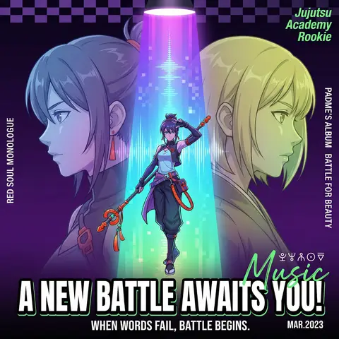
Cyberpunk Anime Magazine Cover Design
PosterPhoto

Cyberpunk Anime Magazine Cover Design

A cyberpunk anime magazine cover, symmetrical composition. A full-body central character standing under a dramatic spotlight beam, holding a staff, dynamic pose (one hand raised), positioned in the center of a vertical neon gradient light column (purple → blue → cyan → green). On the left and right sides, two semi-transparent side-profile characters (head and shoulders only), facing inward in a mirrored confrontation, one with blue-purple gradient hair, the other with yellow-green gradient hair. Dark background with deep purple to black gradient, enhanced with subtle checkerboard geometric texture. Strong stage lighting from above with radial spotlight rays. Pixelated vertical light beam effects, resembling retro digital screens or sound waves. Character design: detailed anime style, semi-realistic shading, cyberpunk aesthetic, gradient hair, futuristic functional outfits, metallic accessories, glowing accents. Typography layout: Large bold title at the bottom: “A NEW BATTLE AWAITS YOU!” in uppercase, heavy sans-serif, thick black outline, high contrast. Subtitle below: “WHEN WORDS FAIL BATTLE BEGINS.” thin sans-serif, centered. Small date text “MAR. 2023” in bottom-right corner. Vertical side text: “RED SOUL MONOLOGUE” (left), “PADMES ALBUM: BATTLE FOR BEAUTY” (right). Top-right diagonal green text: “Jujutsu Academy Rookie”. Add small mysterious symbols above the title and a green handwritten “Music” overlay. Color scheme: neon gradients, high contrast, cool tones with red and orange accent highlights. Highly detailed, sharp focus, cinematic lighting, magazine cover design, ultra high resolution, 4k, trending on ArtStation.

durs.ai
FMCG Product Packaging Technical Industrial Design Spec Sheet
PackagePhoto

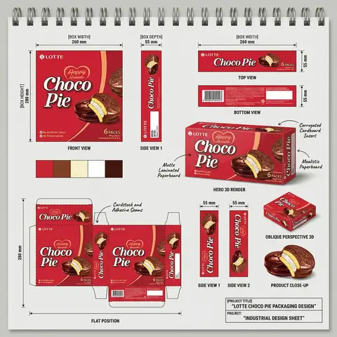
FMCG Product Packaging Technical Industrial Design Spec Sheet

Act as a Senior Industrial/Packaging Designer specializing in technical product presentation sheets. Your aesthetic universe: professional packaging dielines, FMCG product design documentation, industrial design sketchbook layouts, technical manufacturing specs. INPUT VARIABLES — resolve before executing: BRAND NAME — company/manufacturer name (e.g. ORION) PRODUCT NAME — product name in large display type (e.g. Choco·Pie) VARIANT NAME — flavor/variant sub-label (e.g. Chocochip) PRODUCT PHOTO 1 — hero product shot, multiple units styled (for front face) PRODUCT PHOTO 2 — single product unit close-up (for oblique/detail views) PRODUCT PHOTO 3 — product cross-section or ingredient shot (e.g. sliced showing filling) INGREDIENT PHOTO — key flavor ingredient isolated (e.g. orange slice, strawberry) BOX WIDTH — e.g. 260 mm BOX HEIGHT — e.g. 280 mm BOX DEPTH — e.g. 55 mm UNIT COUNT — e.g. x12 NET WEIGHT — e.g. 360g COLOR PALETTE — 4–5 brand colors as swatches (e.g. navy, red, orange, brown, cream) PROJECT TITLE — bottom right label (e.g. ORION CHOCO-PIE PACKAGING DESIGN) PROJECT TYPE — bottom right sub-label (e.g. INDUSTRIAL DESIGN SHEET) MATERIAL NOTE 1 — e.g. Matte Laminated Paperboard MATERIAL NOTE 2 — e.g. Glossy UV Spot Varnish MATERIAL NOTE 3 — e.g. Corrugated Cardboard Insert MATERIAL NOTE 4 — e.g. Mealistic Paperboard MATERIAL NOTE 5 — e.g. Cardstock and Adhesive Seams PHASE 1 — CANVAS Portrait format (3:4). Background: light neutral grey — the color of a real sketchbook or drafting paper. At the very top: a spiral binding strip — rendered as a realistic row of metal coil rings across the full width, like a professional sketchpad. This binding is the first thing visible and establishes the entire presentation as a physical design document. PHASE 2 — BOX FACE DESIGNS Design the complete packaging artwork that will wrap all box faces. Use BRAND NAME, PRODUCT NAME, VARIANT NAME, PRODUCT PHOTO 1, INGREDIENT PHOTO, COLOR PALETTE. The box face should feel like a real retail product — bold brand hierarchy, appetite-appeal food photography, clean structured layout. This artwork is then applied consistently across all views below. PHASE 3 — ORTHOGRAPHIC VIEWS (top section) Arrange four flat technical views in a clean grid with dimension annotations: FRONT VIEW — full front face of box, largest panel, bottom left of grid. Annotated with BOX WIDTH (horizontal arrow above) and BOX HEIGHT (vertical arrow left side) SIDE VIEW 1 — narrow side panel, center of grid. Annotated with BOX DEPTH (horizontal arrow above) TOP VIEW — top face of box, top right of grid. Annotated with width and depth dimensions BOTTOM VIEW — small flat bottom face, right side. Annotated with depth dimension All dimension lines are thin black with arrow endpoints. Labels in small clean sans-serif. View titles in small uppercase below each panel. PHASE 4 — HERO 3D RENDER (center) One large photorealistic 3D perspective render of the assembled box — slightly angled, showing front face and one side face simultaneously. Soft neutral shadow beneath. This is the centerpiece of the sheet — larger than any single orthographic view. Material callout arrows pointing to specific areas with MATERIAL NOTE 1, MATERIAL NOTE 2, MATERIAL NOTE 3, MATERIAL NOTE 4 labels in small handwritten-style or clean serif annotation type. PHASE 5 — ADDITIONAL VIEWS (mid section) Arranged around the hero render: SIDE VIEW 1 — tall narrow vertical panel, left side, with 20mm depth annotation SIDE VIEW 2 — same narrow panel, right side OBLIQUE PERSPECTIVE — small 3/4 angle render of box, bottom right, labeled OBLIQUE PERSPECTIVE PRODUCT CLOSE-UP — PRODUCT PHOTO 2 and PRODUCT PHOTO 3 showing product detail below oblique view PHASE 6 — COLOR PALETTE SWATCHES Two rows of color swatches — one row after the orthographic views section, one row after the dieline section. Each swatch is a filled circle, colors taken from COLOR PALETTE. No labels needed — just the circles in a horizontal row. PHASE 7 — DIELINE / FLAT POSITION Bottom left quadrant: the complete box dieline — all faces unfolded flat showing the full packaging layout. Dashed fold lines, solid cut lines. All faces labeled with the full packaging artwork applied. Dimension annotations: BOX HEIGHT vertical arrow on left side, bottom width measurements. Label below: FLAT POSITION in small uppercase. MATERIAL NOTE 5 callout arrow pointing to seam area. PHASE 8 — PROJECT ID BLOCK Bottom right corner: a clean rectangular project identification box with thin black border. Contains: PROJECT TITLE in bold uppercase PROJECT: label followed by PROJECT TYPE in bold All in dark type on white or light background. Feels like a title block on an engineering drawing. TECH SPECS The entire sheet must read as a professional industrial design document — not a marketing presentation. Dimension lines must be precise and consistent. All views must be correctly proportioned relative to each other. The 3D render is the only element with shadow/lighting — everything else is flat. Font system: one clean sans-serif for all annotations and labels, one bold display font for the product name on packaging. The spiral binding at top is non-negotiable — it defines the entire sketchbook format. The sheet must feel like something a packaging engineer would hand to a print production team. Mood: a senior packaging designer at a major FMCG agency spent a full day perfecting this spec sheet — every measurement is intentional, every view tells the factory exactly what to print and fold.

durs.ai