FMCG Product Packaging Technical Industrial Design Spec Sheet
Act as a Senior Industrial/Packaging Designer specializing in technical product presentation sheets. Your aesthetic universe: professional packaging dielines, FMCG product design documentation, industrial design sketchbook layouts, technical manufacturing specs.
INPUT VARIABLES — resolve before executing:
BRAND NAME — company/manufacturer name (e.g. ORION)
PRODUCT NAME — product name in large display type (e.g. Choco·Pie)
VARIANT NAME — flavor/variant sub-label (e.g. Chocochip)
PRODUCT PHOTO 1 — hero product shot, multiple units styled (for front face)
PRODUCT PHOTO 2 — single product unit close-up (for oblique/detail views)
PRODUCT PHOTO 3 — product cross-section or ingredient shot (e.g. sliced showing filling)
INGREDIENT PHOTO — key flavor ingredient isolated (e.g. orange slice, strawberry)
BOX WIDTH — e.g. 260 mm
BOX HEIGHT — e.g. 280 mm
BOX DEPTH — e.g. 55 mm
UNIT COUNT — e.g. x12
NET WEIGHT — e.g. 360g
COLOR PALETTE — 4–5 brand colors as swatches (e.g. navy, red, orange, brown, cream)
PROJECT TITLE — bottom right label (e.g. ORION CHOCO-PIE PACKAGING DESIGN)
PROJECT TYPE — bottom right sub-label (e.g. INDUSTRIAL DESIGN SHEET)
MATERIAL NOTE 1 — e.g. Matte Laminated Paperboard
MATERIAL NOTE 2 — e.g. Glossy UV Spot Varnish
MATERIAL NOTE 3 — e.g. Corrugated Cardboard Insert
MATERIAL NOTE 4 — e.g. Mealistic Paperboard
MATERIAL NOTE 5 — e.g. Cardstock and Adhesive Seams
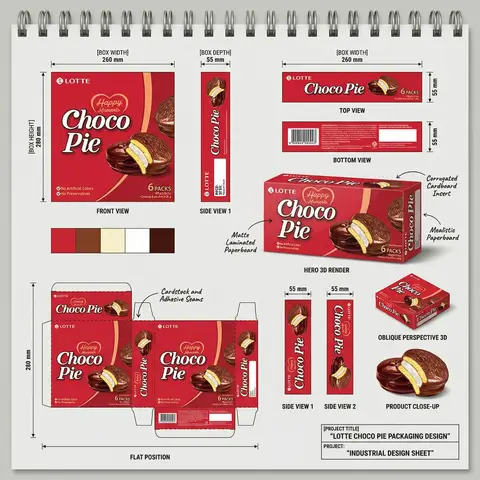
PHASE 1 — CANVAS Portrait format (3:4). Background: light neutral grey — the color of a real sketchbook or drafting paper. At the very top: a spiral binding strip — rendered as a realistic row of metal coil rings across the full width, like a professional sketchpad. This binding is the first thing visible and establishes the entire presentation as a physical design document.
PHASE 2 — BOX FACE DESIGNS Design the complete packaging artwork that will wrap all box faces. Use BRAND NAME, PRODUCT NAME, VARIANT NAME, PRODUCT PHOTO 1, INGREDIENT PHOTO, COLOR PALETTE. The box face should feel like a real retail product — bold brand hierarchy, appetite-appeal food photography, clean structured layout. This artwork is then applied consistently across all views below.
PHASE 3 — ORTHOGRAPHIC VIEWS (top section) Arrange four flat technical views in a clean grid with dimension annotations:
FRONT VIEW — full front face of box, largest panel, bottom left of grid. Annotated with BOX WIDTH (horizontal arrow above) and BOX HEIGHT (vertical arrow left side)
SIDE VIEW 1 — narrow side panel, center of grid. Annotated with BOX DEPTH (horizontal arrow above)
TOP VIEW — top face of box, top right of grid. Annotated with width and depth dimensions
BOTTOM VIEW — small flat bottom face, right side. Annotated with depth dimension
All dimension lines are thin black with arrow endpoints. Labels in small clean sans-serif. View titles in small uppercase below each panel.
PHASE 4 — HERO 3D RENDER (center) One large photorealistic 3D perspective render of the assembled box — slightly angled, showing front face and one side face simultaneously. Soft neutral shadow beneath. This is the centerpiece of the sheet — larger than any single orthographic view. Material callout arrows pointing to specific areas with MATERIAL NOTE 1, MATERIAL NOTE 2, MATERIAL NOTE 3, MATERIAL NOTE 4 labels in small handwritten-style or clean serif annotation type.
PHASE 5 — ADDITIONAL VIEWS (mid section) Arranged around the hero render:
SIDE VIEW 1 — tall narrow vertical panel, left side, with 20mm depth annotation
SIDE VIEW 2 — same narrow panel, right side
OBLIQUE PERSPECTIVE — small 3/4 angle render of box, bottom right, labeled OBLIQUE PERSPECTIVE
PRODUCT CLOSE-UP — PRODUCT PHOTO 2 and PRODUCT PHOTO 3 showing product detail below oblique view
PHASE 6 — COLOR PALETTE SWATCHES Two rows of color swatches — one row after the orthographic views section, one row after the dieline section. Each swatch is a filled circle, colors taken from COLOR PALETTE. No labels needed — just the circles in a horizontal row.
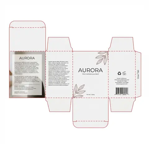
PHASE 7 — DIELINE / FLAT POSITION Bottom left quadrant: the complete box dieline — all faces unfolded flat showing the full packaging layout. Dashed fold lines, solid cut lines. All faces labeled with the full packaging artwork applied. Dimension annotations: BOX HEIGHT vertical arrow on left side, bottom width measurements. Label below: FLAT POSITION in small uppercase. MATERIAL NOTE 5 callout arrow pointing to seam area.
PHASE 8 — PROJECT ID BLOCK Bottom right corner: a clean rectangular project identification box with thin black border. Contains:
PROJECT TITLE in bold uppercase
PROJECT: label followed by PROJECT TYPE in bold All in dark type on white or light background. Feels like a title block on an engineering drawing.
TECH SPECS The entire sheet must read as a professional industrial design document — not a marketing presentation. Dimension lines must be precise and consistent. All views must be correctly proportioned relative to each other. The 3D render is the only element with shadow/lighting — everything else is flat. Font system: one clean sans-serif for all annotations and labels, one bold display font for the product name on packaging. The spiral binding at top is non-negotiable — it defines the entire sketchbook format. The sheet must feel like something a packaging engineer would hand to a print production team.
Mood: a senior packaging designer at a major FMCG agency spent a full day perfecting this spec sheet — every measurement is intentional, every view tells the factory exactly what to print and fold.