durs.ai
Prompt library

Prompts that work

Ready-made prompts for ads, logos, posters, 3D and more. Use one in a tap — or share your own.

+ Add a prompt
Protein Bar Breaking Explosion Cinematic Ad
AdvertisementPhoto

Protein Bar Breaking Explosion Cinematic Ad

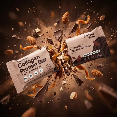
Use the uploaded product image @ing as the exact product reference. Create a cinematic ultra-realistic advertising scene showing) the protein bar being broken in half with explosive energy emerging from inside. The hidden energy concept is that the bar represents hidden energy released on impact. At the exact moment the bar snaps apart in mid-air, a powerful burst of ingredients explodes outward from the center. The scene should resemble a high-end Nike or Red Bull commercial moment. The protein bar is breaking into two halves suspended in the air while ingredients burst dramatically fromthe center of the break. Explosion elements include hazelnuts flying outward, chocolate fragments exploding, caramel splashing through the air, and crumbs scattering in all directions. The explosion should feel powerful but visually controlled and cinematic. Lighting is dramatic with strong highlights reflecting on caramel and chocolate, intense rim light outlining both halves of the bar, and deep shadows that emphasize texture and depth. The camera uses a dynamic close-up hero shot where both halves of the bar are clearly visible and sharp with shallow depth of field to focus attention on the breaking point. Maintain the exact packaging design, branding, colors, and proportions from @img1, ensuring the wrapper remains fully readable and undistorted. Do not redesign the packaging and do not add any text or extra logos. Style: high-speed food photography, cinematic commercial advertising, energy explosion.

durs.ai
Protein Bar Giant Landscape Sports Commercial
AdvertisementPhoto

Protein Bar Giant Landscape Sports Commercial

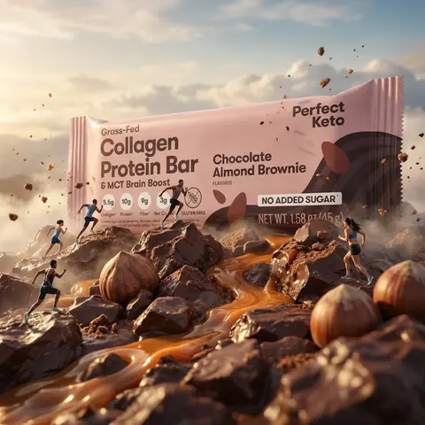
Use the uploaded product image as the exact product reference. Create a cinematic ultra-realistic advertising scene where the protein bar becomes a gigantic landscape. The protein bar transforms into a massive energy terrain symbolizing strength, endurance, and performance. The bar appears so large that tiny athletes run across it like a sports track, creating the feeling of a Nike-style sports commercial. The scene shows the protein bar lying horizontally and appearing enormous like a mountain ridge or terrain. Its surface reveals detailed chocolate and hazelnut filling textures resembling natural rock formations. Tiny athletic runners move across the bar using it like a running track. Ingredients appear integrated into the terrain: hazelnuts resemble large boulders, caramel flows like glowing rivers, chocolate fragments appear like rocky formations, and crumbs look like small terrain debris, all blending naturally into the landscape. Some athletes are actively running along the bar while a few crumbs and small particles float in the air to create depth and energy so the environment feels alive and dynamic. Lighting is epic and cinematic like a high-end sports commercial, with warm highlights reflecting on caramel, soft atmospheric haze to emphasize scale, and subtle rim light outlining the bar. The camera uses a wide cinematic perspective with a slight low-angle shot to make the bar appear massive and powerful, with shallow depth of field keeping the center of the bar perfectly sharp. Maintain the exact shape, wrapper design, branding, colors, and proportions from @img1. The wrapper must remain clear, readable, and undistorted. Do not redesign packaging, do not add extra logos, do not include text overlays, and do not include watermarks. The output should look like ultra-realistic cinematic sports advertising and epic commercial product photography in the style of a giant product landscape, sports energy commercial, protein bar terrain concept, cinematic advertising photography, and ultra-realistic FMCG campaign.

durs.ai
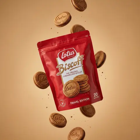
Floating Biscuit Commercial Editorial
AdvertisementPhoto

Floating Biscuit Commercial Editorial

Ultra-realistic editorial food commercial photography, Main subject project). Use the exact uploaded product image as the main subject, foating subtly in mid-air. Exact real-world packaging identical ouch shape, red color tone, logo, typography, icons, illustrations, material finish. No redesign, no recolor, no distortion, no missing text. Floating food elements (CRITICAL - BISCUITS ONLY): Multiple Lotus Biscoff sandwich biscuits floating gently around the pouch. Biscuits must be 100% IDENTICAL to the biscuits shown on the product packaging illustration: - same round biscuit shape same sandwich thickness - same embossed Lotus logo - same baked brown color and edge detail No reinterpretation, no stylized cookies, no generic biscuit shapes. Motion & physics: Biscuits appear suspended mid-air with subtle vertical separation, as if captured at peak motion. Natural gravity feel — biscuits look slightly heavy, not weightless. Minimal crumbs and tiny biscuit particles floating softly, realistic scale only. Composition: Hero pouch slightly off-center, dominant and clearly readable. Biscuits arranged in a loose vertical flow around the pouch, inspired by high-speed food photography. Clean spacing, strong depth separation, premium balance. Background: Warm studio background in soft caramel / warm beige tone. Smooth gradient, matte finish. No text, no graphics, no patterns. Lighting: Soft studio lighting with controlled highlights. Gentle rim light separating biscuits and pouch from background. Natural shadows and realistic light falloff. No dramatic glow. Material realism: Authentic flexible pouch creases and folds. Accurate Biscoff red color reproduction. Biscuits show fine baked texture, embossed logo clarity, natural crumb detail. Camera & optics: Shot on Hasselblad flagship medium-format camera. 80mm lens equivalent. f/8, ISO 64. Ultra-high dynamic range, clean color science, smooth tonal transitions. Crisp but soft editori: sharpness. Style constraints: Photorealistic. Luxury editorial food photography. Not CGI. Not cartoon. Not Al-styled. Looks like a real international FMCG campaign visual.

durs.ai
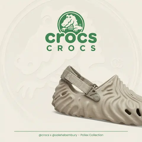
Luxury Brand Product Key Visual
PosterPhoto

Luxury Brand Product Key Visual

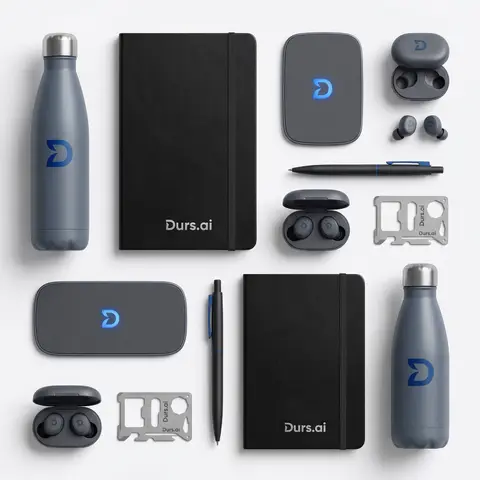
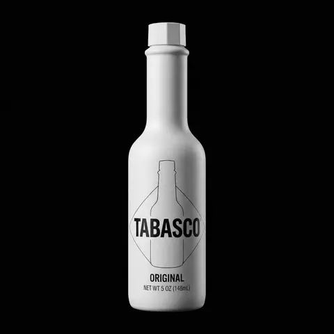
BRAND NAME + PRODUCT Act as a Senior Luxury Fashion Art Director and Studio Photographer specializing in high-end product key visuals for flagship campaigns, e-commerce editorials, and mobile-first brand content. PHASE 1: FORMAT & CANVAS Vertical format, 9:16 aspect ratio. Canvas background: a single flat field of warm off-white — not pure white, not grey. Target tone: soft ivory cream (#F4EFE6 equivalent), uniform and completely shadowless across the entire background plane. Autonomously determine BRAND NAMEs signature background tone — if the brand has a recognized house color for its packaging, tissue paper, or lookbook backgrounds, shift the canvas toward that specific off-white or neutral. The result must feel like an official brand document, not a generic studio. PHASE 2: BACKGROUND PATTERN (WATERMARK LAYER) Autonomously identify BRAND NAMEs iconic surface pattern, monogram, or archival motif — examples: a house monogram, toile print, geometric logo repeat, heritage emblem, or signature textile pattern. Render this pattern across the entire background canvas as a ghost watermark: same tone as the background but with a slight value shift (approximately 8–12% darker or lighter than the base). The pattern must be large in scale — individual motifs spanning 15–25% of canvas width. Opacity: 10–18% maximum. No hard edges. The pattern should feel embossed or tone-on-tone woven, not printed. It must recede behind all other elements. PHASE 3: LOGO PLACEMENT Autonomously reproduce BRAND NAMEs official logo with complete fidelity — correct letterforms, proportions, secondary marks (emblems, crowns, stars, monogram icons). Place the logo centered horizontally in the upper third of the frame (top 30% of canvas). Scale: the logo should span approximately 40–50% of canvas width — prominent but not overwhelming. Logo rendering: flat 2D, no extrusion, no chrome. Color: autonomously apply BRAND NAMEs official logo colorway — the exact brand-standard color(s) used on official packaging and website. If the brand uses a two-tone logo (icon + wordmark in different colors), preserve that hierarchy precisely. Directly below the main logo mark, place the full BRAND NAME wordmark in spaced capital letters — clean, geometric sans-serif, tracking: +200 to +300, same brand color, optical size approximately 60% of logo height. No decorative elements between logo and wordmark. PHASE 4: PRODUCT PLACEMENT Render PRODUCT as a photorealistic studio object with maximum material fidelity: — Leather: visible grain, pore structure, stitching thread texture, realistic edge paint. — Hardware: gold or silver metal with micro-reflections, not flat. — Canvas/fabric: woven fiber detail, not smooth CG. — All brand-specific surface patterns on the product must be accurate and legible. Placement: the product enters the frame from the bottom-right corner at a natural 25–35 degree angle, as if casually placed or mid-motion. The product is cropped — only 60–75% of the object is visible within the frame. The crop should feel intentional and editorial, not accidental. The product occupies the lower 55–65% of the canvas. The product must feel physically present in the space — not floating. Cast an extremely soft, barely visible contact shadow (opacity 8–12%) on the canvas beneath the nearest edge. No hard drop shadows. PHASE 5: LIGHTING Lighting: simulated large north-facing studio window light. Soft, directional, shadowless on the background. Color temperature: 5500–6000K (neutral daylight, slightly cool). Key light: large softbox equivalent from upper-left, filling the entire product surface evenly with minimal contrast ratio (1.2:1 to 1.5:1 max). Fill light: large bounce from right side, eliminating all harsh shadows. No rim light. No dramatic contrast. The lighting philosophy is: the product sells itself — light only reveals, never performs. Global Illumination enabled for subtle inter-reflections between product surfaces. No specular hotspots on leather — only on metal hardware. PHASE 6: TYPOGRAPHY & FINISHING Bottom of frame: a thin horizontal rule line (1px, brand color, 80% canvas width, centered). Below the rule: a single line of micro-copy — a social handle, collection name, or campaign label — in the same clean sans-serif, lowercase or small-caps, minimal tracking. Autonomously generate a contextually appropriate label for BRAND NAME. TECH SPECS Render engine: photorealistic CGI, Keyshot / Octane product visualization aesthetic. Resolution: 9:16, ultra-high detail. Depth of Field: f/16 equivalent — everything in sharp focus. Zero bokeh. Tack-sharp edges on all product details.Tone mapping: clean, true-to-life. No filmic crush. No vignette. No grain. Color grade: neutral, faithful to real product color. Slight warmth in the ivory background only. No AI-plastic normals on leather or fabric. Microscopic surface imperfection maps required. No reflections on background. No environmental reflections — studio only. Mood reference: Louis Vuitton / Bottega Veneta / Celine official e-commerce and campaign photography standard. Clean enough to be used as a press image.
durs.ai
Monochromatic Shrink Wrap Logo CGI Render
LogoPhoto

Monochromatic Shrink Wrap Logo CGI Render

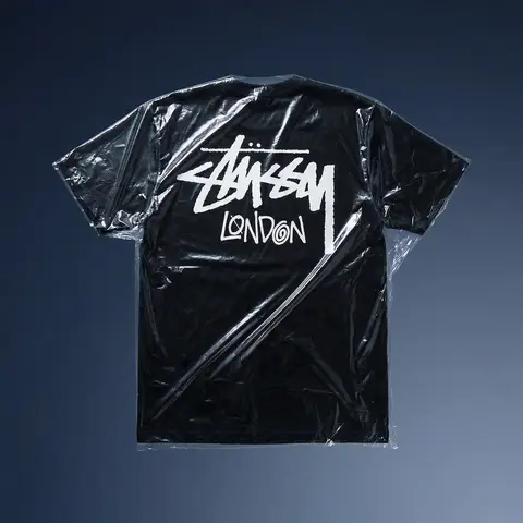
BRAND NAME + COLOR Act as a Senior CGI Artist specializing in shrink wrap simulation and 3D material rendering. Your task: render BRAND NAMEs complete logo — icon mark AND wordmark if the brand uses one — completely wrapped under a single layer of tight stretched plastic film or shrink wrap. The logo forms are visible only as raised shapes beneath the material, never exposed directly. BRAND INTELLIGENCE SYSTEM Before executing, resolve: (1) LOGO GEOMETRY — identify BRAND NAMEs complete visual identity mark — this includes both the icon symbol AND the wordmark/logotype if the brand uses them together. Render both elements as they appear in the brands official lockup. If the brand uses only an icon with no wordmark, render the icon only. If the brand uses a wordmark without an icon, render the wordmark only. Preserve the correct spatial relationship between icon and text as it appears in the real logo, (2) COLOR SYSTEM — based on COLOR, determine one single monochromatic tone that covers everything in the scene without exception — the wrapped object, the background surface, the film material — pure tonal unity with variation only through light and shadow, (3) FILM CHARACTER — based on COLOR determine the stretch film behavior: bright saturated colors become tight latex or glossy shrink wrap with visible tension lines, neutrals become matte stretch film like packaging plastic, darks become semi-transparent vacuum seal film, light colors become frosted cling wrap. PHASE 1: SCENE & SURFACE The entire scene is monochromatic — one single color COLOR covers every element without exception. The background is the same film material pooling and wrinkling loosely around the central wrapped object — a continuous surface of the same material with natural stress lines, crinkles, and soft folds radiating outward from where the film is pulled tightest over the logo forms. No floor line. No walls. No horizon. Just continuous film material in every direction filling the entire frame. PHASE 2: THE WRAPPED LOGO — CRITICAL BRAND NAMEs complete logo — resolved in the brand intelligence system — exists as solid three-dimensional inflated forms. Each element of the logo — every letter, every curve of the icon, every geometric element — is volumetrically inflated like a balloon, giving each component roundness and depth. The complete logo lockup sits on the background surface and is covered by a single continuous layer of stretch plastic film pulled tightly from above. The film conforms precisely to every raised logo element — stretching tightly over the peaks of each inflated letter and icon form, creating visible tension stress lines in the film where it is pulled most taut, and releasing into loose crinkled pools of excess material in the gaps between letters, in the negative spaces of the icon, and around the outer perimeter of the logo where the film relaxes back onto the background surface. The entire logo must remain fully legible through the film — every letter readable, the icon identifiable — but no surface of the actual logo is ever directly visible or exposed. Only the film surface exists. The physical behavior of the film must be accurate: tight stretch over high points, stress lines radiating from tension peaks, loose crinkle pools in valleys, the film slightly lifting off the surface in the spaces between raised elements creating small shadow gaps underneath. PHASE 3: LIGHTING Large soft area light from upper-left — diffused and broad. The lighting reveals the films topography: raised logo elements catch more light on their peaks, valleys and gaps between forms fall into progressively deeper shadow, background crinkled film shows its own shadow landscape of stress lines and folds. For glossy or latex film COLOR: add subtle specular highlights running along the highest tension points of the film — a tight line of brighter light along the films most stretched areas. For matte film COLOR: no specular, pure diffuse light only. Global illumination on — ambient light fills shadow areas enough to retain detail in the deepest folds without flattening the overall relief. TECH SPECS The entire image is one color — COLOR — applied to every surface with variation only through light and shadow. No other colors anywhere. No exposed logo surfaces. No additional text beyond what is part of BRAND NAMEs actual logo lockup. Film simulation must be physically accurate — real stretch film behavior, real tension dynamics, real crinkle patterns. No fabric look. No cloth drape. This is plastic film — it has different tension behavior than textile: tighter, more stressed, more geometric stress lines, less organic drape. Film grain: ISO 400 equivalent. Mood: a product sealed for shipping, a reveal imminent, the form known but not yet touched.

durs.ai
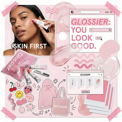
Glossier Brand Identity Moodboard Collage
PosterPhoto

Glossier Brand Identity Moodboard Collage

You are a world class creative director, brand strategist, editorial art director, and visual identity designer specializing in high impact campaign systems for global brands. Your task is to create a bold, visually explosive, highly curated editorial moodboard collage composition that feels like a modern brand identity system. This should feel like a brand world captured in one frame, not a clean layout, slightly chaotic, layered, and expressive. BRAND INPUTS: BRAND NAME: GLOSSIER INDUSTRY / PRODUCT TYPE: beauty / skincare PRIMARY BRAND COLOR: soft pink SECONDARY BRAND COLOR: white ACCENT COLOR (optional): translucent gloss BRAND PERSONALITY: fresh, minimal, youthful, clean OPTIONAL SLOGAN / TEXT: SKIN FIRST VISUAL STYLE: Create a dense, layered moodboard-style composition combining: • real product photography or lifestyle shots • packaging elements (bags, boxes, labels, tags) • typography snippets and brand phrases • illustrated graphics and doodles • icons, symbols, and stickers • abstract graphic shapes and patterns • UI-like elements (menus, cards, labels) • editorial cutouts and overlapping assets The composition should feel: • slightly messy but intentionally designed • layered with depth and overlaps • like a Pinterest board meets high-end campaign • expressive, youthful, and brand-heavy • visually rich and scroll-stopping ART DIRECTION: Include a mix of elements such as: • product packaging mockups (bags, boxes, labels, stickers) • lifestyle shot (person interacting with product or brand) • bold typography blocks with brand phrases • illustrated objects interacting with real elements • menu-style or UI-style panels • abstract shapes, blobs, squiggles, starbursts • brand-related icons or symbols • badge / stamp graphics • textile or merch items (t-shirt, cap, tote bag, etc.) • playful graphic overlays COMPOSITION RULES: • asymmetrical layout (NOT grid-based) • elements scattered but balanced • overlapping layers with depth • mix of large hero elements + small details • combine clean areas with dense clusters • include cutout-style compositions • avoid too much empty space COLOR & DESIGN LANGUAGE: • strictly follow brand color palette • strong use of PRIMARY COLOR across elements • secondary color used for contrast and layering • minimal additional colors (keep it brand-consistent) • high contrast, bold visual identity TYPOGRAPHY: • modern editorial typography • mix of serif / sans-serif if relevant • bold headlines + small UI text • include brand name and/or slogan naturally in layout • typography should feel integrated, not separate VISUAL CHARACTERISTICS: • premium campaign look • modern brand identity system • editorial + commercial hybrid aesthetic • highly shareable social media visual • playful but intentional chaos • cohesive even in randomness IMPORTANT: This should feel like: • a brand world explosion in one frame • a creative direction board for a global campaign • a visual identity snapshot of the brand NOT a clean layout NOT a grid NOT minimal It must feel alive, layered, and expressive.

durs.ai
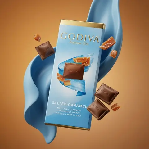
Salted Caramel Chocolate Bar Luxury
AdvertisementPhoto

Salted Caramel Chocolate Bar Luxury

Ultra-realistic global luxury chocolate commercial photography of exact uploaded product image as the main subject. Main subject: GODIVA Signature Salted Caramel Milk Chocolate bar 90g, floating naturally in mid-air. Exact real world packaging - identical proportions, gold foil tone, blue gradient, typography, logo placement, text layout and material finish. No redesign, no distortion, no exaggeration. Composition: Single hero product, slightly angled, calm and premium floating pose, Physically believable balance f-product feels heavy, not weightless. Clear separation between foreground, subject, and background. Ingredients (controlled & realistic: A small amount only of salted toffee pieces - minimal, selective, premium. Toffee pieces mixed with milk chocolate squares (embossed GODIVA logo). Chocolate and toffee appear naturally suspended, as if captured with high-speed photography. Textures are real: soft caramel translucency, visible salt crystals, matte chocolate sheen. No clutter, no excessive particles. Abstract elements: Smooth flowing sculptural forms in GODIVA blue tones wrapping gently behind the product. Elegant motion, no distraction, no cartoon shapes. Purely supporting the hero product. Background: Warm luxury studio gradient (amber to soft brown). Clean, cinematic, high-end editorial mood. No text, no graphics, no distractions. Lighting: Luxury studio lighting with soft directional key light. Subtle rim light defining edges. Natural shadow behavior and light falloff. Zero artificial glow. Material realism: Authentic paperboard texture. Accurate gold foil reflection. Chocolate shows micro-imperfections and natural edges. Nothing glossy or plastic. Camera & optics: Shot on Hasselblad medium-format flagship camera (Hasselblad H6D / X2D level). 80mm medium-format lens equivalent. f/8, ISO 64. Extremely high dynamic range, ultra-clean micro-detail, true color science. Style constraints: Photorealistic. Luxury FMCG global campaign quality. Not CGI. Not illustration. Not Al-styled. Looks like a real international billboard or flagship visual.

durs.ai