durs.ai
Prompt library

Prompts that work

Ready-made prompts for ads, logos, posters, 3D and more. Use one in a tap — or share your own.

+ Add a prompt
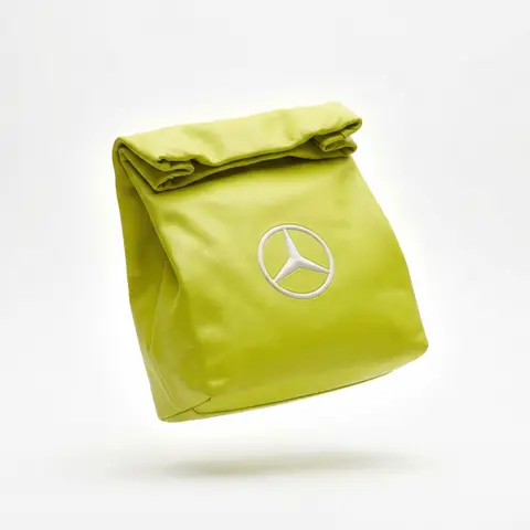
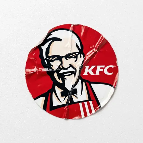
Brand everyday object style
ProductPhoto

Brand everyday object style

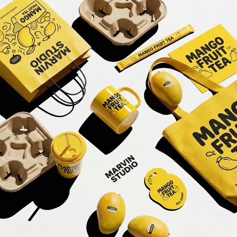
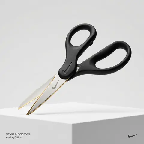
BRAND NAME or LOGO IMAGE. Act as a creative director curating a wide-ranging, eclectic collection of recontextualized everyday objects. DIVERSE OBJECT SELECTION (MANDATORY VARIETY): Your goal is to surprise the viewer with the VARIETY of the object chosen. Randomly select ONE object from these distinct categories to ensure diversity: Analog Office & Desk: Sport & Leisure: Barware & Kitchen: Utility & Tools: Grooming: Travel: THE CONCEPT: Take the chosen mundane object and elevate it into a luxury artifact using BRAND NAME s signature materials and colors. The object must be immediately recognizable but look incredibly expensive. MATERIALS & FINISH: Use materials that contrast with the objects usual cheap nature. Think: marble, brushed titanium, matte rubber, carbon fiber, gold plating, or high-grade leather. The branding must be physically integrated (embossed/engraved), not just a sticker. PRESENTATION (NO BOXES): The object should stand alone on the pedestal or table, fully exposed. If it has parts (like a ping pong set), arrange them neatly (knolling). Avoid closed boxes that hide the shape. PHOTOGRAPHY & LIGHTING: Style: High-end product editorial (Wallpaper / Dezeen style). Lighting: Soft, studio high-key lighting. No harsh shadows. Background: Clean, seamless light grey or white cyclorama. GRAPHIC OVERLAYS (UI): Bottom Left: A small, minimalist 2-line text block describing the object. Font: Manrope Regular. Color: #414141. Bottom Right: A small, discreet, monochrome logomark of BRAND NAME . Color: #414141. Do NOT visualize “Font name” and “Color code”.

durs.ai
Y2K Monochrome Concept Sketch
2DPhoto

Y2K Monochrome Concept Sketch

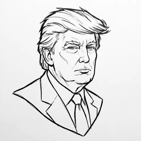
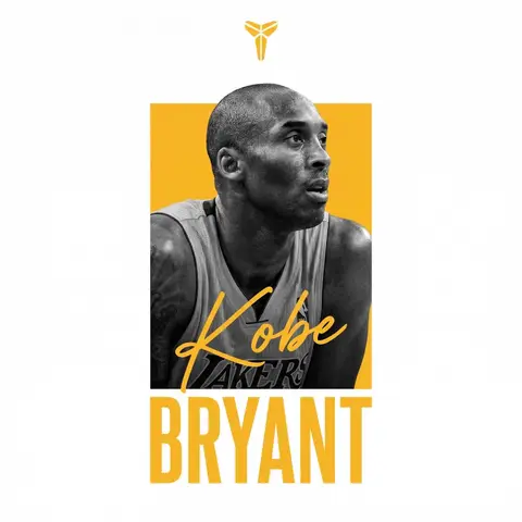
PERSON / CHARACTER NAME or IMAGE. Act as a Lead Concept Artist for a cult classic early 2000s animated series (similar to early Gorillaz or Jet Set Radio). COMPOSITION (FLOATING HEAD DRAFT): Generate a Monochrome Line-Art Concept Sketch of the head/bust of CHARACTER / PERSON . Framing: The head floats strictly in the dead center of the canvas. Orientation: Fixed Three-Quarter View (3/4) for dynamic volume. Negative Space: Generous empty white space around the sketch. VISUAL STYLE (ADVANCED VECTOR SKETCH): The image must look like a Production-Ready Concept Drawing — raw, confident, but polished. NO FILLS (Critical): This is strict LINE ART. Do not use any colors, gradients, or grey fills. The inside of the face, hair, and clothes must be white (transparent), defined only by the outlines. Line Quality (The Inkers Hand): Use Solid Black Ink on pure white paper. Variable Line Weight: Use a THICK, bold contour line for the outer silhouette to pop the character from the background. Use THIN, razor-sharp lines for internal details (eyes, nose, hair texture). Flow: The lines should feel fast and expressive (like a brush pen or sophisticated vector stroke), not shaky or messy. It is an Advanced Draft — distinct and professional. CHARACTERIZATION (THE Y2K VIBE): Stylize the character with slightly angular, edgy features typical of early 2000s street art. Expression: Cool, detached, slightly rebellious, or in the zone. BACKGROUND: Pure White (#FFFFFF). A clean sheet of paper.

durs.ai
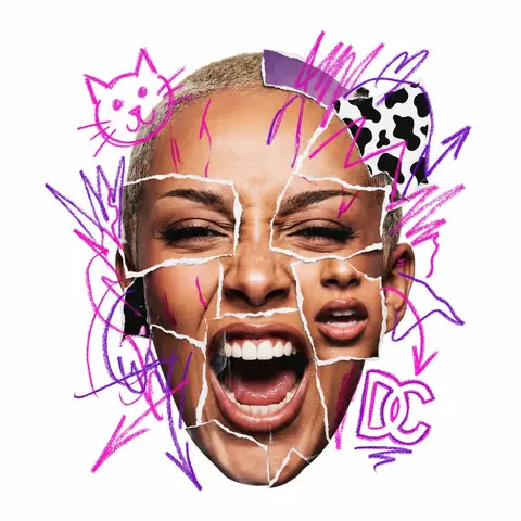
Raw Collage Caricature Portrait
StickerPhoto

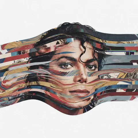
Raw Collage Caricature Portrait

CHARACTER NAME or IMAGE. Act as a radical contemporary mixed-media artist creating a raw, aggressive urban collage portrait. 1. THE SUBJECT (AGGRESSIVE COLLAGE & EMOTION): Generate a hyper-realistic Big-Head Caricature of PERSON / CHARACTER constructed via aggressive photo-montage. Expression (High Energy): The subject must have a visceral, highly charged emotional expression (e.g., roaring laughter, a primal scream, an intensely focused snarl, a manic wide-eyed stare). No passive or neutral faces. The Raw Cut Technique (CRITICAL): The face is NOT a seamless photo. It is a crude assembly of mismatched parts torn from different sources. You must show rough, jagged white paper tear lines and seams where the eyes, mouth, and forehead pieces overlap and are pasted together. The edges must look analog, handmade, and imperfect, like torn magazine pages. 2. THE GRAFFITI EXPLOSION (SMART CONTENT & DYNAMIC PLACEMENT): Over the collage, apply wild, hand-drawn Neon Marker Scribbles. Color & Content Logic (Automatic): Identify the signature color AND 2-3 iconic symbols/logos associated with PERSON / CHARACTER . Draw these specific symbols crudely in the neon color. PLACEMENT (BREAKING BOUNDARIES): The scribble elements must NOT be contained within the face. They must explode dynamically outward, breaking the silhouette of the head and extending wildly into the surrounding white negative space. 3. PHOTOGRAPHY, LIGHTING & TEXTURE: Style: Gritty Street Art meets High-End Photography. Texture: Emphasize the tactile mix of materials: the glossy texture of the photo paper, the fibrous texture of the torn white edges, and the waxy texture of the neon marker. Lighting: Harsh, high-contrast studio lighting that casts hard shadows, emphasizing the layered paper cuts. 4. COMPOSITION: Framing: The photographic head is centered, but the composition feels chaotic due to the exploding scribbles. Background: Pure White (#FFFFFF). Clean, flat, zero texture, providing maximum contrast for the messy collage.

durs.ai
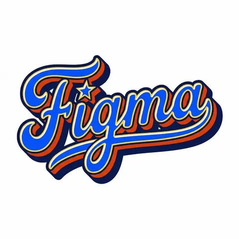
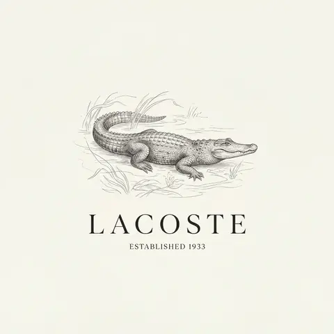
Retro Americana Fat Script Lettering
LogoPhoto

Retro Americana Fat Script Lettering

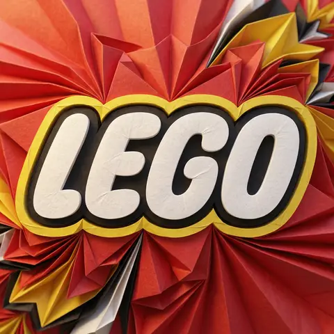
A bold, vibrant, retro-American vector lettering design displaying the name BRAND NAME or TEXT. TYPOGRAPHY STYLE (FAT SCRIPT): The text is rendered in a thick, chunky, hand-lettered baseball script or bubble style, reminiscent of 1950s-1970s American sports logos and automotive decals. Form: The letters are heavy, rounded, and tightly connected (ligatures). Perspective: The text line should be slightly slanted upwards or arched to create dynamic energy. Effects: Apply a thick, bold outline around the text. Crucially, add a deep, solid block shadow (extrusion) behind the letters to create a heavy 3D pop-out effect, characteristic of vintage sticker art. COLOR PALETTE (BRAND VINTAGE): Use a bright, saturated, and flat color palette inspired by BRAND NAMEs identity but filtered through a retro pop-art lens. Fill: Solid, punchy colors (no gradients). Contrast: High contrast between the letter fill, the outline (usually white or cream), and the block shadow (usually a darker shade or contrasting color). DECORATIVE ELEMENTS: Keep it clean and vector-like. You may include subtle, classic Americana design elements integrated into the text flow, such as a swoosh underline, a simple star, or a very simplified icon relevant to the brand (e.g., a lightning bolt for energy, a leaf for eco). Do NOT over-detail; keep it looking like a printed logo. BACKGROUND: Isolated on a clean, pure white background. No paper textures, no noise, no dirt.

durs.ai
Premium Industrial Design Object Concept
AdvertisementPhoto

Premium Industrial Design Object Concept

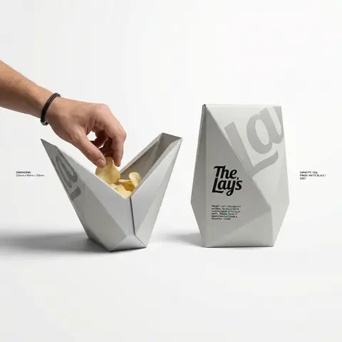
BRAND NAME: The core identity. CATEGORY: Clothing / Food / Automotive / Lifestyle. Goal: Generate a premium industrial design concept on a PURE WHITE background. 1. INNOVATION & OBJECT - Select one mundane functional object from CATEGORY. - Redesign it using unconventional, architectural, or origami-inspired geometry. - The object must look like a high-end designer invention, not a standard product. 2. UNIFIED COMPOSITION - Environment: A seamless, pure white studio background with a flat white floor. - Interaction: A human hand (natural texture) is shown using the object in the foreground, demonstrating its unique ergonomics. - Static Display: Right next to the hand, the same object is placed in a static, perfect pose to show its full silhouette and branding. - Shadows: Soft, realistic grey drop shadows on the white floor to provide depth and ground the objects. 3. BRANDING & TEXT - Identity: Apply the BRAND NAME logo in a high-contrast dark color (Black or Navy) directly onto the objects surface. - Technical Detail: Add small, elegant blocks of justified specification text in the white negative space around the objects for an editorial look. - Pattern: Use a subtle, oversized abstract fragment of the brands logo as a texture on the objects material. 4. MATERIALS & FINISH - High-quality matte materials only: heavy-duty recycled paper, sandblasted metal, or soft-touch polymer. - Sharp architectural lines and clean, premium craftsmanship.

durs.ai
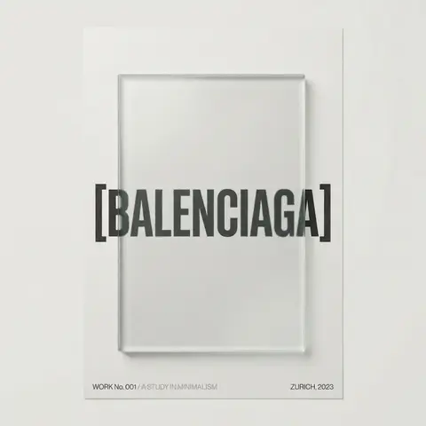
Luxury Brand Product Key Visual
PosterPhoto

Luxury Brand Product Key Visual

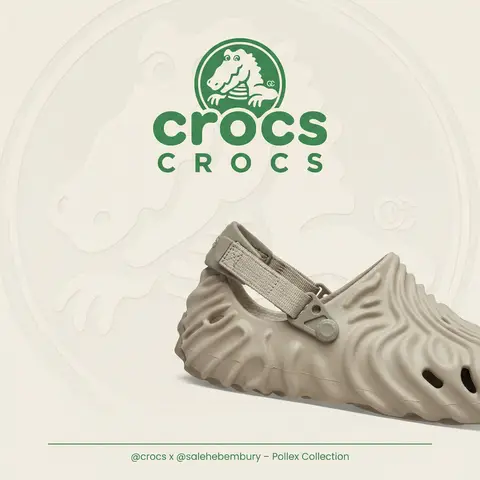
BRAND NAME + PRODUCT Act as a Senior Luxury Fashion Art Director and Studio Photographer specializing in high-end product key visuals for flagship campaigns, e-commerce editorials, and mobile-first brand content. PHASE 1: FORMAT & CANVAS Vertical format, 9:16 aspect ratio. Canvas background: a single flat field of warm off-white — not pure white, not grey. Target tone: soft ivory cream (#F4EFE6 equivalent), uniform and completely shadowless across the entire background plane. Autonomously determine BRAND NAMEs signature background tone — if the brand has a recognized house color for its packaging, tissue paper, or lookbook backgrounds, shift the canvas toward that specific off-white or neutral. The result must feel like an official brand document, not a generic studio. PHASE 2: BACKGROUND PATTERN (WATERMARK LAYER) Autonomously identify BRAND NAMEs iconic surface pattern, monogram, or archival motif — examples: a house monogram, toile print, geometric logo repeat, heritage emblem, or signature textile pattern. Render this pattern across the entire background canvas as a ghost watermark: same tone as the background but with a slight value shift (approximately 8–12% darker or lighter than the base). The pattern must be large in scale — individual motifs spanning 15–25% of canvas width. Opacity: 10–18% maximum. No hard edges. The pattern should feel embossed or tone-on-tone woven, not printed. It must recede behind all other elements. PHASE 3: LOGO PLACEMENT Autonomously reproduce BRAND NAMEs official logo with complete fidelity — correct letterforms, proportions, secondary marks (emblems, crowns, stars, monogram icons). Place the logo centered horizontally in the upper third of the frame (top 30% of canvas). Scale: the logo should span approximately 40–50% of canvas width — prominent but not overwhelming. Logo rendering: flat 2D, no extrusion, no chrome. Color: autonomously apply BRAND NAMEs official logo colorway — the exact brand-standard color(s) used on official packaging and website. If the brand uses a two-tone logo (icon + wordmark in different colors), preserve that hierarchy precisely. Directly below the main logo mark, place the full BRAND NAME wordmark in spaced capital letters — clean, geometric sans-serif, tracking: +200 to +300, same brand color, optical size approximately 60% of logo height. No decorative elements between logo and wordmark. PHASE 4: PRODUCT PLACEMENT Render PRODUCT as a photorealistic studio object with maximum material fidelity: — Leather: visible grain, pore structure, stitching thread texture, realistic edge paint. — Hardware: gold or silver metal with micro-reflections, not flat. — Canvas/fabric: woven fiber detail, not smooth CG. — All brand-specific surface patterns on the product must be accurate and legible. Placement: the product enters the frame from the bottom-right corner at a natural 25–35 degree angle, as if casually placed or mid-motion. The product is cropped — only 60–75% of the object is visible within the frame. The crop should feel intentional and editorial, not accidental. The product occupies the lower 55–65% of the canvas. The product must feel physically present in the space — not floating. Cast an extremely soft, barely visible contact shadow (opacity 8–12%) on the canvas beneath the nearest edge. No hard drop shadows. PHASE 5: LIGHTING Lighting: simulated large north-facing studio window light. Soft, directional, shadowless on the background. Color temperature: 5500–6000K (neutral daylight, slightly cool). Key light: large softbox equivalent from upper-left, filling the entire product surface evenly with minimal contrast ratio (1.2:1 to 1.5:1 max). Fill light: large bounce from right side, eliminating all harsh shadows. No rim light. No dramatic contrast. The lighting philosophy is: the product sells itself — light only reveals, never performs. Global Illumination enabled for subtle inter-reflections between product surfaces. No specular hotspots on leather — only on metal hardware. PHASE 6: TYPOGRAPHY & FINISHING Bottom of frame: a thin horizontal rule line (1px, brand color, 80% canvas width, centered). Below the rule: a single line of micro-copy — a social handle, collection name, or campaign label — in the same clean sans-serif, lowercase or small-caps, minimal tracking. Autonomously generate a contextually appropriate label for BRAND NAME. TECH SPECS Render engine: photorealistic CGI, Keyshot / Octane product visualization aesthetic. Resolution: 9:16, ultra-high detail. Depth of Field: f/16 equivalent — everything in sharp focus. Zero bokeh. Tack-sharp edges on all product details.Tone mapping: clean, true-to-life. No filmic crush. No vignette. No grain. Color grade: neutral, faithful to real product color. Slight warmth in the ivory background only. No AI-plastic normals on leather or fabric. Microscopic surface imperfection maps required. No reflections on background. No environmental reflections — studio only. Mood reference: Louis Vuitton / Bottega Veneta / Celine official e-commerce and campaign photography standard. Clean enough to be used as a press image.
durs.ai