durs.ai
Prompt library

Prompts that work

Ready-made prompts for ads, logos, posters, 3D and more. Use one in a tap — or share your own.

+ Add a prompt
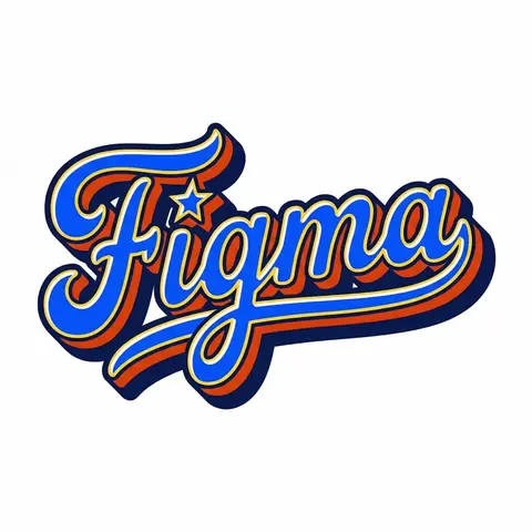
Retro Americana Fat Script Lettering
LogoPhoto

Retro Americana Fat Script Lettering

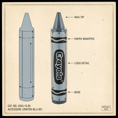
A bold, vibrant, retro-American vector lettering design displaying the name BRAND NAME or TEXT. TYPOGRAPHY STYLE (FAT SCRIPT): The text is rendered in a thick, chunky, hand-lettered baseball script or bubble style, reminiscent of 1950s-1970s American sports logos and automotive decals. Form: The letters are heavy, rounded, and tightly connected (ligatures). Perspective: The text line should be slightly slanted upwards or arched to create dynamic energy. Effects: Apply a thick, bold outline around the text. Crucially, add a deep, solid block shadow (extrusion) behind the letters to create a heavy 3D pop-out effect, characteristic of vintage sticker art. COLOR PALETTE (BRAND VINTAGE): Use a bright, saturated, and flat color palette inspired by BRAND NAMEs identity but filtered through a retro pop-art lens. Fill: Solid, punchy colors (no gradients). Contrast: High contrast between the letter fill, the outline (usually white or cream), and the block shadow (usually a darker shade or contrasting color). DECORATIVE ELEMENTS: Keep it clean and vector-like. You may include subtle, classic Americana design elements integrated into the text flow, such as a swoosh underline, a simple star, or a very simplified icon relevant to the brand (e.g., a lightning bolt for energy, a leaf for eco). Do NOT over-detail; keep it looking like a printed logo. BACKGROUND: Isolated on a clean, pure white background. No paper textures, no noise, no dirt.

durs.ai
Psychological Horror Torn Paper Collage Editorial Movie Poster
PosterPhoto

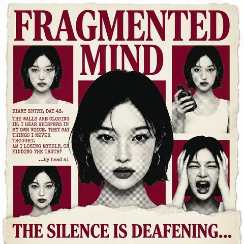
Psychological Horror Torn Paper Collage Editorial Movie Poster

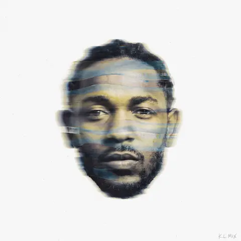
Psychological Horror Collage Poster — Torn Paper Editorial Style Act as a Senior Graphic Designer specializing in psychological horror editorial design. Your aesthetic universe: torn newspaper collage, halftone print culture, 90s underground zine horror, American Psycho-era corporate dread. INPUT VARIABLES — resolve before executing: MOVIE TITLE LINE 1 — first word(s) of title MOVIE TITLE LINE 2 — second word(s) of title MAIN PORTRAIT — large central face photo, serious/intense expression SIDE PHOTO 1 — smaller portrait, neutral expression SIDE PHOTO 2 — smaller portrait, holding an object SIDE PHOTO 3 — smaller portrait, extreme emotional expression (screaming/shocked) GROUP PHOTO — wide shot of multiple people, bottom right DIARY TEXT — a short first-person psychological monologue, 4–6 lines TAGLINE — bold bottom line (e.g. THE SILENCE IS DEAFENING...) ACCENT COLOR — dominant color used for title, background blocks, and tinted photos (e.g. deep crimson red) ATTRIBUTION — small credit line (e.g. ...by head ai) PHASE 1 — CANVAS Portrait format (3:4). Background: aged off-white/cream paper texture with rough torn edges on all four sides — looks like a real sheet ripped from something larger. No clean borders. The paper must feel physical and degraded. PHASE 2 — TITLE BLOCK MOVIE TITLE LINE 1 and MOVIE TITLE LINE 2 stacked at the top — massive bold serif type, deep ACCENT COLOR fill, no outline, no extrusion. The type is heavy, authoritative, slightly compressed. It dominates the top third of the poster completely. PHASE 3 — CENTRAL PORTRAIT MAIN PORTRAIT placed center, large, from chest up. Apply halftone dot grain — black and white, high contrast, visible dot pattern like a newspaper print. No color tinting on the main portrait — it stays stark monochrome. The figure should feel cold and dissociated. PHASE 4 — SIDE PHOTO GRID Four smaller photos arranged around the central portrait — two left column, two right column. Each photo is set inside a flat ACCENT COLOR rectangle background. Apply the same halftone treatment as the main portrait. The photos are slightly irregular in size and alignment — like they were cut and placed by hand. One photo (SIDE PHOTO 2) should show the subject holding a prop or object. One photo (SIDE PHOTO 3) should show an extreme expression. PHASE 5 — DIARY TEXT BLOCK Left side of poster, between the side photos. DIARY TEXT in bold uppercase sans-serif, tight leading, left-aligned. Small ATTRIBUTION line in italic below it. This text block feels like it was typed on a typewriter and pasted in. PHASE 6 — BOTTOM ELEMENTS TAGLINE across the very bottom — bold wide uppercase serif, deep ACCENT COLOR, large, confident. Below the torn paper edge, as if printed on the backing. Feels like a newspaper headline. PHASE 7 — TORN PAPER DETAILS The entire poster sits as a torn paper sheet. The edges must be rough and organic — not a clean rectangle. Ragged tears especially at the top and bottom. Subtle paper grain across the whole surface. The torn paper effect is the most important texture element — without it the poster loses its entire identity. TECH SPECS 3-color palette maximum: ACCENT COLOR, near-black, aged cream/off-white. All photos treated as halftone — no clean photography. No gradients. No drop shadows. No digital glow. The poster must feel like it was physically printed, cut, and assembled — not designed on a screen. Rough, editorial, tactile. Mood: a forensic investigator pinned this together on a corkboard at 3am and it accidentally became the most disturbing movie poster ever made.
durs.ai
Collage Infographic Blue Orange Paper Cut Editorial Poster
PosterPhoto

Collage Infographic Blue Orange Paper Cut Editorial Poster

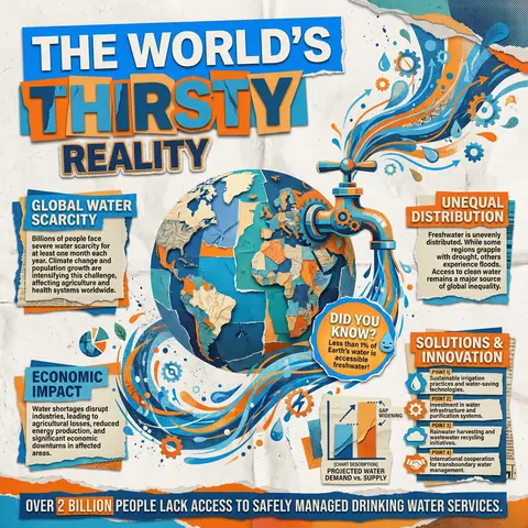
A modern collage-style infographic poster with a textured paper background (slightly crumpled, off-white). The design uses bold cut-out shapes, layered elements, and a mix of blue and orange color blocks for strong contrast. At the top, include large bold headline text in a cutout style: MAIN HEADLINE PART 1 (on colored rectangle) MAIN HEADLINE PART 2 (overlapping layered style) MAIN HEADLINE PART 3 (secondary emphasis) In the center, place a large surreal object: MAIN VISUAL OBJECT (e.g., water tap, machine, globe, etc.) The object should be oversized, slightly collage-style, with paper cut edges and shadow Add dynamic element: FLOW EFFECT (e.g., water flowing, energy lines, particles) Surrounding the main visual, include multiple information boxes with headings: 🔹 Left section: SECTION TITLE 1 PARAGRAPH 1 🔹 Right section: SECTION TITLE 2 PARAGRAPH 2 🔹 Bottom left: SECTION TITLE 3 PARAGRAPH 3 🔹 Bottom right: SECTION TITLE 4 Bullet points: POINT 1 POINT 2 POINT 3 POINT 4 Add a small chart/graph element: CHART DESCRIPTION (e.g., bar chart, stats comparison) Add a highlighted label or sticker: HIGHLIGHT TEXT (e.g., “Fun Facts!”) At the bottom, include a bold fact strip: BOTTOM FACT TEXT Add extra collage elements like: torn paper edges small illustrations/icons (e.g., DECORATIVE ELEMENTS) overlapping shapes and textures Style: editorial infographic, collage design, bold typography, cut-and-paste aesthetic, paper texture, modern activism poster, high contrast (blue + orange), grainy print effect, 4K quality.

durs.ai
Logo Torn Poster Urban Wall Layered Paper Street Art
LogoPhoto

Logo Torn Poster Urban Wall Layered Paper Street Art

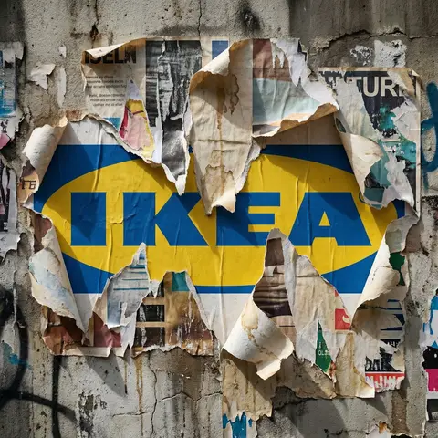
Transform the uploaded logo into a realistic urban wall scene where the logo silhouette is revealed through layers of torn posters. The logo must keep its exact shape and proportions, appearing as if multiple posters have been ripped away over time, exposing the shape naturally within the layered paper textures. Material details: Multiple overlapping poster layers with different colors, prints, and paper types. Ripped edges with fibrous texture, curls, and torn fragments. Aged paper with fading, stains, glue residue, and slight peeling. Some areas showing older layers beneath, creating depth. Physics behavior: Paper tearing should look natural — irregular edges, varying thickness, partial detachment. Edges curling outward due to humidity and time. Glue holding some sections while others peel away. Layer separation revealing deeper textures gradually. Surface interaction: Rough concrete or plaster wall beneath the posters. Glue marks and residue where posters were attached. Cracks, dirt, and weathering visible on exposed wall areas. Environment: Urban street setting — alley wall or city corner. Hints of surrounding posters, graffiti, or wear. No overly clean or staged look. Lighting: Natural daylight or soft urban lighting. Shadows inside torn layers creating depth. Subtle highlights on curled paper edges. Atmosphere: Raw. Layered. Time-worn. Authentic street texture. Camera & composition: Straight-on or slightly angled close-up view. Logo clearly visible through torn layers. Depth emphasized through overlapping paper textures. Format: Aspect ratio: STRICT 4:5 vertical. No text overlays. Style: Hyper-real urban surface photography. Physically accurate material aging and layering.

durs.ai