durs.ai
Prompt library

Prompts that work

Ready-made prompts for ads, logos, posters, 3D and more. Use one in a tap — or share your own.

+ Add a prompt
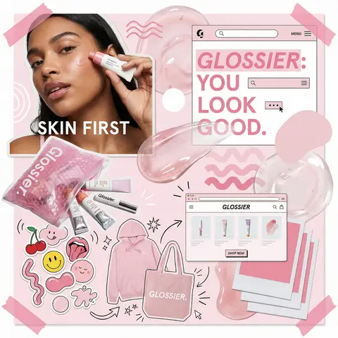
Glossier Brand Identity Moodboard Collage
PosterPhoto

Glossier Brand Identity Moodboard Collage

You are a world class creative director, brand strategist, editorial art director, and visual identity designer specializing in high impact campaign systems for global brands. Your task is to create a bold, visually explosive, highly curated editorial moodboard collage composition that feels like a modern brand identity system. This should feel like a brand world captured in one frame, not a clean layout, slightly chaotic, layered, and expressive. BRAND INPUTS: BRAND NAME: GLOSSIER INDUSTRY / PRODUCT TYPE: beauty / skincare PRIMARY BRAND COLOR: soft pink SECONDARY BRAND COLOR: white ACCENT COLOR (optional): translucent gloss BRAND PERSONALITY: fresh, minimal, youthful, clean OPTIONAL SLOGAN / TEXT: SKIN FIRST VISUAL STYLE: Create a dense, layered moodboard-style composition combining: • real product photography or lifestyle shots • packaging elements (bags, boxes, labels, tags) • typography snippets and brand phrases • illustrated graphics and doodles • icons, symbols, and stickers • abstract graphic shapes and patterns • UI-like elements (menus, cards, labels) • editorial cutouts and overlapping assets The composition should feel: • slightly messy but intentionally designed • layered with depth and overlaps • like a Pinterest board meets high-end campaign • expressive, youthful, and brand-heavy • visually rich and scroll-stopping ART DIRECTION: Include a mix of elements such as: • product packaging mockups (bags, boxes, labels, stickers) • lifestyle shot (person interacting with product or brand) • bold typography blocks with brand phrases • illustrated objects interacting with real elements • menu-style or UI-style panels • abstract shapes, blobs, squiggles, starbursts • brand-related icons or symbols • badge / stamp graphics • textile or merch items (t-shirt, cap, tote bag, etc.) • playful graphic overlays COMPOSITION RULES: • asymmetrical layout (NOT grid-based) • elements scattered but balanced • overlapping layers with depth • mix of large hero elements + small details • combine clean areas with dense clusters • include cutout-style compositions • avoid too much empty space COLOR & DESIGN LANGUAGE: • strictly follow brand color palette • strong use of PRIMARY COLOR across elements • secondary color used for contrast and layering • minimal additional colors (keep it brand-consistent) • high contrast, bold visual identity TYPOGRAPHY: • modern editorial typography • mix of serif / sans-serif if relevant • bold headlines + small UI text • include brand name and/or slogan naturally in layout • typography should feel integrated, not separate VISUAL CHARACTERISTICS: • premium campaign look • modern brand identity system • editorial + commercial hybrid aesthetic • highly shareable social media visual • playful but intentional chaos • cohesive even in randomness IMPORTANT: This should feel like: • a brand world explosion in one frame • a creative direction board for a global campaign • a visual identity snapshot of the brand NOT a clean layout NOT a grid NOT minimal It must feel alive, layered, and expressive.
durs.ai
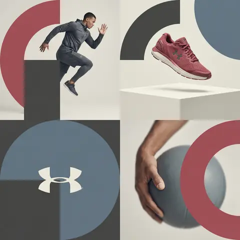
Editorial Grid Geometric Brand Campaign Visual
BrandingPhoto

Editorial Grid Geometric Brand Campaign Visual

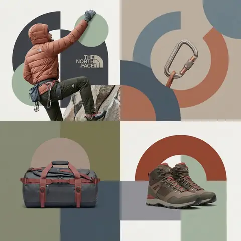
BRAND NAME. Act as a World-Class Editorial Designer. PHASE 1: DYNAMIC SUBJECT LOGIC. - Subject Selection: Autonomously analyze BRAND NAME. - Layering (The Sandwich Effect): Interweave the subject with background shapes. Some parts of the car/person must be hidden behind geometric blocks, while other parts (wheels, limbs, props) must overlap them to create 3D depth. PHASE 2: GRID & GEOMETRY. - Layout: A clean 2x2 grid composition. - Overlays: Superimpose large, bold geometric arcs and circles over the grid. - Visual Balance: Place one iconic product prop (e.g., a floating key fob for cars or a ball for sports) in a separate quadrant to balance the subject. PHASE 3: SOPHISTICATED MUTED PALETTE. - Color Direction: DO NOT use aggressive neon or oversaturated colors. - Palette: Identify the core colors of BRAND NAME and shift them to a Sophisticated Muted spectrum. - Tones: Use desaturated, earthy, or dusty versions of the brand colors (e.g., instead of hot pink, use dusty rose; instead of bright mint, use sage green; instead of royal blue, use slate blue). - Finish: Matte, flat color blocks with zero gradients. PHASE 4: PHOTOGRAPHY & LIGHTING. - Subject Style: High-end commercial studio photography. - Lighting: Soft, diffused studio lighting with gentle highlights. No harsh shadows. - Integration: The subject must feel physically embedded into the graphic grid. PHASE 5: MINIMALIST BRANDING. - Logo: Place a clean, single-color BRAND NAME logo in the center of one background block. No taglines, just the iconic symbol.

durs.ai
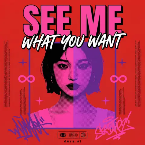
Y2K Japanese Bootleg Movie Poster Harajuku Streetwear Art
PosterPhoto

Y2K Japanese Bootleg Movie Poster Harajuku Streetwear Art

Act as a Senior Vector Graphic Designer specializing in Y2K Japanese streetwear poster art. Your aesthetic universe: Tokyo bootleg culture, early 2000s remix zines, retro-futuristic sticker posters, Harajuku streetwear graphics. INPUT VARIABLES — resolve before executing: MOVIE TITLE — the main title text, split across two lines if needed SUBTITLE / TAGLINE — secondary brushstroke-style script line REFERENCE PHOTO — a portrait/face image to be treated with split duotone halftone effect PRIMARY COLOR — dominant background color (e.g. signal red) ACCENT COLOR 1 — warm saturated pop color for title text (e.g. electric yellow) ACCENT COLOR 2 — cool secondary duotone tone (e.g. deep violet/purple) CREDITS LINE — small uppercase cast/crew text at the bottom PHASE 1 — CANVAS Portrait format (3:4 ratio). Background: flat solid PRIMARY COLOR. No texture, no gradient, completely clean. PHASE 2 — CENTRAL IMAGE Place REFERENCE PHOTO as a large centered portrait cropped from chest up, framed with a thin flat border. Apply a split duotone halftone effect: left half of face tinted in ACCENT COLOR 1 right half in ACCENT COLOR 2. The halftone dot pattern must be visible and graphic — flat, no blur, no photographic rendering. The image feels like a screen-printed bootleg. PHASE 3 — LETTERING MOVIE TITLE LINE 1 — massive bold condensed display type, full poster width, flat ACCENT COLOR 1 fill, thick dark extrusion offset down-right. Dominates the top of the poster. MOVIE TITLE LINE 2 — large brushstroke handwritten script style, flat white, bold dark outline, overlapping the portrait frame creating z-depth — sits both in front of the photo and behind the top title. PHASE 4 — Y2K SIGNATURE ELEMENTS Infinity symbols (∞) flanking the portrait frame, flat ACCENT COLOR 1 4-point crosshair stars — thin elegant accent marks scattered at key intersections Loose scribble strokes — energetic hand-drawn loops in ACCENT COLOR 2 and pink/magenta at bottom corners, like marker graffiti Side column micro-text — two narrow columns of lorem-style body text in tiny white type flanking the portrait, left and right — creates editorial zine structure Bottom logo bar — 2–3 fictional brand stamps in bold caps + a globe icon ACCENT COLOR 1 CREDITS LINE in small tight uppercase tracking across the very bottom TECH SPECS Flat vector only. Zero gradients, zero drop shadows, zero blur. Maximum 5 colors: PRIMARY ACCENT 1 ACCENT 2 white, near-black. All outlines thick and clean. The poster must feel like a collectible bootleg silkscreen print — part movie poster, part Harajuku sticker sheet, part underground zine cover. Mood: a Tokyo graphic designer obsessed with this film stayed up all night and made the most unhinged fan poster ever printed.

durs.ai
Logo Chewing Gum Sidewalk Pavement Urban Macro Street Art
LogoPhoto

Logo Chewing Gum Sidewalk Pavement Urban Macro Street Art

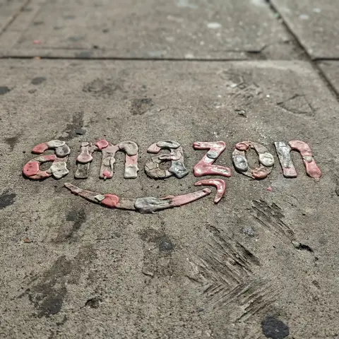
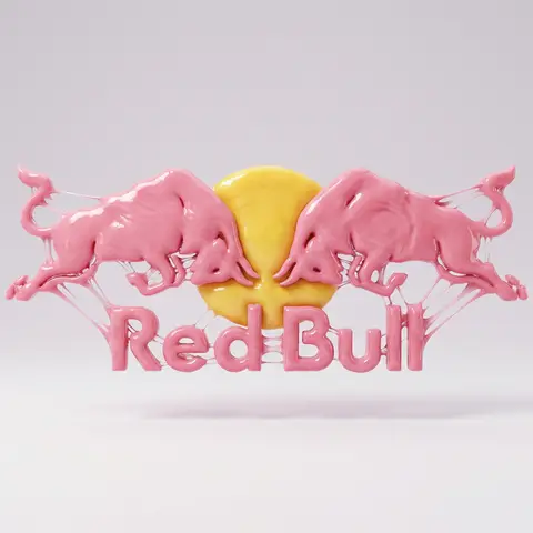
Transform the uploaded logo into a realistic urban sidewalk scene where the logo silhouette is formed from flattened chewing gum stains accumulated over time. The logo must keep its exact shape and proportions, appearing as if multiple pieces of gum were stepped on and pressed into the pavement, gradually forming the recognizable silhouette. Material details: Flattened gum blobs with varied colors (pink, grey, faded white, muted tones). Sticky, semi-matte surfaces with slight gloss in fresher spots. Aged textures — some gum cracked, some stretched, some hardened. Layering where older gum sits beneath newer pieces. Physics behavior: Gum spreads outward under pressure, creating irregular circular and organic shapes. Edges appear uneven, slightly torn or thinned. Some gum shows stretch marks or directional smearing from shoes. Dirt and debris embedded into older gum layers. Surface interaction: Rough concrete pavement with visible grain, cracks, and small stones. Gum pressed into surface pores and micro grooves. Surrounding dirt, dust, and subtle stains blending into the scene. Environment: Urban sidewalk setting with natural wear and imperfections. Hints of city life — faint shoe marks, tire traces, or worn footpaths. Minimal background, focus on ground texture. Lighting: Natural daylight with soft shadows. Highlights catching slightly glossy gum surfaces. Subtle contrast between gum and pavement. Atmosphere: Raw. Urban. Unpolished realism. Everyday street detail. Camera & composition: Top-down or slightly angled close-up view. Logo clearly readable through clustered gum shapes. Natural randomness preserved. Format: Aspect ratio: STRICT 4:5 vertical. No text overlays. Style: Hyper-real macro urban photography. Physically accurate material wear and accumulation.

durs.ai