durs.ai
Prompt library

Prompts that work

Ready-made prompts for ads, logos, posters, 3D and more. Use one in a tap — or share your own.

+ Add a prompt
Polished Steel Peony Product Photography
LogoPhoto

Polished Steel Peony Product Photography

BRAND NAME Act as a Senior Editorial Art Director and Campaign Photographer specializing in high-impact brand posters that combine action photography with bold graphic design. Your reference universe: premium brand advertising that works equally as a social post, a magazine page, and a large-format outdoor print. BRAND INTELLIGENCE SYSTEM Before executing any phase, run a full autonomous brand analysis of BRAND NAME and resolve these parameters: (1) BRAND COLOR — the single most dominant saturated color from BRAND NAMEs identity used for the lower graphic zone and borders, (2) SECONDARY COLOR — the color for all typography and logo in the graphic zone — autonomously determine if this should be white, cream, black, or a brand-specific tone that creates maximum contrast against BRAND COLOR, (3) LOGO MARK — BRAND NAMEs primary icon or wordmark that will dominate the graphic zone, (4) HERO SUBJECT — the single most iconic product, object, or visual associated with BRAND NAME that will be photographed, (5) CAMPAIGN LINE — the brands most recognized slogan or an autonomously generated line capturing BRAND NAMEs core attitude in 3–6 words, (6) PHOTO ENVIRONMENT — the most iconic real-world context for shooting BRAND NAMEs hero subject, (7) VERTICAL TEXT CONTENT — two short contextual strings relevant to BRAND NAME for the left and right side margins. All parameters must be resolved before phase 1 begins. PHASE 1: CANVAS & FORMAT Vertical format, 4:5 ratio. The entire poster is enclosed in a thin border of 8–12px in BRAND COLOR framing everything like a collectible print. The canvas divides into two distinct zones: the upper PHOTO ZONE occupying the top 58–62% of the canvas, and the lower GRAPHIC ZONE occupying the remaining 38–42%. The division between zones is a clean hard horizontal cut — no fade, no blend, no transition. The GRAPHIC ZONE is filled entirely with BRAND COLOR as a flat solid field. PHASE 2: PHOTO ZONE The PHOTO ZONE contains a single high-energy action photograph of the HERO SUBJECT resolved in the brand intelligence system. Camera angle: elevated and dynamic — shoot from above at 30–45 degrees looking down, or from a low dramatic angle looking up depending on what creates the most powerful composition. Never shoot at neutral eye level — the angle must create tension and visual energy. The photograph fills the entire PHOTO ZONE edge to edge with no padding. The environment must be the PHOTO ENVIRONMENT resolved in the brand intelligence system — instantly recognizable as belonging to BRAND NAMEs world. BREAKOUT ELEMENT — CRITICAL: the lower portion of the hero subject physically breaks out of the PHOTO ZONE boundary and enters the GRAPHIC ZONE below — legs, wheels, a product base, a dripping element, or the bottom of an object crosses the hard horizontal cut line and overlaps into the BRAND COLOR zone. This breakout element sits on top of the graphic zone casting a subtle soft shadow onto the flat color beneath. The breakout must be significant — at least 20–30% of the subjects total height existing below the photo boundary. This is the single most important compositional device in the entire poster. PHASE 3: GRAPHIC ZONE The lower zone is a flat solid BRAND COLOR field. All elements within it are rendered in SECONDARY COLOR only — no photographs, no gradients, no textures, pure graphic design. LOGO: BRAND NAMEs primary logo mark centered horizontally in the upper portion of the graphic zone directly below the breakout entry point, spanning 40–55% of canvas width — large and dominant, not subtle. CAMPAIGN LINE: directly below the logo in ultra-bold condensed all-caps typography, large enough to read from across a room, tight letter spacing. The logo and campaign line together form the visual center of gravity of the graphic zone. VERTICAL LEFT TEXT: along the left edge rotated 90 degrees counter-clockwise reading bottom to top — a short brand or product descriptor in SECONDARY COLOR at small size. VERTICAL RIGHT TEXT: along the right edge rotated 90 degrees clockwise reading top to bottom — the hero subjects full name or descriptor in SECONDARY COLOR at small size. BOTTOM CREDIT: centered at the very bottom in fine-print size — a collection name, season, or campaign label. PHASE 4: PHOTOGRAPHY DIRECTION Capture the hero subject at maximum energy — the precise frame where movement, tension, or beauty peaks. For a person: mid-motion at full commitment to the action. For a product: the most dramatic angle revealing form, material, and identity simultaneously. For food: the moment of pour, cut, steam, or impact. For automotive: speed blur, drift, or heroic three-quarter angle. Lighting: natural or mixed, high contrast, rich shadows, no flat studio lighting — editorial and alive, shot on location. Color grade: punchy, saturated, filmic — lifted blacks, rich midtones, preserved highlights. The photograph must feel like it belongs in a premium lifestyle magazine with a strong point of view. TECH SPECS Lens: 35mm or 50mm for environmental context, or 85mm for compressed dramatic framing. Depth of field: subject sharp, background contextual at f/4 to f/8. Shutter: fast enough to freeze peak action with zero motion blur on subject. Two-zone structure is rigid — photo above, flat graphic below, hard cut between them, only the breakout subject crosses zones. Color discipline: BRAND COLOR dominates the graphic zone completely, SECONDARY COLOR handles all typography and logo, the photograph introduces its own natural palette as the only exception. Typography: condensed, bold, authoritative — no decorative fonts. Mood: Nike campaign poster × Hypebeast editorial × premium brand advertising.


durs.ai
FMCG Product Packaging Technical Industrial Design Spec Sheet
PackagePhoto

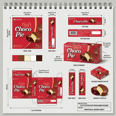
FMCG Product Packaging Technical Industrial Design Spec Sheet

Act as a Senior Industrial/Packaging Designer specializing in technical product presentation sheets. Your aesthetic universe: professional packaging dielines, FMCG product design documentation, industrial design sketchbook layouts, technical manufacturing specs. INPUT VARIABLES — resolve before executing: BRAND NAME — company/manufacturer name (e.g. ORION) PRODUCT NAME — product name in large display type (e.g. Choco·Pie) VARIANT NAME — flavor/variant sub-label (e.g. Chocochip) PRODUCT PHOTO 1 — hero product shot, multiple units styled (for front face) PRODUCT PHOTO 2 — single product unit close-up (for oblique/detail views) PRODUCT PHOTO 3 — product cross-section or ingredient shot (e.g. sliced showing filling) INGREDIENT PHOTO — key flavor ingredient isolated (e.g. orange slice, strawberry) BOX WIDTH — e.g. 260 mm BOX HEIGHT — e.g. 280 mm BOX DEPTH — e.g. 55 mm UNIT COUNT — e.g. x12 NET WEIGHT — e.g. 360g COLOR PALETTE — 4–5 brand colors as swatches (e.g. navy, red, orange, brown, cream) PROJECT TITLE — bottom right label (e.g. ORION CHOCO-PIE PACKAGING DESIGN) PROJECT TYPE — bottom right sub-label (e.g. INDUSTRIAL DESIGN SHEET) MATERIAL NOTE 1 — e.g. Matte Laminated Paperboard MATERIAL NOTE 2 — e.g. Glossy UV Spot Varnish MATERIAL NOTE 3 — e.g. Corrugated Cardboard Insert MATERIAL NOTE 4 — e.g. Mealistic Paperboard MATERIAL NOTE 5 — e.g. Cardstock and Adhesive Seams PHASE 1 — CANVAS Portrait format (3:4). Background: light neutral grey — the color of a real sketchbook or drafting paper. At the very top: a spiral binding strip — rendered as a realistic row of metal coil rings across the full width, like a professional sketchpad. This binding is the first thing visible and establishes the entire presentation as a physical design document. PHASE 2 — BOX FACE DESIGNS Design the complete packaging artwork that will wrap all box faces. Use BRAND NAME, PRODUCT NAME, VARIANT NAME, PRODUCT PHOTO 1, INGREDIENT PHOTO, COLOR PALETTE. The box face should feel like a real retail product — bold brand hierarchy, appetite-appeal food photography, clean structured layout. This artwork is then applied consistently across all views below. PHASE 3 — ORTHOGRAPHIC VIEWS (top section) Arrange four flat technical views in a clean grid with dimension annotations: FRONT VIEW — full front face of box, largest panel, bottom left of grid. Annotated with BOX WIDTH (horizontal arrow above) and BOX HEIGHT (vertical arrow left side) SIDE VIEW 1 — narrow side panel, center of grid. Annotated with BOX DEPTH (horizontal arrow above) TOP VIEW — top face of box, top right of grid. Annotated with width and depth dimensions BOTTOM VIEW — small flat bottom face, right side. Annotated with depth dimension All dimension lines are thin black with arrow endpoints. Labels in small clean sans-serif. View titles in small uppercase below each panel. PHASE 4 — HERO 3D RENDER (center) One large photorealistic 3D perspective render of the assembled box — slightly angled, showing front face and one side face simultaneously. Soft neutral shadow beneath. This is the centerpiece of the sheet — larger than any single orthographic view. Material callout arrows pointing to specific areas with MATERIAL NOTE 1, MATERIAL NOTE 2, MATERIAL NOTE 3, MATERIAL NOTE 4 labels in small handwritten-style or clean serif annotation type. PHASE 5 — ADDITIONAL VIEWS (mid section) Arranged around the hero render: SIDE VIEW 1 — tall narrow vertical panel, left side, with 20mm depth annotation SIDE VIEW 2 — same narrow panel, right side OBLIQUE PERSPECTIVE — small 3/4 angle render of box, bottom right, labeled OBLIQUE PERSPECTIVE PRODUCT CLOSE-UP — PRODUCT PHOTO 2 and PRODUCT PHOTO 3 showing product detail below oblique view PHASE 6 — COLOR PALETTE SWATCHES Two rows of color swatches — one row after the orthographic views section, one row after the dieline section. Each swatch is a filled circle, colors taken from COLOR PALETTE. No labels needed — just the circles in a horizontal row. PHASE 7 — DIELINE / FLAT POSITION Bottom left quadrant: the complete box dieline — all faces unfolded flat showing the full packaging layout. Dashed fold lines, solid cut lines. All faces labeled with the full packaging artwork applied. Dimension annotations: BOX HEIGHT vertical arrow on left side, bottom width measurements. Label below: FLAT POSITION in small uppercase. MATERIAL NOTE 5 callout arrow pointing to seam area. PHASE 8 — PROJECT ID BLOCK Bottom right corner: a clean rectangular project identification box with thin black border. Contains: PROJECT TITLE in bold uppercase PROJECT: label followed by PROJECT TYPE in bold All in dark type on white or light background. Feels like a title block on an engineering drawing. TECH SPECS The entire sheet must read as a professional industrial design document — not a marketing presentation. Dimension lines must be precise and consistent. All views must be correctly proportioned relative to each other. The 3D render is the only element with shadow/lighting — everything else is flat. Font system: one clean sans-serif for all annotations and labels, one bold display font for the product name on packaging. The spiral binding at top is non-negotiable — it defines the entire sketchbook format. The sheet must feel like something a packaging engineer would hand to a print production team. Mood: a senior packaging designer at a major FMCG agency spent a full day perfecting this spec sheet — every measurement is intentional, every view tells the factory exactly what to print and fold.

durs.ai
A&H Collection Isometric Fashion Hoodie Smartphone 3D Product Poster
PosterPhoto

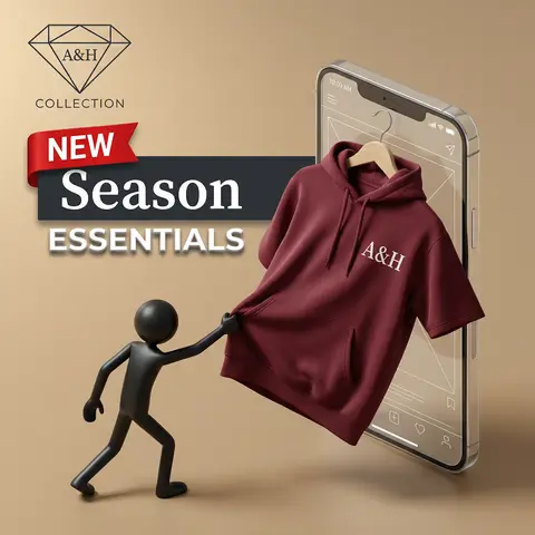
A&H Collection Isometric Fashion Hoodie Smartphone 3D Product Poster

A professional product advertisement in a 3D isometric style on a warm, matte beige-tan background. ​In the top left, a sleek, minimalist black wireframe diamond icon is displayed. Centered inside the diamond is the text A&H in a refined, dark serif font. Below the diamond, the word COLLECTION is written in a smaller, dark, wide sans-serif font. ​Below the logo area, a striking text banner spans across. At the top left of the text is a distinct, red fabric ribbon banner with the word NEW in white, capital, sans-serif letters. Positioned slightly behind and below the ribbon is a dark charcoal horizontal block, on which the word Season is prominently displayed in a large, clean, white serif font. Below this block, the word ESSENTIALS appears in all caps, sans-serif font, rendered in white with a clear grey drop shadow, giving it depth. ​The main composition features a large, glass-like smartphone mock-up with visible white wireframe interface details and status bar icons. From the screen of the phone, a deep maroon, premium-quality short-sleeve hooded sweatshirt on a natural wooden hanger is partially pulled out, with most of the garment projecting forward into 3D space. The sweatshirt has an attached hood with drawstrings and a central pocket. On the chest of the hoodie, the text A&H is sharply printed in a white serif font, matching the logo style. ​On the left side, on the floor surface, a sleek, smooth, matte black plastic 3D stick-figure man is posed as if reaching up and actively pulling the edge of the hoodie with its right hand. The lighting is soft and directional, highlighting textures and creating natural shadows. The scene has a clean, premium, and sophisticated feel.

durs.ai
Fashion Week Editorial Split Layout Magazine Poster Face Swap
PosterPhoto

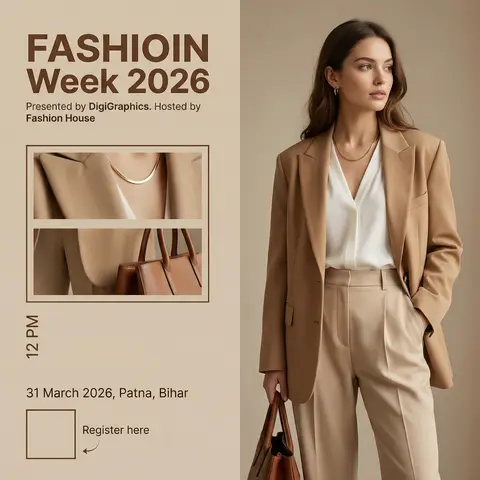
Fashion Week Editorial Split Layout Magazine Poster Face Swap

Ultra-realistic high-end fashion advertisement poster, minimalist editorial magazine style. STRICT LAYOUT (do not change anything): Vertical split composition. Right side: full-body fashion model. Left side: beige editorial panel with text + image frames. MODEL (KEEP EVERYTHING SAME, ONLY CHANGE FACE As GIVEN IN REFRANCE IMAGE): A stylish young woman standing in a relaxed confident pose, body slightly turned sideways, head turned to the right (looking away from camera). One hand inside pant pocket, other hand holding a brown leather bag. Outfit (exact): Beige/tan oversized blazer Soft white V-neck blouse High-waisted beige tailored trousers Minimal gold necklace Small earrings FACE REPLACEMENT (VERY IMPORTANT): Use the face from the provided reference image. Seamlessly blend the reference face onto the model’s head. Match skin tone, lighting, shadows, and color grading perfectly. Keep same head angle and expression as original pose. Ensure realistic identity preservation (no distortion, no mismatch). Ultra-clean face integration, professional fashion photography quality. LIGHTING & STYLE: Soft warm studio lighting, diffused, subtle shadows, luxury editorial look. Beige neutral tones, clean premium aesthetic. LEFT PANEL (COPY EXACT): Top text: “FASHIOIN Week 2026” (same spelling, bold modern sans-serif, brown) Below: “Presented by DigiGraphics. Hosted by Fashion House” Image frames: Two stacked rectangular frames showing cropped outfit close-ups (same outfit, same lighting) Bottom: Vertical text: “12 PM” “31 March 2026, Patna, Bihar” QR code placeholder “Register here” with small arrow STYLE KEYWORDS: ultra-realistic, editorial fashion poster, luxury branding, minimal, soft shadows, high detail, magazine layout.

durs.ai
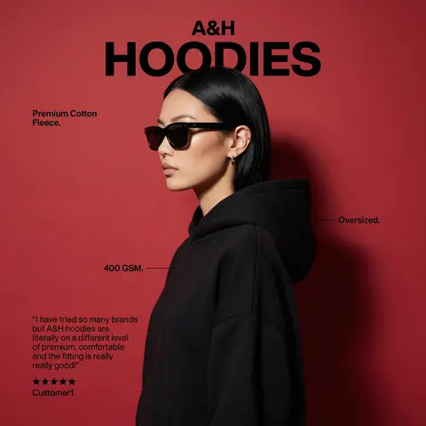
A&H Premium Hoodie Red Studio Fashion Campaign Poster Model Profile
PosterPhoto

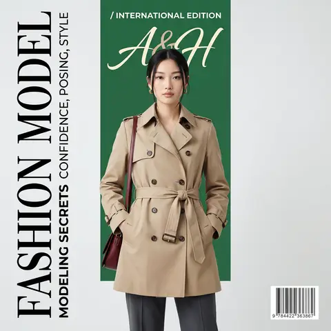
A&H Premium Hoodie Red Studio Fashion Campaign Poster Model Profile

Create a modern premium fashion hoodie advertisement poster with the exact same layout, composition, typography scale, colors, spacing, and element placement as the reference design. Background: solid deep red studio background. Main subject: stylish female model in side profile facing left, wearing a black oversized hoodie, sleek straight black hair tucked behind ear, sharp jawline, bold red lipstick, wearing black square sunglasses, elegant minimal earrings. Studio lighting with strong contrast and a subtle shadow behind the model. IMPORTANT: leave the face neutral and adaptable so the face can be replaced later with a reference face (face should be clean, centered and unobstructed). Top headline layout (same structure as reference): Small bold text above: A&H Large bold headline below: HOODIES Left upper small text: Premium Cotton Fleece. Right side small label pointing to hoodie: Oversized. Left middle small label pointing to fabric: 400 GSM. Left bottom testimonial text block: “I have tried so many brands but A&H hoodies are literally on a different level of premium, comfortable and the fitting is really really good!” Below testimonial: ★★★★★ Signature line: Customer1 Style: premium streetwear fashion advertisement, minimal typography design, high-end clothing campaign poster, ultra realistic editorial lighting, sharp focus, professional product marketing layout, 4K detail. (Copy the character from the reference image)

durs.ai