durs.ai
Prompt library

Prompts that work

Ready-made prompts for ads, logos, posters, 3D and more. Use one in a tap — or share your own.

+ Add a prompt
Brand everyday object style
ProductPhoto

Brand everyday object style

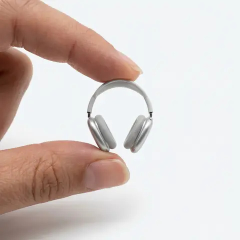
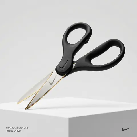
BRAND NAME or LOGO IMAGE. Act as a creative director curating a wide-ranging, eclectic collection of recontextualized everyday objects. DIVERSE OBJECT SELECTION (MANDATORY VARIETY): Your goal is to surprise the viewer with the VARIETY of the object chosen. Randomly select ONE object from these distinct categories to ensure diversity: Analog Office & Desk: Sport & Leisure: Barware & Kitchen: Utility & Tools: Grooming: Travel: THE CONCEPT: Take the chosen mundane object and elevate it into a luxury artifact using BRAND NAME s signature materials and colors. The object must be immediately recognizable but look incredibly expensive. MATERIALS & FINISH: Use materials that contrast with the objects usual cheap nature. Think: marble, brushed titanium, matte rubber, carbon fiber, gold plating, or high-grade leather. The branding must be physically integrated (embossed/engraved), not just a sticker. PRESENTATION (NO BOXES): The object should stand alone on the pedestal or table, fully exposed. If it has parts (like a ping pong set), arrange them neatly (knolling). Avoid closed boxes that hide the shape. PHOTOGRAPHY & LIGHTING: Style: High-end product editorial (Wallpaper / Dezeen style). Lighting: Soft, studio high-key lighting. No harsh shadows. Background: Clean, seamless light grey or white cyclorama. GRAPHIC OVERLAYS (UI): Bottom Left: A small, minimalist 2-line text block describing the object. Font: Manrope Regular. Color: #414141. Bottom Right: A small, discreet, monochrome logomark of BRAND NAME . Color: #414141. Do NOT visualize “Font name” and “Color code”.

durs.ai
Brand Logo Mashup Visual Parody Design
LogoPhoto

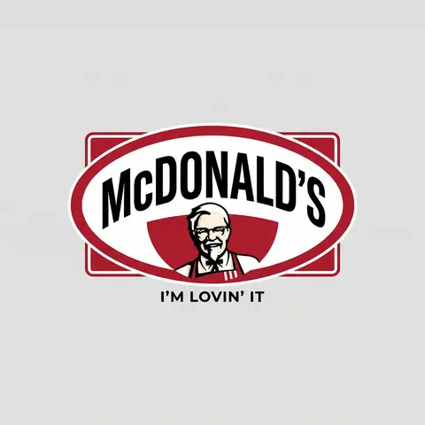
Brand Logo Mashup Visual Parody Design

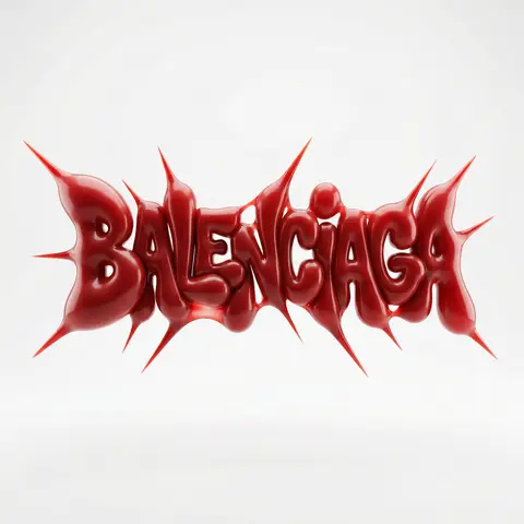
BRAND A + BRAND B. Act as a Brand Identity Designer specializing in Logo Mashups and Visual Parody. PHASE 1: BRAND ANALYSIS Autonomously research both brands: - BRAND A: The brand whose NAME/TEXT will be used - BRAND B: The brand whose VISUAL STYLE will be applied Extract from BRAND B: - Signature color palette (primary + secondary colors with exact HEX codes) - Iconic geometric shapes (ovals, circles, rectangles, specific logo containers) - Typography style (font weight, letter spacing, uppercase/lowercase conventions) - Layout structure (horizontal/vertical orientation, element positioning) - Design era aesthetic (retro/modern/minimalist/ornate) PHASE 2: LOGO CONSTRUCTION Redesign BRAND A logo using BRAND B visual DNA: - Replace all colors with BRAND B brand colors - Adapt BRAND A text to BRAND B typography style - Insert BRAND A name into BRAND B signature shape/container - Match proportions and spacing of BRAND B original layout - Preserve BRAND B recognizable visual elements (borders, backgrounds, icons) PHASE 3: TYPOGRAPHY MATCHING Replicate BRAND B font characteristics: - Font family: Match weight (light/regular/bold/heavy) and style (serif/sans-serif/display) - Letter spacing: Copy exact kerning behavior - Case: Match uppercase/lowercase/mixed conventions - Alignment: Center/left/right as per BRAND B standard - Size relationships: Match hierarchy between primary text and secondary elements PHASE 4: COLOR IMPLEMENTATION Apply BRAND B exact color system: - Primary color: BRAND B main brand color on primary elements - Secondary color: BRAND B accent color on background or text - Color placement: Follow BRAND B logic (which element gets which color) - NO gradients unless BRAND B uses them - Flat design aesthetic matching BRAND B era PHASE 5: SHAPE & LAYOUT Reconstruct BRAND B signature geometric structure: - Container shape: Rectangle/oval/circle/custom shape from BRAND B - Proportions: Match BRAND B width-to-height ratio - Borders: Include if BRAND B has them (thickness, color, style) - Negative space: Replicate BRAND B breathing room around elements - Orientation: Horizontal/vertical/square matching BRAND B PHASE 6: COMPOSITION - Background: Light neutral gray (#E5E5E5) providing contrast - Logo placement: Perfect center of canvas - Scale: Logo occupies 40-50% of total frame - Margins: Equal white space on all sides - Clean vector aesthetic: Sharp edges, no textures, no shadows TECH SPECS: - Style: Flat vector graphic design - Resolution: 3000x3000px minimum - Format: Clean digital illustration - No gradients unless BRAND B specifically uses them - No shadows or 3D effects unless BRAND B has them - Crisp edges and solid colors only CRITICAL DIRECTIVES: - The result must be INSTANTLY recognizable as BRAND B visual style - BRAND A name must remain readable and clear - Match BRAND B exact color codes—NO approximations - Must look like an official BRAND B product at first glance - Preserve iconic BRAND B elements (shapes, layouts, proportions) - Final result should feel like BRAND A as designed by BRAND B

durs.ai
Luxury Suede Handbag Indoor Cinematic Shoot
ProductPhoto

Luxury Suede Handbag Indoor Cinematic Shoot

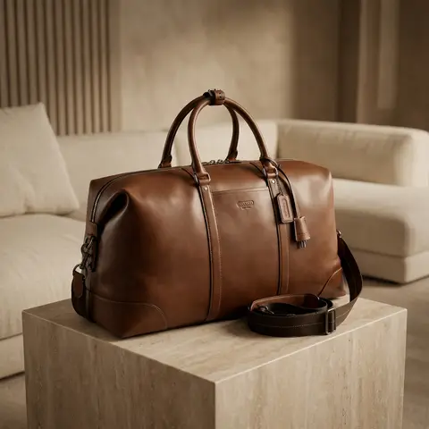
Use the uploaded image as the exact handbag product reference. Do NOT change the handbags size, shape, proportions, color, suede material, stitching, or logo placement. Create a high-end commercial luxury photoshoot in a luxurious indoor room. Scene & setting: elegant luxury interior room, minimalist high-class environment, premium materials (soft fabric sofa, marble table, textured wall, or luxury pedestal), clean backdrop with no clutter. Handbag placement: handbag placed neatly and intentionally, positioned as the main hero product, resting on a luxury surface (stone / fabric / matte pedestal). Camera angle: high angle shot looking down, cinematic framing, balanced composition, handbag centered or slightly off-center for editorial feel. Lighting: cinematic studio lighting, warm luxury tones, soft key light highlighting suede texture, subtle rim light to separate handbag from background, controlled shadows, no harsh highlights. Color & tone: warm bergenel / soft brown palette, color must remain accurate to original handbag reference, elegant contrast, not oversaturated. Focus & detail: suede texture extremely detailed, stitching sharp and clean, logo visible, realistic, embossed, shallow depth of field but product fully sharp. Style & mood: minimalist luxury, high fashion commercial ads, cinematic, calm, premium, timeless and elegant. Final result must look like a real high-budget luxury brand advertisement, suitable for billboard, website hero banner, and premium Instagram ads. Ultra photorealistic, high resolution, cinematic lighting, no Al artifacts, no GI look. Negative Prompt cartoon, illustration, CGI, fake lighting, shiny leather, wrong color, oversaturated, blur product, distorted shape, cheap interior, messy background, watermark, text overlay, Al artifacts.

durs.ai
Polished Steel Peony Product Photography
LogoPhoto

Polished Steel Peony Product Photography

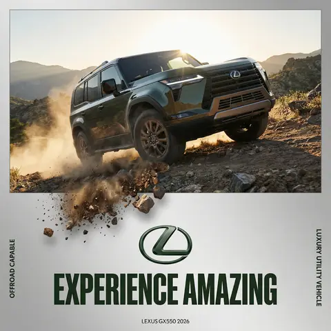
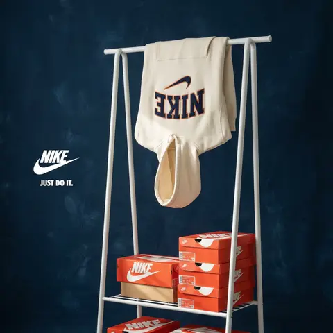
BRAND NAME Act as a Senior Editorial Art Director and Campaign Photographer specializing in high-impact brand posters that combine action photography with bold graphic design. Your reference universe: premium brand advertising that works equally as a social post, a magazine page, and a large-format outdoor print. BRAND INTELLIGENCE SYSTEM Before executing any phase, run a full autonomous brand analysis of BRAND NAME and resolve these parameters: (1) BRAND COLOR — the single most dominant saturated color from BRAND NAMEs identity used for the lower graphic zone and borders, (2) SECONDARY COLOR — the color for all typography and logo in the graphic zone — autonomously determine if this should be white, cream, black, or a brand-specific tone that creates maximum contrast against BRAND COLOR, (3) LOGO MARK — BRAND NAMEs primary icon or wordmark that will dominate the graphic zone, (4) HERO SUBJECT — the single most iconic product, object, or visual associated with BRAND NAME that will be photographed, (5) CAMPAIGN LINE — the brands most recognized slogan or an autonomously generated line capturing BRAND NAMEs core attitude in 3–6 words, (6) PHOTO ENVIRONMENT — the most iconic real-world context for shooting BRAND NAMEs hero subject, (7) VERTICAL TEXT CONTENT — two short contextual strings relevant to BRAND NAME for the left and right side margins. All parameters must be resolved before phase 1 begins. PHASE 1: CANVAS & FORMAT Vertical format, 4:5 ratio. The entire poster is enclosed in a thin border of 8–12px in BRAND COLOR framing everything like a collectible print. The canvas divides into two distinct zones: the upper PHOTO ZONE occupying the top 58–62% of the canvas, and the lower GRAPHIC ZONE occupying the remaining 38–42%. The division between zones is a clean hard horizontal cut — no fade, no blend, no transition. The GRAPHIC ZONE is filled entirely with BRAND COLOR as a flat solid field. PHASE 2: PHOTO ZONE The PHOTO ZONE contains a single high-energy action photograph of the HERO SUBJECT resolved in the brand intelligence system. Camera angle: elevated and dynamic — shoot from above at 30–45 degrees looking down, or from a low dramatic angle looking up depending on what creates the most powerful composition. Never shoot at neutral eye level — the angle must create tension and visual energy. The photograph fills the entire PHOTO ZONE edge to edge with no padding. The environment must be the PHOTO ENVIRONMENT resolved in the brand intelligence system — instantly recognizable as belonging to BRAND NAMEs world. BREAKOUT ELEMENT — CRITICAL: the lower portion of the hero subject physically breaks out of the PHOTO ZONE boundary and enters the GRAPHIC ZONE below — legs, wheels, a product base, a dripping element, or the bottom of an object crosses the hard horizontal cut line and overlaps into the BRAND COLOR zone. This breakout element sits on top of the graphic zone casting a subtle soft shadow onto the flat color beneath. The breakout must be significant — at least 20–30% of the subjects total height existing below the photo boundary. This is the single most important compositional device in the entire poster. PHASE 3: GRAPHIC ZONE The lower zone is a flat solid BRAND COLOR field. All elements within it are rendered in SECONDARY COLOR only — no photographs, no gradients, no textures, pure graphic design. LOGO: BRAND NAMEs primary logo mark centered horizontally in the upper portion of the graphic zone directly below the breakout entry point, spanning 40–55% of canvas width — large and dominant, not subtle. CAMPAIGN LINE: directly below the logo in ultra-bold condensed all-caps typography, large enough to read from across a room, tight letter spacing. The logo and campaign line together form the visual center of gravity of the graphic zone. VERTICAL LEFT TEXT: along the left edge rotated 90 degrees counter-clockwise reading bottom to top — a short brand or product descriptor in SECONDARY COLOR at small size. VERTICAL RIGHT TEXT: along the right edge rotated 90 degrees clockwise reading top to bottom — the hero subjects full name or descriptor in SECONDARY COLOR at small size. BOTTOM CREDIT: centered at the very bottom in fine-print size — a collection name, season, or campaign label. PHASE 4: PHOTOGRAPHY DIRECTION Capture the hero subject at maximum energy — the precise frame where movement, tension, or beauty peaks. For a person: mid-motion at full commitment to the action. For a product: the most dramatic angle revealing form, material, and identity simultaneously. For food: the moment of pour, cut, steam, or impact. For automotive: speed blur, drift, or heroic three-quarter angle. Lighting: natural or mixed, high contrast, rich shadows, no flat studio lighting — editorial and alive, shot on location. Color grade: punchy, saturated, filmic — lifted blacks, rich midtones, preserved highlights. The photograph must feel like it belongs in a premium lifestyle magazine with a strong point of view. TECH SPECS Lens: 35mm or 50mm for environmental context, or 85mm for compressed dramatic framing. Depth of field: subject sharp, background contextual at f/4 to f/8. Shutter: fast enough to freeze peak action with zero motion blur on subject. Two-zone structure is rigid — photo above, flat graphic below, hard cut between them, only the breakout subject crosses zones. Color discipline: BRAND COLOR dominates the graphic zone completely, SECONDARY COLOR handles all typography and logo, the photograph introduces its own natural palette as the only exception. Typography: condensed, bold, authoritative — no decorative fonts. Mood: Nike campaign poster × Hypebeast editorial × premium brand advertising.
durs.ai
Ghibli-Inspired Maximalist Kitchen Illustration
2DPhoto

Ghibli-Inspired Maximalist Kitchen Illustration

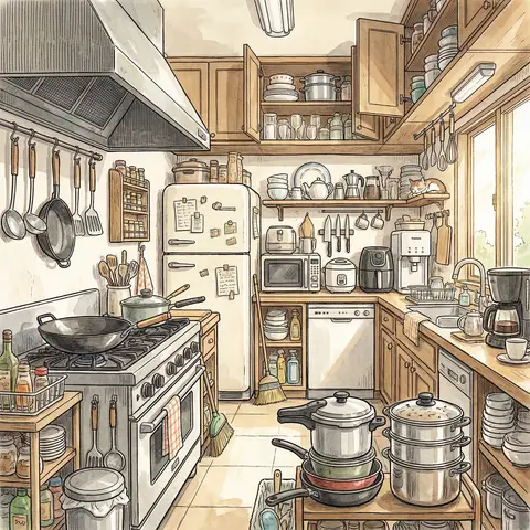
A highly detailed anime-style illustration of a modern kitchen in Ghibli-inspired aesthetic, rendered with pen linework and soft watercolor wash (ink + light color rendering). The composition is maximalist, filled with a rich variety of kitchen objects and tools, creating a warm, lively, and slightly cluttered atmosphere. The kitchen includes numerous appliances: a gas stove, range hood, large wok spatulas, microwave, rice cooker, air fryer, refrigerator, freezer, dishwasher, sterilizer cabinet, and water purifier. Cooking utensils: wok for high-heat stir-frying, soup pot for stewing, steamer for steaming dishes, pressure cooker for fast cooking. Tableware: a wide variety of ceramic, plastic, and stainless steel utensils, along with wine sets, tea sets, and coffee-making tools. Storage elements: dish racks, spice racks, cabinets, drawers, all neatly but densely arranged, contributing to a maximalist aesthetic. Cleaning supplies: dish soap, cleaning cloths, steel scrubbers, kitchen paper towels, trash bins, broom and dustpan. Kitchen tools: knives, cutting boards, spatulas, ladles, chopsticks, whisks, rolling pins, and other essential cooking tools scattered naturally. Style: Studio Ghibli-inspired atmosphere (soft lighting, warm tones, cozy mood), delicate pen outlines with varying thickness, watercolor shading, slightly nostalgic feeling, rich details, lively environment, cinematic composition. Lighting: soft natural daylight coming through a window, subtle shadows, warm highlights. Ultra-detailed, 4K resolution, highly textured, cozy, vibrant, storytelling scene.

durs.ai