Prompt library

Prompts that work

Ready-made prompts for ads, logos, posters, 3D and more. Use one in a tap — or share your own.

+ Add a prompt
Futuristic Instagram Profile UI Mockup
AdvertisementPhoto

Futuristic Instagram Profile UI Mockup

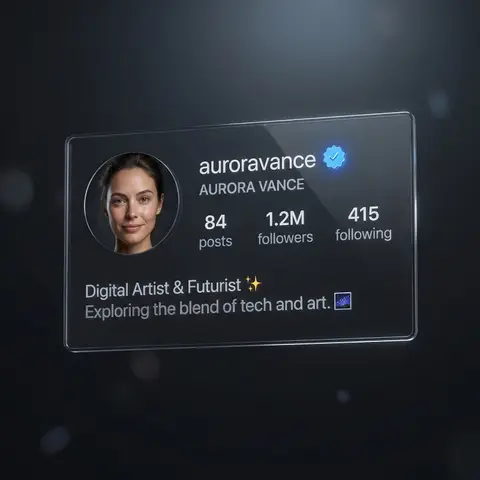
REFERENCE IMAGE. Ultra high-resolution photorealistic futuristic Instagram profile interface for a verified creator account, dark mode Ul, premium tech aesthetic. Main focus: a floating transparent glass Ul panel displaying a modern Instagram profile layout, inspired by iOS design language, clean and minimal. Profile name text: NOME DO PERFIL, verified badge visible next to the username USERNAME DO PERFIL. Circular profile picture on the left: DESCRIÇÃO DO ROSTO / PESSOA, realistic skin texture, natural expression EXPRESSAO FACIAL), studio portrait lighting with soft shadow falloff, sharp facial details, correct anatomy. Typography: clean sans-serifUl font, white and soft gray text, perfectly aligned, readable, no distortion. Stats section: NÚMERO DE POSTS posts, INÚMERO DE SEGUIDORES seguidores INÚMERO SEGUINDO seguindo, displayed in a balanced horizontal grid. Bio section text: BIO DO PERFIL - PROFISSÃO / DESCRIÇÃO, optional emojis EMOJIS OPCIONAIS, engraved as subtle luminous text. Material: semi-transparent glass Ul panel with polished acrylic finish, soft internal reflections, realistic light refraction, thin glowing edges. Lighting: soft ambient top light, subtle rim light outlining the interface, controlled reflections, no blown highlights. Background: deep black to dark graphite gradient, cinematic low-key mood, shallow depth of field, strong subject separation. Camera: full-frame DSLR look, 50mm lens, f/2.0, ISO 100, ultra-sharp focus on Ul panel, minimal background bokeh. Style: ultra high-res, correct anatomy, professional lighting, clean branding mockup, futuristic social media identity, no extra text, no watermark, no Ul glitches.

durs.ai
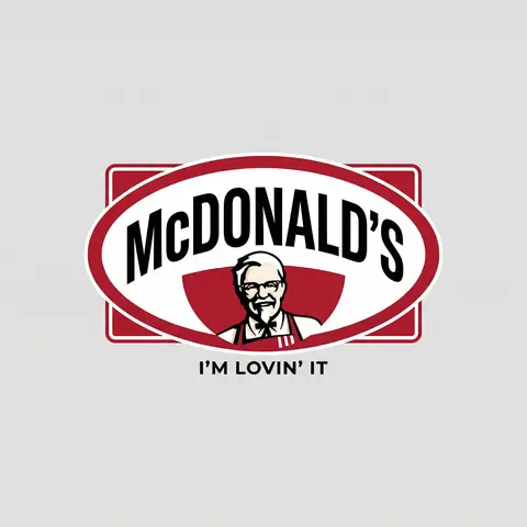
Brand Logo Mashup Visual Parody Design
LogoPhoto

Brand Logo Mashup Visual Parody Design

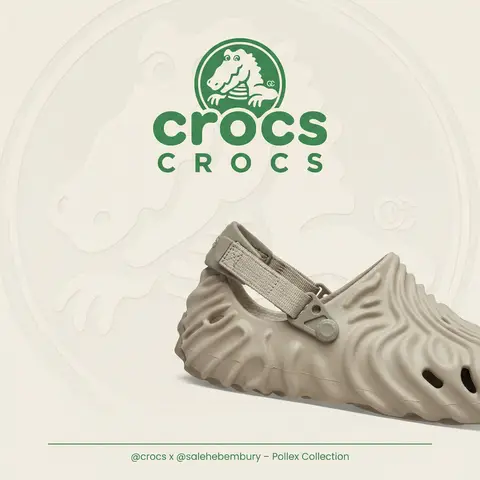
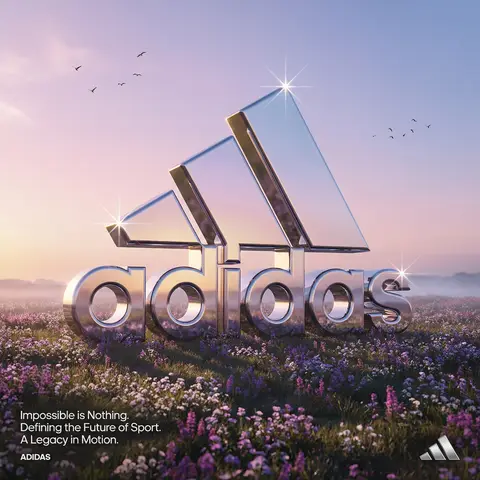
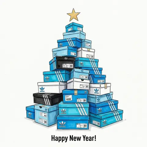
BRAND A + BRAND B. Act as a Brand Identity Designer specializing in Logo Mashups and Visual Parody. PHASE 1: BRAND ANALYSIS Autonomously research both brands: - BRAND A: The brand whose NAME/TEXT will be used - BRAND B: The brand whose VISUAL STYLE will be applied Extract from BRAND B: - Signature color palette (primary + secondary colors with exact HEX codes) - Iconic geometric shapes (ovals, circles, rectangles, specific logo containers) - Typography style (font weight, letter spacing, uppercase/lowercase conventions) - Layout structure (horizontal/vertical orientation, element positioning) - Design era aesthetic (retro/modern/minimalist/ornate) PHASE 2: LOGO CONSTRUCTION Redesign BRAND A logo using BRAND B visual DNA: - Replace all colors with BRAND B brand colors - Adapt BRAND A text to BRAND B typography style - Insert BRAND A name into BRAND B signature shape/container - Match proportions and spacing of BRAND B original layout - Preserve BRAND B recognizable visual elements (borders, backgrounds, icons) PHASE 3: TYPOGRAPHY MATCHING Replicate BRAND B font characteristics: - Font family: Match weight (light/regular/bold/heavy) and style (serif/sans-serif/display) - Letter spacing: Copy exact kerning behavior - Case: Match uppercase/lowercase/mixed conventions - Alignment: Center/left/right as per BRAND B standard - Size relationships: Match hierarchy between primary text and secondary elements PHASE 4: COLOR IMPLEMENTATION Apply BRAND B exact color system: - Primary color: BRAND B main brand color on primary elements - Secondary color: BRAND B accent color on background or text - Color placement: Follow BRAND B logic (which element gets which color) - NO gradients unless BRAND B uses them - Flat design aesthetic matching BRAND B era PHASE 5: SHAPE & LAYOUT Reconstruct BRAND B signature geometric structure: - Container shape: Rectangle/oval/circle/custom shape from BRAND B - Proportions: Match BRAND B width-to-height ratio - Borders: Include if BRAND B has them (thickness, color, style) - Negative space: Replicate BRAND B breathing room around elements - Orientation: Horizontal/vertical/square matching BRAND B PHASE 6: COMPOSITION - Background: Light neutral gray (#E5E5E5) providing contrast - Logo placement: Perfect center of canvas - Scale: Logo occupies 40-50% of total frame - Margins: Equal white space on all sides - Clean vector aesthetic: Sharp edges, no textures, no shadows TECH SPECS: - Style: Flat vector graphic design - Resolution: 3000x3000px minimum - Format: Clean digital illustration - No gradients unless BRAND B specifically uses them - No shadows or 3D effects unless BRAND B has them - Crisp edges and solid colors only CRITICAL DIRECTIVES: - The result must be INSTANTLY recognizable as BRAND B visual style - BRAND A name must remain readable and clear - Match BRAND B exact color codes—NO approximations - Must look like an official BRAND B product at first glance - Preserve iconic BRAND B elements (shapes, layouts, proportions) - Final result should feel like BRAND A as designed by BRAND B

durs.ai
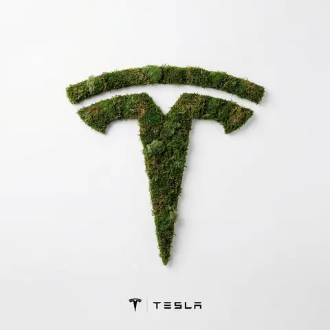
Moss Texture Logo Icon Art Direction
LogoPhoto

Moss Texture Logo Icon Art Direction

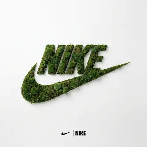
BRAND NAME: Enter the brand name here. Goal: Generate a minimalist organic image where a stylized logo icon of BRAND NAME is transformed into a large moss-textured artifact, with a small brand signature at the bottom. Constraint: NO TEXT inside or immediately near the central moss icon. Only the bottom signature. 1. THE CENTRAL MOSS ICON - Main Subject: A large, geometrically precise symbol, sculpted into the exact form of the BRAND NAME logo icon. - Material: The symbol is entirely made of dense, heavily textured, natural green stabilizing moss. The texture is rough and organic with varying shades of green and brown. - Form: The geometric edges are sharp and clean, but filled with the soft, billowy texture of moss. 2. ENVIRONMENT & LAYOUT - View: A top-down, central flat lay view. - Background: A flawless, uniform, matte white studio background. Full minimalist negative space. - Lighting: Bright, soft, diffused studio lighting that emphasizes the tactile moss texture while minimizing harsh shadows. 3. BOTTOM BRAND SIGNATURE (CRITICAL) - Placement: A clean horizontal signature block centered at the bottom, far below the moss icon. - Elements: A tiny, flat, minimalist version of the BRAND NAME logo icon on the left. - Text: The word BRAND NAME in a clean, bold, black sans-serif typeface immediately to the right of the tiny logo. - Scale: The signature must be very small compared to the central moss artifact. 4. AESTHETIC - Biophilic design, premium product photography, clean, fresh, airy, high-end editorial look. 8k resolution.

durs.ai
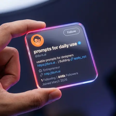
Transparent Glass Social Media Profile Card
3DPhoto

Transparent Glass Social Media Profile Card

Close-up shot of a human hand holding a square, transparent acrylic/glass-like social media profile card in mid-air. Dark studio background, softly blurred, with subtle blue-purple ambient light. Very shallow depth of field (f/1.8), only the glass card and fingers are in sharp focus, with heavy bokeh background. Scene & Atmosphere Environment: Dark studio (#0c0f19), vignette edges, subtle blue-purple ambient light Mood: Futuristic, tech, premium, clean UI, social media identity card Camera: Macro lens (85mm equivalent), f/1.8, 8K ultra-realistic rendering Transparent Card Design Material: Transparent acrylic/glass (transparency 0.92, IOR 1.5, roughness 0.05) Shape: Perfect rounded square (corner radius 10-16px), 3-5mm thickness Edge Glow: Strong neon gradient - linear-gradient(135deg, #ff4d4d, #ff7de3, #8a5dff, #41c3ff) Held By: Realistic human hand, thumb on front-left edge, warm skin tone UI Layout Header: - Avatar: Circular, top-left, flat illustration style (orange background, dark hair, glasses) - Username: nanoprompts ▲ - Bold rounded sans-serif, near-white color - Verified Badge: Blue (#1D9BF0), next to username - Handle: @promptslab - Below username, color #d0d6e5 - Follow Button: Top-right, transparent/glassy, 1px solid #ffffff99 border Body: - Description: 100+ Free AI Prompts & Workflows for Nano Banana Image Generation - Link: https://nanoprompts.org . | Building 🔗apply_xyz (color #5da7ff) - Meta: Profession icon + Entrepreneur - Website: http://rehanuds.framr.website Footer Stats: - 135 Following | 446 Followers - Joined May 2025 (color #ffffff66) Lighting Main Light: Softbox from top-left/front-left, 5200-5600K cool white Rim Light: Neon edge emission, strong on corners Background: Dark with extra glow (#3e4fff33), round bokeh (#283759) Avoid No extra hands, distorted fingers, low-res text, fingerprints, watermarks, or cropped buttons

durs.ai
Luxury Brand Product Key Visual
PosterPhoto

Luxury Brand Product Key Visual

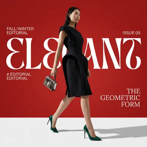
BRAND NAME + PRODUCT Act as a Senior Luxury Fashion Art Director and Studio Photographer specializing in high-end product key visuals for flagship campaigns, e-commerce editorials, and mobile-first brand content. PHASE 1: FORMAT & CANVAS Vertical format, 9:16 aspect ratio. Canvas background: a single flat field of warm off-white — not pure white, not grey. Target tone: soft ivory cream (#F4EFE6 equivalent), uniform and completely shadowless across the entire background plane. Autonomously determine BRAND NAMEs signature background tone — if the brand has a recognized house color for its packaging, tissue paper, or lookbook backgrounds, shift the canvas toward that specific off-white or neutral. The result must feel like an official brand document, not a generic studio. PHASE 2: BACKGROUND PATTERN (WATERMARK LAYER) Autonomously identify BRAND NAMEs iconic surface pattern, monogram, or archival motif — examples: a house monogram, toile print, geometric logo repeat, heritage emblem, or signature textile pattern. Render this pattern across the entire background canvas as a ghost watermark: same tone as the background but with a slight value shift (approximately 8–12% darker or lighter than the base). The pattern must be large in scale — individual motifs spanning 15–25% of canvas width. Opacity: 10–18% maximum. No hard edges. The pattern should feel embossed or tone-on-tone woven, not printed. It must recede behind all other elements. PHASE 3: LOGO PLACEMENT Autonomously reproduce BRAND NAMEs official logo with complete fidelity — correct letterforms, proportions, secondary marks (emblems, crowns, stars, monogram icons). Place the logo centered horizontally in the upper third of the frame (top 30% of canvas). Scale: the logo should span approximately 40–50% of canvas width — prominent but not overwhelming. Logo rendering: flat 2D, no extrusion, no chrome. Color: autonomously apply BRAND NAMEs official logo colorway — the exact brand-standard color(s) used on official packaging and website. If the brand uses a two-tone logo (icon + wordmark in different colors), preserve that hierarchy precisely. Directly below the main logo mark, place the full BRAND NAME wordmark in spaced capital letters — clean, geometric sans-serif, tracking: +200 to +300, same brand color, optical size approximately 60% of logo height. No decorative elements between logo and wordmark. PHASE 4: PRODUCT PLACEMENT Render PRODUCT as a photorealistic studio object with maximum material fidelity: — Leather: visible grain, pore structure, stitching thread texture, realistic edge paint. — Hardware: gold or silver metal with micro-reflections, not flat. — Canvas/fabric: woven fiber detail, not smooth CG. — All brand-specific surface patterns on the product must be accurate and legible. Placement: the product enters the frame from the bottom-right corner at a natural 25–35 degree angle, as if casually placed or mid-motion. The product is cropped — only 60–75% of the object is visible within the frame. The crop should feel intentional and editorial, not accidental. The product occupies the lower 55–65% of the canvas. The product must feel physically present in the space — not floating. Cast an extremely soft, barely visible contact shadow (opacity 8–12%) on the canvas beneath the nearest edge. No hard drop shadows. PHASE 5: LIGHTING Lighting: simulated large north-facing studio window light. Soft, directional, shadowless on the background. Color temperature: 5500–6000K (neutral daylight, slightly cool). Key light: large softbox equivalent from upper-left, filling the entire product surface evenly with minimal contrast ratio (1.2:1 to 1.5:1 max). Fill light: large bounce from right side, eliminating all harsh shadows. No rim light. No dramatic contrast. The lighting philosophy is: the product sells itself — light only reveals, never performs. Global Illumination enabled for subtle inter-reflections between product surfaces. No specular hotspots on leather — only on metal hardware. PHASE 6: TYPOGRAPHY & FINISHING Bottom of frame: a thin horizontal rule line (1px, brand color, 80% canvas width, centered). Below the rule: a single line of micro-copy — a social handle, collection name, or campaign label — in the same clean sans-serif, lowercase or small-caps, minimal tracking. Autonomously generate a contextually appropriate label for BRAND NAME. TECH SPECS Render engine: photorealistic CGI, Keyshot / Octane product visualization aesthetic. Resolution: 9:16, ultra-high detail. Depth of Field: f/16 equivalent — everything in sharp focus. Zero bokeh. Tack-sharp edges on all product details.Tone mapping: clean, true-to-life. No filmic crush. No vignette. No grain. Color grade: neutral, faithful to real product color. Slight warmth in the ivory background only. No AI-plastic normals on leather or fabric. Microscopic surface imperfection maps required. No reflections on background. No environmental reflections — studio only. Mood reference: Louis Vuitton / Bottega Veneta / Celine official e-commerce and campaign photography standard. Clean enough to be used as a press image.

durs.ai
Moss Texture Logo Artifact Flat Lay
LogoPhoto

Moss Texture Logo Artifact Flat Lay

PROMPTSREF: Enter the brand name here. Goal: Generate a minimalist organic image where a stylized logo icon of PROMPTSREF is transformed into a large moss-textured artifact, with a small brand signature at the bottom. Constraint: NO TEXT inside or immediately near the central moss icon. Only the bottom signature. 1. THE CENTRAL MOSS ICON - Main Subject: A large, geometrically precise symbol, sculpted into the exact form of the PROMPTSREF logo icon. - Material: The symbol is entirely made of dense, heavily textured, natural green stabilizing moss. The texture is rough and organic with varying shades of green and brown. - Form: The geometric edges are sharp and clean, but filled with the soft, billowy texture of moss. 2. ENVIRONMENT & LAYOUT - View: A top-down, central flat lay view. - Background: A flawless, uniform, matte white studio background. Full minimalist negative space. - Lighting: Bright, soft, diffused studio lighting that emphasizes the tactile moss texture while minimizing harsh shadows. 3. BOTTOM BRAND SIGNATURE (CRITICAL) - Placement: A clean horizontal signature block centered at the bottom, far below the moss icon. - Elements: A tiny, flat, minimalist version of the PROMPTSREF logo icon on the left. - Text: The word PROMPTSREF in a clean, bold, black sans-serif typeface immediately to the right of the tiny logo. - Scale: The signature must be very small compared to the central moss artifact. 4. AESTHETIC - Biophilic design, premium product photography, clean, fresh, airy, high-end editorial look. 8k resolution.

durs.ai
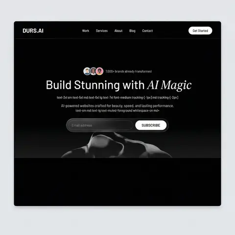
VIRALMEDIA AI Agency Dark Landing Page
BrandingPhoto

VIRALMEDIA AI Agency Dark Landing Page

Build a dark-themed, single-page landing page for an AI web design agency called VIRALMEDIA. The design uses a pure black background (#000) with white text, a signature liquid glass glassmorphism effect, and two Google Fonts: Barlow (body/UI) and Instrument Serif (italic accent text). Use React, Tailwind CSS, Framer Motion, and hls.js. All buttons are rounded-full. DESIGN SYSTEM (index.css) Color tokens (all HSL, dark-only — no light mode): --background: 0 0% 0% (pure black) --foreground: 0 0% 100% (pure white) --card: 0 0% 9%, --card-foreground: 0 0% 100% --primary: 0 0% 97%, --primary-foreground: 0 0% 9% --secondary: 0 0% 15%, --secondary-foreground: 0 0% 100% --muted: 0 0% 15%, --muted-foreground: 0 0% 75% --accent: 0 0% 15%, --accent-foreground: 0 0% 100% --border: 0 0% 20%, --input: 0 0% 20%, --ring: 0 0% 100% --radius: 2px --font-body: Barlow, sans-serif --font-accent: Instrument Serif, serif Liquid Glass CSS classes: .liquid-glass — subtle glassmorphism: background: rgba(255,255,255,0.01), background-blend-mode: luminosity, backdrop-filter: blur(4px), no border, box-shadow: inset 0 1px 1px rgba(255,255,255,0.1). Has a ::before pseudo-element for a gradient border effect using linear-gradient(180deg, rgba(255,255,255,0.45) 0%, rgba(255,255,255,0.15) 20%, transparent 40%, transparent 60%, rgba(255,255,255,0.15) 80%, rgba(255,255,255,0.45) 100%) with mask-composite: exclude and padding: 1.4px. .liquid-glass-strong — stronger variant: same as above but backdrop-filter: blur(50px), box-shadow: 4px 4px 4px rgba(0,0,0,0.05), inset 0 1px 1px rgba(255,255,255,0.15), and slightly higher gradient opacity values (0.5/0.2 instead of 0.45/0.15). Tailwind config: Set fontFamily: body: Barlow, sans-serif, accent: Instrument Serif, serif at the theme root level (not in extend). SECTION 1: NAVBAR (fixed) Fixed top, full-width, z-50, px-8 py-6, flex row with space-between Left: Logo text VIRALMEDIA — text-xl font-semibold tracking-tight font-body text-foreground Center (hidden on mobile): Nav links Work, Services, About, Blog, Contact — each px-4 py-2 text-sm font-medium text-foreground rounded-sm hover:bg-white/10 Right: Get Started button — liquid-glass-strong rounded-full px-6 py-2.5 text-sm font-medium text-foreground SECTION 2: HERO (full viewport height) Container: relative w-full h-screen overflow-hidden Background video (behind everything): Absolutely positioned, object-cover object-bottom. On mobile: -translate-y-100px, on md+: no translate. Video URL: https://d8j0ntlcm91z4.cloudfront.net/user_38xzZboKViGWJOttwIXH07lWA1P/hf_20260326_073936_8dd07fdb-4f6b-4220-a3f0-9dedfaab0c88.mp4 (autoPlay, loop, muted, playsInline) Bottom gradient overlay: absolute inset-x-0 bottom-0 h-60 bg-gradient-to-t from-background to-transparent Content (z-10, flex column, justify-end, pb-10 md:pb-20): Avatar row: 3 overlapping circular avatars (http://pravatar.cc, w-8 h-8 rounded-full border-2 border-background, -space-x-2) + text 7,000+ brands already transformed in text-muted-foreground text-sm Heading: text-3xl sm:text-5xl md:text-6xl lg:text-7xl font-medium tracking--1px md:tracking--2px — Build Stunning with + <span className=font-accent italic font-normal>AI Magic</span> Subtitle: text-sm md:text-lg text-muted-foreground whitespace-normal md:whitespace-nowrap — AI-powered websites crafted for beauty, speed, and lasting performance. Email form: liquid-glass rounded-full p-1.5 md:p-2 max-w-lg w-full with transparent input and a solid white bg-foreground text-background rounded-full SUBSCRIBE button. Button uses motion.button with whileHover= scale: 1.03 and whileTap= scale: 0.98
durs.ai
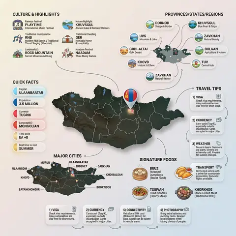
Country Infographic Editorial Poster
PosterPhoto

Country Infographic Editorial Poster

Ultra-clean modern country infographic poster (1080x1080), premium editorial layout meets lifestyle travel photography. Showcase Country as the hero visual in the center: a slightly angled 3D map cutout / glossy paper-cut map silhouette with subtle shadow, with a small flag pin marker on the capital city. Add a soft natural studio lighting feel, gentle gradient + minimal texture background for an upscale magazine look. Around the hero map, arrange information like a recipe infographic—dynamic, floating panels and clusters, not restricted to top-down. Clear hierarchy: hero map > key stats badges > cities/provinces > culture/foods > tips. SECTION 1 — Quick Facts (clean glassmorphism badges near the hero): - Capital: CAPITAL - Population: POPULATION - Currency: CURRENCY - Language(s): LANGUAGES - Time zone: TIMEZONE - Best time to visit: BEST SEASON Display as modern rounded pills/bubbles with accent color highlights. SECTION 2 — Provinces/States/Regions (ingredients-style clusters): List NUMBER provinces/regions with mini icons/mini map segments or simple pictograms. Example: PROVINCE 1, PROVINCE 2, PROVINCE 3... Each item includes a small icon (mountains, river, desert, forest, coastline) and one short label (e.g., “coastal”, “historic”, “wine region”). Arrange in curved flows connected with thin lines to the map. SECTION 3 — Major Cities (connected pin points): Show 5–8 key cities with small pin markers on/near the map and clean labels: City 1, City 2, City 3... Use lines/arrows from labels to map pins, avoiding clutter. SECTION 4 — Signature Foods (recipe vibe): Show 4–6 famous foods of COUNTRY with small tasty mini illustrations or photo-style cutouts: Food 1, Food 2, Food 3... Add short descriptors (spicy, street food, dessert, grilled). Keep vibrant natural food colors. SECTION 5 — Culture & Highlights (editorial callouts): Include icons and 1-line notes for: - Famous festival: FESTIVAL - Traditional music/dance: CULTURE - Landmark(s): LANDMARKS - Nature highlight: NATURE Use clean vector icons and minimal text. SECTION 6 — Travel Tips (step-like numbered panels): Show 4–6 numbered “tips” panels arranged around the hero map with arrows showing flow: 1) Tip 1 2) Tip 2 3) Tip 3 Add small icons (plane, train, hotel, safety, budget, camera, SIM card). Use glassmorphism panels with soft gradients and subtle drop shadows. Typography & Style: Modern sans-serif typography, high readability, strong grid alignment, airy negative space, subtle shadows, crisp vector icons, accent color palette inspired by COUNTRY flag (tasteful, not overwhelming). Editorial, premium, ultra-clean, social-feed optimized. Output requirements: Ultra-crisp, no watermark, no logo, no extra text beyond the provided labels, balanced spacing, high contrast readability, 1080×1080.

durs.ai