Cinematic Heavyweight T-Shirt Merch Campaign
BRAND NAME. Act as a High-End Editorial Fashion Photographer specializing in dark, cinematic merch and streetwear product campaigns.
PHASE 1: CONCEPT & OBJECT
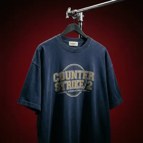
Photograph a single premium heavyweight cotton T-shirt hanging
on a slim matte black clothing hanger. The hanger is suspended
from an industrial chrome pipe rail with a visible mechanical
clamp/hook fitting — the pipe enters the frame from the upper
right corner at a diagonal angle, partially cropped by the frame.
THE T-SHIRT:
Oversized unisex silhouette, heavyweight garment-dyed cotton
(320–380gsm equivalent). Color: autonomously determine the most
iconic or culturally resonant base color associated with
BRAND NAME — apply as a washed, slightly faded version
(not factory-fresh, not overly distressed — editorial vintage).
The shirt hangs with natural gravity drape — subtle wrinkles
at the torso, slight fabric pull at the shoulders from the hanger.
NOT ironed flat. NOT pinned. Pure natural hang.
NECK LABEL:
A small woven white label visible inside the back collar,
folded slightly outward. The label reads BRAND NAME
in fine serif or script typeface — small, understated, luxury.
CHEST GRAPHIC:
Autonomously design a chest-centered screen-print graphic
that reflects BRAND NAMEs visual identity and cultural world.
The graphic must follow this construction logic:
- Style: Vintage varsity / retro sports circular badge OR
editorial script lettering — the aesthetic that best fits
BRAND NAMEs DNA
- Technique: Screen-print appearance — ink sits ON the fabric,
visible halftone texture at edges, slight cracking on the
darkest ink areas (authentic vintage wear)
- Color: 2–3 colors maximum. Autonomously determine the palette
based on BRAND NAMEs iconic colors + white outline/stroke
- Content: BRAND NAME wordmark or monogram rendered in the
chosen style. Add one short sub-line of text (4–6 words)
that captures BRAND NAMEs ethos or cultural reference
- Scale: Graphic occupies ~35–40% of the shirts chest area
PHASE 2: LIGHTING
Single dominant key light: large softbox positioned front-left,
elevated at 40 degrees above subject — Rembrandt lighting logic.
This creates:
- Strong illumination on the LEFT side of the shirt
- The graphic/print fully lit and readable
- RIGHT side falls into deep natural shadow (no fill light)
- Hanger hardware catches a sharp specular highlight
Color temperature: 4200K — slightly warm, tungsten-adjacent.
No rim light. No background light. No lens flare.
The shadow IS the aesthetic — do not fight it.
Global Illumination: subtle bounce from the lit shirt face
back onto the immediate background only.
PHASE 3: BACKGROUND & ATMOSPHERE
Seamless cyclorama backdrop: deep, saturated single-color
gradient. Autonomously select the background color that creates
maximum dramatic contrast with BRAND NAMEs shirt color
while staying within a dark, moody palette — deep crimson,
oxblood, prussian blue, forest shadow, noir charcoal.
Vignette: strong radial darkening toward all four corners —
center is 30% brighter than edges. No texture. No grain on BG.
The background reads as infinite depth.
PHASE 4: COMPOSITION & CAMERA
Orientation: Portrait, 4:5 ratio.
Camera angle: Slightly below eye-level, looking up 8–12 degrees —
gives the garment presence and weight
Framing: T-shirt occupies 70–75% of frame. Bottom hem is
cropped slightly. Sleeve tips reach near frame edges.
Hanger pipe enters from upper-right, cropped at frame edge.
The hook/clamp mechanism is fully visible — its a design element.
Rotation: Entire composition tilts 4–6 degrees counter-clockwise.
Depth of Field: f/5.6 equivalent — entire shirt in sharp focus,
background at soft focus threshold (not bokeh blurred —
just atmospheric depth). Macro detail on fabric weave visible.
TECH SPECS
Render/Capture style: Photorealistic — NOT CGI render aesthetic.
Must read as actual studio photography.
Fabric texture: Individual cotton weave threads visible on
the lit areas. Pilling micro-texture on surface. Subsurface
light interaction on thick fabric ridges.
Print texture: Screen-print ink layer has tactile presence —
slightly raised, edge halftone dots, micro-cracking in dark fills.
No AI plastic sheen on fabric. No oversaturated colors.
No symmetrical composition. No ghost mannequin. No flat lay.
Resolution: 4096 x 5120px. Post: Subtle film grain (ISO 800 equiv.), slight desaturation
(-8), lifted blacks (cinematic), neutral-warm color grade.
Style references: Undercover FW campaigns, Raf Simons archive
product shots, Stüssy × Our Legacy editorials, Highsnobiety
product features.
NEGATIVE: No model wearing the shirt. No white background.
No floating hanger (hardware must be attached to visible pipe).
No CGI fabric simulation. No overly bright studio look.