🎁 durs.ai-д шинэ үү? Бүртгүүлээд 20,000 үнэгүй кредит аваарай — 6 Seedance бичлэг эсвэл 110 зураг бидний бэлэг.Үнэгүй кредит авах →
Промптын сан

Үр дүнтэй промптууд

Сурталчилгаа, лого, постер, 3D болон бусад бэлэн промпт. Нэг товшилтоор ашиглаарай — эсвэл өөрийнхөөгөө хуваалцаарай.

+ Промпт нэмэх
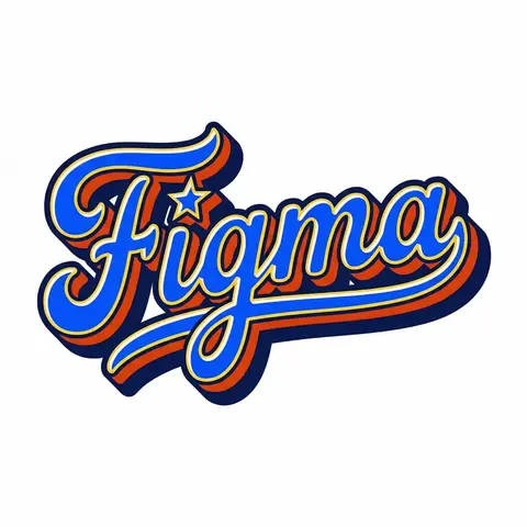
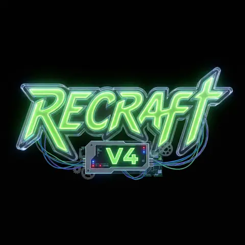
Retro Americana Fat Script Lettering
LogoЗураг

Retro Americana Fat Script Lettering

A bold, vibrant, retro-American vector lettering design displaying the name BRAND NAME or TEXT. TYPOGRAPHY STYLE (FAT SCRIPT): The text is rendered in a thick, chunky, hand-lettered baseball script or bubble style, reminiscent of 1950s-1970s American sports logos and automotive decals. Form: The letters are heavy, rounded, and tightly connected (ligatures). Perspective: The text line should be slightly slanted upwards or arched to create dynamic energy. Effects: Apply a thick, bold outline around the text. Crucially, add a deep, solid block shadow (extrusion) behind the letters to create a heavy 3D pop-out effect, characteristic of vintage sticker art. COLOR PALETTE (BRAND VINTAGE): Use a bright, saturated, and flat color palette inspired by BRAND NAMEs identity but filtered through a retro pop-art lens. Fill: Solid, punchy colors (no gradients). Contrast: High contrast between the letter fill, the outline (usually white or cream), and the block shadow (usually a darker shade or contrasting color). DECORATIVE ELEMENTS: Keep it clean and vector-like. You may include subtle, classic Americana design elements integrated into the text flow, such as a swoosh underline, a simple star, or a very simplified icon relevant to the brand (e.g., a lightning bolt for energy, a leaf for eco). Do NOT over-detail; keep it looking like a printed logo. BACKGROUND: Isolated on a clean, pure white background. No paper textures, no noise, no dirt.

durs.ai
Cinematic Heavyweight T-Shirt Merch Campaign
ProductЗураг

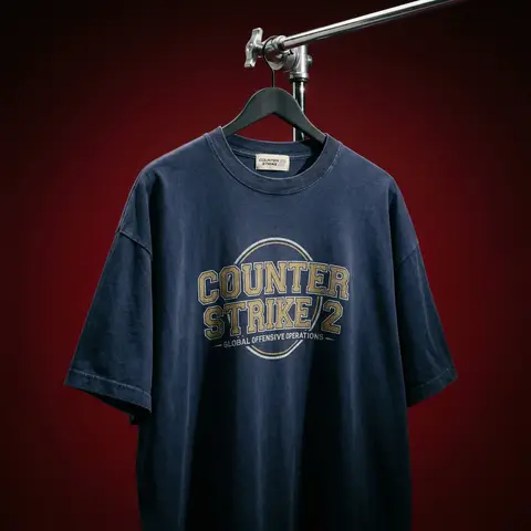
Cinematic Heavyweight T-Shirt Merch Campaign

BRAND NAME. Act as a High-End Editorial Fashion Photographer specializing in dark, cinematic merch and streetwear product campaigns. PHASE 1: CONCEPT & OBJECT Photograph a single premium heavyweight cotton T-shirt hanging on a slim matte black clothing hanger. The hanger is suspended from an industrial chrome pipe rail with a visible mechanical clamp/hook fitting — the pipe enters the frame from the upper right corner at a diagonal angle, partially cropped by the frame. THE T-SHIRT: Oversized unisex silhouette, heavyweight garment-dyed cotton (320–380gsm equivalent). Color: autonomously determine the most iconic or culturally resonant base color associated with BRAND NAME — apply as a washed, slightly faded version (not factory-fresh, not overly distressed — editorial vintage). The shirt hangs with natural gravity drape — subtle wrinkles at the torso, slight fabric pull at the shoulders from the hanger. NOT ironed flat. NOT pinned. Pure natural hang. NECK LABEL: A small woven white label visible inside the back collar, folded slightly outward. The label reads BRAND NAME in fine serif or script typeface — small, understated, luxury. CHEST GRAPHIC: Autonomously design a chest-centered screen-print graphic that reflects BRAND NAMEs visual identity and cultural world. The graphic must follow this construction logic: - Style: Vintage varsity / retro sports circular badge OR editorial script lettering — the aesthetic that best fits BRAND NAMEs DNA - Technique: Screen-print appearance — ink sits ON the fabric, visible halftone texture at edges, slight cracking on the darkest ink areas (authentic vintage wear) - Color: 2–3 colors maximum. Autonomously determine the palette based on BRAND NAMEs iconic colors + white outline/stroke - Content: BRAND NAME wordmark or monogram rendered in the chosen style. Add one short sub-line of text (4–6 words) that captures BRAND NAMEs ethos or cultural reference - Scale: Graphic occupies ~35–40% of the shirts chest area PHASE 2: LIGHTING Single dominant key light: large softbox positioned front-left, elevated at 40 degrees above subject — Rembrandt lighting logic. This creates: - Strong illumination on the LEFT side of the shirt - The graphic/print fully lit and readable - RIGHT side falls into deep natural shadow (no fill light) - Hanger hardware catches a sharp specular highlight Color temperature: 4200K — slightly warm, tungsten-adjacent. No rim light. No background light. No lens flare. The shadow IS the aesthetic — do not fight it. Global Illumination: subtle bounce from the lit shirt face back onto the immediate background only. PHASE 3: BACKGROUND & ATMOSPHERE Seamless cyclorama backdrop: deep, saturated single-color gradient. Autonomously select the background color that creates maximum dramatic contrast with BRAND NAMEs shirt color while staying within a dark, moody palette — deep crimson, oxblood, prussian blue, forest shadow, noir charcoal. Vignette: strong radial darkening toward all four corners — center is 30% brighter than edges. No texture. No grain on BG. The background reads as infinite depth. PHASE 4: COMPOSITION & CAMERA Orientation: Portrait, 4:5 ratio. Camera angle: Slightly below eye-level, looking up 8–12 degrees — gives the garment presence and weight Framing: T-shirt occupies 70–75% of frame. Bottom hem is cropped slightly. Sleeve tips reach near frame edges. Hanger pipe enters from upper-right, cropped at frame edge. The hook/clamp mechanism is fully visible — its a design element. Rotation: Entire composition tilts 4–6 degrees counter-clockwise. Depth of Field: f/5.6 equivalent — entire shirt in sharp focus, background at soft focus threshold (not bokeh blurred — just atmospheric depth). Macro detail on fabric weave visible. TECH SPECS Render/Capture style: Photorealistic — NOT CGI render aesthetic. Must read as actual studio photography. Fabric texture: Individual cotton weave threads visible on the lit areas. Pilling micro-texture on surface. Subsurface light interaction on thick fabric ridges. Print texture: Screen-print ink layer has tactile presence — slightly raised, edge halftone dots, micro-cracking in dark fills. No AI plastic sheen on fabric. No oversaturated colors. No symmetrical composition. No ghost mannequin. No flat lay. Resolution: 4096 x 5120px. Post: Subtle film grain (ISO 800 equiv.), slight desaturation (-8), lifted blacks (cinematic), neutral-warm color grade. Style references: Undercover FW campaigns, Raf Simons archive product shots, Stüssy × Our Legacy editorials, Highsnobiety product features. NEGATIVE: No model wearing the shirt. No white background. No floating hanger (hardware must be attached to visible pipe). No CGI fabric simulation. No overly bright studio look.

durs.ai
Professional Character Design Turnaround Sheet
3DЗураг

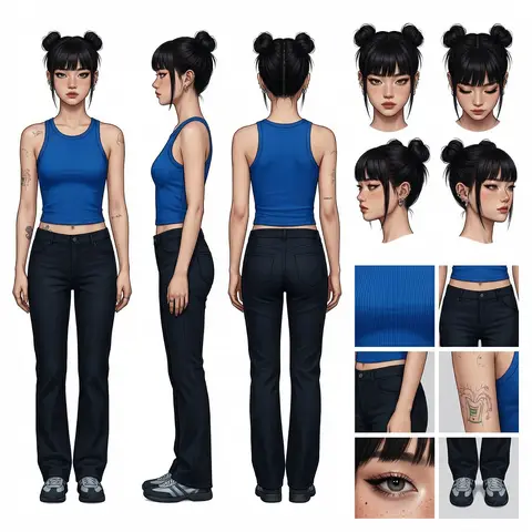
Professional Character Design Turnaround Sheet

A high-definition, clean, minimalist character design board / character turnaround reference sheet, set against a pure white background. The overall presentation should resemble a professional game art character modeling sheet, fashion design reference page, character design sheet, or character turnaround board. The layout should be neat and well-organized, with clearly divided information sections, a realistic and premium visual quality, consistent lighting, and strict character consistency throughout. On the left side of the composition, show the character’s full-body three-view turnaround, occupying the main visual area, including: 1. Front full-body standing pose 2. Left-side full-body standing pose 3. Back full-body standing pose All three figures must be the exact same character, with identical facial features, hairstyle, clothing, body shape, and height proportions. The standing pose should feel natural, with both arms hanging naturally at the sides. This should be suitable as a character modeling reference. The camera angle should be eye level, with neutral studio lighting, no obstruction, no exaggerated perspective, and no complex background. The right side of the composition should be divided into two sections: In the upper-right section, place six headshot / head-angle reference images of the same character, arranged neatly to show different head perspectives, including: - Front-facing portrait - Slight downward angle showing the top of the head - Back of the head / rear head view - Left-side facial profile - A near-side-angle comparison view (this line was slightly unclear in the source and may not be exact) - 3/4 profile portrait The head references should have clear facial features, visible hair parting, and consistent facial structure, making them suitable as head design references. In the lower-right section, place six close-up detail images of the character, arranged into a clean grid, showing key design details, including: - Close-up of the upper garment fabric texture - Front close-up of the lower-body clothing - Close-up of the hip / tailoring detail - Close-up of the leg or skin texture detail - Close-up of the eyes or facial feature details - Full close-up of the shoes as a standalone item All detail images must match the main character’s outfit and appearance exactly. Materials should look realistic, and the details should be clean and precise, suitable as clothing and accessory modeling references. Overall style requirements: Minimalist, professional, realistic, unified, clean, and premium, similar to a character design board, fashion design reference sheet, 3D character modeling reference page, or character turnaround presentation board. The character edges should be sharp, garment shapes should be clearly defined, hair strands should appear natural, skin should look refined, and material rendering should be accurate. The overall layout should have generous white space, as if it were made by a professional concept art team. Character setup: Character appearance description Output requirements: Landscape composition, white background, full character visible, no cropping, no extra props, no explanatory text, no logo, no watermark, no UI interface elements, no like/save buttons, and no social-media-screenshot appearance.

durs.ai
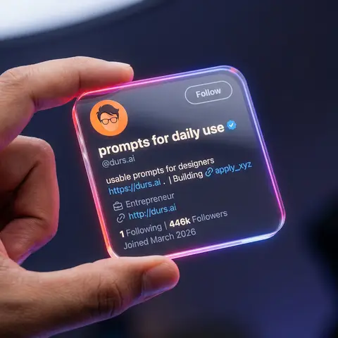
Transparent Glass Social Media Profile Card
3DЗураг

Transparent Glass Social Media Profile Card

Close-up shot of a human hand holding a square, transparent acrylic/glass-like social media profile card in mid-air. Dark studio background, softly blurred, with subtle blue-purple ambient light. Very shallow depth of field (f/1.8), only the glass card and fingers are in sharp focus, with heavy bokeh background. Scene & Atmosphere Environment: Dark studio (#0c0f19), vignette edges, subtle blue-purple ambient light Mood: Futuristic, tech, premium, clean UI, social media identity card Camera: Macro lens (85mm equivalent), f/1.8, 8K ultra-realistic rendering Transparent Card Design Material: Transparent acrylic/glass (transparency 0.92, IOR 1.5, roughness 0.05) Shape: Perfect rounded square (corner radius 10-16px), 3-5mm thickness Edge Glow: Strong neon gradient - linear-gradient(135deg, #ff4d4d, #ff7de3, #8a5dff, #41c3ff) Held By: Realistic human hand, thumb on front-left edge, warm skin tone UI Layout Header: - Avatar: Circular, top-left, flat illustration style (orange background, dark hair, glasses) - Username: nanoprompts ▲ - Bold rounded sans-serif, near-white color - Verified Badge: Blue (#1D9BF0), next to username - Handle: @promptslab - Below username, color #d0d6e5 - Follow Button: Top-right, transparent/glassy, 1px solid #ffffff99 border Body: - Description: 100+ Free AI Prompts & Workflows for Nano Banana Image Generation - Link: https://nanoprompts.org . | Building 🔗apply_xyz (color #5da7ff) - Meta: Profession icon + Entrepreneur - Website: http://rehanuds.framr.website Footer Stats: - 135 Following | 446 Followers - Joined May 2025 (color #ffffff66) Lighting Main Light: Softbox from top-left/front-left, 5200-5600K cool white Rim Light: Neon edge emission, strong on corners Background: Dark with extra glow (#3e4fff33), round bokeh (#283759) Avoid No extra hands, distorted fingers, low-res text, fingerprints, watermarks, or cropped buttons

durs.ai
Polished Steel Peony Product Photography
LogoЗураг

Polished Steel Peony Product Photography

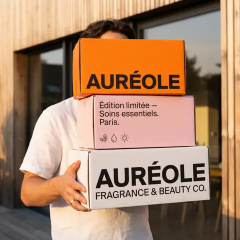
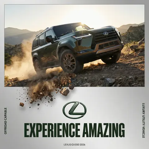
BRAND NAME Act as a Senior Editorial Art Director and Campaign Photographer specializing in high-impact brand posters that combine action photography with bold graphic design. Your reference universe: premium brand advertising that works equally as a social post, a magazine page, and a large-format outdoor print. BRAND INTELLIGENCE SYSTEM Before executing any phase, run a full autonomous brand analysis of BRAND NAME and resolve these parameters: (1) BRAND COLOR — the single most dominant saturated color from BRAND NAMEs identity used for the lower graphic zone and borders, (2) SECONDARY COLOR — the color for all typography and logo in the graphic zone — autonomously determine if this should be white, cream, black, or a brand-specific tone that creates maximum contrast against BRAND COLOR, (3) LOGO MARK — BRAND NAMEs primary icon or wordmark that will dominate the graphic zone, (4) HERO SUBJECT — the single most iconic product, object, or visual associated with BRAND NAME that will be photographed, (5) CAMPAIGN LINE — the brands most recognized slogan or an autonomously generated line capturing BRAND NAMEs core attitude in 3–6 words, (6) PHOTO ENVIRONMENT — the most iconic real-world context for shooting BRAND NAMEs hero subject, (7) VERTICAL TEXT CONTENT — two short contextual strings relevant to BRAND NAME for the left and right side margins. All parameters must be resolved before phase 1 begins. PHASE 1: CANVAS & FORMAT Vertical format, 4:5 ratio. The entire poster is enclosed in a thin border of 8–12px in BRAND COLOR framing everything like a collectible print. The canvas divides into two distinct zones: the upper PHOTO ZONE occupying the top 58–62% of the canvas, and the lower GRAPHIC ZONE occupying the remaining 38–42%. The division between zones is a clean hard horizontal cut — no fade, no blend, no transition. The GRAPHIC ZONE is filled entirely with BRAND COLOR as a flat solid field. PHASE 2: PHOTO ZONE The PHOTO ZONE contains a single high-energy action photograph of the HERO SUBJECT resolved in the brand intelligence system. Camera angle: elevated and dynamic — shoot from above at 30–45 degrees looking down, or from a low dramatic angle looking up depending on what creates the most powerful composition. Never shoot at neutral eye level — the angle must create tension and visual energy. The photograph fills the entire PHOTO ZONE edge to edge with no padding. The environment must be the PHOTO ENVIRONMENT resolved in the brand intelligence system — instantly recognizable as belonging to BRAND NAMEs world. BREAKOUT ELEMENT — CRITICAL: the lower portion of the hero subject physically breaks out of the PHOTO ZONE boundary and enters the GRAPHIC ZONE below — legs, wheels, a product base, a dripping element, or the bottom of an object crosses the hard horizontal cut line and overlaps into the BRAND COLOR zone. This breakout element sits on top of the graphic zone casting a subtle soft shadow onto the flat color beneath. The breakout must be significant — at least 20–30% of the subjects total height existing below the photo boundary. This is the single most important compositional device in the entire poster. PHASE 3: GRAPHIC ZONE The lower zone is a flat solid BRAND COLOR field. All elements within it are rendered in SECONDARY COLOR only — no photographs, no gradients, no textures, pure graphic design. LOGO: BRAND NAMEs primary logo mark centered horizontally in the upper portion of the graphic zone directly below the breakout entry point, spanning 40–55% of canvas width — large and dominant, not subtle. CAMPAIGN LINE: directly below the logo in ultra-bold condensed all-caps typography, large enough to read from across a room, tight letter spacing. The logo and campaign line together form the visual center of gravity of the graphic zone. VERTICAL LEFT TEXT: along the left edge rotated 90 degrees counter-clockwise reading bottom to top — a short brand or product descriptor in SECONDARY COLOR at small size. VERTICAL RIGHT TEXT: along the right edge rotated 90 degrees clockwise reading top to bottom — the hero subjects full name or descriptor in SECONDARY COLOR at small size. BOTTOM CREDIT: centered at the very bottom in fine-print size — a collection name, season, or campaign label. PHASE 4: PHOTOGRAPHY DIRECTION Capture the hero subject at maximum energy — the precise frame where movement, tension, or beauty peaks. For a person: mid-motion at full commitment to the action. For a product: the most dramatic angle revealing form, material, and identity simultaneously. For food: the moment of pour, cut, steam, or impact. For automotive: speed blur, drift, or heroic three-quarter angle. Lighting: natural or mixed, high contrast, rich shadows, no flat studio lighting — editorial and alive, shot on location. Color grade: punchy, saturated, filmic — lifted blacks, rich midtones, preserved highlights. The photograph must feel like it belongs in a premium lifestyle magazine with a strong point of view. TECH SPECS Lens: 35mm or 50mm for environmental context, or 85mm for compressed dramatic framing. Depth of field: subject sharp, background contextual at f/4 to f/8. Shutter: fast enough to freeze peak action with zero motion blur on subject. Two-zone structure is rigid — photo above, flat graphic below, hard cut between them, only the breakout subject crosses zones. Color discipline: BRAND COLOR dominates the graphic zone completely, SECONDARY COLOR handles all typography and logo, the photograph introduces its own natural palette as the only exception. Typography: condensed, bold, authoritative — no decorative fonts. Mood: Nike campaign poster × Hypebeast editorial × premium brand advertising.

durs.ai
Country Infographic Editorial Poster
PosterЗураг

Country Infographic Editorial Poster

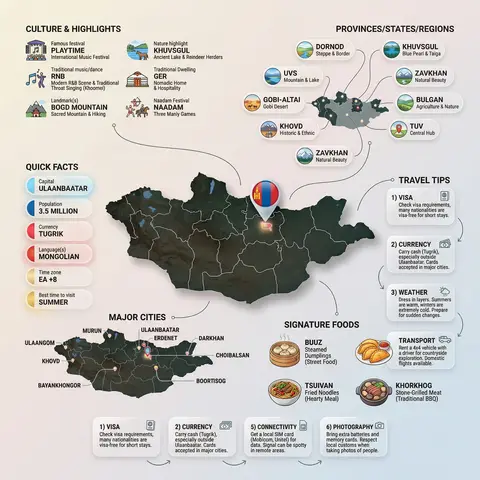
Ultra-clean modern country infographic poster (1080x1080), premium editorial layout meets lifestyle travel photography. Showcase Country as the hero visual in the center: a slightly angled 3D map cutout / glossy paper-cut map silhouette with subtle shadow, with a small flag pin marker on the capital city. Add a soft natural studio lighting feel, gentle gradient + minimal texture background for an upscale magazine look. Around the hero map, arrange information like a recipe infographic—dynamic, floating panels and clusters, not restricted to top-down. Clear hierarchy: hero map > key stats badges > cities/provinces > culture/foods > tips. SECTION 1 — Quick Facts (clean glassmorphism badges near the hero): - Capital: CAPITAL - Population: POPULATION - Currency: CURRENCY - Language(s): LANGUAGES - Time zone: TIMEZONE - Best time to visit: BEST SEASON Display as modern rounded pills/bubbles with accent color highlights. SECTION 2 — Provinces/States/Regions (ingredients-style clusters): List NUMBER provinces/regions with mini icons/mini map segments or simple pictograms. Example: PROVINCE 1, PROVINCE 2, PROVINCE 3... Each item includes a small icon (mountains, river, desert, forest, coastline) and one short label (e.g., “coastal”, “historic”, “wine region”). Arrange in curved flows connected with thin lines to the map. SECTION 3 — Major Cities (connected pin points): Show 5–8 key cities with small pin markers on/near the map and clean labels: City 1, City 2, City 3... Use lines/arrows from labels to map pins, avoiding clutter. SECTION 4 — Signature Foods (recipe vibe): Show 4–6 famous foods of COUNTRY with small tasty mini illustrations or photo-style cutouts: Food 1, Food 2, Food 3... Add short descriptors (spicy, street food, dessert, grilled). Keep vibrant natural food colors. SECTION 5 — Culture & Highlights (editorial callouts): Include icons and 1-line notes for: - Famous festival: FESTIVAL - Traditional music/dance: CULTURE - Landmark(s): LANDMARKS - Nature highlight: NATURE Use clean vector icons and minimal text. SECTION 6 — Travel Tips (step-like numbered panels): Show 4–6 numbered “tips” panels arranged around the hero map with arrows showing flow: 1) Tip 1 2) Tip 2 3) Tip 3 Add small icons (plane, train, hotel, safety, budget, camera, SIM card). Use glassmorphism panels with soft gradients and subtle drop shadows. Typography & Style: Modern sans-serif typography, high readability, strong grid alignment, airy negative space, subtle shadows, crisp vector icons, accent color palette inspired by COUNTRY flag (tasteful, not overwhelming). Editorial, premium, ultra-clean, social-feed optimized. Output requirements: Ultra-crisp, no watermark, no logo, no extra text beyond the provided labels, balanced spacing, high contrast readability, 1080×1080.

durs.ai
Industrial X-Ray Transparency Product Render
3DЗураг

Industrial X-Ray Transparency Product Render

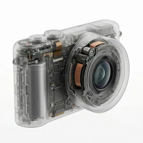
visual_style_analysis_v2: style_definition: name: Industrial X-Ray Transparency Render, core_aesthetic: Minimalist, Futuristic, Clinical Precision, Structural Functionalism , visual_logic: Exploded view aesthetics within a closed shell , color_system: palette_type: Monochromatic Grayscale with Metallic Accents, background: #F5F5F5 to #FFFFFF (Clean Studio White), foreground: outer_shell: Frosted Translucent White/Grey, inner_components_primary: Matte Black/Dark Graphite, inner_components_secondary: Metallic Silver/Copper, highlights: Soft Specular Highlights , internal_component_architecture: description: Hierarchy of internal parts to create realistic density, layer_1_structure_skeleton: elements: Injection molding ribs, screw bosses, mounting brackets, visual_role: Defines the shape and adds ghostly lines inside the shell , layer_2_power_drive: elements: Cylindrical/Pouch Batteries, Copper Coils, Transformers, Magnets, visual_role: Provides visual weight and dense black masses , layer_3_logic_control: elements: Printed Circuit Boards (PCB), Solder points, Silicon Chips, Ribbon Cables, visual_role: Adds intricate, fine detail and technical texture , layer_4_interface: elements: Tactile switches, USB-C ports, LED indicators, haptic motors, visual_role: Connects the inside to the outside surface , lighting_and_atmosphere: lighting_type: Backlit Clinical Studio, characteristics: Transmissive Glow, Rim Lighting to define edges, Soft Ambient Occlusion inside , materials_and_textures: shell_material: Frosted Polycarbonate (PC) with 85% opacity, internal_finish: Matte vs Glossy contrast (components are glossy, shell is matte), x_ray_effect: Depth-based opacity (thicker parts look darker) , demonstration_example: product_type: Pro Game Controller / Precision Tool, prompt_application: Show rumble motors (weights), battery pack in center, ribbon cables connecting triggers, complex PCB under buttons , ai_prompt_keywords_suggestion: X-ray render, translucent frosted shell, visible internal engineering, layered internal components, complex circuitry, copper coils and batteries, structural ribbing, C4D octane render, industrial exploded view, schematic realism

durs.ai
NOVA Pure Sound Wireless Earbuds Premium Ad
PosterЗураг

NOVA Pure Sound Wireless Earbuds Premium Ad

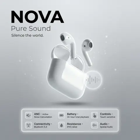
prompt: brand: <b>NOVA</b>, title: Pure Sound, tagline: Silence the world., visual_style: composition: minimalist product ad, Apple-style premium aesthetic, background: soft gray gradient with subtle noise texture, ambient light particles or micro-gradient overlays to gently fill negative space without clutter, lighting: high-end studio lighting, soft rim light, gentle catchlights, negative_space: balanced asymmetry with subtle decorative elements (soft gradient orbs, faint geometric lines) to occupy empty areas while preserving clean minimalism , product: name: NOVA Pure Sound Wireless Earbuds, specifications: finish: matte black anodized aluminum, design: ergonomic in-ear fit, seamless unibody construction, features: Active Noise Cancellation (ANC), Bluetooth 5.3 connectivity, 30-hour battery life with charging case, IPX5 water resistance, Touch-sensitive controls, Spatial audio support , dimensions: Earbud: 2.1g each | Case: 45g , placement: centered, floating slightly above surface with subtle drop shadow , specifications_ui: container_style: glass morphism panel, icon_style: effect: frosted glass blur (14px), soft white border glow, subtle inner shadow for depth, background: rgba(255,255,255,0.1) with backdrop-filter blur, layout: icons arranged in a responsive grid beneath product, evenly spaced with gentle hover elevation , specs: icon: 🔇, label: ANC, value: Active Noise Cancellation, tooltip: Block out distractions, immerse in pure sound , icon: 📡, label: Connectivity, value: Bluetooth 5.3, tooltip: Stable, low-latency wireless connection , icon: 🔋, label: Battery, value: 30-hour total playback, tooltip: All-day power with compact charging case , icon: 💧, label: Resistance, value: IPX5 rated, tooltip: Sweat and splash resistant for active lifestyles , icon: 👆, label: Controls, value: Touch-sensitive, tooltip: Intuitive gestures for music, calls, and voice assistant , icon: 🔊, label: Audio, value: Spatial Audio, tooltip: Immersive 3D soundstage with dynamic head tracking , ui_elements: accent_icon: style: glass morphism, description: translucent frosted-glass icon with subtle blur, soft white border glow, floating near product, symbol: abstract soundwave or minimalist earbud silhouette, effect: background blur: 12px, opacity: 0.85, inner shadow for depth , typography: brand_font: bold, ultra-clean sans-serif (e.g., SF Pro Display Bold), body_font: light weight, high legibility, color: charcoal black / soft white contrast, hierarchy: brand prominent, tagline subtle, specs clean and scannable , mood: premium, serene, technologically sophisticated, output_format: ultra-high-resolution, 4K, photorealistic render with shallow depth of field
durs.ai
Y2K Japanese Bootleg Movie Poster Harajuku Streetwear Art
PosterЗураг

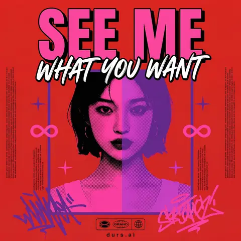
Y2K Japanese Bootleg Movie Poster Harajuku Streetwear Art

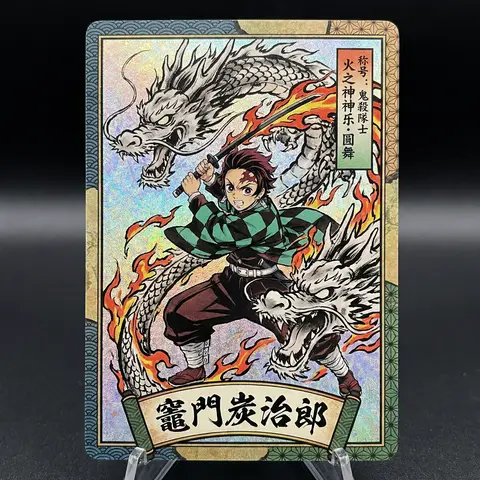
Act as a Senior Vector Graphic Designer specializing in Y2K Japanese streetwear poster art. Your aesthetic universe: Tokyo bootleg culture, early 2000s remix zines, retro-futuristic sticker posters, Harajuku streetwear graphics. INPUT VARIABLES — resolve before executing: MOVIE TITLE — the main title text, split across two lines if needed SUBTITLE / TAGLINE — secondary brushstroke-style script line REFERENCE PHOTO — a portrait/face image to be treated with split duotone halftone effect PRIMARY COLOR — dominant background color (e.g. signal red) ACCENT COLOR 1 — warm saturated pop color for title text (e.g. electric yellow) ACCENT COLOR 2 — cool secondary duotone tone (e.g. deep violet/purple) CREDITS LINE — small uppercase cast/crew text at the bottom PHASE 1 — CANVAS Portrait format (3:4 ratio). Background: flat solid PRIMARY COLOR. No texture, no gradient, completely clean. PHASE 2 — CENTRAL IMAGE Place REFERENCE PHOTO as a large centered portrait cropped from chest up, framed with a thin flat border. Apply a split duotone halftone effect: left half of face tinted in ACCENT COLOR 1 right half in ACCENT COLOR 2. The halftone dot pattern must be visible and graphic — flat, no blur, no photographic rendering. The image feels like a screen-printed bootleg. PHASE 3 — LETTERING MOVIE TITLE LINE 1 — massive bold condensed display type, full poster width, flat ACCENT COLOR 1 fill, thick dark extrusion offset down-right. Dominates the top of the poster. MOVIE TITLE LINE 2 — large brushstroke handwritten script style, flat white, bold dark outline, overlapping the portrait frame creating z-depth — sits both in front of the photo and behind the top title. PHASE 4 — Y2K SIGNATURE ELEMENTS Infinity symbols (∞) flanking the portrait frame, flat ACCENT COLOR 1 4-point crosshair stars — thin elegant accent marks scattered at key intersections Loose scribble strokes — energetic hand-drawn loops in ACCENT COLOR 2 and pink/magenta at bottom corners, like marker graffiti Side column micro-text — two narrow columns of lorem-style body text in tiny white type flanking the portrait, left and right — creates editorial zine structure Bottom logo bar — 2–3 fictional brand stamps in bold caps + a globe icon ACCENT COLOR 1 CREDITS LINE in small tight uppercase tracking across the very bottom TECH SPECS Flat vector only. Zero gradients, zero drop shadows, zero blur. Maximum 5 colors: PRIMARY ACCENT 1 ACCENT 2 white, near-black. All outlines thick and clean. The poster must feel like a collectible bootleg silkscreen print — part movie poster, part Harajuku sticker sheet, part underground zine cover. Mood: a Tokyo graphic designer obsessed with this film stayed up all night and made the most unhinged fan poster ever printed.

durs.ai
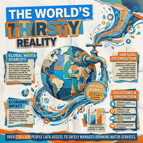
Collage Infographic Blue Orange Paper Cut Editorial Poster
PosterЗураг

Collage Infographic Blue Orange Paper Cut Editorial Poster

A modern collage-style infographic poster with a textured paper background (slightly crumpled, off-white). The design uses bold cut-out shapes, layered elements, and a mix of blue and orange color blocks for strong contrast. At the top, include large bold headline text in a cutout style: MAIN HEADLINE PART 1 (on colored rectangle) MAIN HEADLINE PART 2 (overlapping layered style) MAIN HEADLINE PART 3 (secondary emphasis) In the center, place a large surreal object: MAIN VISUAL OBJECT (e.g., water tap, machine, globe, etc.) The object should be oversized, slightly collage-style, with paper cut edges and shadow Add dynamic element: FLOW EFFECT (e.g., water flowing, energy lines, particles) Surrounding the main visual, include multiple information boxes with headings: 🔹 Left section: SECTION TITLE 1 PARAGRAPH 1 🔹 Right section: SECTION TITLE 2 PARAGRAPH 2 🔹 Bottom left: SECTION TITLE 3 PARAGRAPH 3 🔹 Bottom right: SECTION TITLE 4 Bullet points: POINT 1 POINT 2 POINT 3 POINT 4 Add a small chart/graph element: CHART DESCRIPTION (e.g., bar chart, stats comparison) Add a highlighted label or sticker: HIGHLIGHT TEXT (e.g., “Fun Facts!”) At the bottom, include a bold fact strip: BOTTOM FACT TEXT Add extra collage elements like: torn paper edges small illustrations/icons (e.g., DECORATIVE ELEMENTS) overlapping shapes and textures Style: editorial infographic, collage design, bold typography, cut-and-paste aesthetic, paper texture, modern activism poster, high contrast (blue + orange), grainy print effect, 4K quality.

durs.ai