durs.ai
Prompt library

Prompts that work

Ready-made prompts for ads, logos, posters, 3D and more. Use one in a tap — or share your own.

+ Add a prompt
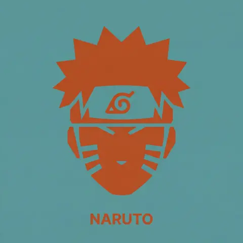
Duotone Character Face Icon
PosterPhoto

Duotone Character Face Icon

A single, isolated, strict duotone flat vector icon representing the face of CHARACTER NAME or IMAGE. CONTENT SCOPE (FACE ONLY): The design must represent ONLY the head, face, or helmet of CHARACTER . Absolutely NO shoulders, torso, weapons, or accessories. DYNAMIC DUOTONE COLOR PALETTE (MATERIAL DESIGN): The entire image must use strictly ONLY TWO solid, flat colors chosen by the AI based on the characters lore, allegiance, or iconic appearance. 1. Background Theme Color: A moderate, pleasing solid flat color covering the entire canvas. 2. Foreground Theme Color: A second solid flat color used for the icon shape and the text, chosen to contrast well with the background. Aesthetic Constraint: The colors must be chosen from a Google Material Design aesthetic—moderate hues, matte finish, pleasing to the eye, avoiding overly harsh saturation or neon tones. No gradients, shadows, or outlines. STYLE & TECHNIQUE (BRUTAL MINIMALISM): The style is brutal geometric minimalism with high abstraction. Reduce facial features to their most basic, blocky, angular shapes. Use large, solid masses of the Foreground Theme Color to define the form. Internal details (eyes, mouth, key features) must be formed solely by bold, blocky cuts of the Background Theme Color negative space into the foreground silhouette. The icon must be a free-floating silhouette with NO enclosing circle, border, or container shape. BACKGROUND: The background is filled entirely with the solid, flat Background Theme Color. TYPOGRAPHY (CRITICAL CONSTRAINTS): Directly below the floating icon, placed centrally, is the name CHARACTER . 1. FONT FAMILY (STRICT): The text MUST be rendered in the style of the font Inter Bold. Do NOT use any other font. 2. CASE & COLOR: Title case only. The text color must exactly match the solid Foreground Theme Color. 3. SIZE & SCALE (STRICT): The text must be very small. The total width of the entire text string must NOT exceed 25% of the total image width. 4. KERNING: Maintain very tight negative kerning (approx -8%).

durs.ai
Brand Logo Mashup Visual Parody Design
LogoPhoto

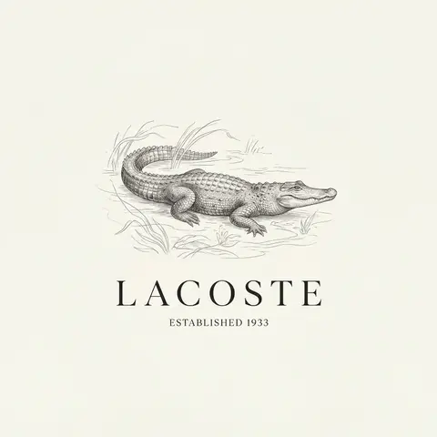
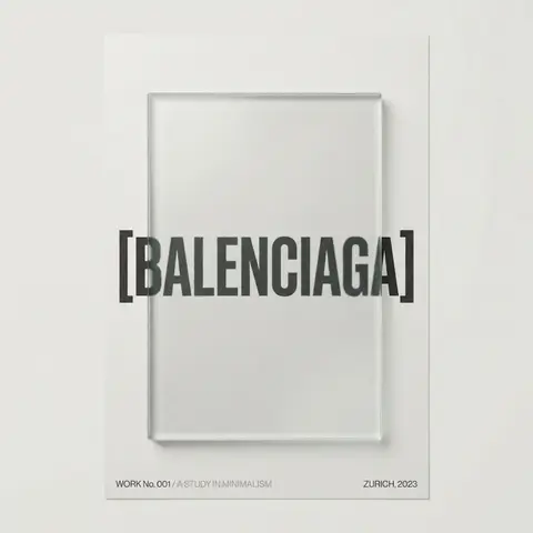
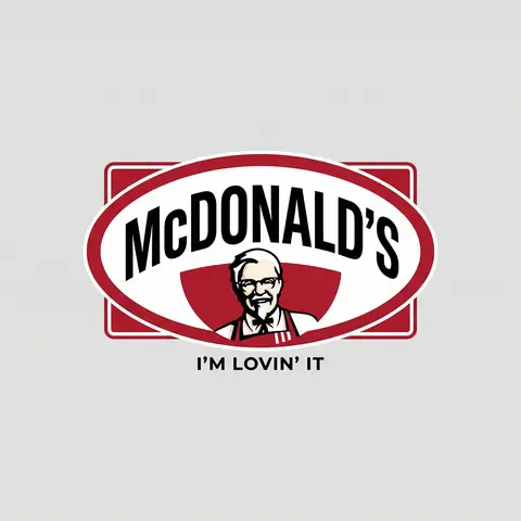
Brand Logo Mashup Visual Parody Design

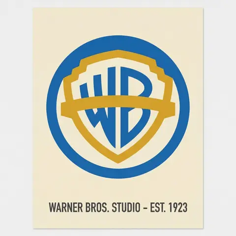
BRAND A + BRAND B. Act as a Brand Identity Designer specializing in Logo Mashups and Visual Parody. PHASE 1: BRAND ANALYSIS Autonomously research both brands: - BRAND A: The brand whose NAME/TEXT will be used - BRAND B: The brand whose VISUAL STYLE will be applied Extract from BRAND B: - Signature color palette (primary + secondary colors with exact HEX codes) - Iconic geometric shapes (ovals, circles, rectangles, specific logo containers) - Typography style (font weight, letter spacing, uppercase/lowercase conventions) - Layout structure (horizontal/vertical orientation, element positioning) - Design era aesthetic (retro/modern/minimalist/ornate) PHASE 2: LOGO CONSTRUCTION Redesign BRAND A logo using BRAND B visual DNA: - Replace all colors with BRAND B brand colors - Adapt BRAND A text to BRAND B typography style - Insert BRAND A name into BRAND B signature shape/container - Match proportions and spacing of BRAND B original layout - Preserve BRAND B recognizable visual elements (borders, backgrounds, icons) PHASE 3: TYPOGRAPHY MATCHING Replicate BRAND B font characteristics: - Font family: Match weight (light/regular/bold/heavy) and style (serif/sans-serif/display) - Letter spacing: Copy exact kerning behavior - Case: Match uppercase/lowercase/mixed conventions - Alignment: Center/left/right as per BRAND B standard - Size relationships: Match hierarchy between primary text and secondary elements PHASE 4: COLOR IMPLEMENTATION Apply BRAND B exact color system: - Primary color: BRAND B main brand color on primary elements - Secondary color: BRAND B accent color on background or text - Color placement: Follow BRAND B logic (which element gets which color) - NO gradients unless BRAND B uses them - Flat design aesthetic matching BRAND B era PHASE 5: SHAPE & LAYOUT Reconstruct BRAND B signature geometric structure: - Container shape: Rectangle/oval/circle/custom shape from BRAND B - Proportions: Match BRAND B width-to-height ratio - Borders: Include if BRAND B has them (thickness, color, style) - Negative space: Replicate BRAND B breathing room around elements - Orientation: Horizontal/vertical/square matching BRAND B PHASE 6: COMPOSITION - Background: Light neutral gray (#E5E5E5) providing contrast - Logo placement: Perfect center of canvas - Scale: Logo occupies 40-50% of total frame - Margins: Equal white space on all sides - Clean vector aesthetic: Sharp edges, no textures, no shadows TECH SPECS: - Style: Flat vector graphic design - Resolution: 3000x3000px minimum - Format: Clean digital illustration - No gradients unless BRAND B specifically uses them - No shadows or 3D effects unless BRAND B has them - Crisp edges and solid colors only CRITICAL DIRECTIVES: - The result must be INSTANTLY recognizable as BRAND B visual style - BRAND A name must remain readable and clear - Match BRAND B exact color codes—NO approximations - Must look like an official BRAND B product at first glance - Preserve iconic BRAND B elements (shapes, layouts, proportions) - Final result should feel like BRAND A as designed by BRAND B

durs.ai
Professional Character Design Turnaround Sheet
3DPhoto

Professional Character Design Turnaround Sheet

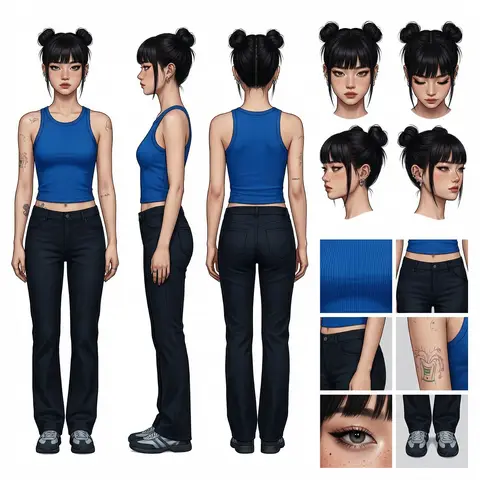
A high-definition, clean, minimalist character design board / character turnaround reference sheet, set against a pure white background. The overall presentation should resemble a professional game art character modeling sheet, fashion design reference page, character design sheet, or character turnaround board. The layout should be neat and well-organized, with clearly divided information sections, a realistic and premium visual quality, consistent lighting, and strict character consistency throughout. On the left side of the composition, show the character’s full-body three-view turnaround, occupying the main visual area, including: 1. Front full-body standing pose 2. Left-side full-body standing pose 3. Back full-body standing pose All three figures must be the exact same character, with identical facial features, hairstyle, clothing, body shape, and height proportions. The standing pose should feel natural, with both arms hanging naturally at the sides. This should be suitable as a character modeling reference. The camera angle should be eye level, with neutral studio lighting, no obstruction, no exaggerated perspective, and no complex background. The right side of the composition should be divided into two sections: In the upper-right section, place six headshot / head-angle reference images of the same character, arranged neatly to show different head perspectives, including: - Front-facing portrait - Slight downward angle showing the top of the head - Back of the head / rear head view - Left-side facial profile - A near-side-angle comparison view (this line was slightly unclear in the source and may not be exact) - 3/4 profile portrait The head references should have clear facial features, visible hair parting, and consistent facial structure, making them suitable as head design references. In the lower-right section, place six close-up detail images of the character, arranged into a clean grid, showing key design details, including: - Close-up of the upper garment fabric texture - Front close-up of the lower-body clothing - Close-up of the hip / tailoring detail - Close-up of the leg or skin texture detail - Close-up of the eyes or facial feature details - Full close-up of the shoes as a standalone item All detail images must match the main character’s outfit and appearance exactly. Materials should look realistic, and the details should be clean and precise, suitable as clothing and accessory modeling references. Overall style requirements: Minimalist, professional, realistic, unified, clean, and premium, similar to a character design board, fashion design reference sheet, 3D character modeling reference page, or character turnaround presentation board. The character edges should be sharp, garment shapes should be clearly defined, hair strands should appear natural, skin should look refined, and material rendering should be accurate. The overall layout should have generous white space, as if it were made by a professional concept art team. Character setup: Character appearance description Output requirements: Landscape composition, white background, full character visible, no cropping, no extra props, no explanatory text, no logo, no watermark, no UI interface elements, no like/save buttons, and no social-media-screenshot appearance.
durs.ai