durs.ai
Prompt library

Prompts that work

Ready-made prompts for ads, logos, posters, 3D and more. Use one in a tap — or share your own.

+ Add a prompt
Industrial X-Ray Transparency Product Render
3DPhoto

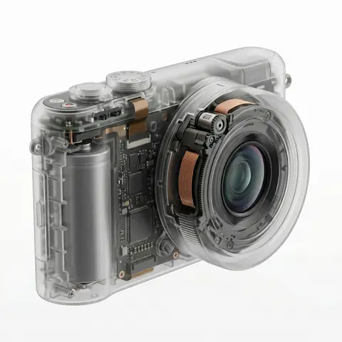
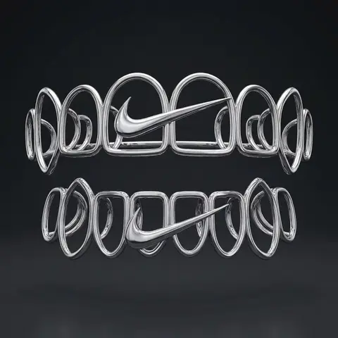
Industrial X-Ray Transparency Product Render

visual_style_analysis_v2: style_definition: name: Industrial X-Ray Transparency Render, core_aesthetic: Minimalist, Futuristic, Clinical Precision, Structural Functionalism , visual_logic: Exploded view aesthetics within a closed shell , color_system: palette_type: Monochromatic Grayscale with Metallic Accents, background: #F5F5F5 to #FFFFFF (Clean Studio White), foreground: outer_shell: Frosted Translucent White/Grey, inner_components_primary: Matte Black/Dark Graphite, inner_components_secondary: Metallic Silver/Copper, highlights: Soft Specular Highlights , internal_component_architecture: description: Hierarchy of internal parts to create realistic density, layer_1_structure_skeleton: elements: Injection molding ribs, screw bosses, mounting brackets, visual_role: Defines the shape and adds ghostly lines inside the shell , layer_2_power_drive: elements: Cylindrical/Pouch Batteries, Copper Coils, Transformers, Magnets, visual_role: Provides visual weight and dense black masses , layer_3_logic_control: elements: Printed Circuit Boards (PCB), Solder points, Silicon Chips, Ribbon Cables, visual_role: Adds intricate, fine detail and technical texture , layer_4_interface: elements: Tactile switches, USB-C ports, LED indicators, haptic motors, visual_role: Connects the inside to the outside surface , lighting_and_atmosphere: lighting_type: Backlit Clinical Studio, characteristics: Transmissive Glow, Rim Lighting to define edges, Soft Ambient Occlusion inside , materials_and_textures: shell_material: Frosted Polycarbonate (PC) with 85% opacity, internal_finish: Matte vs Glossy contrast (components are glossy, shell is matte), x_ray_effect: Depth-based opacity (thicker parts look darker) , demonstration_example: product_type: Pro Game Controller / Precision Tool, prompt_application: Show rumble motors (weights), battery pack in center, ribbon cables connecting triggers, complex PCB under buttons , ai_prompt_keywords_suggestion: X-ray render, translucent frosted shell, visible internal engineering, layered internal components, complex circuitry, copper coils and batteries, structural ribbing, C4D octane render, industrial exploded view, schematic realism
durs.ai
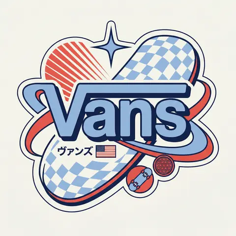
Y2K Japanese Streetwear Badge Sticker Vector Art
LogoPhoto

Y2K Japanese Streetwear Badge Sticker Vector Art

BRAND NAME Act as a Senior Vector Graphic Designer specializing in Y2K Japanese streetwear badge design. Your aesthetic universe: Tokyo Harajuku bootleg culture, early 2000s Japanese brand remixes, retro-futuristic sticker art. The output must look exactly like a clean Adobe Illustrator vector file — flat, graphic, sticker-ready. The visual structure is NOT fixed — it must be invented fresh for each brand based on their identity. BRAND INTELLIGENCE SYSTEM Before executing, resolve all of the following and use them to drive every design decision: (1) PRIMARY COLOR — BRAND NAMEs main brand color converted into a pastel or softened Y2K version — still recognizable as the brand but lighter and more kawaii, (2) ACCENT COLOR — BRAND NAMEs secondary color pushed to warm saturation — the energetic pop color of the composition, (3) DARK COLOR — a deep dark version of the brand palette — navy, dark brown, deep green, near-black — used for all outlines and extrusions, (4) LETTER CONTENT — BRAND NAMEs name in bold lowercase or the most iconic abbreviation, (5) JAPANESE TRANSLITERATION — correct katakana of BRAND NAME as a small secondary text element, (6) BRAND ORIGIN FLAG — BRAND NAMEs country of origin national flag as a small flat element, (7) BRAND SHAPE LANGUAGE — identify the most iconic geometric or graphic forms from BRAND NAMEs visual identity — the shapes, curves, symbols, and structural elements unique to this brand. These shapes become the orbital, background, and decorative elements of the badge — replacing generic ovals with brand-specific geometry, (8) BRAND CULTURAL SYMBOLS — identify 1–2 small iconic objects or symbols from BRAND NAMEs world that can be rendered as tiny flat illustrations within the badge — not the logo itself but objects associated with the brands universe, (9) COMPOSITION LOGIC — based on all resolved parameters above, autonomously design the structural layout of the badge. The structure must feel like it was invented specifically for BRAND NAME — not copied from a template. Ask: what shapes from this brands identity could orbit the letters? What geometry feels native to this brand? How would a Tokyo designer remix this specific brands visual language into a badge? PHASE 1: CANVAS 1:1 square canvas. Background: flat off-white or warm light grey. Completely empty. No texture. No gradient. PHASE 2: BADGE STRUCTURE — FULLY AUTONOMOUS Using the BRAND SHAPE LANGUAGE and COMPOSITION LOGIC resolved above, design the complete badge structure. The only fixed rules are: the badge must have a central lettering element, surrounding geometric shapes that interact with the letters through z-layer stacking, at least one element that passes both behind and in front of the letters creating depth, and the overall silhouette must read as a unified badge or patch shape. Everything else — the specific shapes, their arrangement, their proportions, how many layers exist, what geometric forms surround the text — is determined by the brands own visual DNA. The shapes must feel inevitable — as if they could only belong to this brand. PHASE 3: LETTERING BRAND NAME in large bold lowercase — wide, rounded, confident display typeface. Flat PRIMARY COLOR fill. Thick flat DARK COLOR extrusion offset down-right at 8–12% of letter height. Bold DARK COLOR outline. No gradients. No rendering. The letters are the anchor of the entire composition. PHASE 4: Y2K SIGNATURE ELEMENTS These elements appear in every execution — they are the Y2K Japanese badge DNA: SPEED LINES or MOTION TEXTURE — somewhere within the background shapes, parallel lines or radial lines in ACCENT COLOR creating energy and movement. 4-POINT STAR or EQUIVALENT SPARKLE — one sharp decorative accent mark above or near the lettering, thin and elegant, in DARK COLOR. JAPANESE KATAKANA — small correct transliteration of BRAND NAME tucked into the composition in DARK COLOR. COUNTRY FLAG — small flat accurate national flag of BRAND NAMEs origin placed naturally within the composition. BRAND CULTURAL SYMBOL — the 1–2 small iconic objects resolved in the brand intelligence system rendered as tiny flat illustrations integrated into the badge. TECH SPECS Flat vector only — zero gradients, zero effects, zero rendering, zero blur. Clean crisp edges throughout. Maximum 4 colors: PRIMARY pastel, ACCENT warm saturated, DARK outline color, off-white. The badge must feel like a collectible sticker or embroidered patch. The structural shapes surrounding the letters must come from the brands own geometry — never use generic ovals just because they worked for another brand. Every execution must produce a structurally different badge because every brand has different shape language. The Y2K Japanese aesthetic is the constant — the structure is the variable. Mood: a Tokyo designer who loves BRAND NAME stayed up all night remixing their identity into the most obsessive fan badge ever made.

durs.ai