Prompt library

Prompts that work

Ready-made prompts for ads, logos, posters, 3D and more. Use one in a tap — or share your own.

+ Add a prompt
Cinematic Heavyweight T-Shirt Merch Campaign
ProductPhoto

Cinematic Heavyweight T-Shirt Merch Campaign

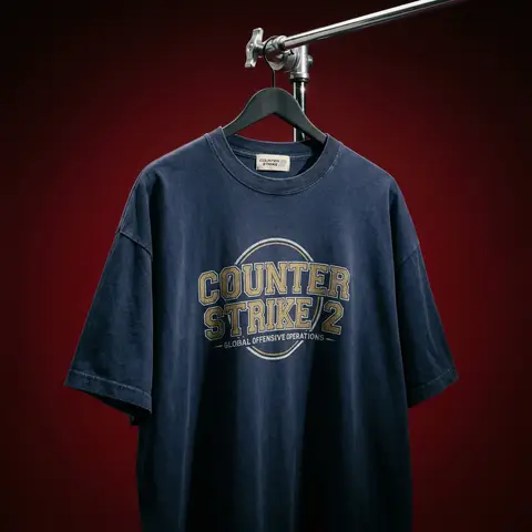
BRAND NAME. Act as a High-End Editorial Fashion Photographer specializing in dark, cinematic merch and streetwear product campaigns. PHASE 1: CONCEPT & OBJECT Photograph a single premium heavyweight cotton T-shirt hanging on a slim matte black clothing hanger. The hanger is suspended from an industrial chrome pipe rail with a visible mechanical clamp/hook fitting — the pipe enters the frame from the upper right corner at a diagonal angle, partially cropped by the frame. THE T-SHIRT: Oversized unisex silhouette, heavyweight garment-dyed cotton (320–380gsm equivalent). Color: autonomously determine the most iconic or culturally resonant base color associated with BRAND NAME — apply as a washed, slightly faded version (not factory-fresh, not overly distressed — editorial vintage). The shirt hangs with natural gravity drape — subtle wrinkles at the torso, slight fabric pull at the shoulders from the hanger. NOT ironed flat. NOT pinned. Pure natural hang. NECK LABEL: A small woven white label visible inside the back collar, folded slightly outward. The label reads BRAND NAME in fine serif or script typeface — small, understated, luxury. CHEST GRAPHIC: Autonomously design a chest-centered screen-print graphic that reflects BRAND NAMEs visual identity and cultural world. The graphic must follow this construction logic: - Style: Vintage varsity / retro sports circular badge OR editorial script lettering — the aesthetic that best fits BRAND NAMEs DNA - Technique: Screen-print appearance — ink sits ON the fabric, visible halftone texture at edges, slight cracking on the darkest ink areas (authentic vintage wear) - Color: 2–3 colors maximum. Autonomously determine the palette based on BRAND NAMEs iconic colors + white outline/stroke - Content: BRAND NAME wordmark or monogram rendered in the chosen style. Add one short sub-line of text (4–6 words) that captures BRAND NAMEs ethos or cultural reference - Scale: Graphic occupies ~35–40% of the shirts chest area PHASE 2: LIGHTING Single dominant key light: large softbox positioned front-left, elevated at 40 degrees above subject — Rembrandt lighting logic. This creates: - Strong illumination on the LEFT side of the shirt - The graphic/print fully lit and readable - RIGHT side falls into deep natural shadow (no fill light) - Hanger hardware catches a sharp specular highlight Color temperature: 4200K — slightly warm, tungsten-adjacent. No rim light. No background light. No lens flare. The shadow IS the aesthetic — do not fight it. Global Illumination: subtle bounce from the lit shirt face back onto the immediate background only. PHASE 3: BACKGROUND & ATMOSPHERE Seamless cyclorama backdrop: deep, saturated single-color gradient. Autonomously select the background color that creates maximum dramatic contrast with BRAND NAMEs shirt color while staying within a dark, moody palette — deep crimson, oxblood, prussian blue, forest shadow, noir charcoal. Vignette: strong radial darkening toward all four corners — center is 30% brighter than edges. No texture. No grain on BG. The background reads as infinite depth. PHASE 4: COMPOSITION & CAMERA Orientation: Portrait, 4:5 ratio. Camera angle: Slightly below eye-level, looking up 8–12 degrees — gives the garment presence and weight Framing: T-shirt occupies 70–75% of frame. Bottom hem is cropped slightly. Sleeve tips reach near frame edges. Hanger pipe enters from upper-right, cropped at frame edge. The hook/clamp mechanism is fully visible — its a design element. Rotation: Entire composition tilts 4–6 degrees counter-clockwise. Depth of Field: f/5.6 equivalent — entire shirt in sharp focus, background at soft focus threshold (not bokeh blurred — just atmospheric depth). Macro detail on fabric weave visible. TECH SPECS Render/Capture style: Photorealistic — NOT CGI render aesthetic. Must read as actual studio photography. Fabric texture: Individual cotton weave threads visible on the lit areas. Pilling micro-texture on surface. Subsurface light interaction on thick fabric ridges. Print texture: Screen-print ink layer has tactile presence — slightly raised, edge halftone dots, micro-cracking in dark fills. No AI plastic sheen on fabric. No oversaturated colors. No symmetrical composition. No ghost mannequin. No flat lay. Resolution: 4096 x 5120px. Post: Subtle film grain (ISO 800 equiv.), slight desaturation (-8), lifted blacks (cinematic), neutral-warm color grade. Style references: Undercover FW campaigns, Raf Simons archive product shots, Stüssy × Our Legacy editorials, Highsnobiety product features. NEGATIVE: No model wearing the shirt. No white background. No floating hanger (hardware must be attached to visible pipe). No CGI fabric simulation. No overly bright studio look.

durs.ai
Mixed-Media Brand Campaign Art Direction
PosterPhoto

Mixed-Media Brand Campaign Art Direction

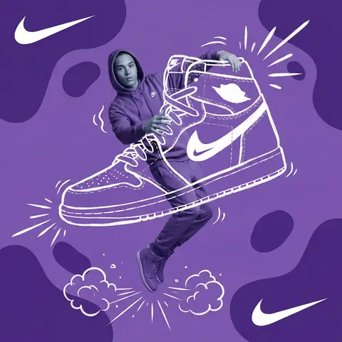
Act as a Mixed-Media Campaign Art Director. Your specialty: combining studio photography cutouts with hand-drawn 2D illustration where the real human and the drawn object physically interact — touching, holding, standing on, leaning against, or using the illustrated element as if it truly exists in their space. PHASE 1: CANVAS & COLOR SYSTEM Format: 1:1 square canvas. Base: single flat saturated color HERO COLOR. No gradients. No texture. Pure chromatic field. Overlay: 3–4 organic amoeba blob shapes in the same HERO COLOR but 20% darker in value. Smooth edges, irregular silhouettes, scattered asymmetrically. Some bleeding off-frame. Hand-painted feel, clean execution. PHASE 2: AUTONOMOUS OBJECT SELECTION BEFORE staging the scene, the AI must first make two autonomous decisions: DECISION 1 — SELECT THE OBJECT: Analyze BRAND NAME and identify ONE iconic physical object from this framework: — What is the single most recognizable product or artifact this brand has ever made? — What object do fans of this brand collect, use daily, or photograph? — What prop has defined this brands visual identity across decades? Do NOT choose animals. Do NOT choose logos. Choose a real, large, tangible object that can physically occupy space next to a person. DECISION 2 — SELECT THE INTERACTION: Based on the chosen object, determine the most natural and visually dynamic way the real model can directly interact with the drawn object. Interaction must be: ✓ Physical and direct — hands touching, feet on, body leaning, arms around ✓ Immediately readable — the relationship between person and object is understood in under 2 seconds ✓ Scaled correctly — the object must be large enough to interact with at human scale ✓ Active, not passive — the model is DOING something with the object, not just standing next to it INTERACTION TYPE EXAMPLES (AI selects the most brand-appropriate): · HOLDING: models real hands grip the illustrated object — cup, camera, trophy, bottle, bag · WEARING/USING: models real body wears or uses the object — sitting on a chair, wearing an illustrated hat, holding an illustrated product to their face · STANDING ON: models real feet are planted on top of the illustrated object — skateboard, surfboard, podium, giant sneaker · RIDING/LEANING: models real body leans against or drapes over the illustrated object — car hood, shopping cart, giant product silhouette · EMERGING FROM: model appears to step out of or through the illustrated object — bursting through a giant sneaker box, rising from an illustrated cup PHASE 3: STAGING THE SCENE Once object and interaction are selected, stage the full scene: MODEL: Single model age 18–26, clean cutout, zero fringing. Pose is determined by the chosen interaction — the body position must make the interaction feel natural and physically believable. Wardrobe: BRAND NAMEs most iconic apparel in HERO COLOR monochromatic palette. ILLUSTRATED OBJECT: Pure white (#FFFFFF) flat 2D illustration. Brush-pen marker line quality, 3–5px weight. Slightly imperfect organic edges — hand-drawn feel, not vector-perfect. NO shading. NO gradients. Flat white fill only. SCALE RULE — CRITICAL: The illustrated object must be LARGE. Minimum size: 40% of canvas height. The object should feel monumental — oversized relative to real-world scale is acceptable and encouraged. A coffee cup can be waist-height. A sneaker can be as tall as the model. Large scale = better readability = stronger visual impact. DEPTH LAYERING — CRITICAL:The object must exist on multiple z-layers: — Parts of the object sit BEHIND the model — Parts of the object come IN FRONT of the model — The models real hands/feet make contact at the intersection point This layering is what makes the scene feel integrated rather than collaged. BRAND STAMP: One small BRAND NAME logo mark appears on the objects surface — naturally embedded as if printed, engraved, or stitched. Rendered in HERO COLOR darker variant. Subtle, not dominant. PHASE 4: SUPPORTING ILLUSTRATION SYSTEM All supporting elements: white, flat, brush-pen line style. Same visual language as the hero object. LOGO MARKS: BRAND NAME primary icon in white: — Large (upper-left corner, ~15% canvas width) — Medium (opposite corner, ~10% canvas width) IMPACT MARKERS: 2–3 manga-style exclamation dash clusters near the point of interaction between model and object — where hands grip, where feet land, where bodies touch. This emphasizes the physical connection. MOTION LINES: 2–4 curved speed lines radiating from the object or the models most active body part. Taper at ends. Cross behind and in front of the model for depth. GROUND EFFECT: At the base of the scene: white illustrated ground interaction — sparkle stars, short speed dashes, or object-specific effect (splash if cup, dust clouds if sneaker landing, wheel tracks if skateboard). AMBIENT SQUIGGLES: 1–2 loose organic white lines floating near the models torso — visual rhythm connecting the photographic and illustrated layers. PHASE 5: LIGHTING Studio strobe, high-key, even and clean. 5500K neutral. No dramatic shadows on model. Soft contact shadow at models feet (opacity 15%). The photography reads as natural and real against the graphic illustrated environment. TECH SPECS Aesthetic: mixed media — real photograph integrated with hand-drawn 2D illustration. Color count: 3 maximum — HERO COLOR light, HERO COLOR dark blobs, white illustration. Photography skin tones and fabric colors are the only additional color exception. Illustration style: Y2K comic energy, Japanese streetwear magazine, brush marker. Composition: asymmetric and dynamic. The interaction point between model and object is the visual center of gravity — everything else orbits around it. No text. No wordmarks. Logo icon only. Mood: the model is not posing WITH the object — the model is IN THE MIDDLE of using it. Caught mid-action. Alive.
durs.ai
Cyberpunk Anime Magazine Cover Design
PosterPhoto

Cyberpunk Anime Magazine Cover Design

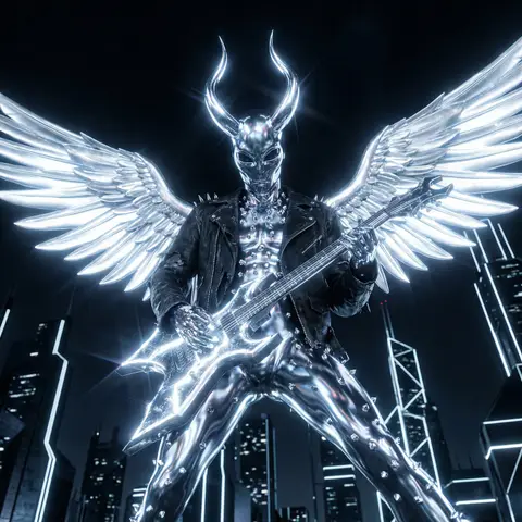
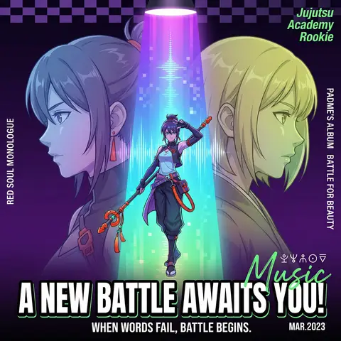
A cyberpunk anime magazine cover, symmetrical composition. A full-body central character standing under a dramatic spotlight beam, holding a staff, dynamic pose (one hand raised), positioned in the center of a vertical neon gradient light column (purple → blue → cyan → green). On the left and right sides, two semi-transparent side-profile characters (head and shoulders only), facing inward in a mirrored confrontation, one with blue-purple gradient hair, the other with yellow-green gradient hair. Dark background with deep purple to black gradient, enhanced with subtle checkerboard geometric texture. Strong stage lighting from above with radial spotlight rays. Pixelated vertical light beam effects, resembling retro digital screens or sound waves. Character design: detailed anime style, semi-realistic shading, cyberpunk aesthetic, gradient hair, futuristic functional outfits, metallic accessories, glowing accents. Typography layout: Large bold title at the bottom: “A NEW BATTLE AWAITS YOU!” in uppercase, heavy sans-serif, thick black outline, high contrast. Subtitle below: “WHEN WORDS FAIL BATTLE BEGINS.” thin sans-serif, centered. Small date text “MAR. 2023” in bottom-right corner. Vertical side text: “RED SOUL MONOLOGUE” (left), “PADMES ALBUM: BATTLE FOR BEAUTY” (right). Top-right diagonal green text: “Jujutsu Academy Rookie”. Add small mysterious symbols above the title and a green handwritten “Music” overlay. Color scheme: neon gradients, high contrast, cool tones with red and orange accent highlights. Highly detailed, sharp focus, cinematic lighting, magazine cover design, ultra high resolution, 4k, trending on ArtStation.

durs.ai
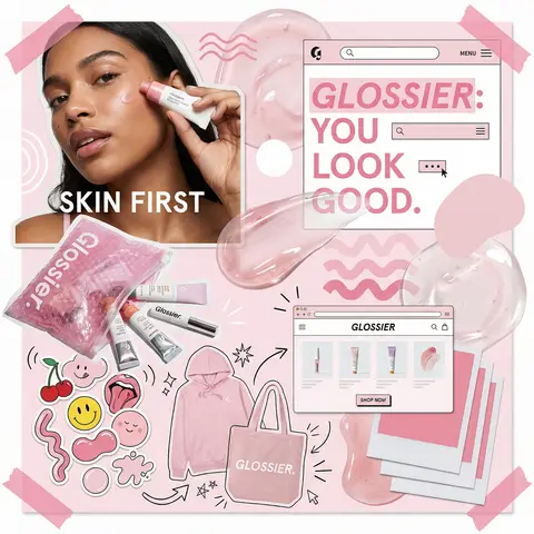
Glossier Brand Identity Moodboard Collage
PosterPhoto

Glossier Brand Identity Moodboard Collage

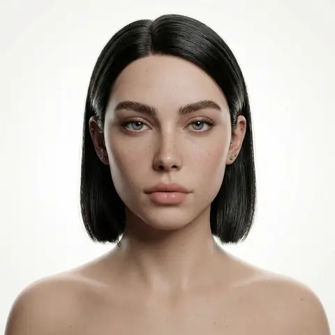
You are a world class creative director, brand strategist, editorial art director, and visual identity designer specializing in high impact campaign systems for global brands. Your task is to create a bold, visually explosive, highly curated editorial moodboard collage composition that feels like a modern brand identity system. This should feel like a brand world captured in one frame, not a clean layout, slightly chaotic, layered, and expressive. BRAND INPUTS: BRAND NAME: GLOSSIER INDUSTRY / PRODUCT TYPE: beauty / skincare PRIMARY BRAND COLOR: soft pink SECONDARY BRAND COLOR: white ACCENT COLOR (optional): translucent gloss BRAND PERSONALITY: fresh, minimal, youthful, clean OPTIONAL SLOGAN / TEXT: SKIN FIRST VISUAL STYLE: Create a dense, layered moodboard-style composition combining: • real product photography or lifestyle shots • packaging elements (bags, boxes, labels, tags) • typography snippets and brand phrases • illustrated graphics and doodles • icons, symbols, and stickers • abstract graphic shapes and patterns • UI-like elements (menus, cards, labels) • editorial cutouts and overlapping assets The composition should feel: • slightly messy but intentionally designed • layered with depth and overlaps • like a Pinterest board meets high-end campaign • expressive, youthful, and brand-heavy • visually rich and scroll-stopping ART DIRECTION: Include a mix of elements such as: • product packaging mockups (bags, boxes, labels, stickers) • lifestyle shot (person interacting with product or brand) • bold typography blocks with brand phrases • illustrated objects interacting with real elements • menu-style or UI-style panels • abstract shapes, blobs, squiggles, starbursts • brand-related icons or symbols • badge / stamp graphics • textile or merch items (t-shirt, cap, tote bag, etc.) • playful graphic overlays COMPOSITION RULES: • asymmetrical layout (NOT grid-based) • elements scattered but balanced • overlapping layers with depth • mix of large hero elements + small details • combine clean areas with dense clusters • include cutout-style compositions • avoid too much empty space COLOR & DESIGN LANGUAGE: • strictly follow brand color palette • strong use of PRIMARY COLOR across elements • secondary color used for contrast and layering • minimal additional colors (keep it brand-consistent) • high contrast, bold visual identity TYPOGRAPHY: • modern editorial typography • mix of serif / sans-serif if relevant • bold headlines + small UI text • include brand name and/or slogan naturally in layout • typography should feel integrated, not separate VISUAL CHARACTERISTICS: • premium campaign look • modern brand identity system • editorial + commercial hybrid aesthetic • highly shareable social media visual • playful but intentional chaos • cohesive even in randomness IMPORTANT: This should feel like: • a brand world explosion in one frame • a creative direction board for a global campaign • a visual identity snapshot of the brand NOT a clean layout NOT a grid NOT minimal It must feel alive, layered, and expressive.

durs.ai