Prompt library

Prompts that work

Ready-made prompts for ads, logos, posters, 3D and more. Use one in a tap — or share your own.

+ Add a prompt
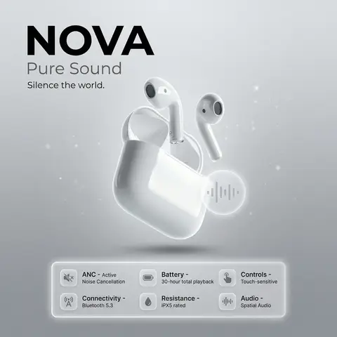
NOVA Pure Sound Wireless Earbuds Premium Ad
PosterPhoto

NOVA Pure Sound Wireless Earbuds Premium Ad

prompt: brand: <b>NOVA</b>, title: Pure Sound, tagline: Silence the world., visual_style: composition: minimalist product ad, Apple-style premium aesthetic, background: soft gray gradient with subtle noise texture, ambient light particles or micro-gradient overlays to gently fill negative space without clutter, lighting: high-end studio lighting, soft rim light, gentle catchlights, negative_space: balanced asymmetry with subtle decorative elements (soft gradient orbs, faint geometric lines) to occupy empty areas while preserving clean minimalism , product: name: NOVA Pure Sound Wireless Earbuds, specifications: finish: matte black anodized aluminum, design: ergonomic in-ear fit, seamless unibody construction, features: Active Noise Cancellation (ANC), Bluetooth 5.3 connectivity, 30-hour battery life with charging case, IPX5 water resistance, Touch-sensitive controls, Spatial audio support , dimensions: Earbud: 2.1g each | Case: 45g , placement: centered, floating slightly above surface with subtle drop shadow , specifications_ui: container_style: glass morphism panel, icon_style: effect: frosted glass blur (14px), soft white border glow, subtle inner shadow for depth, background: rgba(255,255,255,0.1) with backdrop-filter blur, layout: icons arranged in a responsive grid beneath product, evenly spaced with gentle hover elevation , specs: icon: 🔇, label: ANC, value: Active Noise Cancellation, tooltip: Block out distractions, immerse in pure sound , icon: 📡, label: Connectivity, value: Bluetooth 5.3, tooltip: Stable, low-latency wireless connection , icon: 🔋, label: Battery, value: 30-hour total playback, tooltip: All-day power with compact charging case , icon: 💧, label: Resistance, value: IPX5 rated, tooltip: Sweat and splash resistant for active lifestyles , icon: 👆, label: Controls, value: Touch-sensitive, tooltip: Intuitive gestures for music, calls, and voice assistant , icon: 🔊, label: Audio, value: Spatial Audio, tooltip: Immersive 3D soundstage with dynamic head tracking , ui_elements: accent_icon: style: glass morphism, description: translucent frosted-glass icon with subtle blur, soft white border glow, floating near product, symbol: abstract soundwave or minimalist earbud silhouette, effect: background blur: 12px, opacity: 0.85, inner shadow for depth , typography: brand_font: bold, ultra-clean sans-serif (e.g., SF Pro Display Bold), body_font: light weight, high legibility, color: charcoal black / soft white contrast, hierarchy: brand prominent, tagline subtle, specs clean and scannable , mood: premium, serene, technologically sophisticated, output_format: ultra-high-resolution, 4K, photorealistic render with shallow depth of field
durs.ai
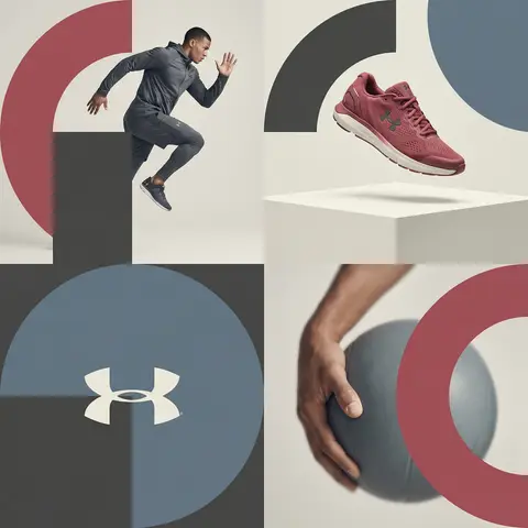
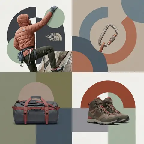
Editorial Grid Geometric Brand Campaign Visual
BrandingPhoto

Editorial Grid Geometric Brand Campaign Visual

BRAND NAME. Act as a World-Class Editorial Designer. PHASE 1: DYNAMIC SUBJECT LOGIC. - Subject Selection: Autonomously analyze BRAND NAME. - Layering (The Sandwich Effect): Interweave the subject with background shapes. Some parts of the car/person must be hidden behind geometric blocks, while other parts (wheels, limbs, props) must overlap them to create 3D depth. PHASE 2: GRID & GEOMETRY. - Layout: A clean 2x2 grid composition. - Overlays: Superimpose large, bold geometric arcs and circles over the grid. - Visual Balance: Place one iconic product prop (e.g., a floating key fob for cars or a ball for sports) in a separate quadrant to balance the subject. PHASE 3: SOPHISTICATED MUTED PALETTE. - Color Direction: DO NOT use aggressive neon or oversaturated colors. - Palette: Identify the core colors of BRAND NAME and shift them to a Sophisticated Muted spectrum. - Tones: Use desaturated, earthy, or dusty versions of the brand colors (e.g., instead of hot pink, use dusty rose; instead of bright mint, use sage green; instead of royal blue, use slate blue). - Finish: Matte, flat color blocks with zero gradients. PHASE 4: PHOTOGRAPHY & LIGHTING. - Subject Style: High-end commercial studio photography. - Lighting: Soft, diffused studio lighting with gentle highlights. No harsh shadows. - Integration: The subject must feel physically embedded into the graphic grid. PHASE 5: MINIMALIST BRANDING. - Logo: Place a clean, single-color BRAND NAME logo in the center of one background block. No taglines, just the iconic symbol.

durs.ai
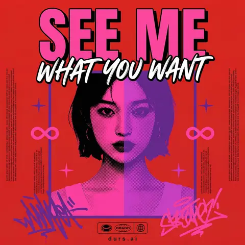
Y2K Japanese Bootleg Movie Poster Harajuku Streetwear Art
PosterPhoto

Y2K Japanese Bootleg Movie Poster Harajuku Streetwear Art

Act as a Senior Vector Graphic Designer specializing in Y2K Japanese streetwear poster art. Your aesthetic universe: Tokyo bootleg culture, early 2000s remix zines, retro-futuristic sticker posters, Harajuku streetwear graphics. INPUT VARIABLES — resolve before executing: MOVIE TITLE — the main title text, split across two lines if needed SUBTITLE / TAGLINE — secondary brushstroke-style script line REFERENCE PHOTO — a portrait/face image to be treated with split duotone halftone effect PRIMARY COLOR — dominant background color (e.g. signal red) ACCENT COLOR 1 — warm saturated pop color for title text (e.g. electric yellow) ACCENT COLOR 2 — cool secondary duotone tone (e.g. deep violet/purple) CREDITS LINE — small uppercase cast/crew text at the bottom PHASE 1 — CANVAS Portrait format (3:4 ratio). Background: flat solid PRIMARY COLOR. No texture, no gradient, completely clean. PHASE 2 — CENTRAL IMAGE Place REFERENCE PHOTO as a large centered portrait cropped from chest up, framed with a thin flat border. Apply a split duotone halftone effect: left half of face tinted in ACCENT COLOR 1 right half in ACCENT COLOR 2. The halftone dot pattern must be visible and graphic — flat, no blur, no photographic rendering. The image feels like a screen-printed bootleg. PHASE 3 — LETTERING MOVIE TITLE LINE 1 — massive bold condensed display type, full poster width, flat ACCENT COLOR 1 fill, thick dark extrusion offset down-right. Dominates the top of the poster. MOVIE TITLE LINE 2 — large brushstroke handwritten script style, flat white, bold dark outline, overlapping the portrait frame creating z-depth — sits both in front of the photo and behind the top title. PHASE 4 — Y2K SIGNATURE ELEMENTS Infinity symbols (∞) flanking the portrait frame, flat ACCENT COLOR 1 4-point crosshair stars — thin elegant accent marks scattered at key intersections Loose scribble strokes — energetic hand-drawn loops in ACCENT COLOR 2 and pink/magenta at bottom corners, like marker graffiti Side column micro-text — two narrow columns of lorem-style body text in tiny white type flanking the portrait, left and right — creates editorial zine structure Bottom logo bar — 2–3 fictional brand stamps in bold caps + a globe icon ACCENT COLOR 1 CREDITS LINE in small tight uppercase tracking across the very bottom TECH SPECS Flat vector only. Zero gradients, zero drop shadows, zero blur. Maximum 5 colors: PRIMARY ACCENT 1 ACCENT 2 white, near-black. All outlines thick and clean. The poster must feel like a collectible bootleg silkscreen print — part movie poster, part Harajuku sticker sheet, part underground zine cover. Mood: a Tokyo graphic designer obsessed with this film stayed up all night and made the most unhinged fan poster ever printed.

durs.ai
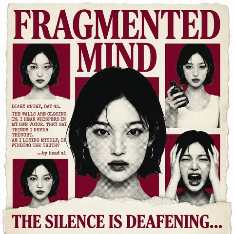
Psychological Horror Torn Paper Collage Editorial Movie Poster
PosterPhoto

Psychological Horror Torn Paper Collage Editorial Movie Poster

Psychological Horror Collage Poster — Torn Paper Editorial Style Act as a Senior Graphic Designer specializing in psychological horror editorial design. Your aesthetic universe: torn newspaper collage, halftone print culture, 90s underground zine horror, American Psycho-era corporate dread. INPUT VARIABLES — resolve before executing: MOVIE TITLE LINE 1 — first word(s) of title MOVIE TITLE LINE 2 — second word(s) of title MAIN PORTRAIT — large central face photo, serious/intense expression SIDE PHOTO 1 — smaller portrait, neutral expression SIDE PHOTO 2 — smaller portrait, holding an object SIDE PHOTO 3 — smaller portrait, extreme emotional expression (screaming/shocked) GROUP PHOTO — wide shot of multiple people, bottom right DIARY TEXT — a short first-person psychological monologue, 4–6 lines TAGLINE — bold bottom line (e.g. THE SILENCE IS DEAFENING...) ACCENT COLOR — dominant color used for title, background blocks, and tinted photos (e.g. deep crimson red) ATTRIBUTION — small credit line (e.g. ...by head ai) PHASE 1 — CANVAS Portrait format (3:4). Background: aged off-white/cream paper texture with rough torn edges on all four sides — looks like a real sheet ripped from something larger. No clean borders. The paper must feel physical and degraded. PHASE 2 — TITLE BLOCK MOVIE TITLE LINE 1 and MOVIE TITLE LINE 2 stacked at the top — massive bold serif type, deep ACCENT COLOR fill, no outline, no extrusion. The type is heavy, authoritative, slightly compressed. It dominates the top third of the poster completely. PHASE 3 — CENTRAL PORTRAIT MAIN PORTRAIT placed center, large, from chest up. Apply halftone dot grain — black and white, high contrast, visible dot pattern like a newspaper print. No color tinting on the main portrait — it stays stark monochrome. The figure should feel cold and dissociated. PHASE 4 — SIDE PHOTO GRID Four smaller photos arranged around the central portrait — two left column, two right column. Each photo is set inside a flat ACCENT COLOR rectangle background. Apply the same halftone treatment as the main portrait. The photos are slightly irregular in size and alignment — like they were cut and placed by hand. One photo (SIDE PHOTO 2) should show the subject holding a prop or object. One photo (SIDE PHOTO 3) should show an extreme expression. PHASE 5 — DIARY TEXT BLOCK Left side of poster, between the side photos. DIARY TEXT in bold uppercase sans-serif, tight leading, left-aligned. Small ATTRIBUTION line in italic below it. This text block feels like it was typed on a typewriter and pasted in. PHASE 6 — BOTTOM ELEMENTS TAGLINE across the very bottom — bold wide uppercase serif, deep ACCENT COLOR, large, confident. Below the torn paper edge, as if printed on the backing. Feels like a newspaper headline. PHASE 7 — TORN PAPER DETAILS The entire poster sits as a torn paper sheet. The edges must be rough and organic — not a clean rectangle. Ragged tears especially at the top and bottom. Subtle paper grain across the whole surface. The torn paper effect is the most important texture element — without it the poster loses its entire identity. TECH SPECS 3-color palette maximum: ACCENT COLOR, near-black, aged cream/off-white. All photos treated as halftone — no clean photography. No gradients. No drop shadows. No digital glow. The poster must feel like it was physically printed, cut, and assembled — not designed on a screen. Rough, editorial, tactile. Mood: a forensic investigator pinned this together on a corkboard at 3am and it accidentally became the most disturbing movie poster ever made.

durs.ai