durs.ai
Prompt library

Prompts that work

Ready-made prompts for ads, logos, posters, 3D and more. Use one in a tap — or share your own.

+ Add a prompt
Raw Collage Caricature Portrait
StickerPhoto

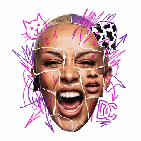
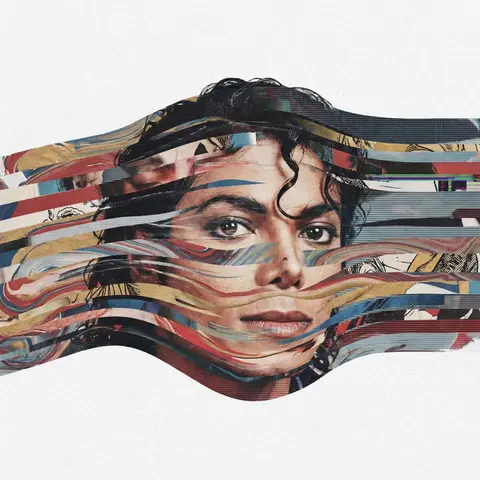
Raw Collage Caricature Portrait

CHARACTER NAME or IMAGE. Act as a radical contemporary mixed-media artist creating a raw, aggressive urban collage portrait. 1. THE SUBJECT (AGGRESSIVE COLLAGE & EMOTION): Generate a hyper-realistic Big-Head Caricature of PERSON / CHARACTER constructed via aggressive photo-montage. Expression (High Energy): The subject must have a visceral, highly charged emotional expression (e.g., roaring laughter, a primal scream, an intensely focused snarl, a manic wide-eyed stare). No passive or neutral faces. The Raw Cut Technique (CRITICAL): The face is NOT a seamless photo. It is a crude assembly of mismatched parts torn from different sources. You must show rough, jagged white paper tear lines and seams where the eyes, mouth, and forehead pieces overlap and are pasted together. The edges must look analog, handmade, and imperfect, like torn magazine pages. 2. THE GRAFFITI EXPLOSION (SMART CONTENT & DYNAMIC PLACEMENT): Over the collage, apply wild, hand-drawn Neon Marker Scribbles. Color & Content Logic (Automatic): Identify the signature color AND 2-3 iconic symbols/logos associated with PERSON / CHARACTER . Draw these specific symbols crudely in the neon color. PLACEMENT (BREAKING BOUNDARIES): The scribble elements must NOT be contained within the face. They must explode dynamically outward, breaking the silhouette of the head and extending wildly into the surrounding white negative space. 3. PHOTOGRAPHY, LIGHTING & TEXTURE: Style: Gritty Street Art meets High-End Photography. Texture: Emphasize the tactile mix of materials: the glossy texture of the photo paper, the fibrous texture of the torn white edges, and the waxy texture of the neon marker. Lighting: Harsh, high-contrast studio lighting that casts hard shadows, emphasizing the layered paper cuts. 4. COMPOSITION: Framing: The photographic head is centered, but the composition feels chaotic due to the exploding scribbles. Background: Pure White (#FFFFFF). Clean, flat, zero texture, providing maximum contrast for the messy collage.

durs.ai
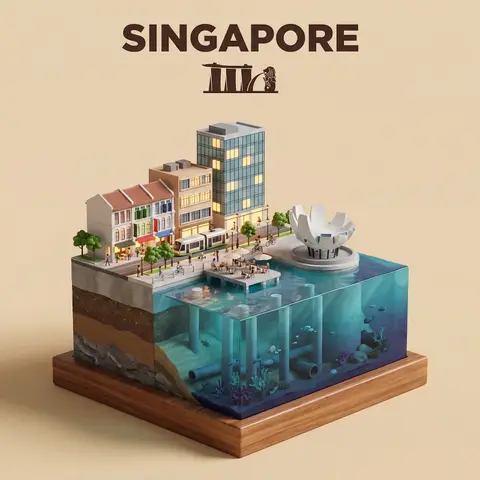
Waterfront City Cross-Section Diorama
3DPhoto

Waterfront City Cross-Section Diorama

Present a clear, side-facing isometric miniature 3D cartoon diorama of CITY along the WATERFRONT. The scene is a clean vertical cross-section slice — the city is cut open like a museum specimen, mounted on a small raised diorama-style base that exposes the full stratigraphy from rooftop to riverbed. Above the waterline: a curated selection of CITYs most iconic waterfront elements — layered building facades in local architectural style, embankment promenade, bridges, trams or cyclists, warm soft ambient lighting. Tiny stylized figures of residents in casual attire — walking, cycling, sitting at waterfront cafés (no facial details). The water surface is a clean glassy horizontal band — cartoon-stylized, slightly transparent, acting as the visual threshold between the two worlds. Below the waterline: the geographically honest submerged anatomy of CITYs WATERFRONT — accurate foundation and piling types, real underwater infrastructure, sediment and substrate layers appropriate to this specific body of water, local aquatic life rendered in the same soft cartoon style. Tiny stylized fish, slow-drifting particulate, refracted light shafts filtering down from the surface. The cross-section cut edge is razor-clean — pavement strata, foundations, soil layers, and underwater geology all simultaneously visible in the base wall, like a natural history diorama exhibit. Style: soft refined textures, realistic PBR materials, immersive ambient lighting. Color language: warm amber and golden tones above the waterline, cold teal-green and deep indigo below, blending at the water threshold. Ultra-clean, high-clarity 3D cartoon diorama aesthetic. Use a clean solid BACKGROUND COLOR background. At the top-center, display CITY in large bold text, and place the waterfront name or a city landmark silhouette emblem below the text. All text must automatically match background contrast.

durs.ai
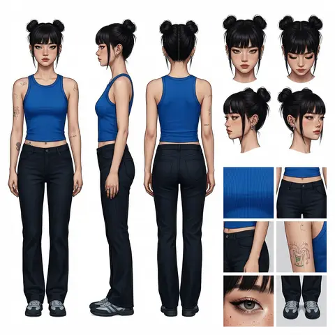
Professional Character Design Turnaround Sheet
3DPhoto

Professional Character Design Turnaround Sheet

A high-definition, clean, minimalist character design board / character turnaround reference sheet, set against a pure white background. The overall presentation should resemble a professional game art character modeling sheet, fashion design reference page, character design sheet, or character turnaround board. The layout should be neat and well-organized, with clearly divided information sections, a realistic and premium visual quality, consistent lighting, and strict character consistency throughout. On the left side of the composition, show the character’s full-body three-view turnaround, occupying the main visual area, including: 1. Front full-body standing pose 2. Left-side full-body standing pose 3. Back full-body standing pose All three figures must be the exact same character, with identical facial features, hairstyle, clothing, body shape, and height proportions. The standing pose should feel natural, with both arms hanging naturally at the sides. This should be suitable as a character modeling reference. The camera angle should be eye level, with neutral studio lighting, no obstruction, no exaggerated perspective, and no complex background. The right side of the composition should be divided into two sections: In the upper-right section, place six headshot / head-angle reference images of the same character, arranged neatly to show different head perspectives, including: - Front-facing portrait - Slight downward angle showing the top of the head - Back of the head / rear head view - Left-side facial profile - A near-side-angle comparison view (this line was slightly unclear in the source and may not be exact) - 3/4 profile portrait The head references should have clear facial features, visible hair parting, and consistent facial structure, making them suitable as head design references. In the lower-right section, place six close-up detail images of the character, arranged into a clean grid, showing key design details, including: - Close-up of the upper garment fabric texture - Front close-up of the lower-body clothing - Close-up of the hip / tailoring detail - Close-up of the leg or skin texture detail - Close-up of the eyes or facial feature details - Full close-up of the shoes as a standalone item All detail images must match the main character’s outfit and appearance exactly. Materials should look realistic, and the details should be clean and precise, suitable as clothing and accessory modeling references. Overall style requirements: Minimalist, professional, realistic, unified, clean, and premium, similar to a character design board, fashion design reference sheet, 3D character modeling reference page, or character turnaround presentation board. The character edges should be sharp, garment shapes should be clearly defined, hair strands should appear natural, skin should look refined, and material rendering should be accurate. The overall layout should have generous white space, as if it were made by a professional concept art team. Character setup: Character appearance description Output requirements: Landscape composition, white background, full character visible, no cropping, no extra props, no explanatory text, no logo, no watermark, no UI interface elements, no like/save buttons, and no social-media-screenshot appearance.

durs.ai
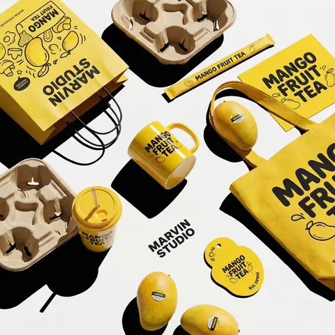
Polished Steel Peony Product Photography
LogoPhoto

Polished Steel Peony Product Photography

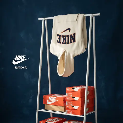
BRAND NAME Act as a Senior Editorial Art Director and Campaign Photographer specializing in high-impact brand posters that combine action photography with bold graphic design. Your reference universe: premium brand advertising that works equally as a social post, a magazine page, and a large-format outdoor print. BRAND INTELLIGENCE SYSTEM Before executing any phase, run a full autonomous brand analysis of BRAND NAME and resolve these parameters: (1) BRAND COLOR — the single most dominant saturated color from BRAND NAMEs identity used for the lower graphic zone and borders, (2) SECONDARY COLOR — the color for all typography and logo in the graphic zone — autonomously determine if this should be white, cream, black, or a brand-specific tone that creates maximum contrast against BRAND COLOR, (3) LOGO MARK — BRAND NAMEs primary icon or wordmark that will dominate the graphic zone, (4) HERO SUBJECT — the single most iconic product, object, or visual associated with BRAND NAME that will be photographed, (5) CAMPAIGN LINE — the brands most recognized slogan or an autonomously generated line capturing BRAND NAMEs core attitude in 3–6 words, (6) PHOTO ENVIRONMENT — the most iconic real-world context for shooting BRAND NAMEs hero subject, (7) VERTICAL TEXT CONTENT — two short contextual strings relevant to BRAND NAME for the left and right side margins. All parameters must be resolved before phase 1 begins. PHASE 1: CANVAS & FORMAT Vertical format, 4:5 ratio. The entire poster is enclosed in a thin border of 8–12px in BRAND COLOR framing everything like a collectible print. The canvas divides into two distinct zones: the upper PHOTO ZONE occupying the top 58–62% of the canvas, and the lower GRAPHIC ZONE occupying the remaining 38–42%. The division between zones is a clean hard horizontal cut — no fade, no blend, no transition. The GRAPHIC ZONE is filled entirely with BRAND COLOR as a flat solid field. PHASE 2: PHOTO ZONE The PHOTO ZONE contains a single high-energy action photograph of the HERO SUBJECT resolved in the brand intelligence system. Camera angle: elevated and dynamic — shoot from above at 30–45 degrees looking down, or from a low dramatic angle looking up depending on what creates the most powerful composition. Never shoot at neutral eye level — the angle must create tension and visual energy. The photograph fills the entire PHOTO ZONE edge to edge with no padding. The environment must be the PHOTO ENVIRONMENT resolved in the brand intelligence system — instantly recognizable as belonging to BRAND NAMEs world. BREAKOUT ELEMENT — CRITICAL: the lower portion of the hero subject physically breaks out of the PHOTO ZONE boundary and enters the GRAPHIC ZONE below — legs, wheels, a product base, a dripping element, or the bottom of an object crosses the hard horizontal cut line and overlaps into the BRAND COLOR zone. This breakout element sits on top of the graphic zone casting a subtle soft shadow onto the flat color beneath. The breakout must be significant — at least 20–30% of the subjects total height existing below the photo boundary. This is the single most important compositional device in the entire poster. PHASE 3: GRAPHIC ZONE The lower zone is a flat solid BRAND COLOR field. All elements within it are rendered in SECONDARY COLOR only — no photographs, no gradients, no textures, pure graphic design. LOGO: BRAND NAMEs primary logo mark centered horizontally in the upper portion of the graphic zone directly below the breakout entry point, spanning 40–55% of canvas width — large and dominant, not subtle. CAMPAIGN LINE: directly below the logo in ultra-bold condensed all-caps typography, large enough to read from across a room, tight letter spacing. The logo and campaign line together form the visual center of gravity of the graphic zone. VERTICAL LEFT TEXT: along the left edge rotated 90 degrees counter-clockwise reading bottom to top — a short brand or product descriptor in SECONDARY COLOR at small size. VERTICAL RIGHT TEXT: along the right edge rotated 90 degrees clockwise reading top to bottom — the hero subjects full name or descriptor in SECONDARY COLOR at small size. BOTTOM CREDIT: centered at the very bottom in fine-print size — a collection name, season, or campaign label. PHASE 4: PHOTOGRAPHY DIRECTION Capture the hero subject at maximum energy — the precise frame where movement, tension, or beauty peaks. For a person: mid-motion at full commitment to the action. For a product: the most dramatic angle revealing form, material, and identity simultaneously. For food: the moment of pour, cut, steam, or impact. For automotive: speed blur, drift, or heroic three-quarter angle. Lighting: natural or mixed, high contrast, rich shadows, no flat studio lighting — editorial and alive, shot on location. Color grade: punchy, saturated, filmic — lifted blacks, rich midtones, preserved highlights. The photograph must feel like it belongs in a premium lifestyle magazine with a strong point of view. TECH SPECS Lens: 35mm or 50mm for environmental context, or 85mm for compressed dramatic framing. Depth of field: subject sharp, background contextual at f/4 to f/8. Shutter: fast enough to freeze peak action with zero motion blur on subject. Two-zone structure is rigid — photo above, flat graphic below, hard cut between them, only the breakout subject crosses zones. Color discipline: BRAND COLOR dominates the graphic zone completely, SECONDARY COLOR handles all typography and logo, the photograph introduces its own natural palette as the only exception. Typography: condensed, bold, authoritative — no decorative fonts. Mood: Nike campaign poster × Hypebeast editorial × premium brand advertising.

durs.ai
VIRALMEDIA AI Agency Dark Landing Page
BrandingPhoto

VIRALMEDIA AI Agency Dark Landing Page

Build a dark-themed, single-page landing page for an AI web design agency called VIRALMEDIA. The design uses a pure black background (#000) with white text, a signature liquid glass glassmorphism effect, and two Google Fonts: Barlow (body/UI) and Instrument Serif (italic accent text). Use React, Tailwind CSS, Framer Motion, and hls.js. All buttons are rounded-full. DESIGN SYSTEM (index.css) Color tokens (all HSL, dark-only — no light mode): --background: 0 0% 0% (pure black) --foreground: 0 0% 100% (pure white) --card: 0 0% 9%, --card-foreground: 0 0% 100% --primary: 0 0% 97%, --primary-foreground: 0 0% 9% --secondary: 0 0% 15%, --secondary-foreground: 0 0% 100% --muted: 0 0% 15%, --muted-foreground: 0 0% 75% --accent: 0 0% 15%, --accent-foreground: 0 0% 100% --border: 0 0% 20%, --input: 0 0% 20%, --ring: 0 0% 100% --radius: 2px --font-body: Barlow, sans-serif --font-accent: Instrument Serif, serif Liquid Glass CSS classes: .liquid-glass — subtle glassmorphism: background: rgba(255,255,255,0.01), background-blend-mode: luminosity, backdrop-filter: blur(4px), no border, box-shadow: inset 0 1px 1px rgba(255,255,255,0.1). Has a ::before pseudo-element for a gradient border effect using linear-gradient(180deg, rgba(255,255,255,0.45) 0%, rgba(255,255,255,0.15) 20%, transparent 40%, transparent 60%, rgba(255,255,255,0.15) 80%, rgba(255,255,255,0.45) 100%) with mask-composite: exclude and padding: 1.4px. .liquid-glass-strong — stronger variant: same as above but backdrop-filter: blur(50px), box-shadow: 4px 4px 4px rgba(0,0,0,0.05), inset 0 1px 1px rgba(255,255,255,0.15), and slightly higher gradient opacity values (0.5/0.2 instead of 0.45/0.15). Tailwind config: Set fontFamily: body: Barlow, sans-serif, accent: Instrument Serif, serif at the theme root level (not in extend). SECTION 1: NAVBAR (fixed) Fixed top, full-width, z-50, px-8 py-6, flex row with space-between Left: Logo text VIRALMEDIA — text-xl font-semibold tracking-tight font-body text-foreground Center (hidden on mobile): Nav links Work, Services, About, Blog, Contact — each px-4 py-2 text-sm font-medium text-foreground rounded-sm hover:bg-white/10 Right: Get Started button — liquid-glass-strong rounded-full px-6 py-2.5 text-sm font-medium text-foreground SECTION 2: HERO (full viewport height) Container: relative w-full h-screen overflow-hidden Background video (behind everything): Absolutely positioned, object-cover object-bottom. On mobile: -translate-y-100px, on md+: no translate. Video URL: https://d8j0ntlcm91z4.cloudfront.net/user_38xzZboKViGWJOttwIXH07lWA1P/hf_20260326_073936_8dd07fdb-4f6b-4220-a3f0-9dedfaab0c88.mp4 (autoPlay, loop, muted, playsInline) Bottom gradient overlay: absolute inset-x-0 bottom-0 h-60 bg-gradient-to-t from-background to-transparent Content (z-10, flex column, justify-end, pb-10 md:pb-20): Avatar row: 3 overlapping circular avatars (http://pravatar.cc, w-8 h-8 rounded-full border-2 border-background, -space-x-2) + text 7,000+ brands already transformed in text-muted-foreground text-sm Heading: text-3xl sm:text-5xl md:text-6xl lg:text-7xl font-medium tracking--1px md:tracking--2px — Build Stunning with + <span className=font-accent italic font-normal>AI Magic</span> Subtitle: text-sm md:text-lg text-muted-foreground whitespace-normal md:whitespace-nowrap — AI-powered websites crafted for beauty, speed, and lasting performance. Email form: liquid-glass rounded-full p-1.5 md:p-2 max-w-lg w-full with transparent input and a solid white bg-foreground text-background rounded-full SUBSCRIBE button. Button uses motion.button with whileHover= scale: 1.03 and whileTap= scale: 0.98
durs.ai
Ghibli-Inspired Maximalist Kitchen Illustration
2DPhoto

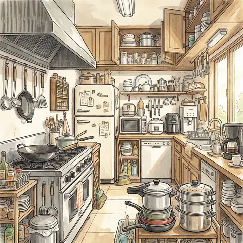
Ghibli-Inspired Maximalist Kitchen Illustration

A highly detailed anime-style illustration of a modern kitchen in Ghibli-inspired aesthetic, rendered with pen linework and soft watercolor wash (ink + light color rendering). The composition is maximalist, filled with a rich variety of kitchen objects and tools, creating a warm, lively, and slightly cluttered atmosphere. The kitchen includes numerous appliances: a gas stove, range hood, large wok spatulas, microwave, rice cooker, air fryer, refrigerator, freezer, dishwasher, sterilizer cabinet, and water purifier. Cooking utensils: wok for high-heat stir-frying, soup pot for stewing, steamer for steaming dishes, pressure cooker for fast cooking. Tableware: a wide variety of ceramic, plastic, and stainless steel utensils, along with wine sets, tea sets, and coffee-making tools. Storage elements: dish racks, spice racks, cabinets, drawers, all neatly but densely arranged, contributing to a maximalist aesthetic. Cleaning supplies: dish soap, cleaning cloths, steel scrubbers, kitchen paper towels, trash bins, broom and dustpan. Kitchen tools: knives, cutting boards, spatulas, ladles, chopsticks, whisks, rolling pins, and other essential cooking tools scattered naturally. Style: Studio Ghibli-inspired atmosphere (soft lighting, warm tones, cozy mood), delicate pen outlines with varying thickness, watercolor shading, slightly nostalgic feeling, rich details, lively environment, cinematic composition. Lighting: soft natural daylight coming through a window, subtle shadows, warm highlights. Ultra-detailed, 4K resolution, highly textured, cozy, vibrant, storytelling scene.

durs.ai
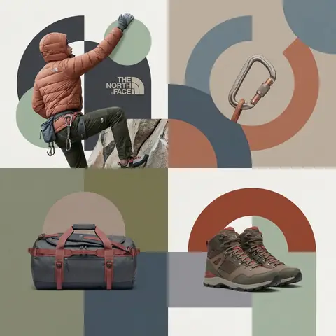
Editorial Grid Geometric Brand Campaign Visual
BrandingPhoto

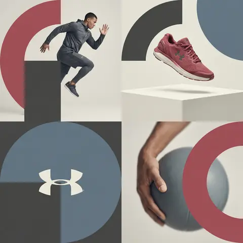
Editorial Grid Geometric Brand Campaign Visual

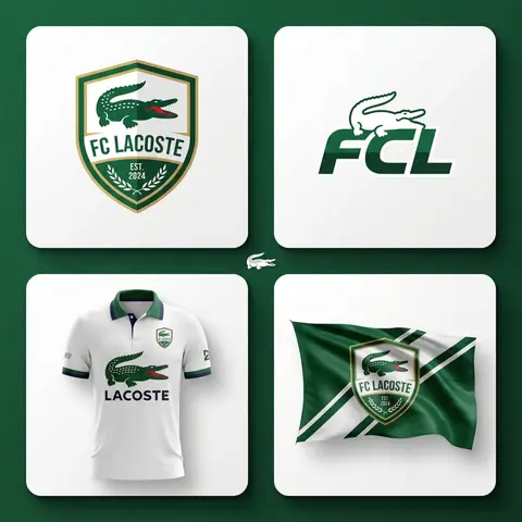
BRAND NAME. Act as a World-Class Editorial Designer. PHASE 1: DYNAMIC SUBJECT LOGIC. - Subject Selection: Autonomously analyze BRAND NAME. - Layering (The Sandwich Effect): Interweave the subject with background shapes. Some parts of the car/person must be hidden behind geometric blocks, while other parts (wheels, limbs, props) must overlap them to create 3D depth. PHASE 2: GRID & GEOMETRY. - Layout: A clean 2x2 grid composition. - Overlays: Superimpose large, bold geometric arcs and circles over the grid. - Visual Balance: Place one iconic product prop (e.g., a floating key fob for cars or a ball for sports) in a separate quadrant to balance the subject. PHASE 3: SOPHISTICATED MUTED PALETTE. - Color Direction: DO NOT use aggressive neon or oversaturated colors. - Palette: Identify the core colors of BRAND NAME and shift them to a Sophisticated Muted spectrum. - Tones: Use desaturated, earthy, or dusty versions of the brand colors (e.g., instead of hot pink, use dusty rose; instead of bright mint, use sage green; instead of royal blue, use slate blue). - Finish: Matte, flat color blocks with zero gradients. PHASE 4: PHOTOGRAPHY & LIGHTING. - Subject Style: High-end commercial studio photography. - Lighting: Soft, diffused studio lighting with gentle highlights. No harsh shadows. - Integration: The subject must feel physically embedded into the graphic grid. PHASE 5: MINIMALIST BRANDING. - Logo: Place a clean, single-color BRAND NAME logo in the center of one background block. No taglines, just the iconic symbol.

durs.ai