durs.ai
Prompt library

Prompts that work

Ready-made prompts for ads, logos, posters, 3D and more. Use one in a tap — or share your own.

+ Add a prompt
Y2K Monochrome Concept Sketch
2DPhoto

Y2K Monochrome Concept Sketch

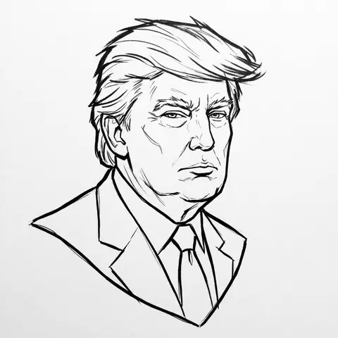
PERSON / CHARACTER NAME or IMAGE. Act as a Lead Concept Artist for a cult classic early 2000s animated series (similar to early Gorillaz or Jet Set Radio). COMPOSITION (FLOATING HEAD DRAFT): Generate a Monochrome Line-Art Concept Sketch of the head/bust of CHARACTER / PERSON . Framing: The head floats strictly in the dead center of the canvas. Orientation: Fixed Three-Quarter View (3/4) for dynamic volume. Negative Space: Generous empty white space around the sketch. VISUAL STYLE (ADVANCED VECTOR SKETCH): The image must look like a Production-Ready Concept Drawing — raw, confident, but polished. NO FILLS (Critical): This is strict LINE ART. Do not use any colors, gradients, or grey fills. The inside of the face, hair, and clothes must be white (transparent), defined only by the outlines. Line Quality (The Inkers Hand): Use Solid Black Ink on pure white paper. Variable Line Weight: Use a THICK, bold contour line for the outer silhouette to pop the character from the background. Use THIN, razor-sharp lines for internal details (eyes, nose, hair texture). Flow: The lines should feel fast and expressive (like a brush pen or sophisticated vector stroke), not shaky or messy. It is an Advanced Draft — distinct and professional. CHARACTERIZATION (THE Y2K VIBE): Stylize the character with slightly angular, edgy features typical of early 2000s street art. Expression: Cool, detached, slightly rebellious, or in the zone. BACKGROUND: Pure White (#FFFFFF). A clean sheet of paper.

durs.ai
Duotone Character Face Icon
PosterPhoto

Duotone Character Face Icon

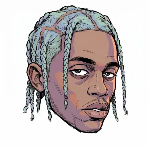
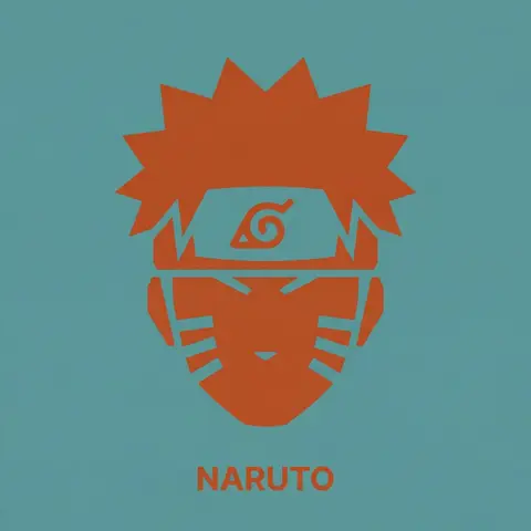
A single, isolated, strict duotone flat vector icon representing the face of CHARACTER NAME or IMAGE. CONTENT SCOPE (FACE ONLY): The design must represent ONLY the head, face, or helmet of CHARACTER . Absolutely NO shoulders, torso, weapons, or accessories. DYNAMIC DUOTONE COLOR PALETTE (MATERIAL DESIGN): The entire image must use strictly ONLY TWO solid, flat colors chosen by the AI based on the characters lore, allegiance, or iconic appearance. 1. Background Theme Color: A moderate, pleasing solid flat color covering the entire canvas. 2. Foreground Theme Color: A second solid flat color used for the icon shape and the text, chosen to contrast well with the background. Aesthetic Constraint: The colors must be chosen from a Google Material Design aesthetic—moderate hues, matte finish, pleasing to the eye, avoiding overly harsh saturation or neon tones. No gradients, shadows, or outlines. STYLE & TECHNIQUE (BRUTAL MINIMALISM): The style is brutal geometric minimalism with high abstraction. Reduce facial features to their most basic, blocky, angular shapes. Use large, solid masses of the Foreground Theme Color to define the form. Internal details (eyes, mouth, key features) must be formed solely by bold, blocky cuts of the Background Theme Color negative space into the foreground silhouette. The icon must be a free-floating silhouette with NO enclosing circle, border, or container shape. BACKGROUND: The background is filled entirely with the solid, flat Background Theme Color. TYPOGRAPHY (CRITICAL CONSTRAINTS): Directly below the floating icon, placed centrally, is the name CHARACTER . 1. FONT FAMILY (STRICT): The text MUST be rendered in the style of the font Inter Bold. Do NOT use any other font. 2. CASE & COLOR: Title case only. The text color must exactly match the solid Foreground Theme Color. 3. SIZE & SCALE (STRICT): The text must be very small. The total width of the entire text string must NOT exceed 25% of the total image width. 4. KERNING: Maintain very tight negative kerning (approx -8%).
durs.ai
Retro Americana Fat Script Lettering
LogoPhoto

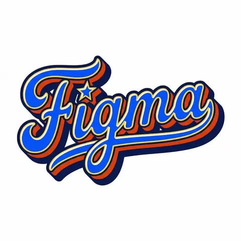
Retro Americana Fat Script Lettering

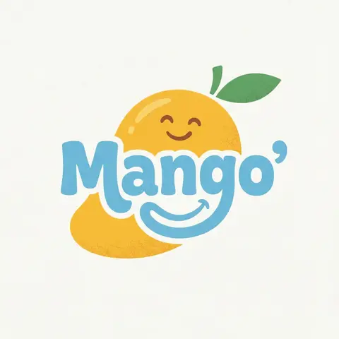
A bold, vibrant, retro-American vector lettering design displaying the name BRAND NAME or TEXT. TYPOGRAPHY STYLE (FAT SCRIPT): The text is rendered in a thick, chunky, hand-lettered baseball script or bubble style, reminiscent of 1950s-1970s American sports logos and automotive decals. Form: The letters are heavy, rounded, and tightly connected (ligatures). Perspective: The text line should be slightly slanted upwards or arched to create dynamic energy. Effects: Apply a thick, bold outline around the text. Crucially, add a deep, solid block shadow (extrusion) behind the letters to create a heavy 3D pop-out effect, characteristic of vintage sticker art. COLOR PALETTE (BRAND VINTAGE): Use a bright, saturated, and flat color palette inspired by BRAND NAMEs identity but filtered through a retro pop-art lens. Fill: Solid, punchy colors (no gradients). Contrast: High contrast between the letter fill, the outline (usually white or cream), and the block shadow (usually a darker shade or contrasting color). DECORATIVE ELEMENTS: Keep it clean and vector-like. You may include subtle, classic Americana design elements integrated into the text flow, such as a swoosh underline, a simple star, or a very simplified icon relevant to the brand (e.g., a lightning bolt for energy, a leaf for eco). Do NOT over-detail; keep it looking like a printed logo. BACKGROUND: Isolated on a clean, pure white background. No paper textures, no noise, no dirt.

durs.ai
Brand Logo Mashup Visual Parody Design
LogoPhoto

Brand Logo Mashup Visual Parody Design

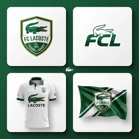
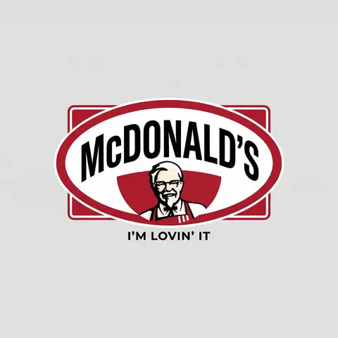
BRAND A + BRAND B. Act as a Brand Identity Designer specializing in Logo Mashups and Visual Parody. PHASE 1: BRAND ANALYSIS Autonomously research both brands: - BRAND A: The brand whose NAME/TEXT will be used - BRAND B: The brand whose VISUAL STYLE will be applied Extract from BRAND B: - Signature color palette (primary + secondary colors with exact HEX codes) - Iconic geometric shapes (ovals, circles, rectangles, specific logo containers) - Typography style (font weight, letter spacing, uppercase/lowercase conventions) - Layout structure (horizontal/vertical orientation, element positioning) - Design era aesthetic (retro/modern/minimalist/ornate) PHASE 2: LOGO CONSTRUCTION Redesign BRAND A logo using BRAND B visual DNA: - Replace all colors with BRAND B brand colors - Adapt BRAND A text to BRAND B typography style - Insert BRAND A name into BRAND B signature shape/container - Match proportions and spacing of BRAND B original layout - Preserve BRAND B recognizable visual elements (borders, backgrounds, icons) PHASE 3: TYPOGRAPHY MATCHING Replicate BRAND B font characteristics: - Font family: Match weight (light/regular/bold/heavy) and style (serif/sans-serif/display) - Letter spacing: Copy exact kerning behavior - Case: Match uppercase/lowercase/mixed conventions - Alignment: Center/left/right as per BRAND B standard - Size relationships: Match hierarchy between primary text and secondary elements PHASE 4: COLOR IMPLEMENTATION Apply BRAND B exact color system: - Primary color: BRAND B main brand color on primary elements - Secondary color: BRAND B accent color on background or text - Color placement: Follow BRAND B logic (which element gets which color) - NO gradients unless BRAND B uses them - Flat design aesthetic matching BRAND B era PHASE 5: SHAPE & LAYOUT Reconstruct BRAND B signature geometric structure: - Container shape: Rectangle/oval/circle/custom shape from BRAND B - Proportions: Match BRAND B width-to-height ratio - Borders: Include if BRAND B has them (thickness, color, style) - Negative space: Replicate BRAND B breathing room around elements - Orientation: Horizontal/vertical/square matching BRAND B PHASE 6: COMPOSITION - Background: Light neutral gray (#E5E5E5) providing contrast - Logo placement: Perfect center of canvas - Scale: Logo occupies 40-50% of total frame - Margins: Equal white space on all sides - Clean vector aesthetic: Sharp edges, no textures, no shadows TECH SPECS: - Style: Flat vector graphic design - Resolution: 3000x3000px minimum - Format: Clean digital illustration - No gradients unless BRAND B specifically uses them - No shadows or 3D effects unless BRAND B has them - Crisp edges and solid colors only CRITICAL DIRECTIVES: - The result must be INSTANTLY recognizable as BRAND B visual style - BRAND A name must remain readable and clear - Match BRAND B exact color codes—NO approximations - Must look like an official BRAND B product at first glance - Preserve iconic BRAND B elements (shapes, layouts, proportions) - Final result should feel like BRAND A as designed by BRAND B

durs.ai