durs.ai
Prompt library

Prompts that work

Ready-made prompts for ads, logos, posters, 3D and more. Use one in a tap — or share your own.

+ Add a prompt
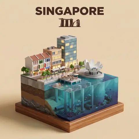
Waterfront City Cross-Section Diorama
3DPhoto

Waterfront City Cross-Section Diorama

Present a clear, side-facing isometric miniature 3D cartoon diorama of CITY along the WATERFRONT. The scene is a clean vertical cross-section slice — the city is cut open like a museum specimen, mounted on a small raised diorama-style base that exposes the full stratigraphy from rooftop to riverbed. Above the waterline: a curated selection of CITYs most iconic waterfront elements — layered building facades in local architectural style, embankment promenade, bridges, trams or cyclists, warm soft ambient lighting. Tiny stylized figures of residents in casual attire — walking, cycling, sitting at waterfront cafés (no facial details). The water surface is a clean glassy horizontal band — cartoon-stylized, slightly transparent, acting as the visual threshold between the two worlds. Below the waterline: the geographically honest submerged anatomy of CITYs WATERFRONT — accurate foundation and piling types, real underwater infrastructure, sediment and substrate layers appropriate to this specific body of water, local aquatic life rendered in the same soft cartoon style. Tiny stylized fish, slow-drifting particulate, refracted light shafts filtering down from the surface. The cross-section cut edge is razor-clean — pavement strata, foundations, soil layers, and underwater geology all simultaneously visible in the base wall, like a natural history diorama exhibit. Style: soft refined textures, realistic PBR materials, immersive ambient lighting. Color language: warm amber and golden tones above the waterline, cold teal-green and deep indigo below, blending at the water threshold. Ultra-clean, high-clarity 3D cartoon diorama aesthetic. Use a clean solid BACKGROUND COLOR background. At the top-center, display CITY in large bold text, and place the waterfront name or a city landmark silhouette emblem below the text. All text must automatically match background contrast.

durs.ai
Fashion E-Commerce Product Infographic
BrandingPhoto

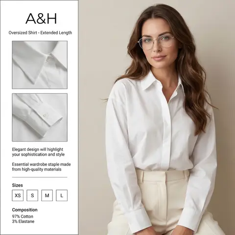
Fashion E-Commerce Product Infographic

A professional fashion e-commerce infographic for the brand BRAND NAME or LOGO IMAGE. The layout is divided: on the right, a high-quality studio portrait of a woman with long, wavy brunette hair wearing thin-framed silver glasses, a crisp white oversized cotton shirt, and cream-colored high-waisted trousers. Her face is soft and elegant, looking directly at the camera. On the left, a clean white vertical sidebar containing two square close-up inset photos of the shirts collar and pleated cuff details. The text in the sidebar is in English: at the top BRAND NAME or LOGO IMAGE and Oversized Shirt - Extended Length, in the middle Elegant design will highlight your sophistication and style and Essential wardrobe staple made from high-quality materials. At the bottom, a Sizes section with XS, S, M, L in boxes, and a Composition section showing 97% Cotton and 3% Elastane. Soft studio lighting, minimalist aesthetic, high resolution, fashion magazine style. ​Key Elements for Success ​If you are using this in another AI generator, keep these levers in mind to get the best result: ​Layout Keywords: Use terms like UI/UX layout, product infographic, and split composition to ensure the text stays on one side and the model on the other. ​Character Consistency: Mentioning the thin-framed glasses and wavy brunette hair is crucial to maintaining the likeness from your second reference photo. ​Typography: AI can be finicky with long sentences. If the text comes out garbled, you may need to use a graphic design tool (like Canva or Photoshop) to overlay the final English text onto the generated image.

durs.ai
Champagne Gold Metallic Wordmark Sculpture
3DPhoto

Champagne Gold Metallic Wordmark Sculpture

Use the uploaded logo/wordmark as the exact base silhouette. Preserve the original proportions, letterforms, spacing, curvature, and structure. Do not redesign the typography. Transform the logo into a solid monumental metallic sculpture. Structure: The word formed as a thick volumetric 3D object Strong uniform extrusion depth Clean vertical faces Sharp but controlled beveled edges Solld block-like construction Subtle curvature preserved exactly as original No distortion of the original letterforms Material: Brushed champagne gold metal Smooth satin metallic finish Subtle micro-texture across surfaces Soft reflective gradients Slight warm iridescent highlights Physically accurate metallic reflections Dense premium material feel Surface details: Crisp edge transitions Clean light rolloff across curves Subtle tonal variation between faces Refined highlight streaks Deep shadow definition between letters Environment: Pure black background Minimal composition Floating in mid-air No visible support Luxury brand campaign setting Lighting: Cinematic studio lighting Warm key light from upper side Soft fill light for dimensional clarity Subtle rim light outlining silhouette High dynamic range contrast Deep rich shadows Camera: Slight three-quarter perspective Centered composition 85mm lens look Macro-level surface detail Shallow depth of field Editorial luxury product photography aesthetic Mood: Premium Emotional Iconic Bold Monumental Timeless Style: Ultra-realistic 3D render High-end branding campaign look Physically based rendering Sharp focus Clean composition No additional elements

durs.ai
Brand Logo Mashup Visual Parody Design
LogoPhoto

Brand Logo Mashup Visual Parody Design

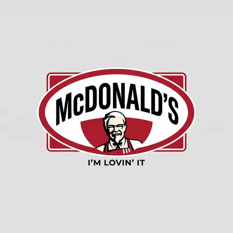
BRAND A + BRAND B. Act as a Brand Identity Designer specializing in Logo Mashups and Visual Parody. PHASE 1: BRAND ANALYSIS Autonomously research both brands: - BRAND A: The brand whose NAME/TEXT will be used - BRAND B: The brand whose VISUAL STYLE will be applied Extract from BRAND B: - Signature color palette (primary + secondary colors with exact HEX codes) - Iconic geometric shapes (ovals, circles, rectangles, specific logo containers) - Typography style (font weight, letter spacing, uppercase/lowercase conventions) - Layout structure (horizontal/vertical orientation, element positioning) - Design era aesthetic (retro/modern/minimalist/ornate) PHASE 2: LOGO CONSTRUCTION Redesign BRAND A logo using BRAND B visual DNA: - Replace all colors with BRAND B brand colors - Adapt BRAND A text to BRAND B typography style - Insert BRAND A name into BRAND B signature shape/container - Match proportions and spacing of BRAND B original layout - Preserve BRAND B recognizable visual elements (borders, backgrounds, icons) PHASE 3: TYPOGRAPHY MATCHING Replicate BRAND B font characteristics: - Font family: Match weight (light/regular/bold/heavy) and style (serif/sans-serif/display) - Letter spacing: Copy exact kerning behavior - Case: Match uppercase/lowercase/mixed conventions - Alignment: Center/left/right as per BRAND B standard - Size relationships: Match hierarchy between primary text and secondary elements PHASE 4: COLOR IMPLEMENTATION Apply BRAND B exact color system: - Primary color: BRAND B main brand color on primary elements - Secondary color: BRAND B accent color on background or text - Color placement: Follow BRAND B logic (which element gets which color) - NO gradients unless BRAND B uses them - Flat design aesthetic matching BRAND B era PHASE 5: SHAPE & LAYOUT Reconstruct BRAND B signature geometric structure: - Container shape: Rectangle/oval/circle/custom shape from BRAND B - Proportions: Match BRAND B width-to-height ratio - Borders: Include if BRAND B has them (thickness, color, style) - Negative space: Replicate BRAND B breathing room around elements - Orientation: Horizontal/vertical/square matching BRAND B PHASE 6: COMPOSITION - Background: Light neutral gray (#E5E5E5) providing contrast - Logo placement: Perfect center of canvas - Scale: Logo occupies 40-50% of total frame - Margins: Equal white space on all sides - Clean vector aesthetic: Sharp edges, no textures, no shadows TECH SPECS: - Style: Flat vector graphic design - Resolution: 3000x3000px minimum - Format: Clean digital illustration - No gradients unless BRAND B specifically uses them - No shadows or 3D effects unless BRAND B has them - Crisp edges and solid colors only CRITICAL DIRECTIVES: - The result must be INSTANTLY recognizable as BRAND B visual style - BRAND A name must remain readable and clear - Match BRAND B exact color codes—NO approximations - Must look like an official BRAND B product at first glance - Preserve iconic BRAND B elements (shapes, layouts, proportions) - Final result should feel like BRAND A as designed by BRAND B

durs.ai
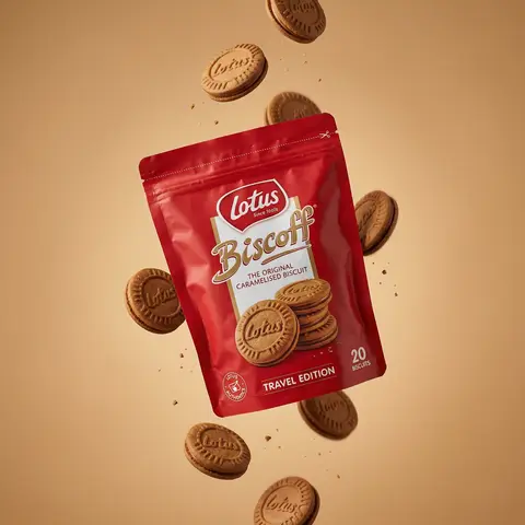
Floating Biscuit Commercial Editorial
AdvertisementPhoto

Floating Biscuit Commercial Editorial

Ultra-realistic editorial food commercial photography, Main subject project). Use the exact uploaded product image as the main subject, foating subtly in mid-air. Exact real-world packaging identical ouch shape, red color tone, logo, typography, icons, illustrations, material finish. No redesign, no recolor, no distortion, no missing text. Floating food elements (CRITICAL - BISCUITS ONLY): Multiple Lotus Biscoff sandwich biscuits floating gently around the pouch. Biscuits must be 100% IDENTICAL to the biscuits shown on the product packaging illustration: - same round biscuit shape same sandwich thickness - same embossed Lotus logo - same baked brown color and edge detail No reinterpretation, no stylized cookies, no generic biscuit shapes. Motion & physics: Biscuits appear suspended mid-air with subtle vertical separation, as if captured at peak motion. Natural gravity feel — biscuits look slightly heavy, not weightless. Minimal crumbs and tiny biscuit particles floating softly, realistic scale only. Composition: Hero pouch slightly off-center, dominant and clearly readable. Biscuits arranged in a loose vertical flow around the pouch, inspired by high-speed food photography. Clean spacing, strong depth separation, premium balance. Background: Warm studio background in soft caramel / warm beige tone. Smooth gradient, matte finish. No text, no graphics, no patterns. Lighting: Soft studio lighting with controlled highlights. Gentle rim light separating biscuits and pouch from background. Natural shadows and realistic light falloff. No dramatic glow. Material realism: Authentic flexible pouch creases and folds. Accurate Biscoff red color reproduction. Biscuits show fine baked texture, embossed logo clarity, natural crumb detail. Camera & optics: Shot on Hasselblad flagship medium-format camera. 80mm lens equivalent. f/8, ISO 64. Ultra-high dynamic range, clean color science, smooth tonal transitions. Crisp but soft editori: sharpness. Style constraints: Photorealistic. Luxury editorial food photography. Not CGI. Not cartoon. Not Al-styled. Looks like a real international FMCG campaign visual.

durs.ai